NTT CPaaS
Communication API Service for the Japanese Market
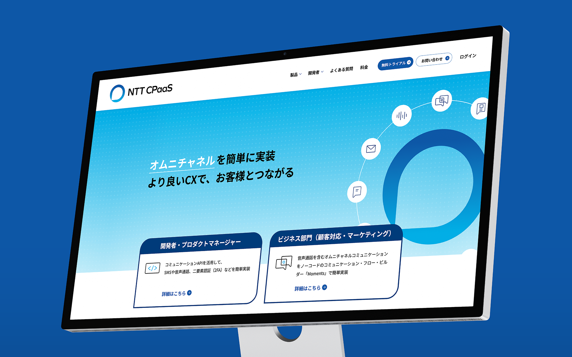
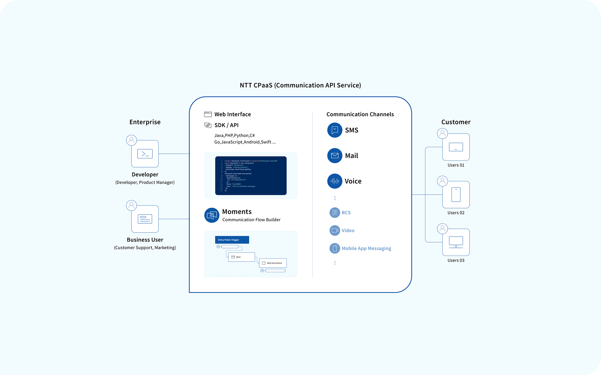
NTT CPaaS (Communication Platform as a Service) is a multi-channel communication platform developed by NTTCom Online Marketing Solutions Corporation for the Japanese market. It allows seamless integration of voice, SMS, email, IVR, and other communication channels into client systems via SDKs and APIs.
It provides developers with APIs and SDKs, while offering business users a no-code tool called “Moments.” Combining the reliable communication quality of the NTT Group with the technology partnership of Infobip, NTT CPaaS enables both robust customer engagement and flexible experience design.
This project restructured the complex, multilayered nature of NTT CPaaS into a visual and easily understandable identity for both developers and business users. From the logo and UI to service pages, dashboards, icons, illustrations, and brand guidelines, all outputs were developed under a unified visual and semantic framework.
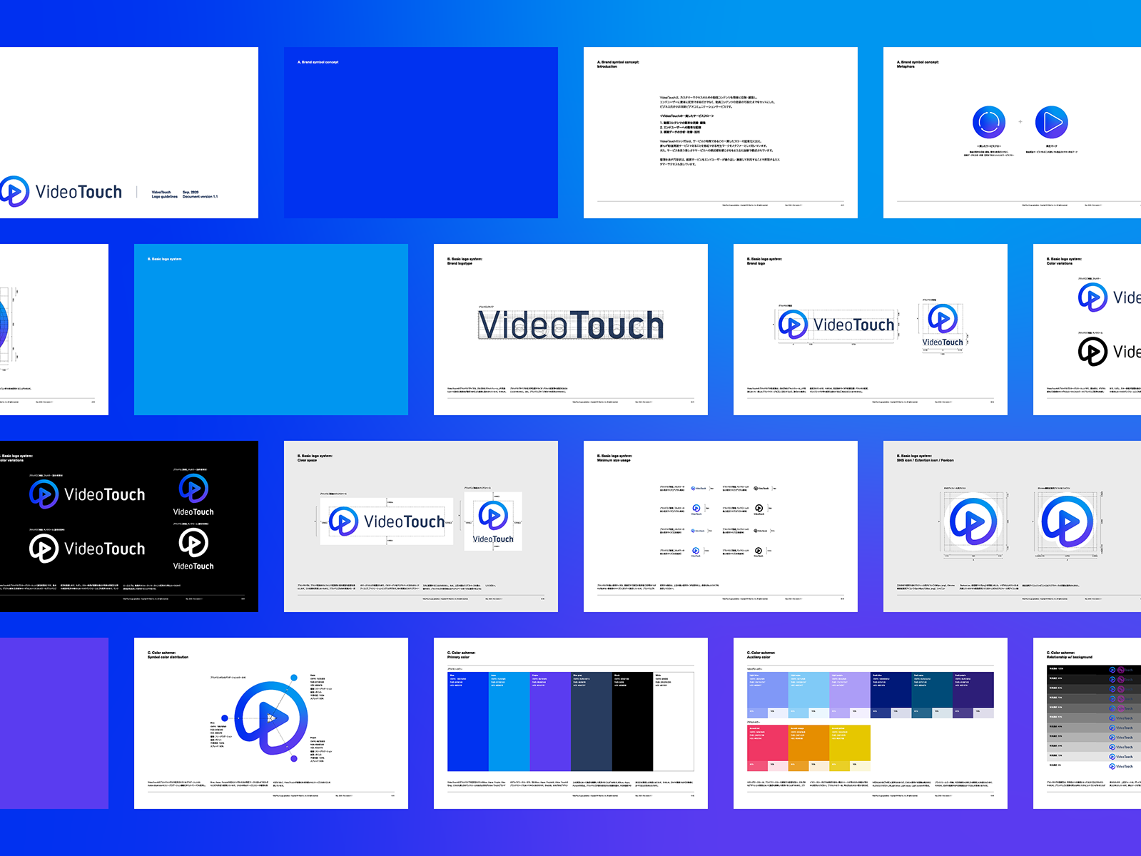
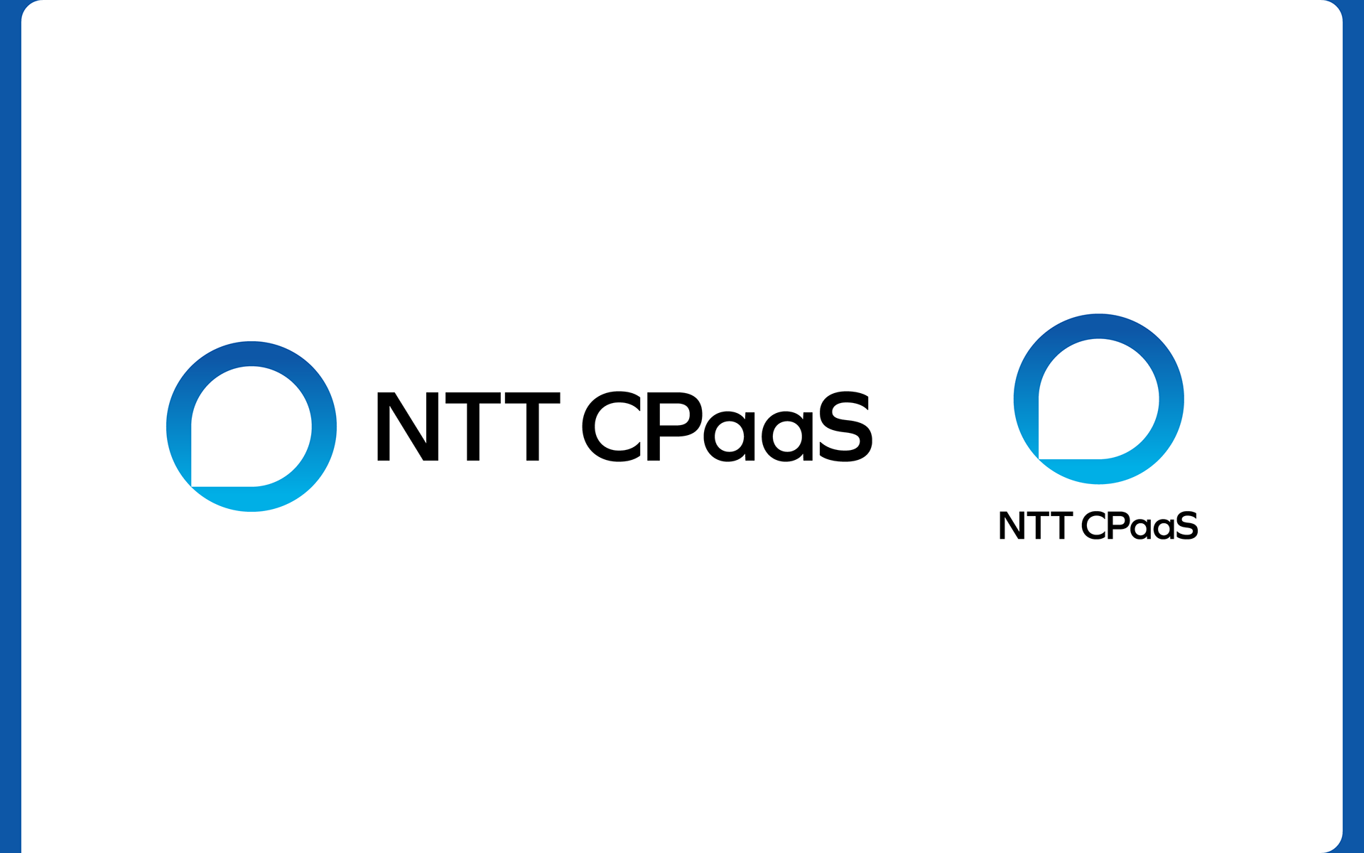
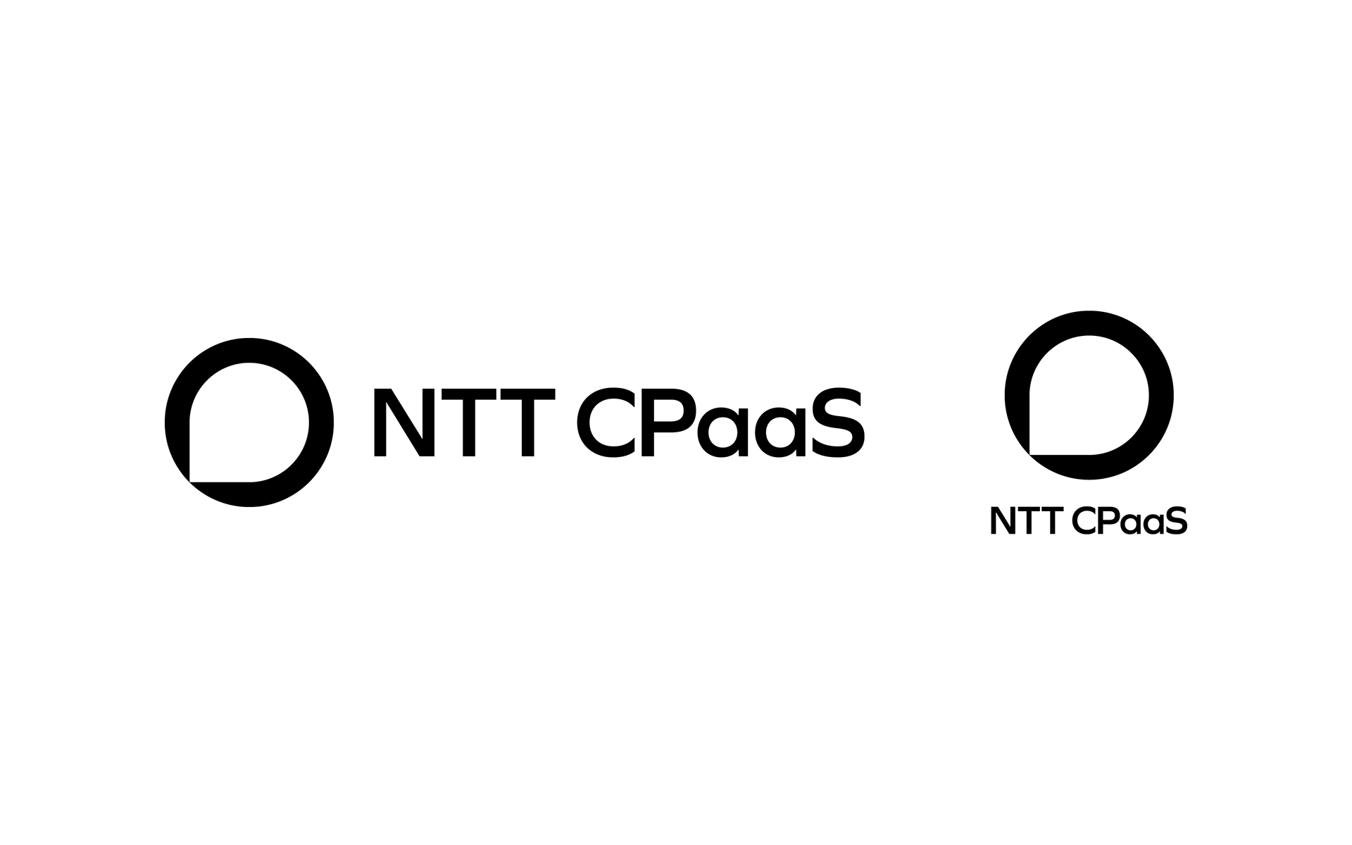
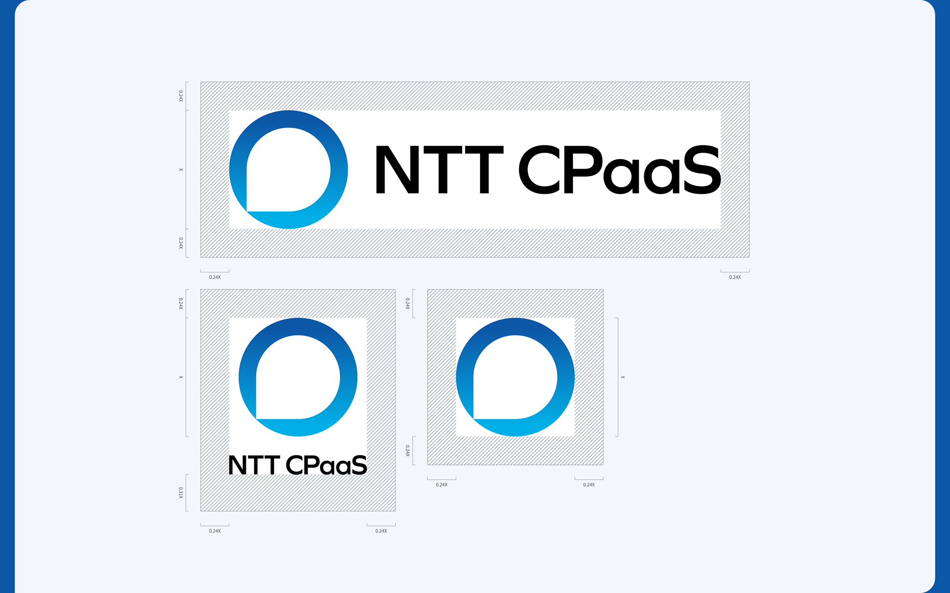
Brand Logo
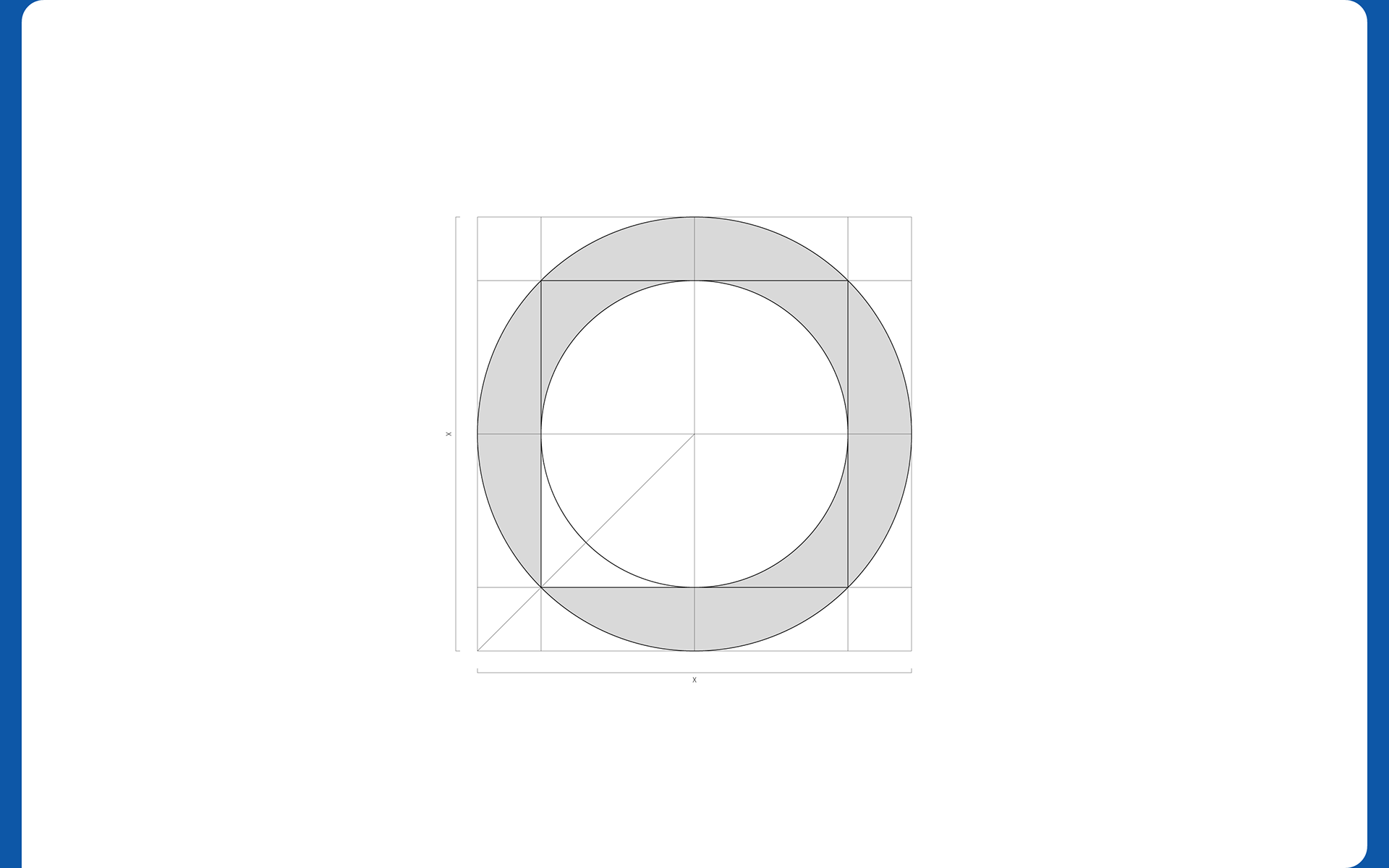
The brand logo represents NTT CPaaS as a CX platform for the Japanese market—blending the trust of the NTT Group with the global track record of Infobip.
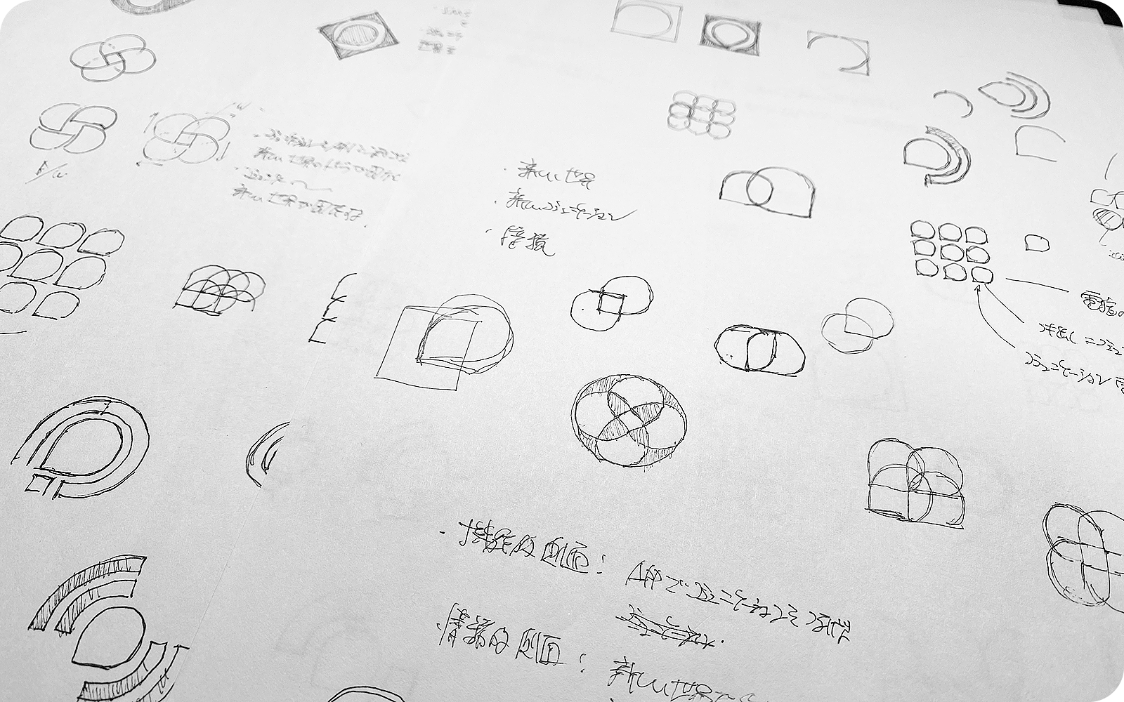
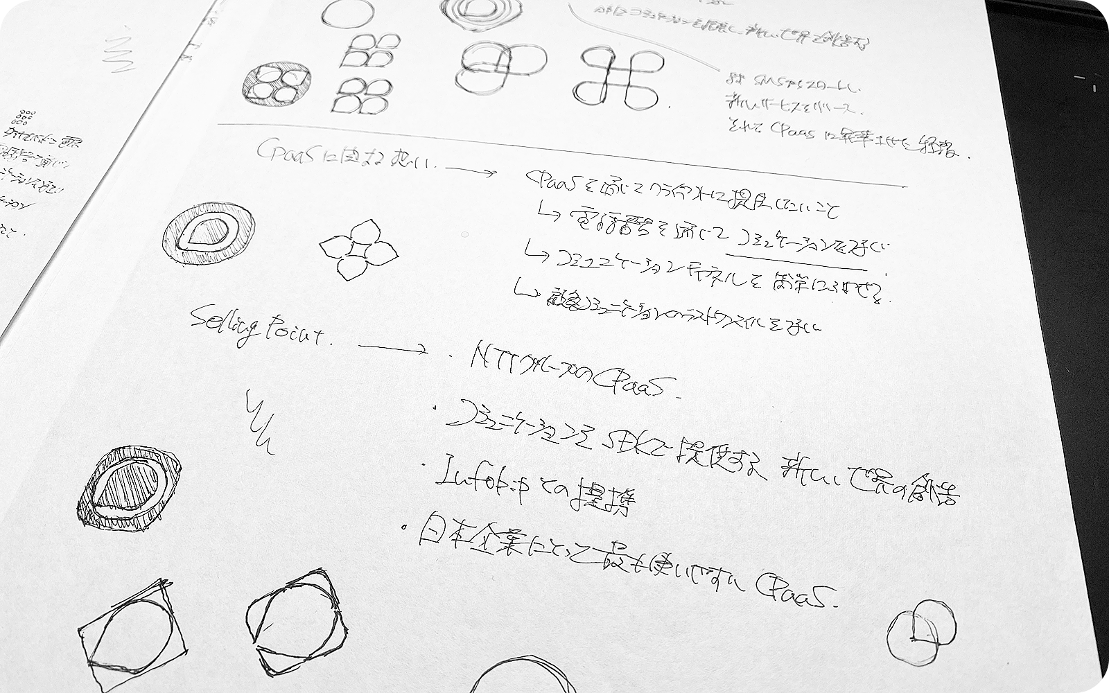
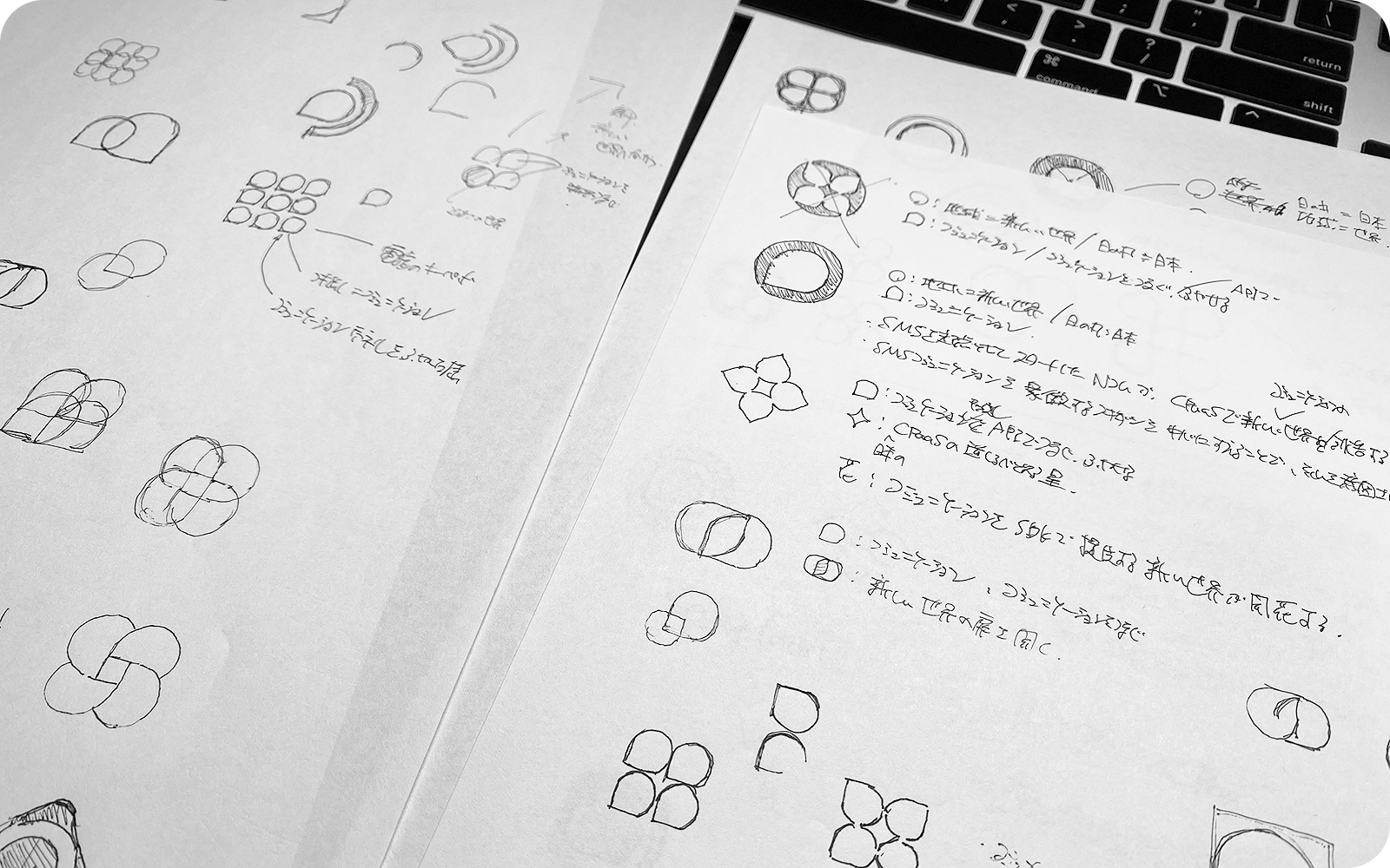
Early Logo Sketches — exploring speech‑bubble & circle motifs
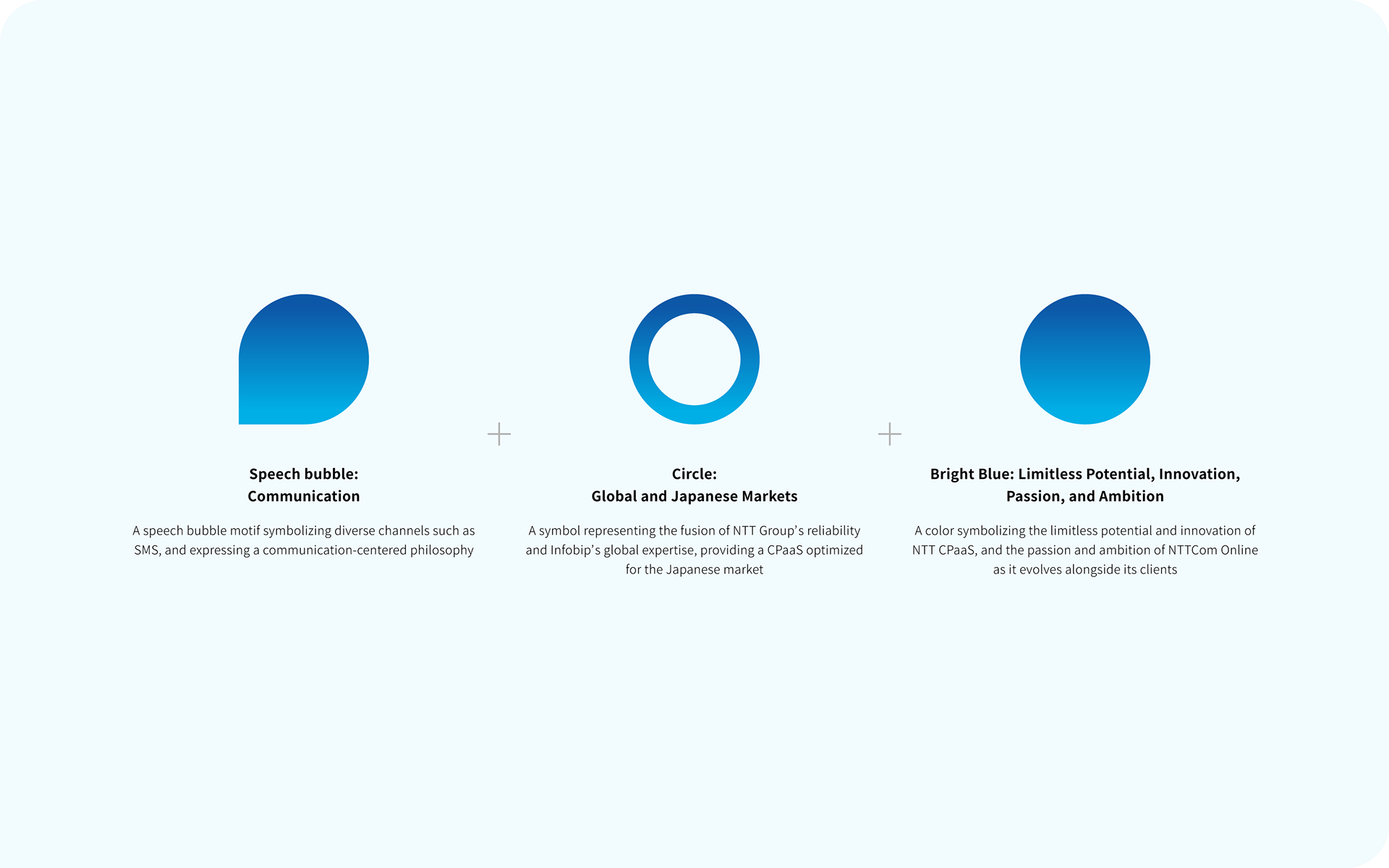
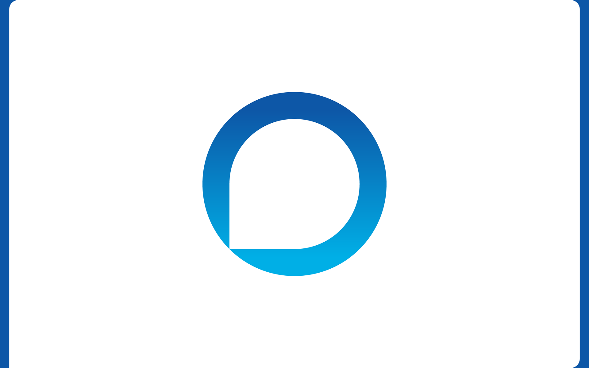
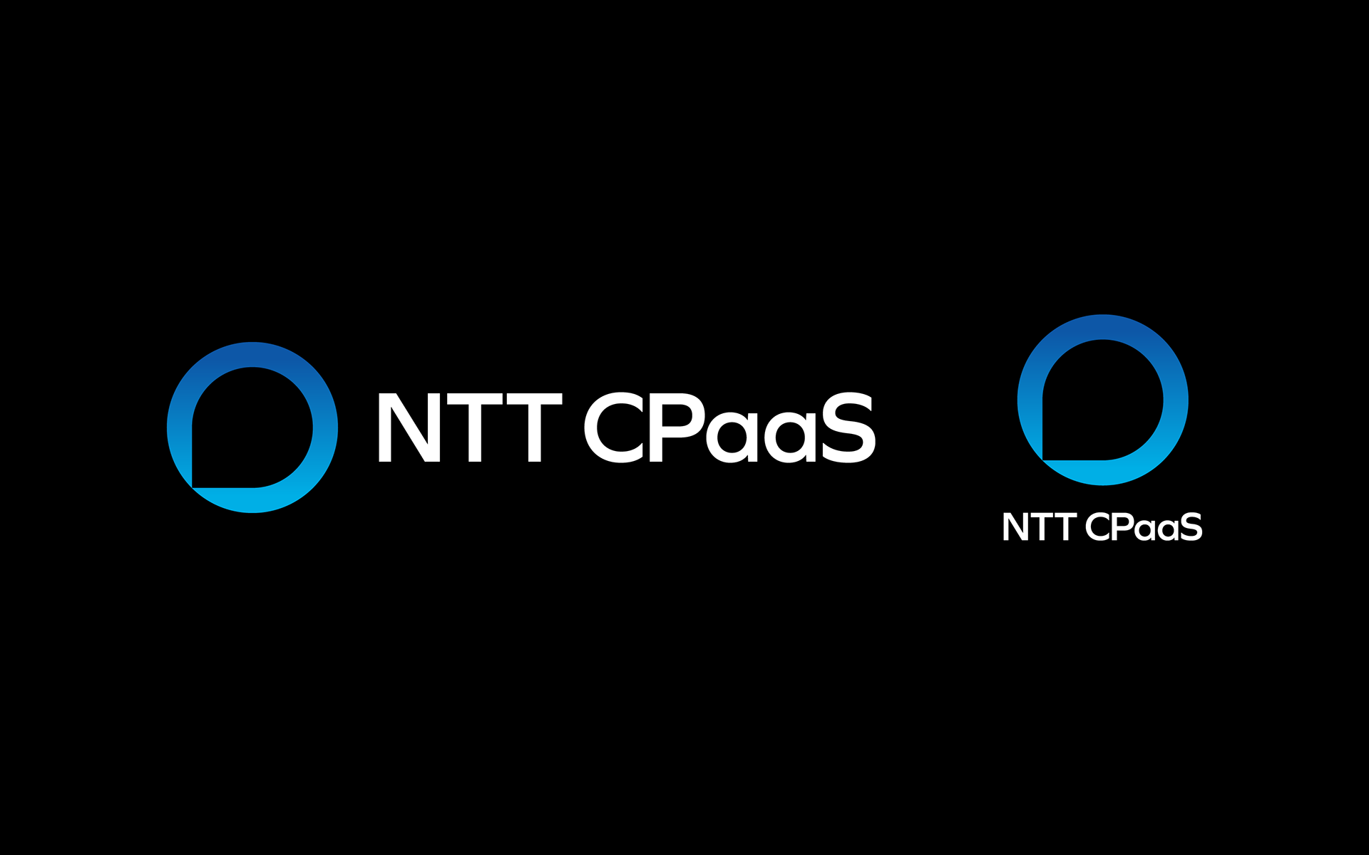
Speech Bubble: Communication
At the core of the symbol is a speech bubble, representing SMS and other communication channels. It reflects the brand’s design principle of building experiences that begin with dialogue.
At the core of the symbol is a speech bubble, representing SMS and other communication channels. It reflects the brand’s design principle of building experiences that begin with dialogue.
Circle: Global and Japanese Markets
The circle symbolizes two spheres—the global market and the Japanese market—and the structure that bridges them. Placing the speech bubble at the center visually conveys NTT CPaaS's core value: global technology optimized for local needs.
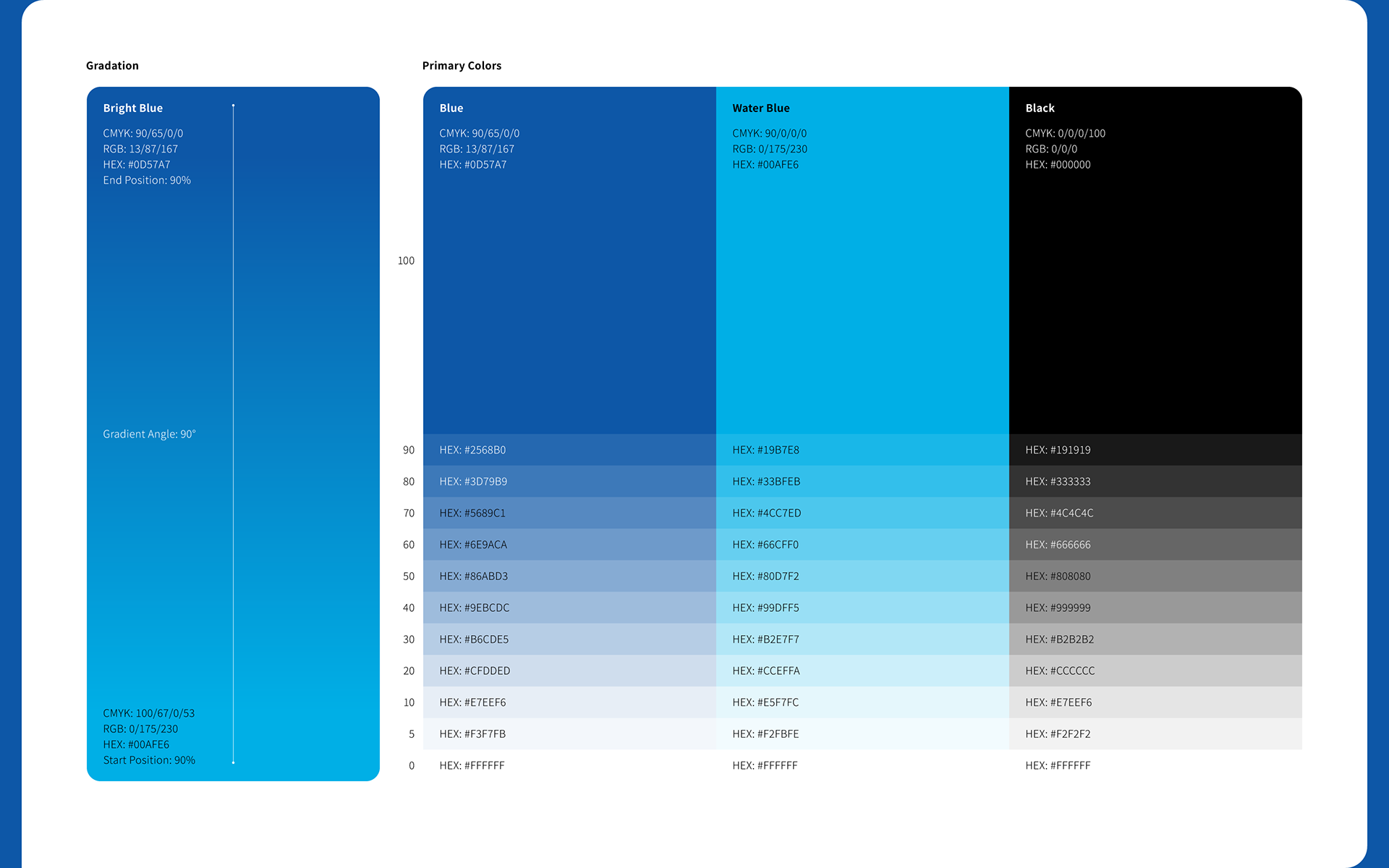
Bright Blue: Limitless Possibility, Innovation, Drive
The expansive blue gradient symbolizes limitless potential, technological advancement, and a spirit of ambition. The bright blue used in NTT CPaaS is based on the corporate color of NTTCom Online Marketing Solutions Corporation, ensuring visual consistency across the group.
Our studio has been involved in a range of brand refresh initiatives for the company, including its corporate website redesign, internal presentation templates, pamphlets, and key visual development.
This project is positioned as part of that broader brand effort. Additionally, we designed the logo and landing page for the Karaden SMS API service, applying a unified visual approach across service lines with careful attention to symbolic and chromatic consistency.

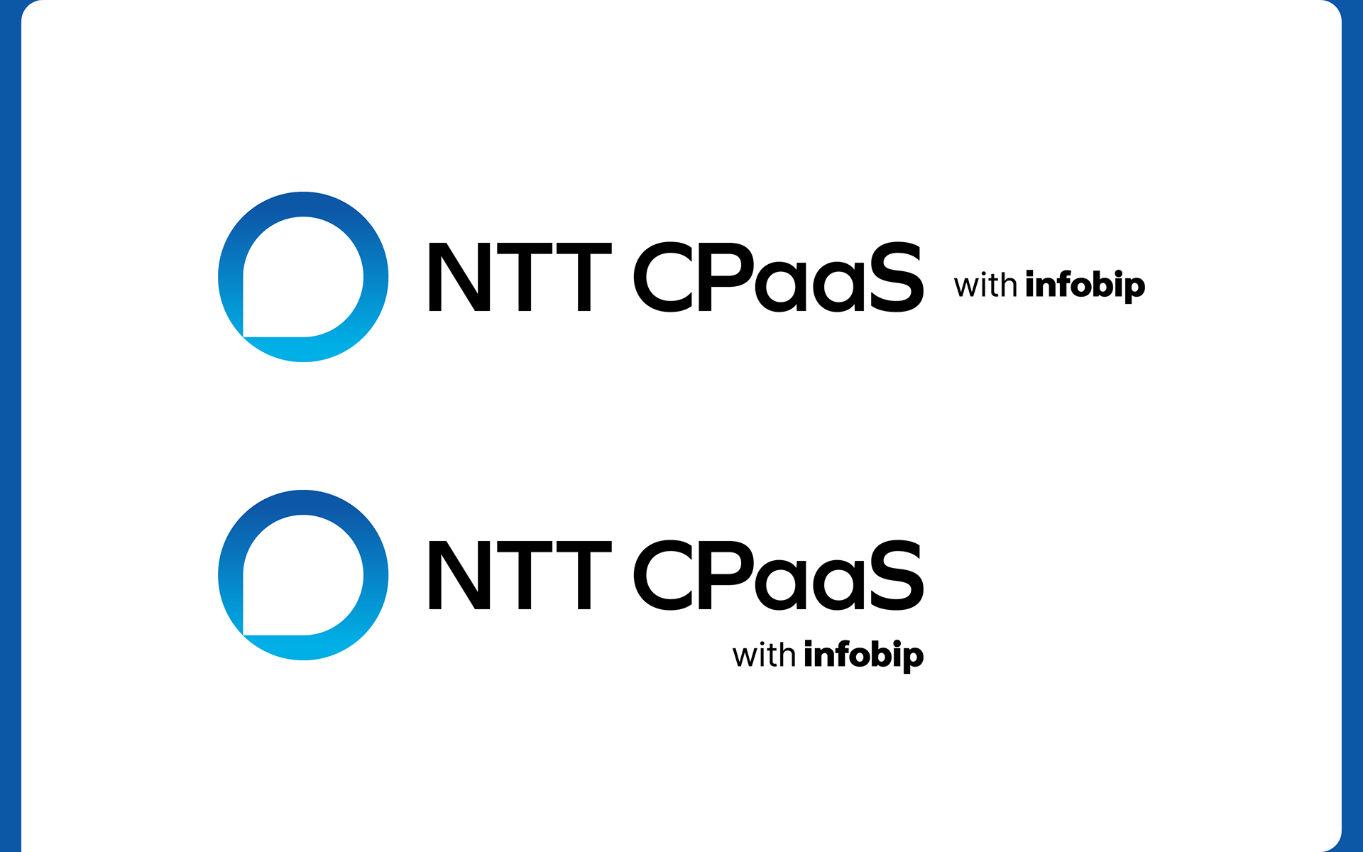
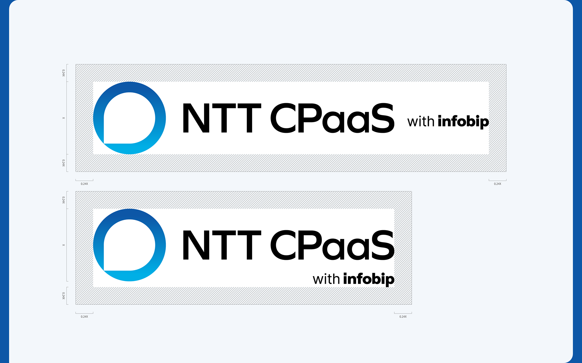
Co-Branding Logo
Infobip, NTT CPaaS’s technology partner, is one of the world’s leading CPaaS providers, operating in over 190 countries.
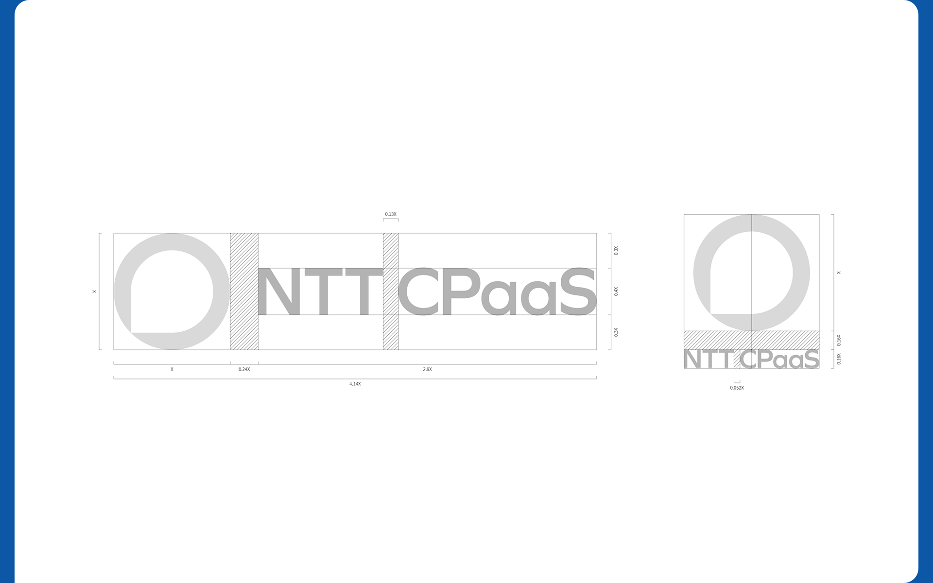
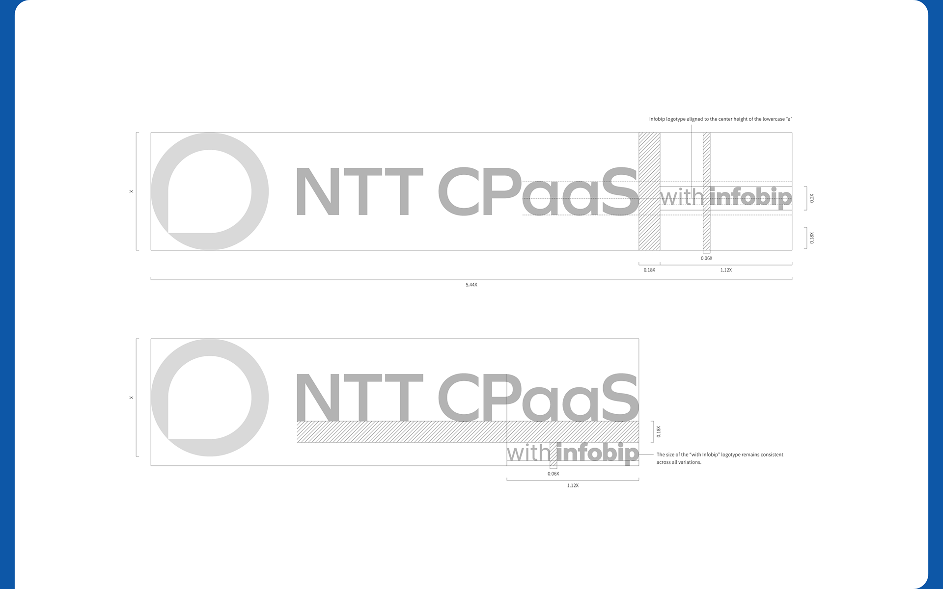
The co-branded logotype is designed using a “with structure” that conveys both brands equally. Its size, positioning, and spacing are all defined by a precise set of visual rules to maintain brand equity and clarity.
The co-branded logotype is designed using a “with structure” that conveys both brands equally. Its size, positioning, and spacing are all defined by a precise set of visual rules to maintain brand equity and clarity.
Visual Language
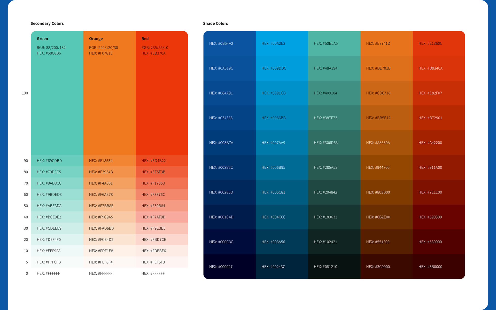
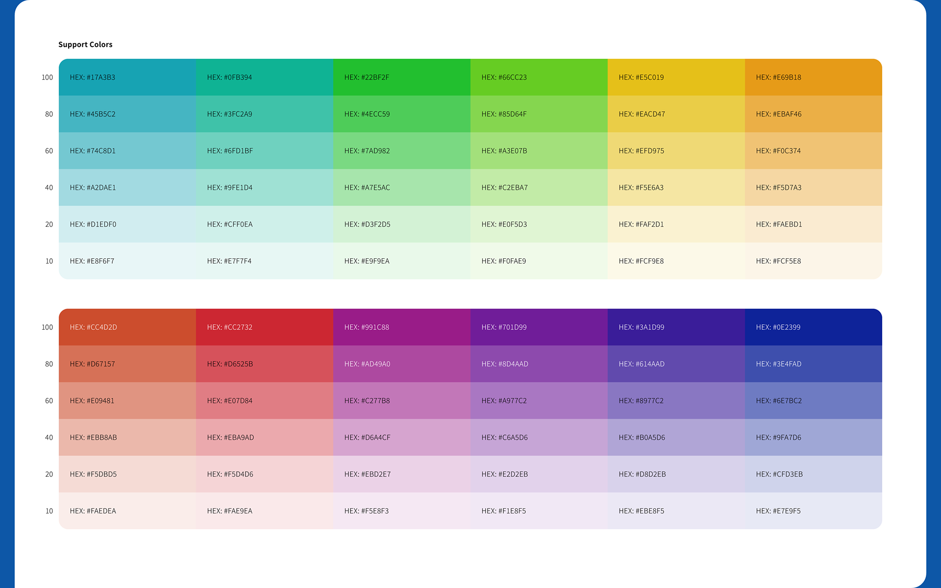
The primary and secondary color palettes are based on NTTCom Online Marketing Solutions Corporation’s corporate color (Bright Blue). Additional support colors were introduced to establish a layered color system adaptable to a range of use cases.
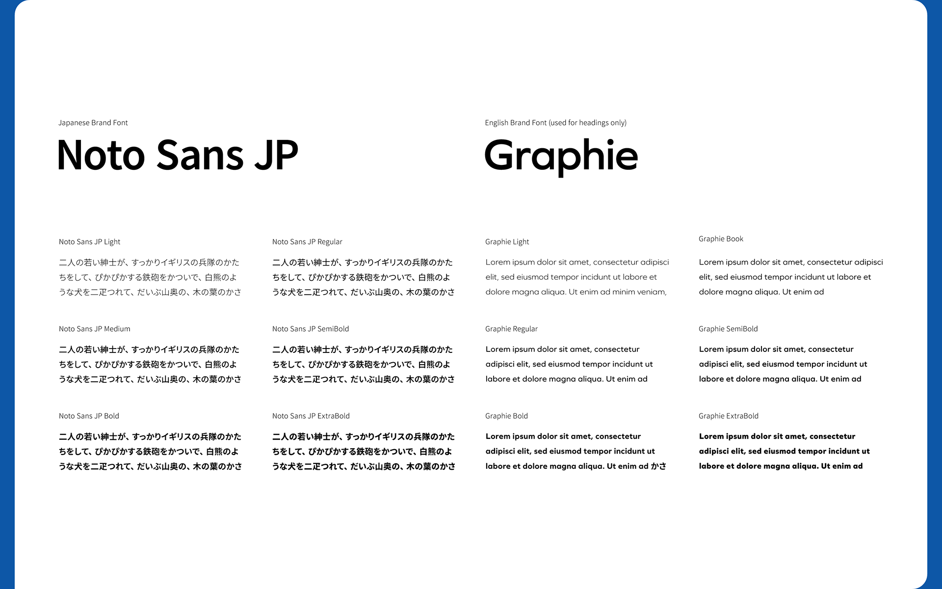
Brand fonts were selected from the official company type system to ensure alignment with the broader brand identity. The English font, Graphie, is primarily used for headings.
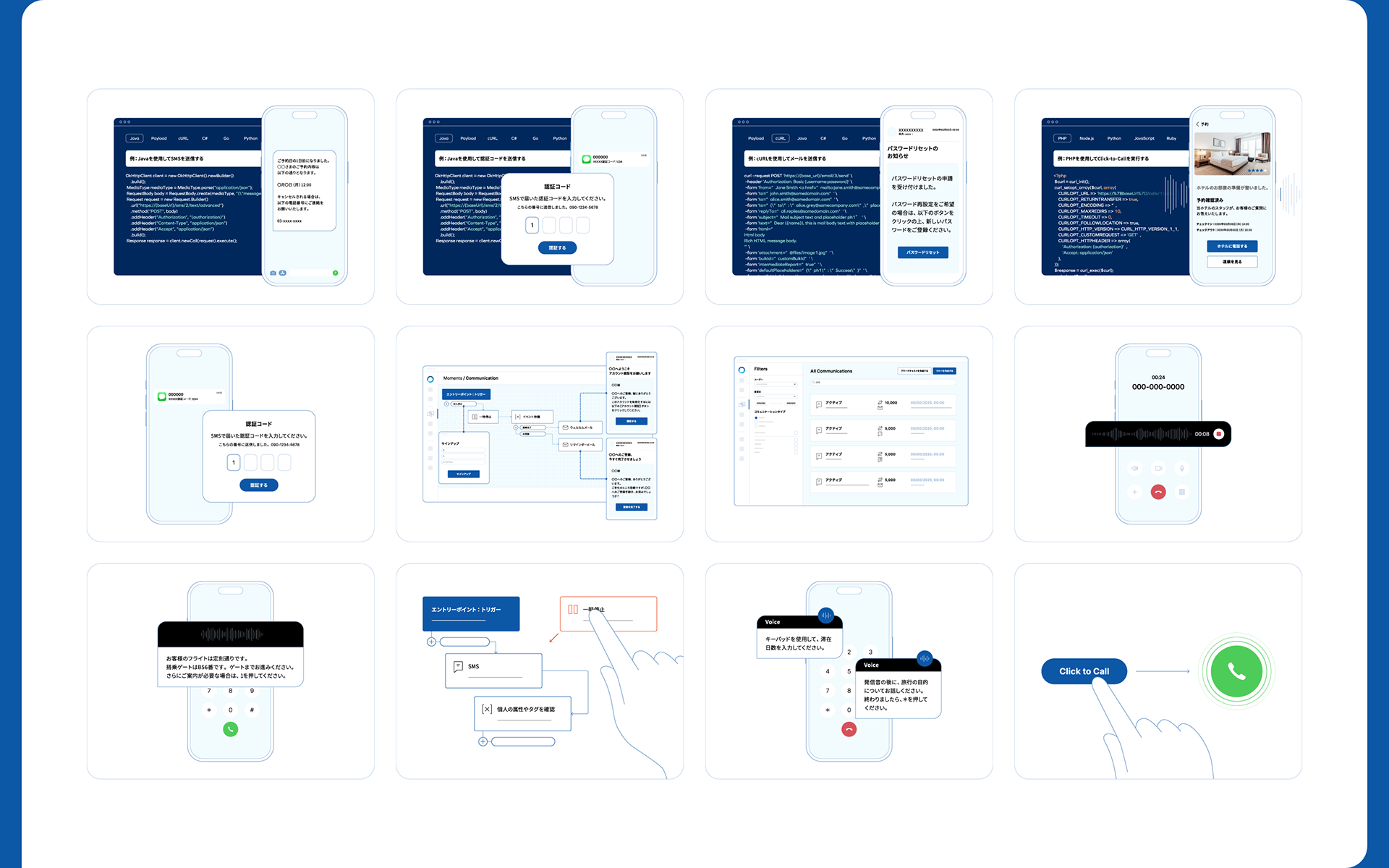
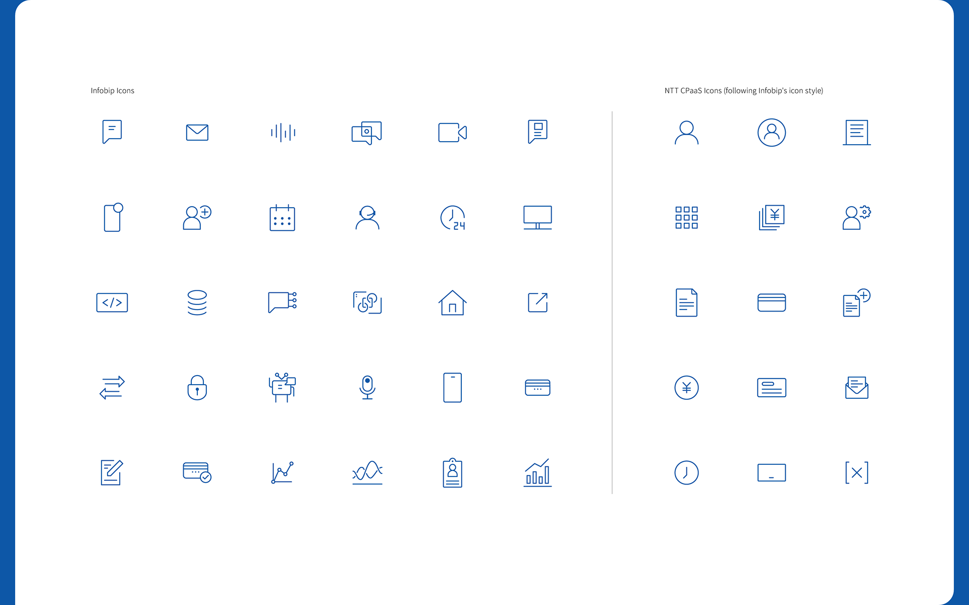
Icons and illustrations were designed to enhance clarity and understanding, especially when explaining product features or UI flows. The icon system is based on Infobip’s style guide to ensure visual consistency when services from both companies are displayed side by side.
Brand fonts were selected from the official company type system to ensure alignment with the broader brand identity. The English font, Graphie, is primarily used for headings.
Icons and illustrations were designed to enhance clarity and understanding, especially when explaining product features or UI flows. The icon system is based on Infobip’s style guide to ensure visual consistency when services from both companies are displayed side by side.
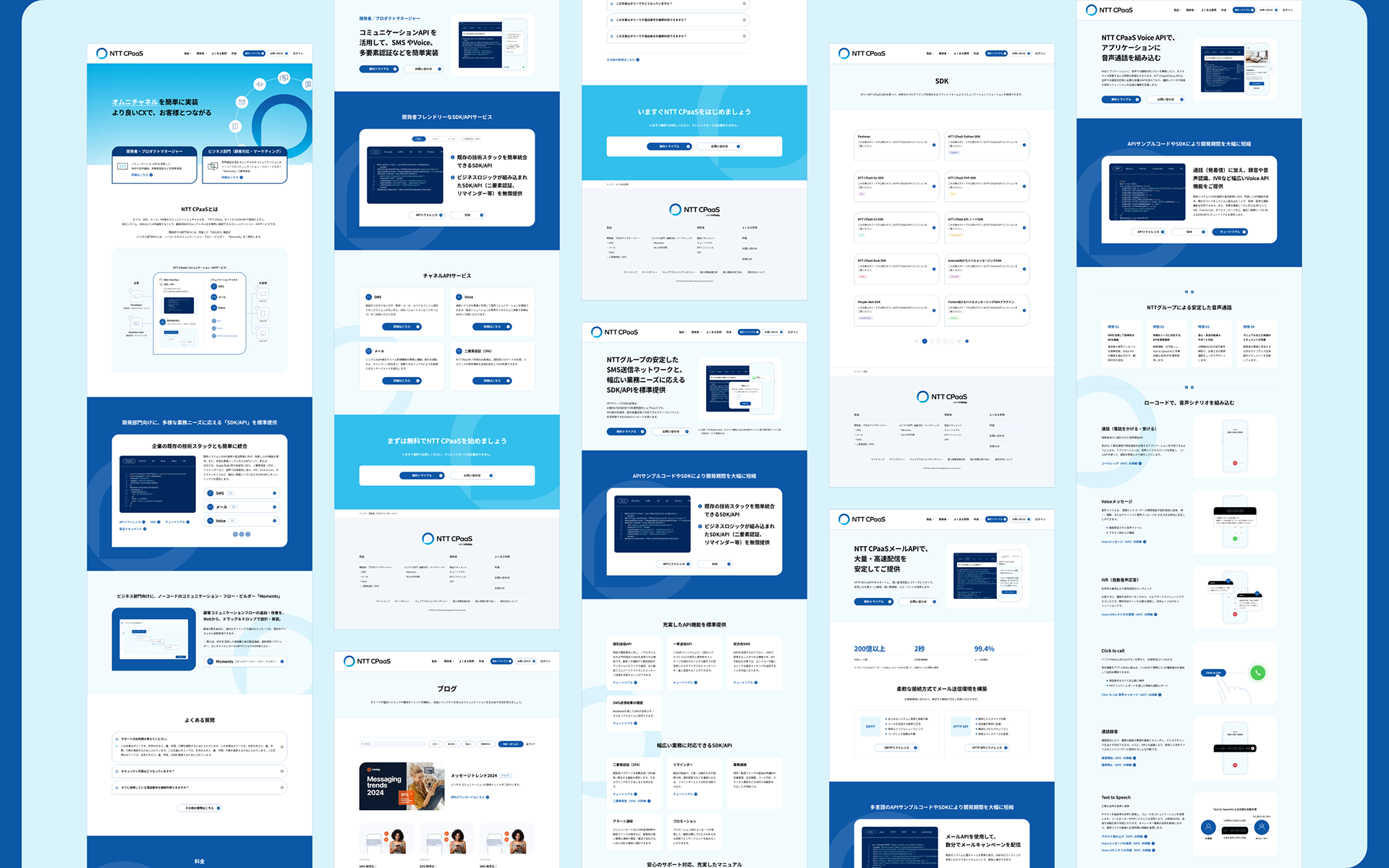
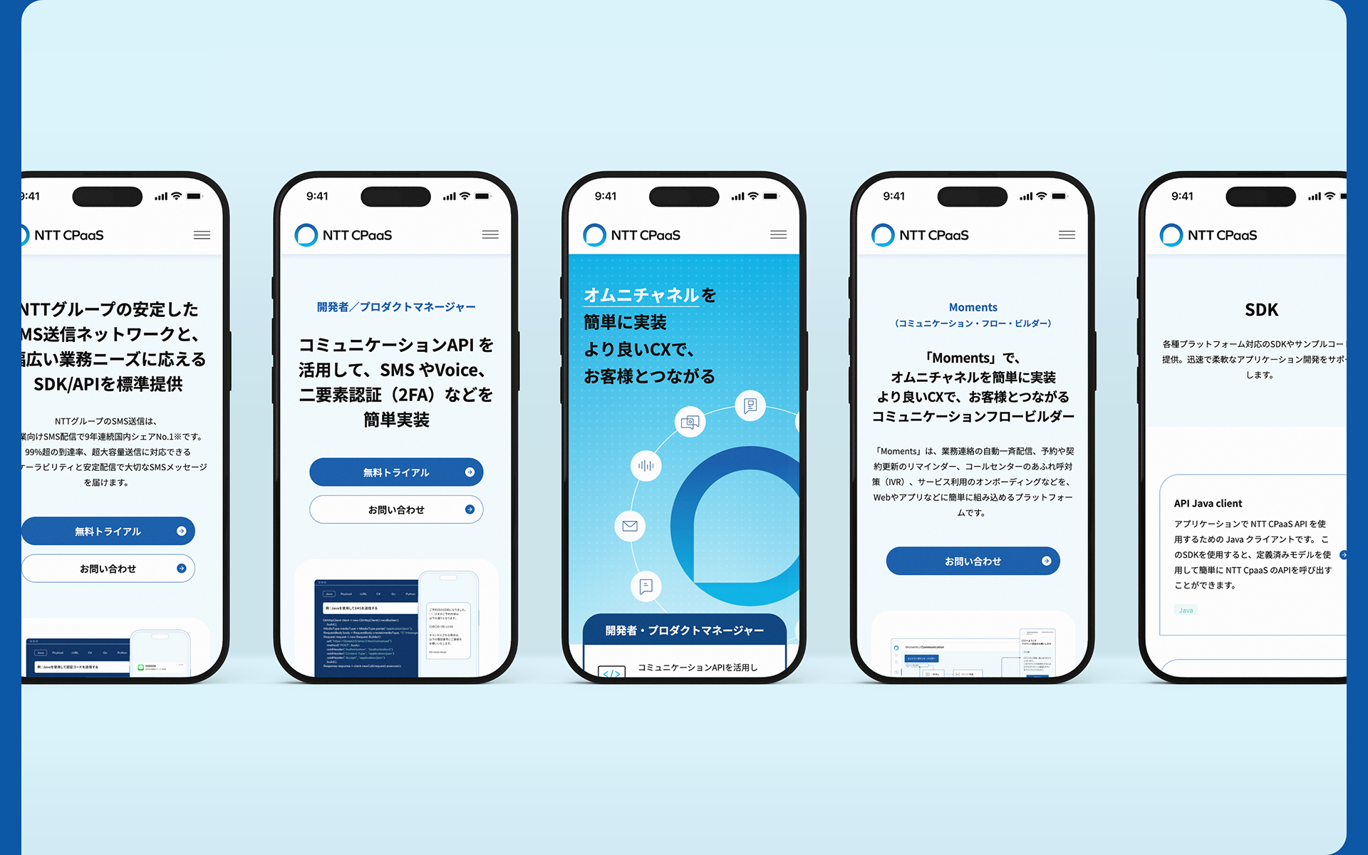
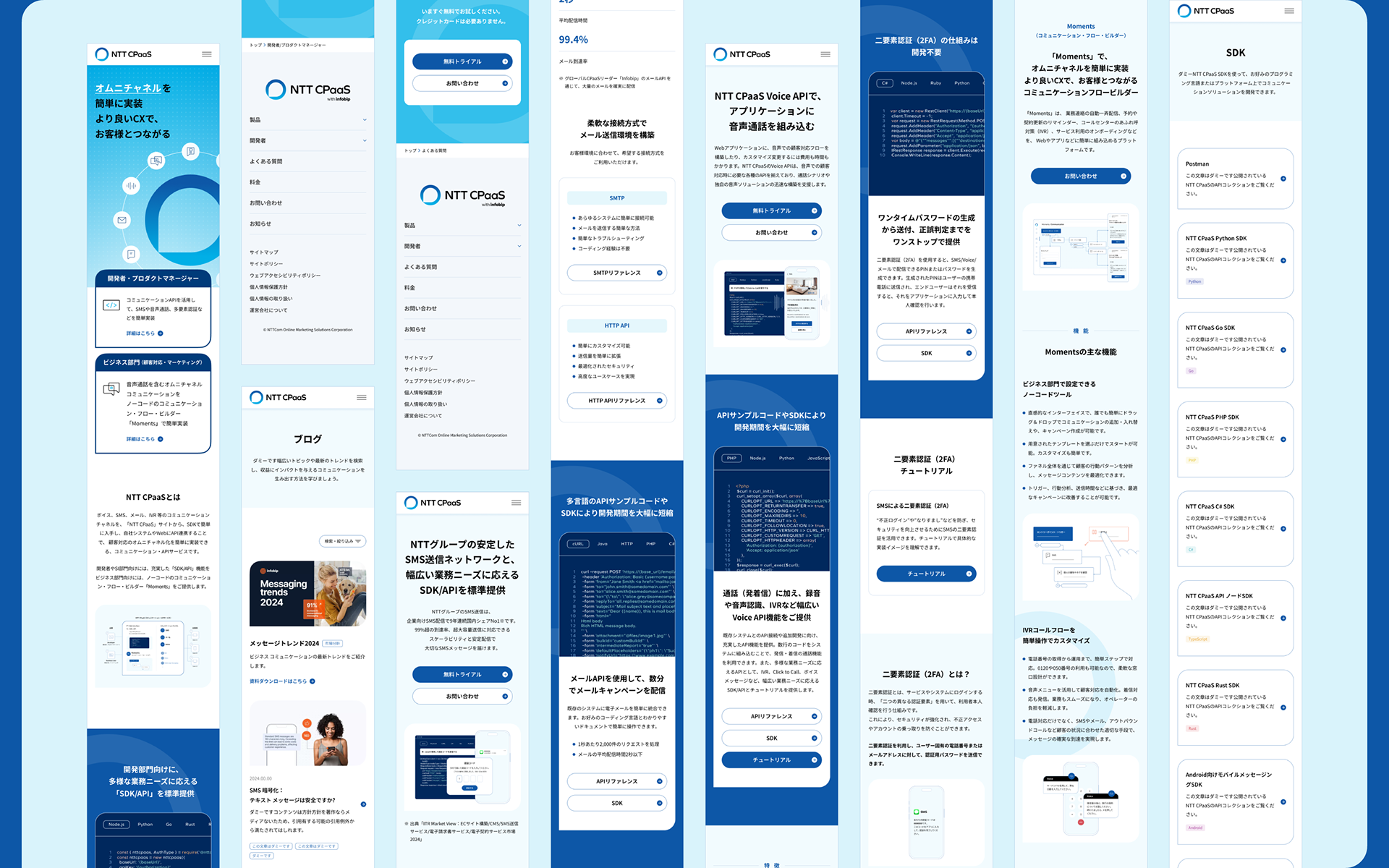
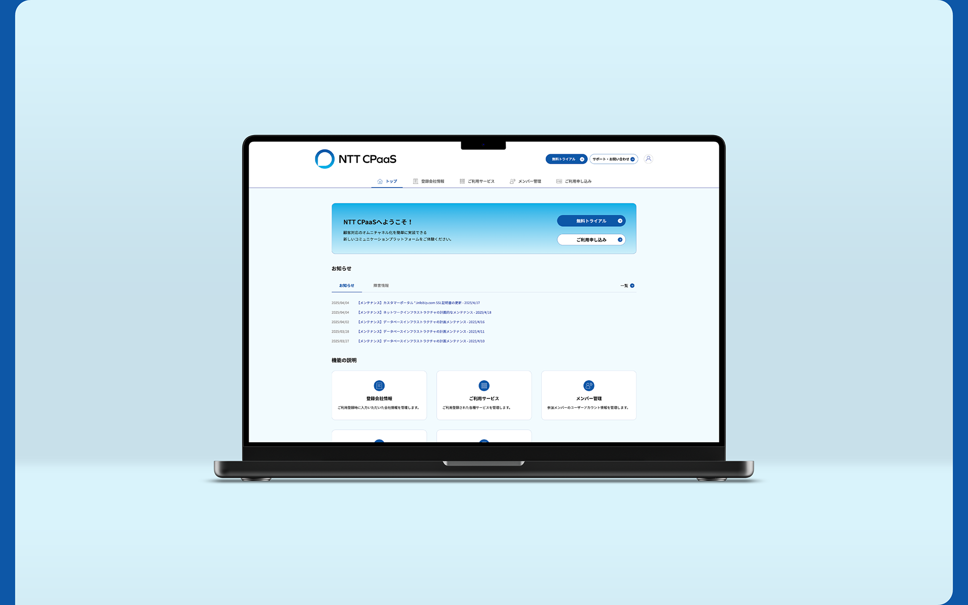
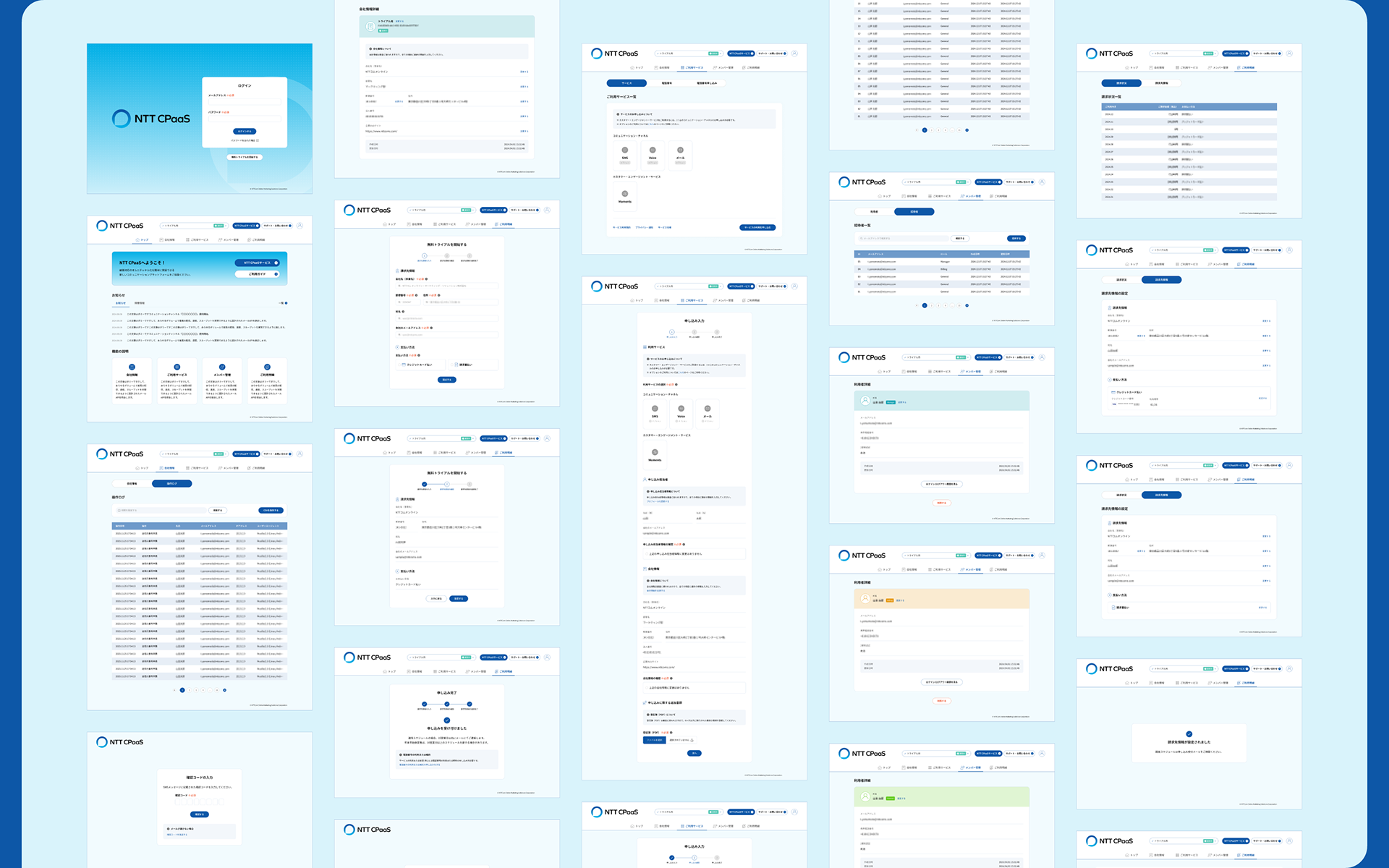
User Interface
The UI—including service sites, dashboards, and other digital interfaces—was designed to balance brand consistency with usability. Even within complex, information-dense product environments, the design ensures a clean and intuitive experience through a unified visual system of color, structure, and motion.

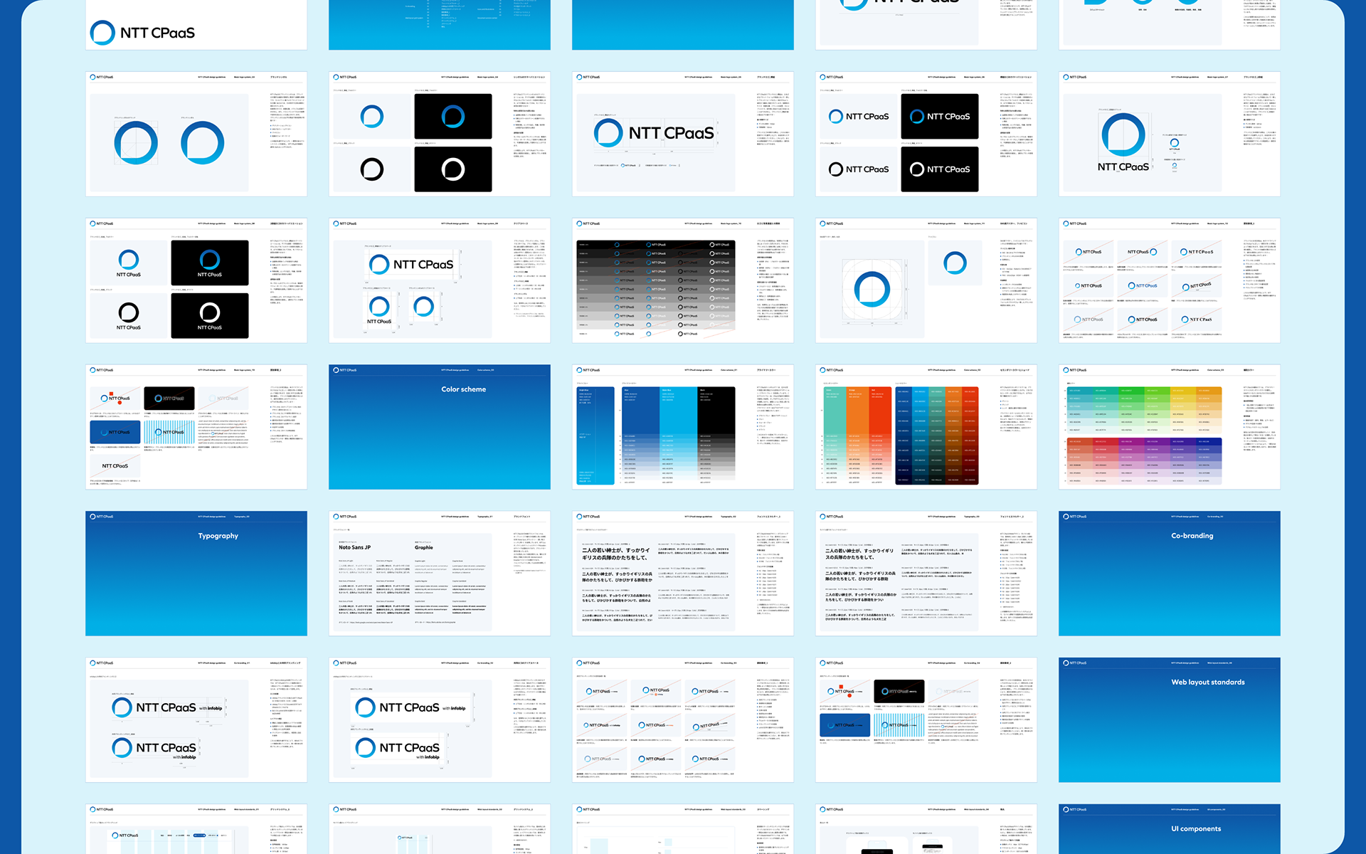
Brand Guidelines
The brand guidelines consolidate all identity components—including logos, color palettes, typography, layout systems, UI components, illustrations, photography, and rules for blog and social media visuals—into a coherent framework for decision-making and execution.
This project was designed to establish brand recognition and consistency for NTT CPaaS.
Built on a unified brand language that extends beyond logos and UI, the system continues to evolve as a scalable and clearly structured identity across products and platforms.
Built on a unified brand language that extends beyond logos and UI, the system continues to evolve as a scalable and clearly structured identity across products and platforms.
Client: NTTCom Online Marketing Solutions Corporation
Project management: Eisuke Takeuchi (Gamboo Inc.)
Copy writing: Tadayasu Seto (Omou)
Project management: Eisuke Takeuchi (Gamboo Inc.)
Copy writing: Tadayasu Seto (Omou)
Art direction/design: Hiromi Maeo (enhanced Inc.)
2024-2025, Tokyo, Japan
Thank you for exploring my work.
Connect and follow for updates:
Facebook | LinkedIn | Instagram | X (Twitter)
Facebook | LinkedIn | Instagram | X (Twitter)