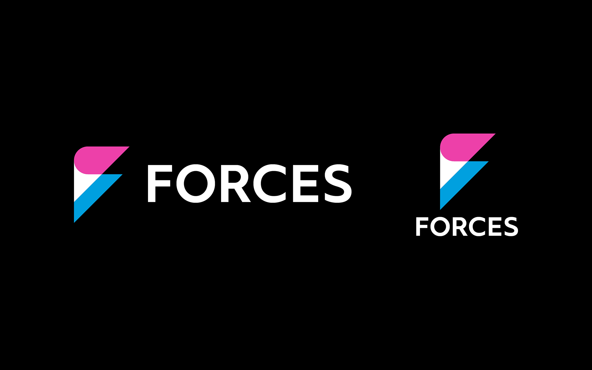
FORCES
Forces 11, a video/3DCG/TV commercial/animation/game production company, has changed its name to FORCES, along with redefining its identity. By doing so, the company aims to create a new organization that is not bound by the conventional framework.
Forces 11, a video/3DCG/TV commercial/animation/game production company, has changed its name to FORCES, along with redefining its identity. By doing so, the company aims to create a new organization that is not bound by the conventional framework.
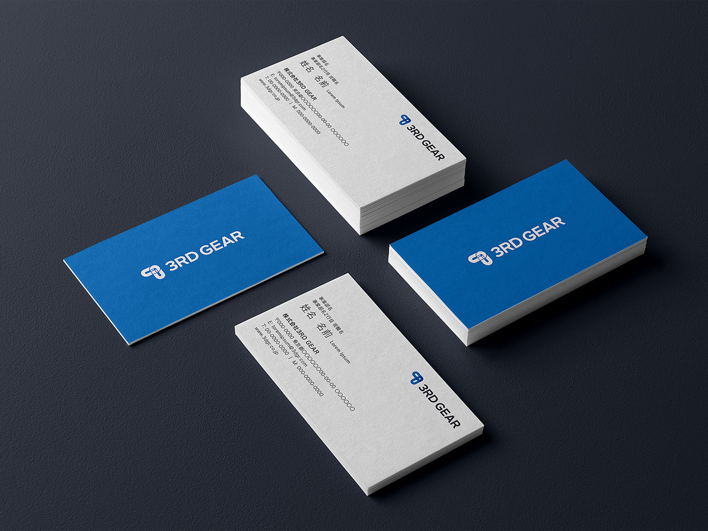
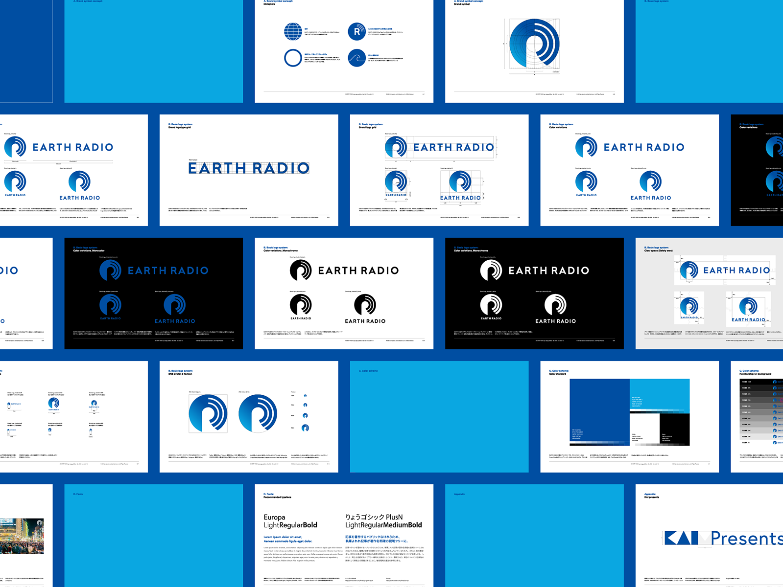
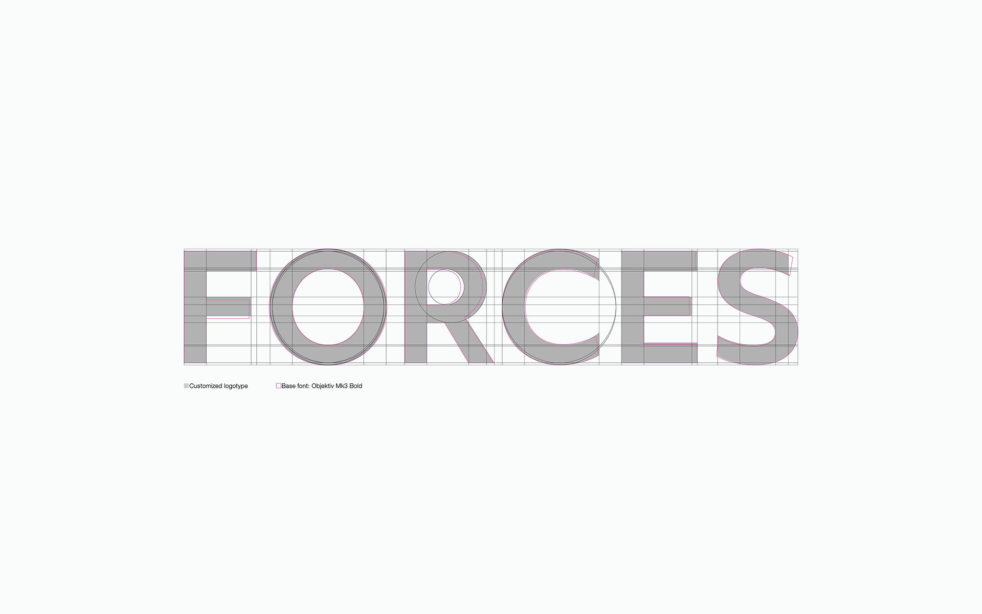
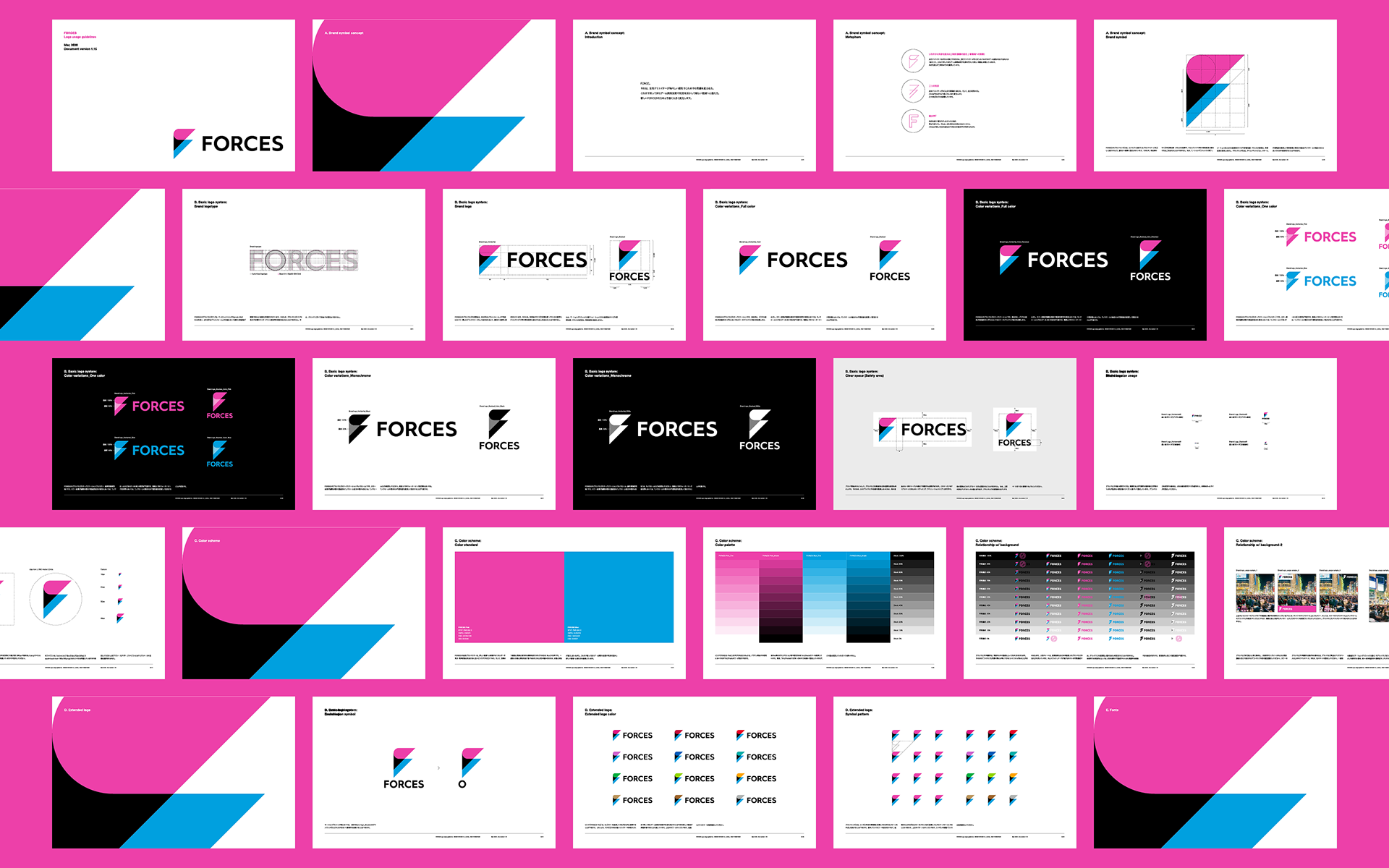
We enhanced Inc. has developed the logo and logo guidelines for FORCES.
-
-
映像/3DCG/CM/アニメーション/ゲーム等の制作を行うForces 11は、新しく社名をFORCESに変更した。それに伴い、FORCESという名称が持つ意味を再定義。これにより、これまでの枠組みに捉われない新しい企業づくりを目指していく。
enhanced Inc.は、FORCESのロゴ構築およびロゴガイドライン策定等を行なった。
Challenge
"The power we have cultivated so far should not be confined to the current industries. The power enables us to reach a wider range of areas." Based on the propositions given by our clients, we first defined the name FORCES as follows.
"The power we have cultivated so far should not be confined to the current industries. The power enables us to reach a wider range of areas." Based on the propositions given by our clients, we first defined the name FORCES as follows.
What is FORCES?
Power of talented creators that change the status quo with their fresh sensitivity.
Ability to evolve into new areas with fostered development technologies and knowledge.
With these, the new FORCES power will be further stronger and significantly changed.
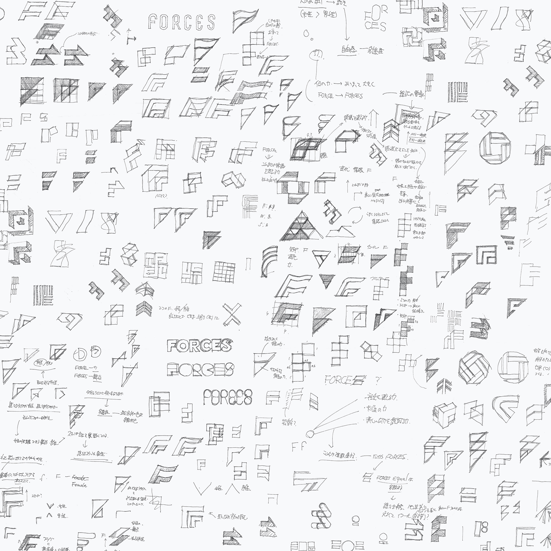
Based on this definition, we created several symbolic plans.
-
-
「これまで私たちが培ってきた力は、同じ業界だけで留まるべきではない。この力は、もっと幅広い分野にもリーチできるはず。」クライアントから与えられたその命題を踏まえ、まず私たちは、FORCESという名称を以下のように定義した。
FORCESとは。
才能あるクリエイターが、瑞々しい感性でこれまでの常識を変える力。
これまで培ってきた開発技術や知見を活かして、新しい領域へと進化する力。
これらによって新しいFORCESの力はより強く大きく変化する。
この定義に基づき、いくつかのシンボルプランを作成した。
Solution
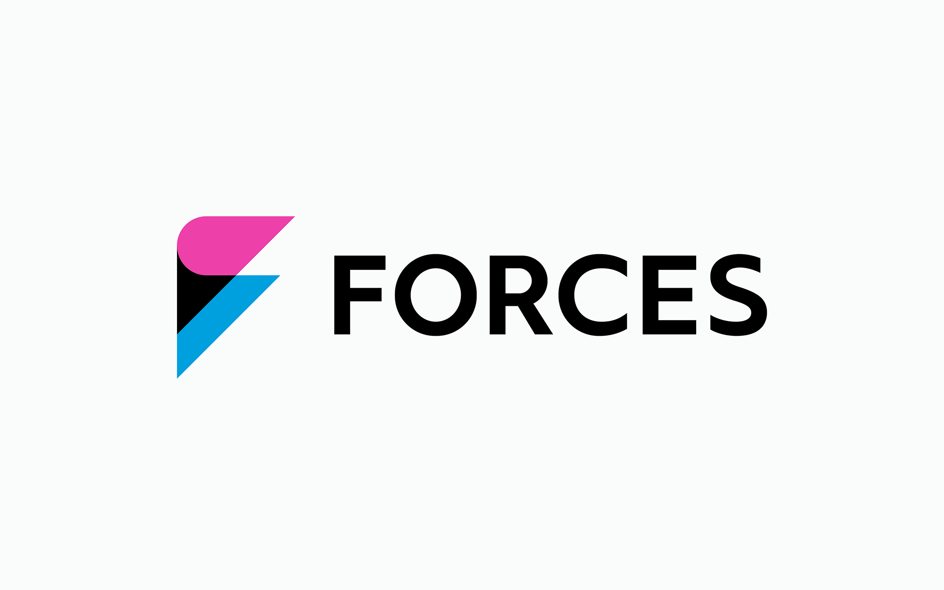
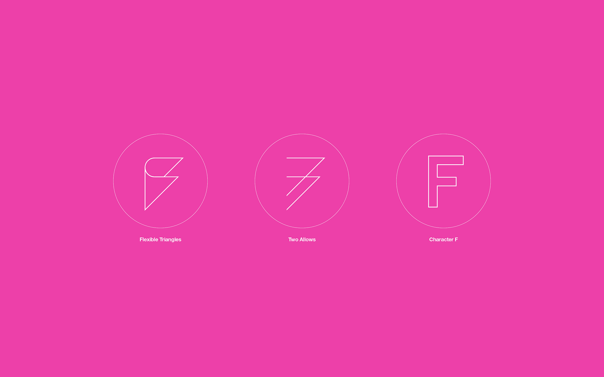
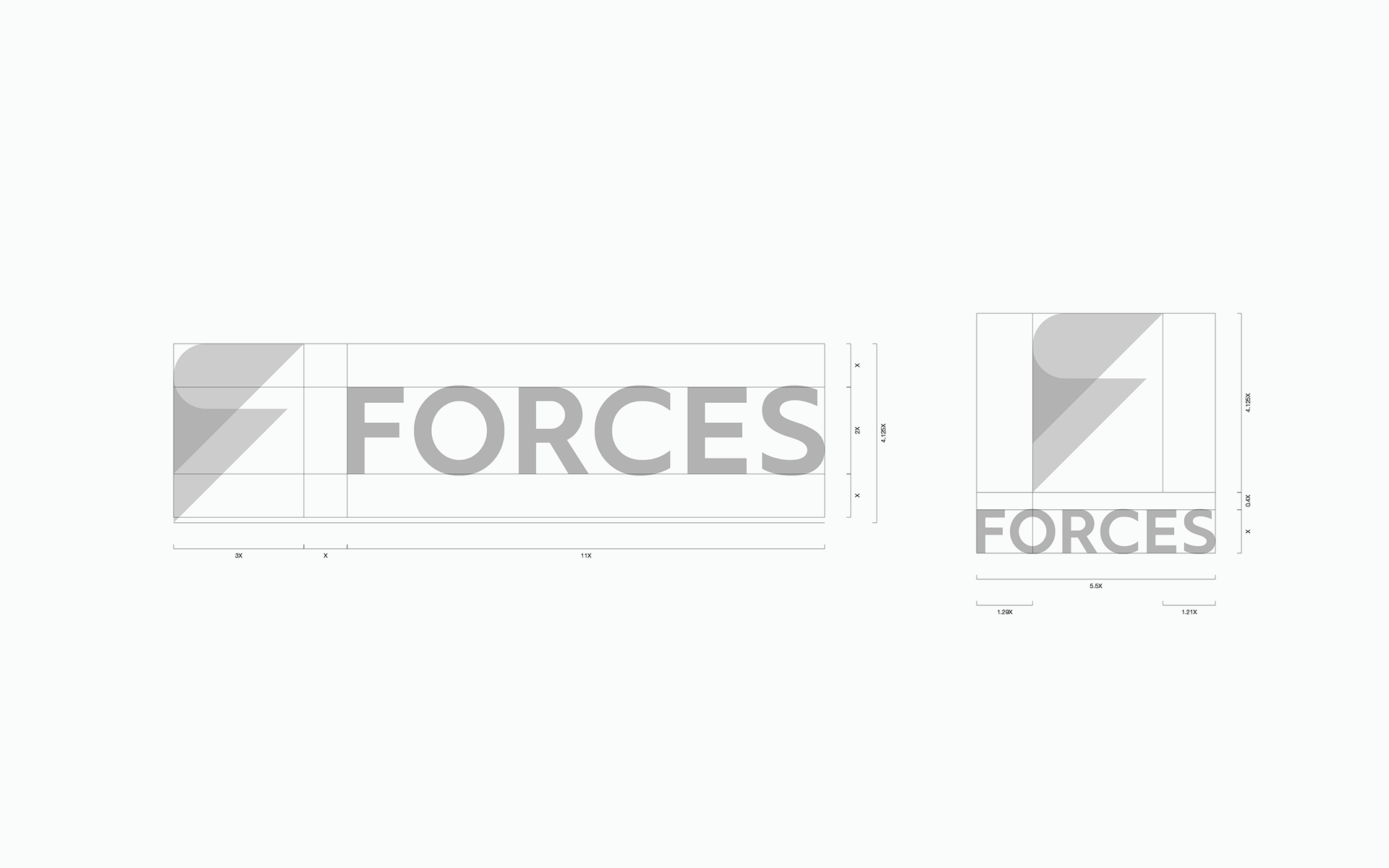
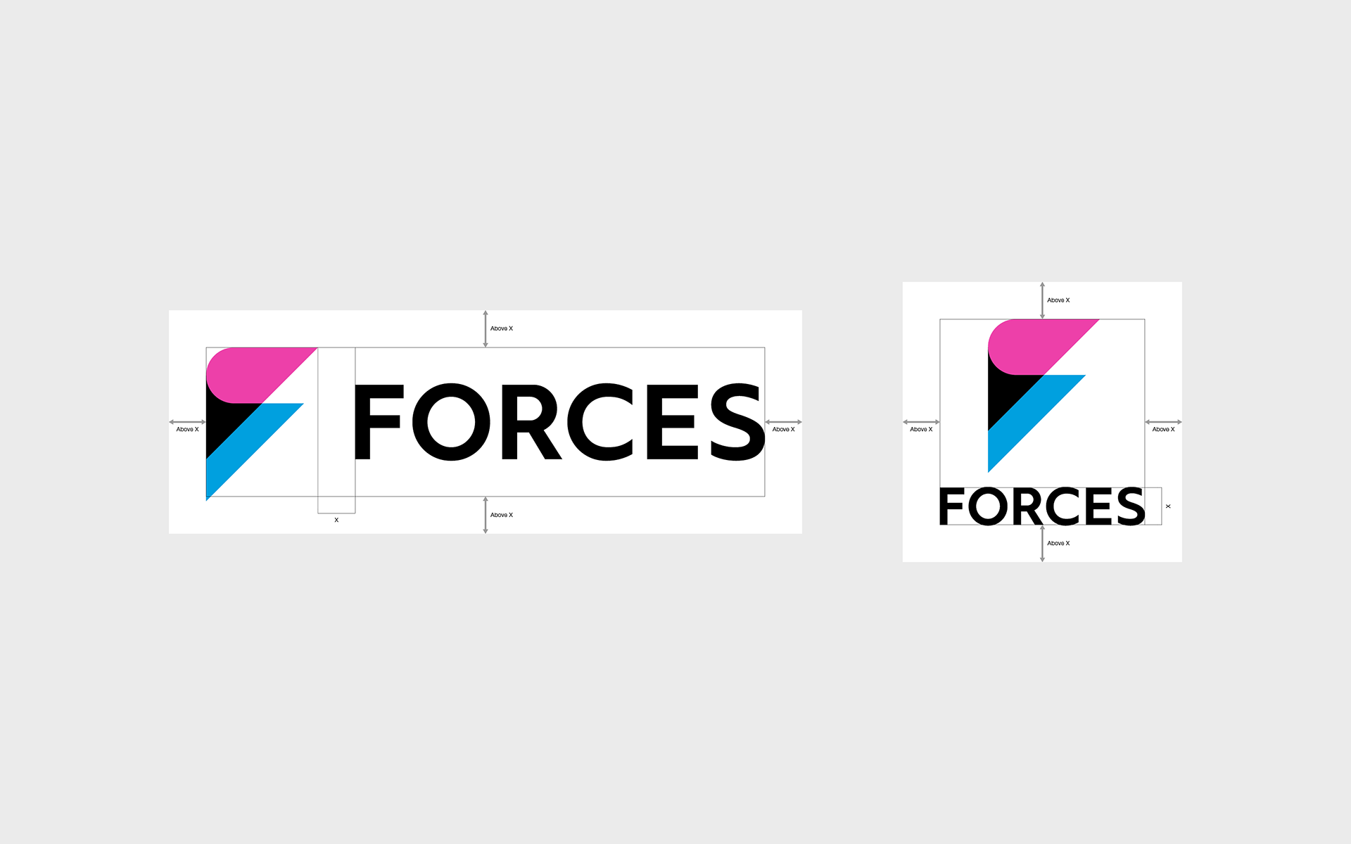
The final chosen symbol has the following three metaphors.
The final chosen symbol has the following three metaphors.
● The triangle that reshapes flexibly and moves forward - change in perception/challenge to new areas:
FORCES is largely changing the industry’s status quo which used to be dominated by male creators while taking advantage of the game development skills and knowledge accumulated over the years, and challenging in new areas. The flexible triangle is symbolic of this.
● Two Arrows:
The power of all creators to move into new territory. And a sustaining force. These two forces combine to evolve significantly into a stronger force. The two arrows symbolize this.
● Initial F:
Two triangles that overlap each other while moving forward. To overlap means to combine, expand, and evolve various forces. This forms the initial letter F of the newly reborn FORCES.
-
-
最終的に選ばれたシンボルは、以下の3つのメタファーを持つ。
● しなやかに形を変え、前進する三角形 - 認識の変化 / 新領域への挑戦:
FORCESは、男性クリエイターが中心だった業界の当たり前を大きく変えつつ、長く培ってきたゲーム開発技術や知見を活かして、新しい領域に挑戦する。しなやかに向きを変える三角形はそれを象徴する。
● 二つの矢印:
すべてのクリエイターが新領域へ進む力。そして、支える力。これらが合わさり、より強い力に大きく進化する。2つの矢印はそれを象徴する。
● 頭文字F:
前進しながら重なり合う2つの三角形。重なり合うこととは、さまざまな力を合わせ、拡大し、進化させるということ。これにより新しく生まれ変わるFORCESの頭文字Fが形作られる。
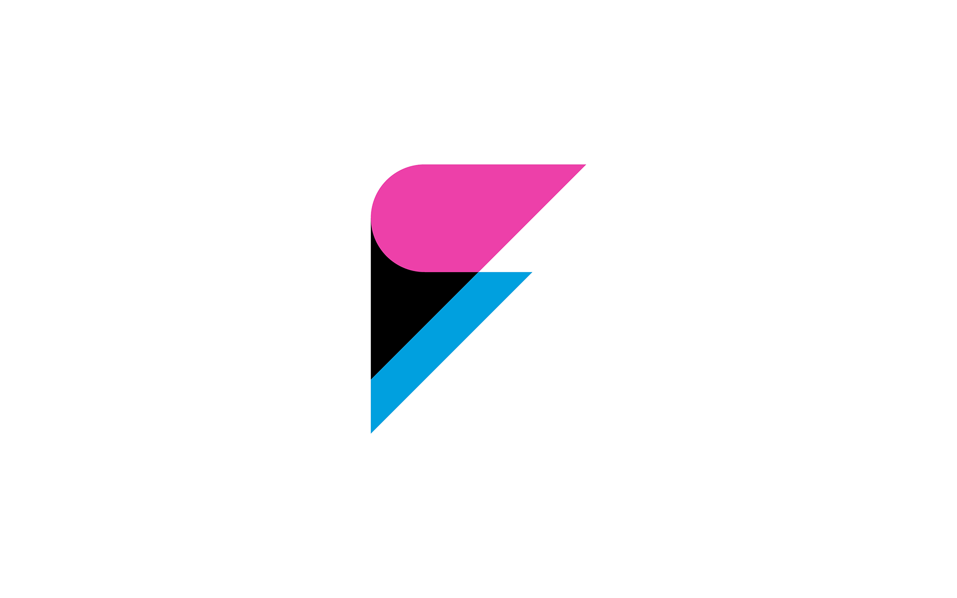
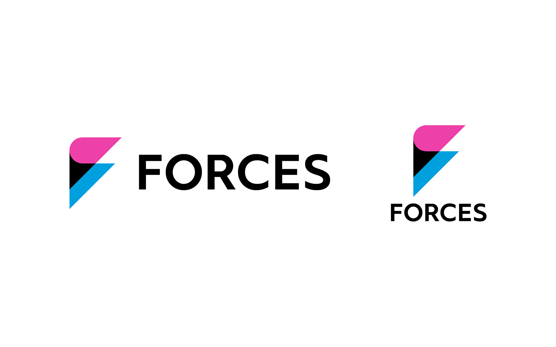
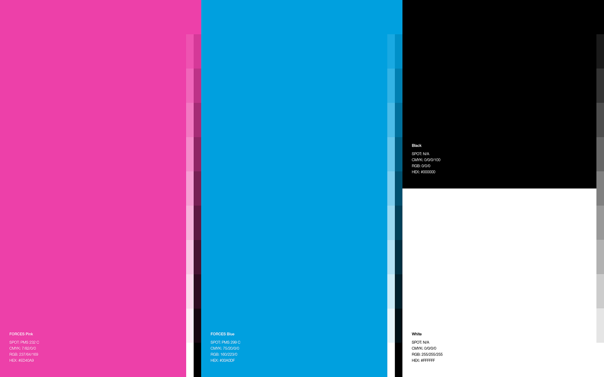
Color
One of the basic brand colors of FORCES, pink (FORCES Pink) represents the energy and spiritual strength to venture into new areas. The second color, light blue (FORCES Blue), represents the company's calm and sincere approach to development.
One of the basic brand colors of FORCES, pink (FORCES Pink) represents the energy and spiritual strength to venture into new areas. The second color, light blue (FORCES Blue), represents the company's calm and sincere approach to development.
The combination of these two colors symbolizes the ability of creators to cooperate and advance into new areas by utilizing the development skills and knowledge they have cultivated up to now.
-
-
FORCESの基本ブランドカラーのひとつであるピンク(FORCES Pink)は、新しい領域へと挑戦するエネルギーや精神的強さを表わす。そして、セカンドカラーの水色(FORCES Blue)は、冷静かつ誠実に開発に取り組む姿勢を表す。
これら2色の組み合わせは、クリエイターが協力しあい、これまで培ってきた開発の技術や知見を活かし新しい領域へと進む力を象徴する。
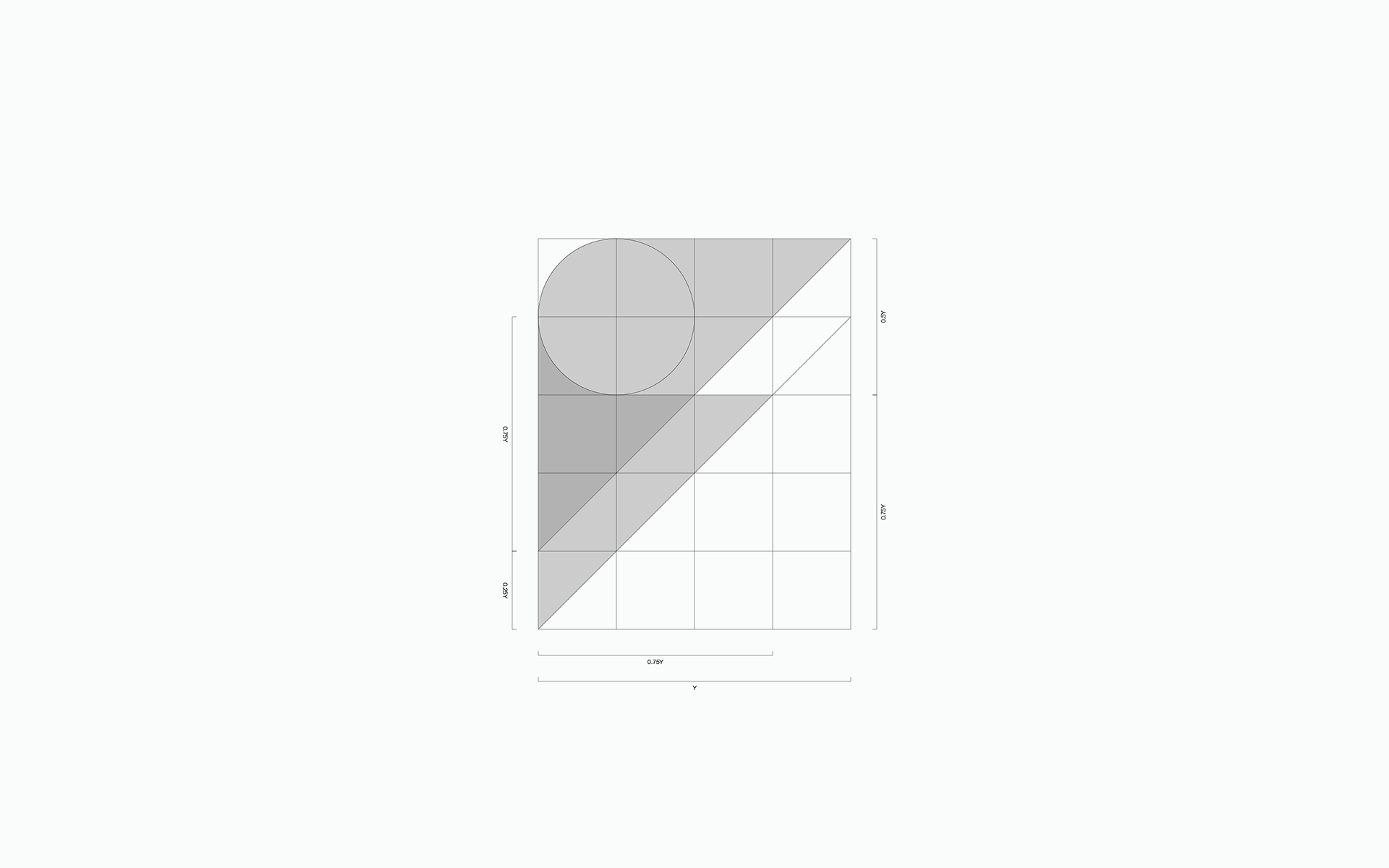
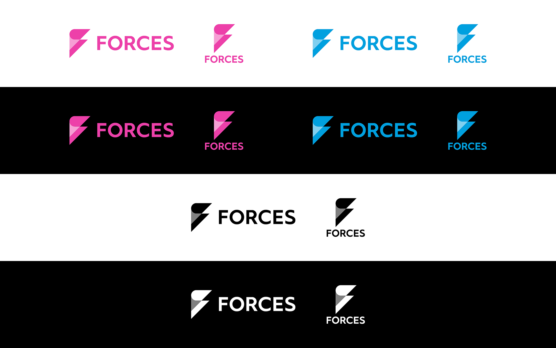
Extended logo
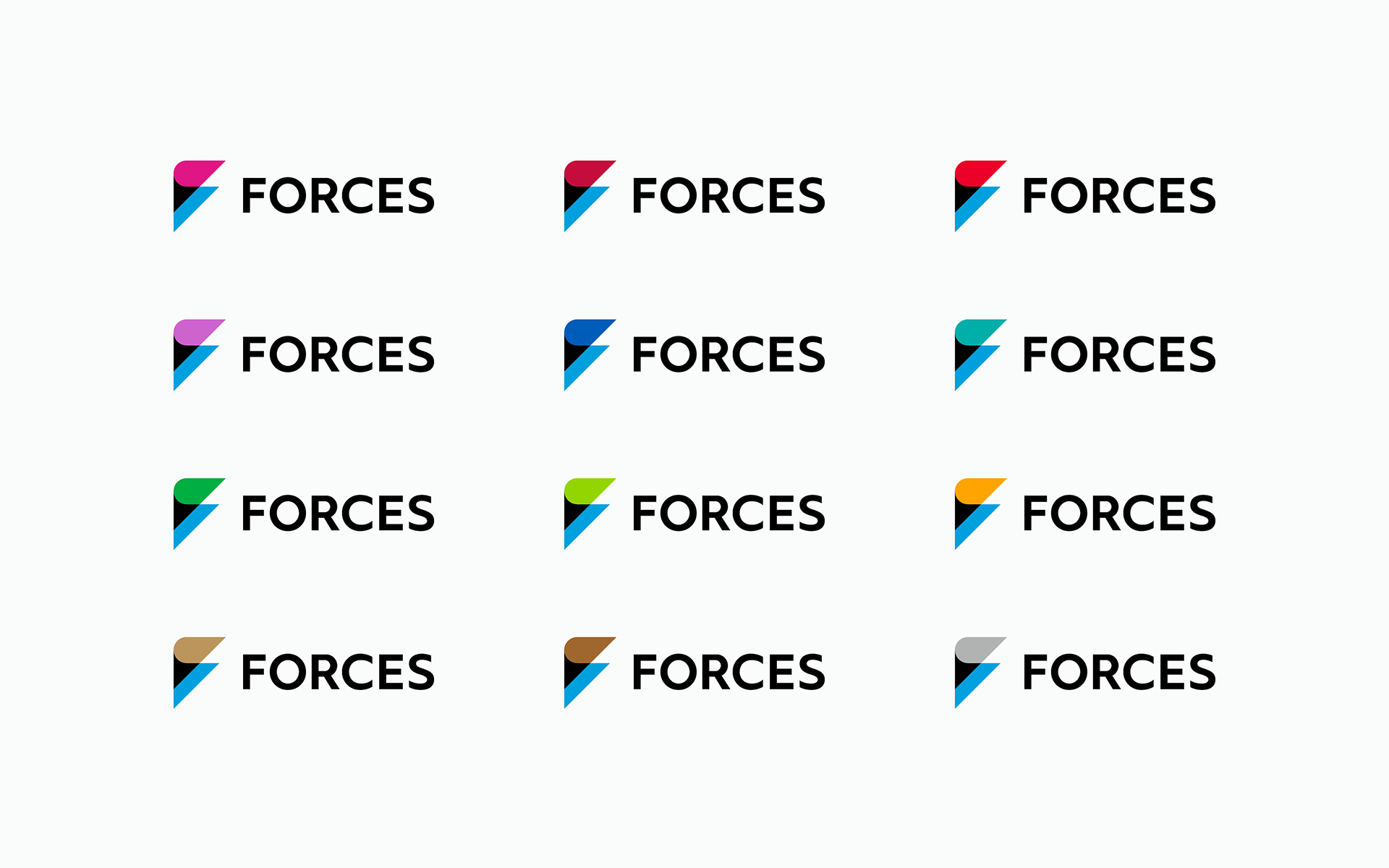
The pink used in the symbol can be replaced by various colors. The replaced colors mean the following.
The pink used in the symbol can be replaced by various colors. The replaced colors mean the following.
● FORCES creators are all unique individuals.
● The new areas they will challenge are wide and diverse.
-
-
シンボルに使用されているピンクは、さまざまな色に置き換えることができる。そして、置き換えられたさまざまな色は以下を意味している。
● FORCESに在籍するクリエイター達が個性豊かである。
● 彼らがこれから進む新しい領域は幅広く多様である。
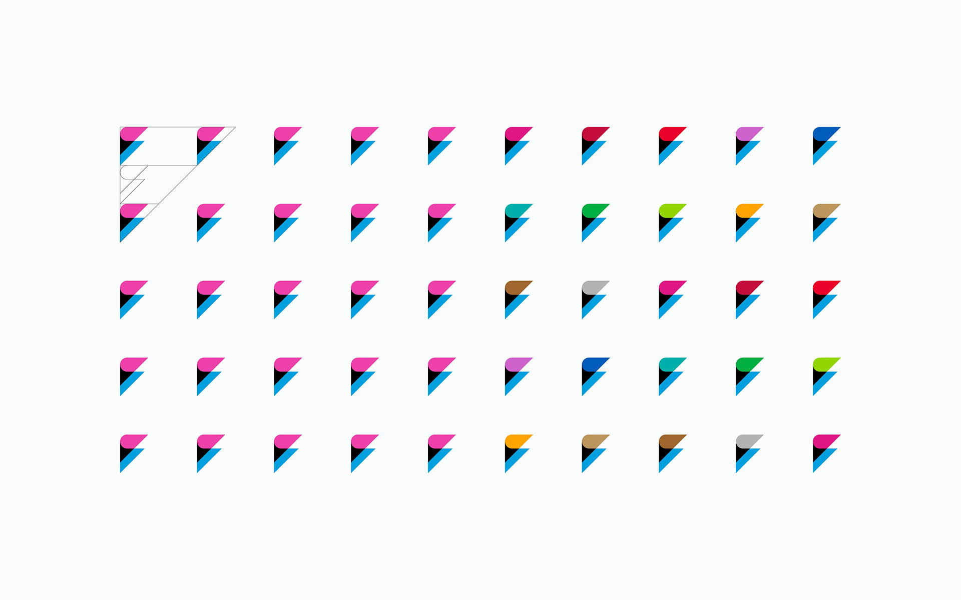
The symbol can be used in various patterns by equal interval placement. Multi-colored patterns are also possible by using symbols in multiple colors.
-
シンボルは、等間隔に配置することでさまざまなパターンとしても使用できる。さまざまな色に置き換えられたシンボルを使用すればマルチカラーのパターンも作成可能となる。
-
シンボルは、等間隔に配置することでさまざまなパターンとしても使用できる。さまざまな色に置き換えられたシンボルを使用すればマルチカラーのパターンも作成可能となる。
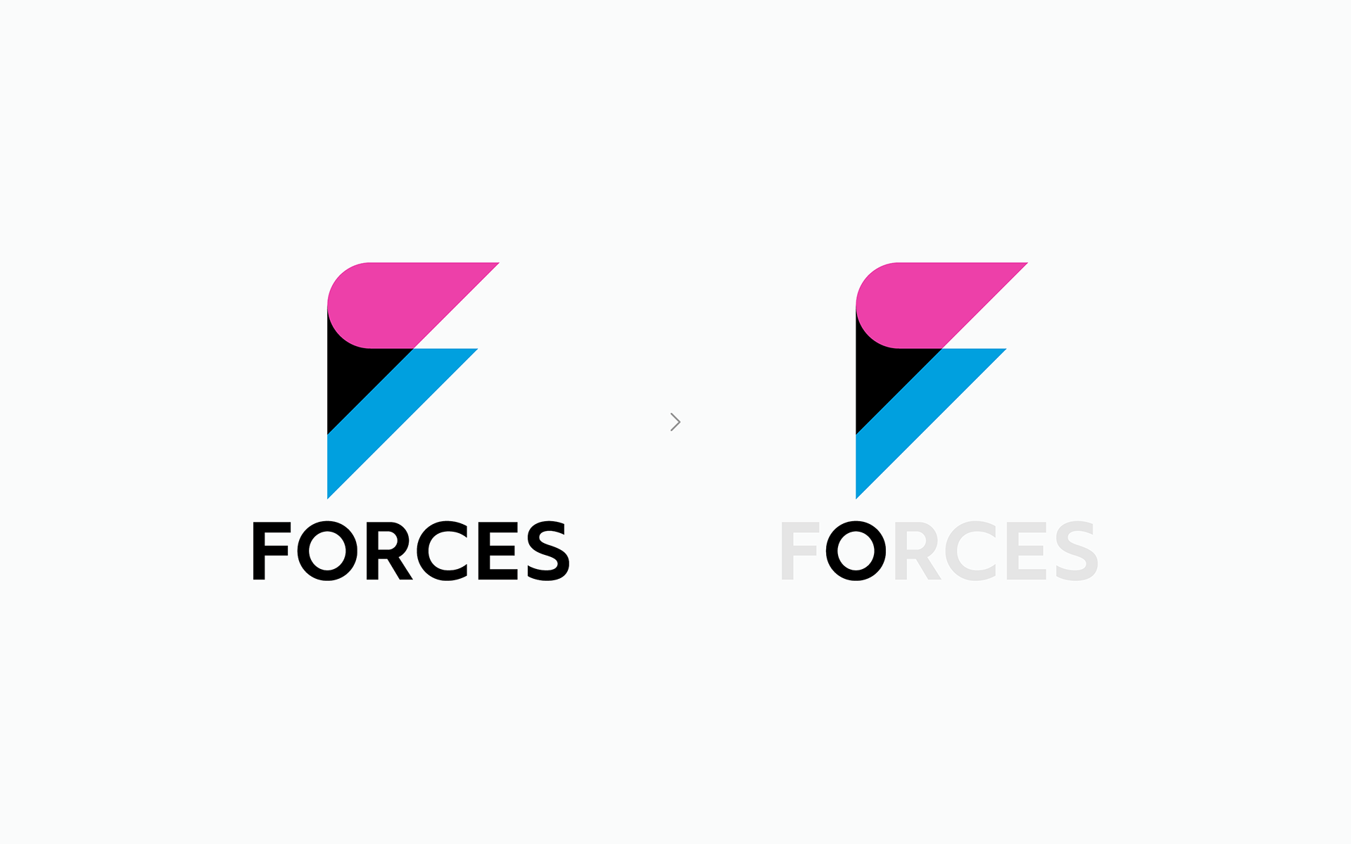
In motion graphics and other videos, the symbol and logotype’s letter O combined can also express an exclamation mark, which represents the wonderful creation of FORCES.
また、モーショングラフィックス等の映像において、シンボルとロゴタイプの文字Oを組み合わせて感嘆符を表現することもできる。この感嘆符は、FORCESの素晴らしい創造性を表現する。
また、モーショングラフィックス等の映像において、シンボルとロゴタイプの文字Oを組み合わせて感嘆符を表現することもできる。この感嘆符は、FORCESの素晴らしい創造性を表現する。
Result
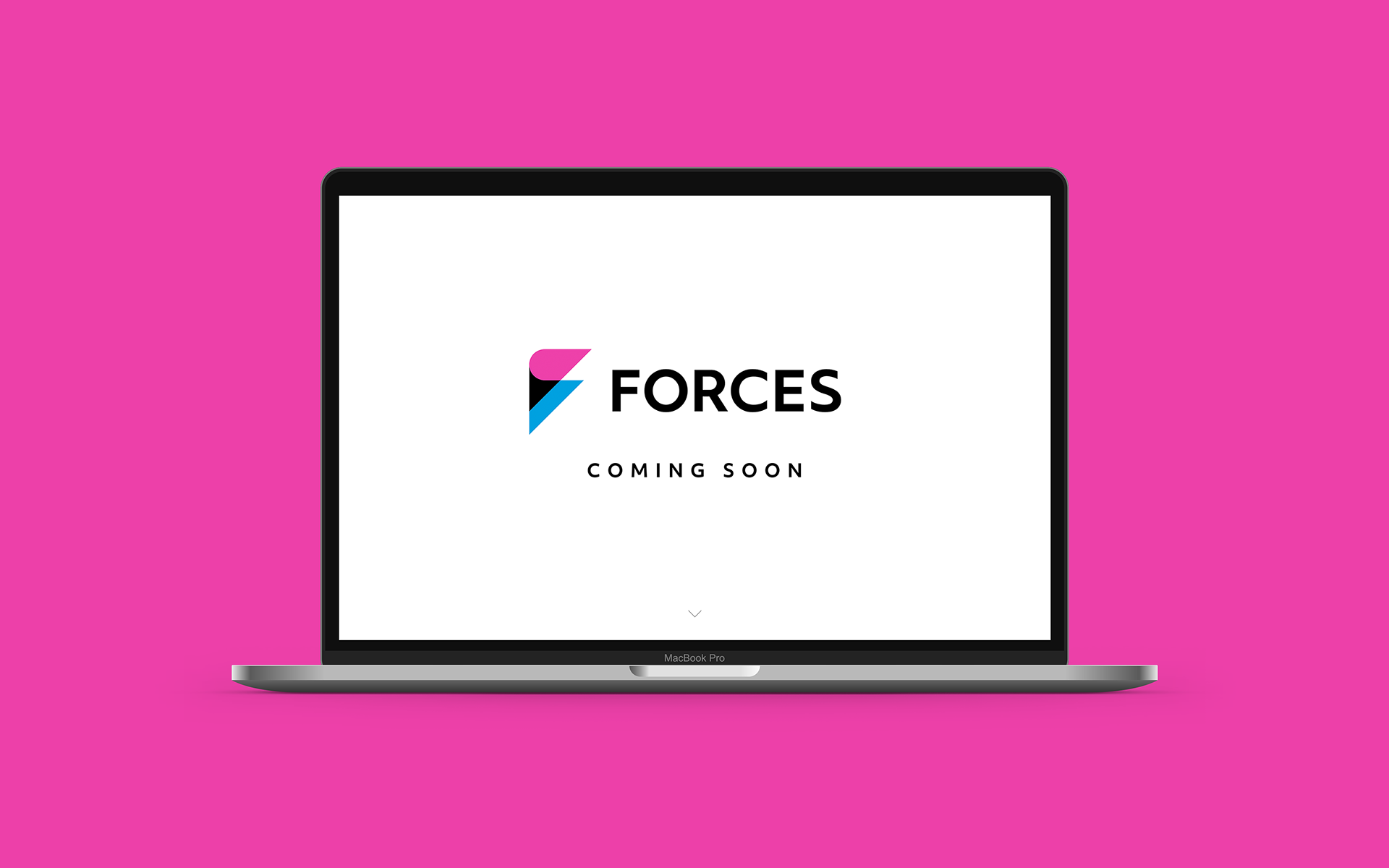
In May 2020, a simple teaser site with the new logo has been launched. The official site will be released accordingly.
-
2020年5月。新しいロゴを使用したシンプルなティザーサイトが公開された。正式なサイトは追って公開される予定である。
In May 2020, a simple teaser site with the new logo has been launched. The official site will be released accordingly.
-
2020年5月。新しいロゴを使用したシンプルなティザーサイトが公開された。正式なサイトは追って公開される予定である。
Client: FORCES
Logo concept & design, Logo guidelines: Hiromi Maeo (enhanced Inc.)
Web: FORCES team
Web: FORCES team
2020 Tokyo, Japan