Soden Inc. - EV charging platformer
As the shift towards EVs gains momentum worldwide, the key to the growth of the EV market in Japan is the proliferation of EV charging infrastructure.
Soden Inc. has a mission to "create an open world where everyone can freely manipulate electricity, and as one of the few EV charging platform providers in Japan that handles both software and hardware, the company aims to solve the challenges of EV charging infrastructure in Japan by making use of ideas and technology and to continue to revolutionize the way EV charging is done from the ground up.
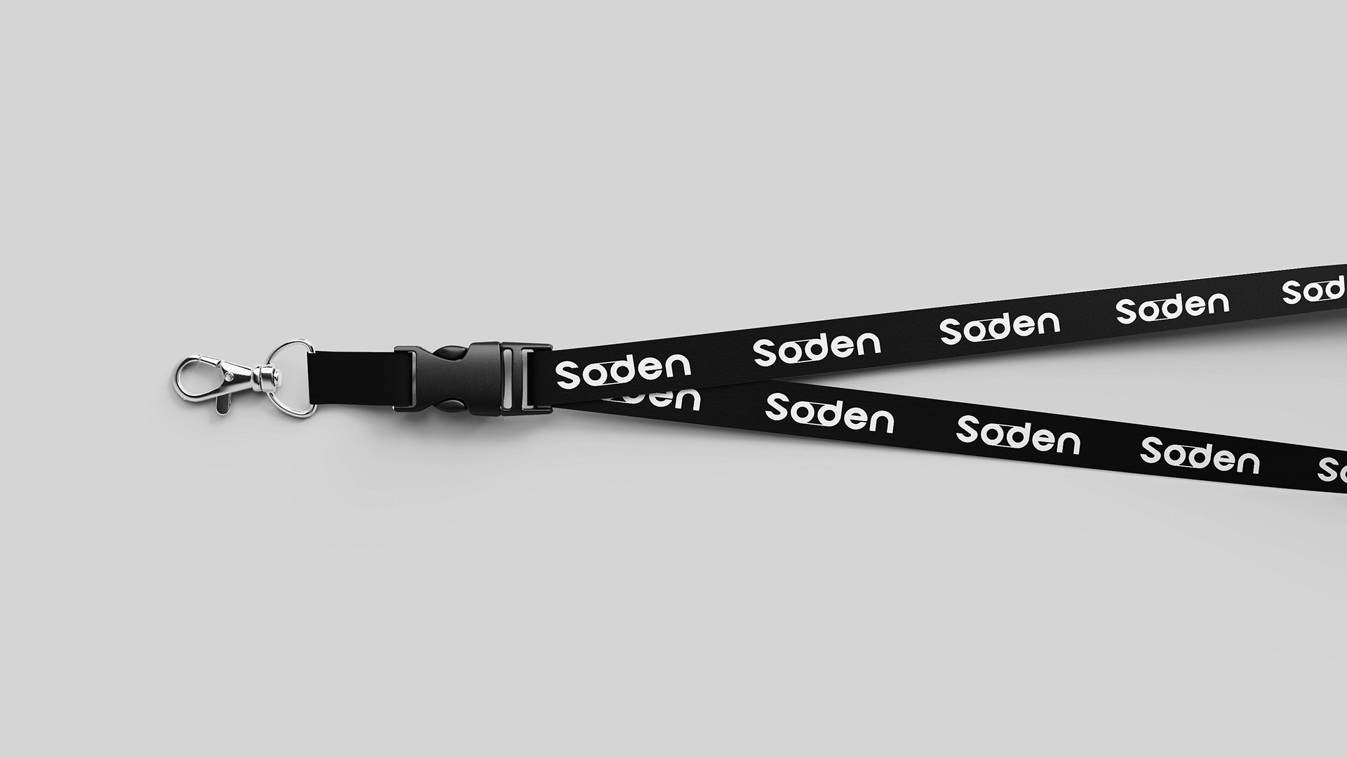
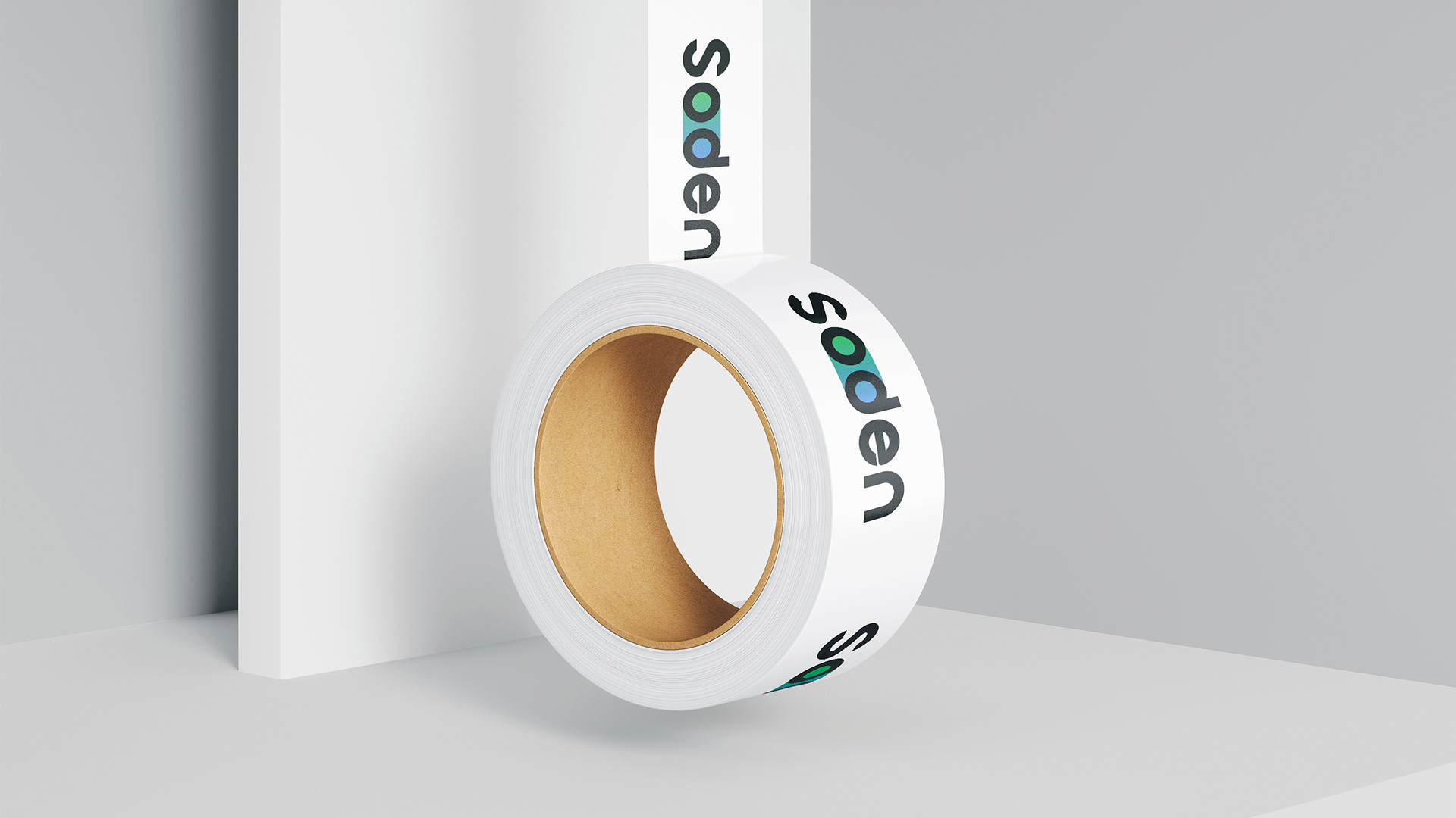
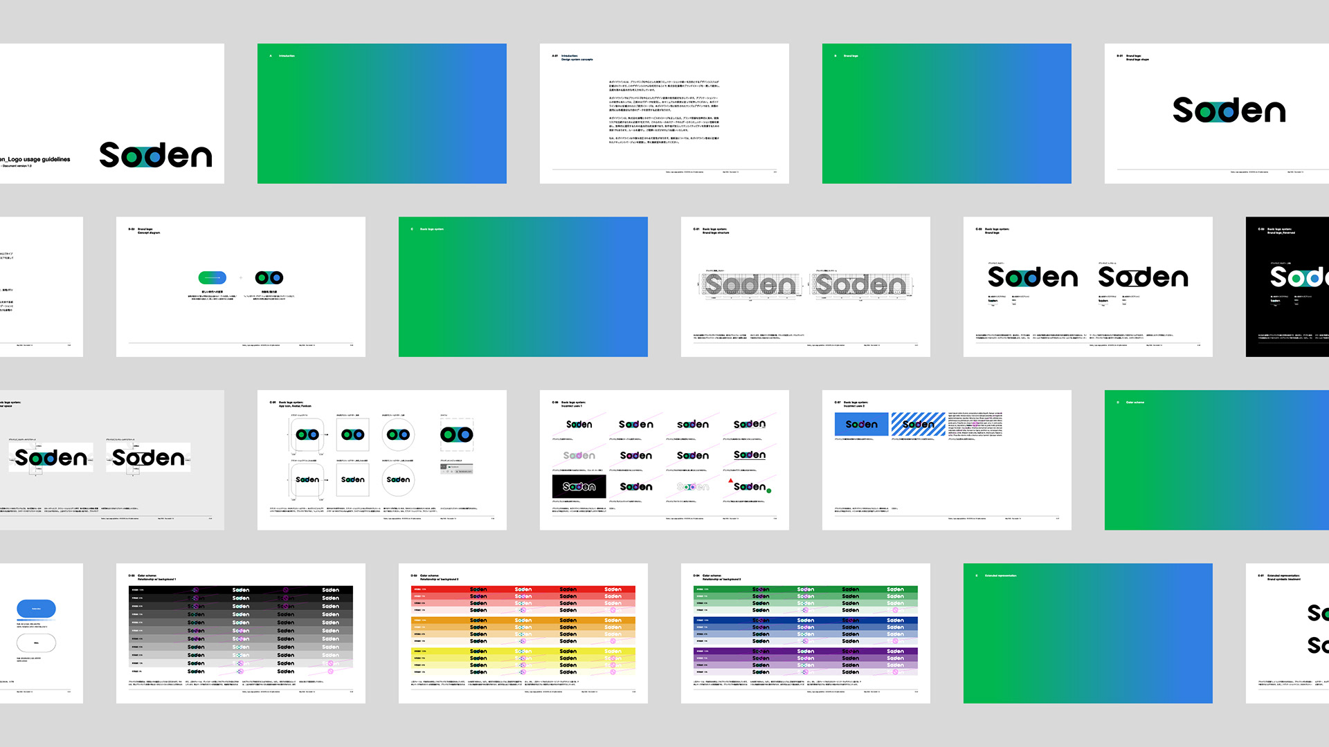
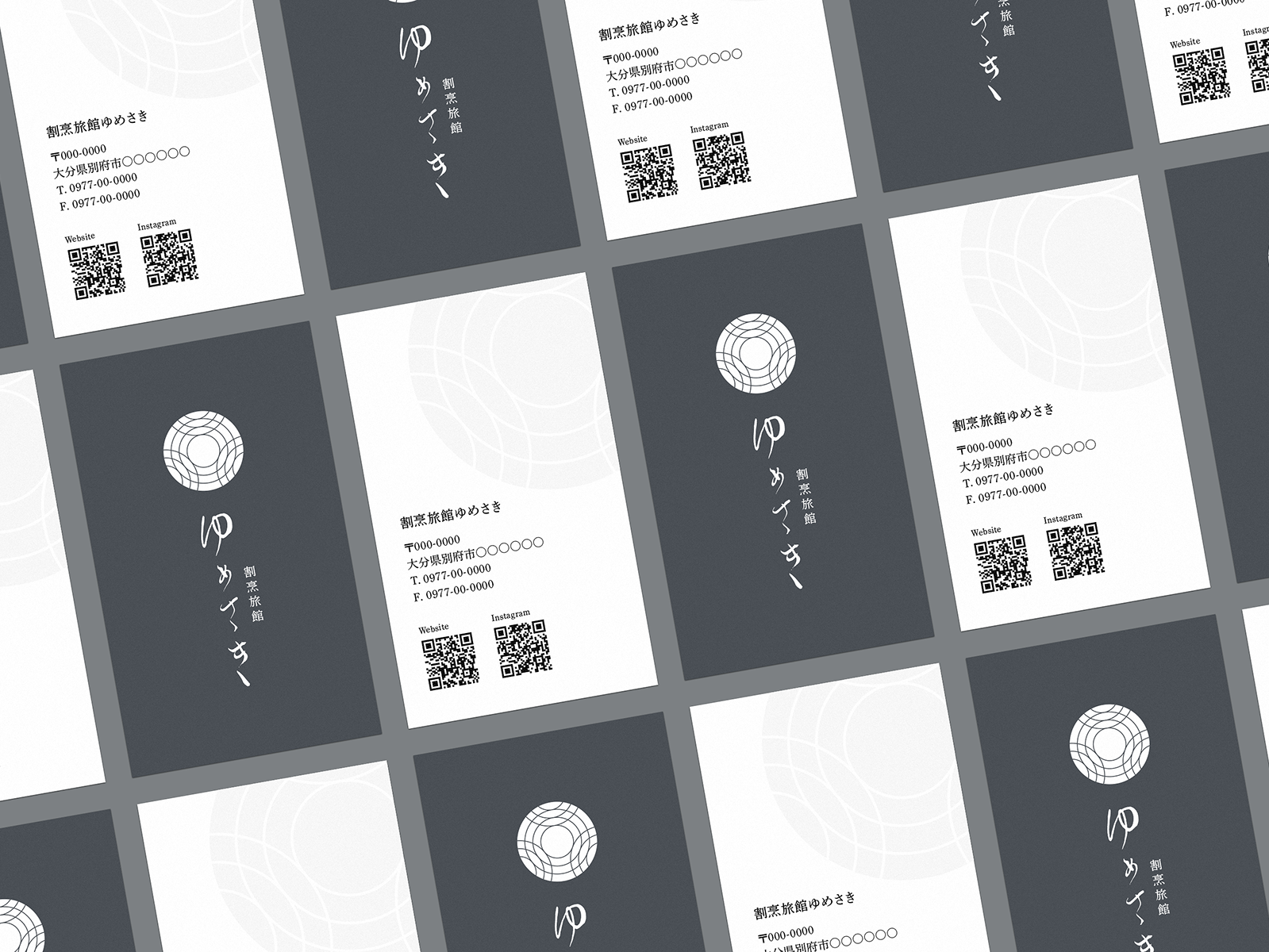
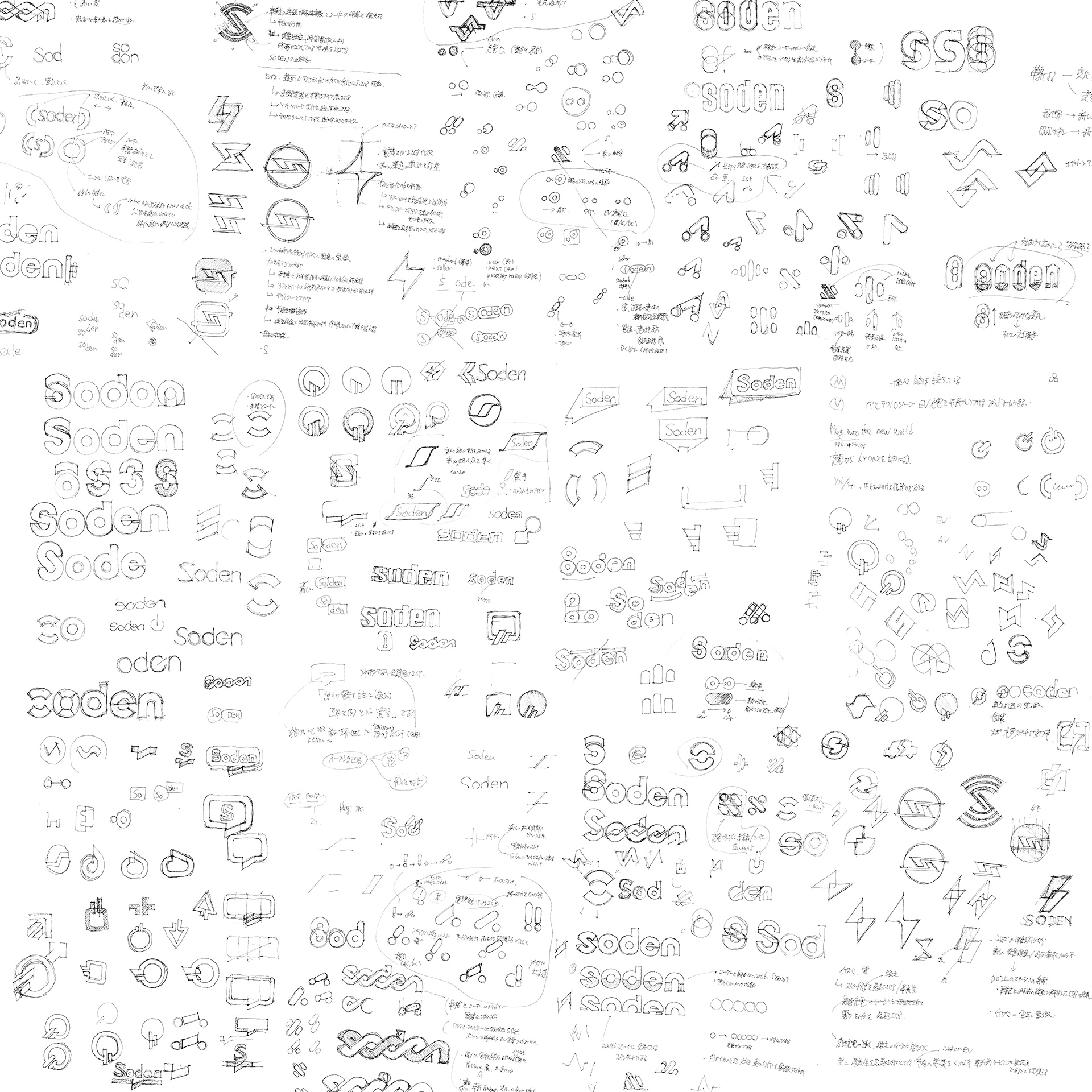
We were involved in the development of the Soden logo, logo guidelines, etc.
Soden Inc. has a mission to "create an open world where everyone can freely manipulate electricity, and as one of the few EV charging platform providers in Japan that handles both software and hardware, the company aims to solve the challenges of EV charging infrastructure in Japan by making use of ideas and technology and to continue to revolutionize the way EV charging is done from the ground up.
We were involved in the development of the Soden logo, logo guidelines, etc.
-
世界的に電気自動車(EV)への移行が加速する中、日本におけるEV市場の成長鍵を握るのがEV充電インフラの普及である。
株式会社操電は「誰もが電気を自由に操れるオープンな世界をつくる」をミッションに掲げ、ソフトウェアとハードウェアの両面でEV充電ソリューションを手掛ける国内有数のプラットフォーマーである。同社はアイデアと技術力を結集し、日本のEV充電インフラにおける課題を解決し、その在り方を根本から革新することを目指す。
私たち株式会社enhancedは、このSodenのロゴ開発やロゴガイドラインの策定などに携わった。
株式会社操電は「誰もが電気を自由に操れるオープンな世界をつくる」をミッションに掲げ、ソフトウェアとハードウェアの両面でEV充電ソリューションを手掛ける国内有数のプラットフォーマーである。同社はアイデアと技術力を結集し、日本のEV充電インフラにおける課題を解決し、その在り方を根本から革新することを目指す。
私たち株式会社enhancedは、このSodenのロゴ開発やロゴガイドラインの策定などに携わった。
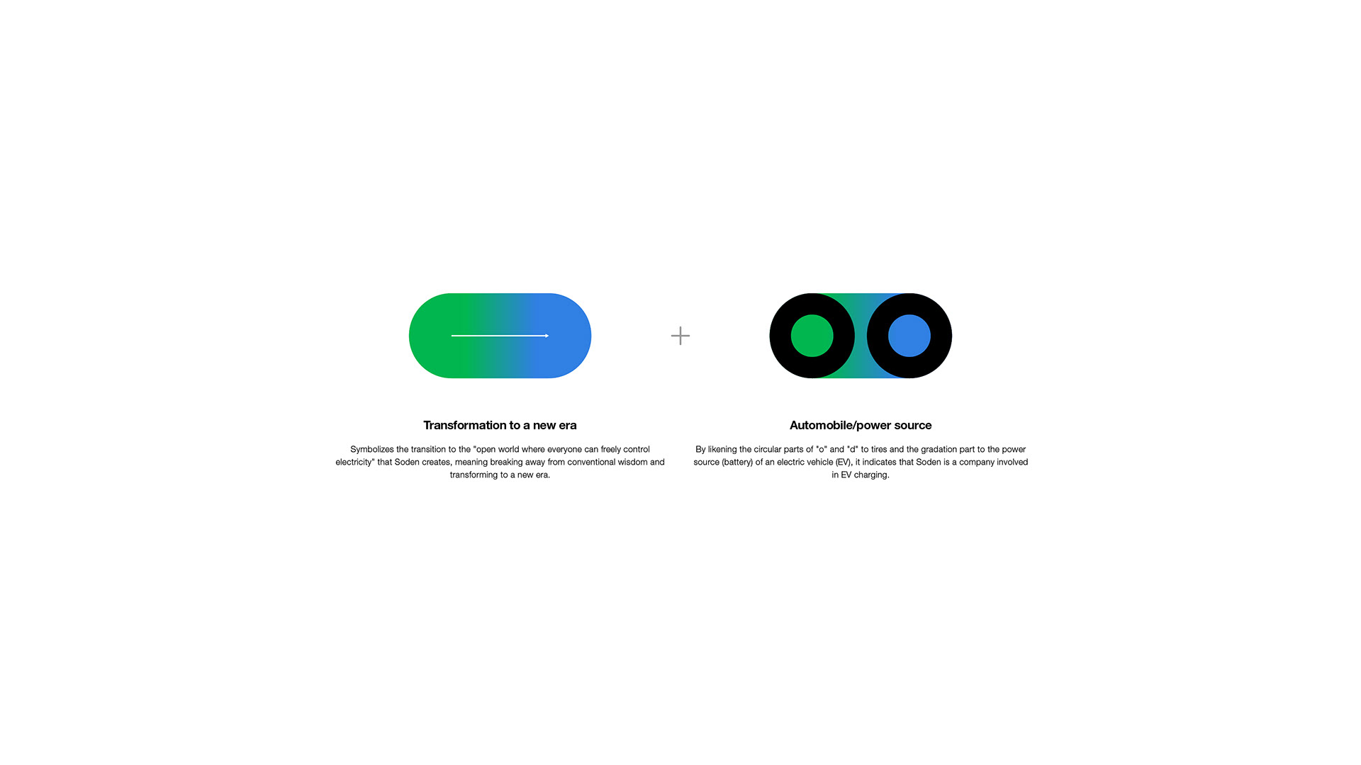
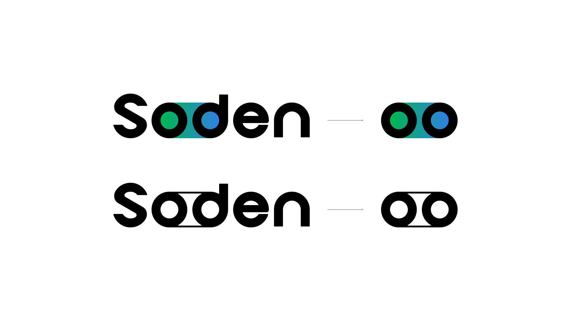
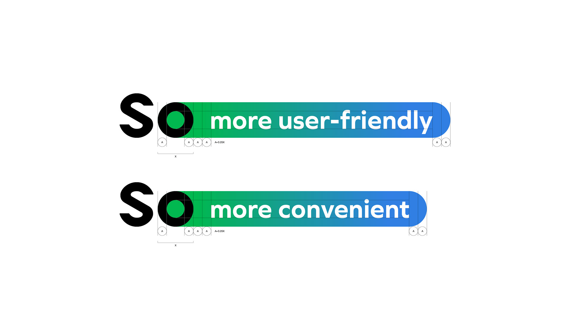
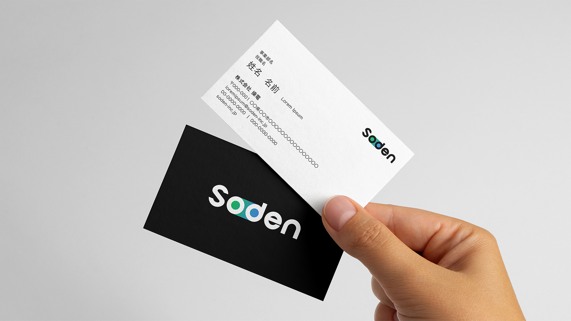
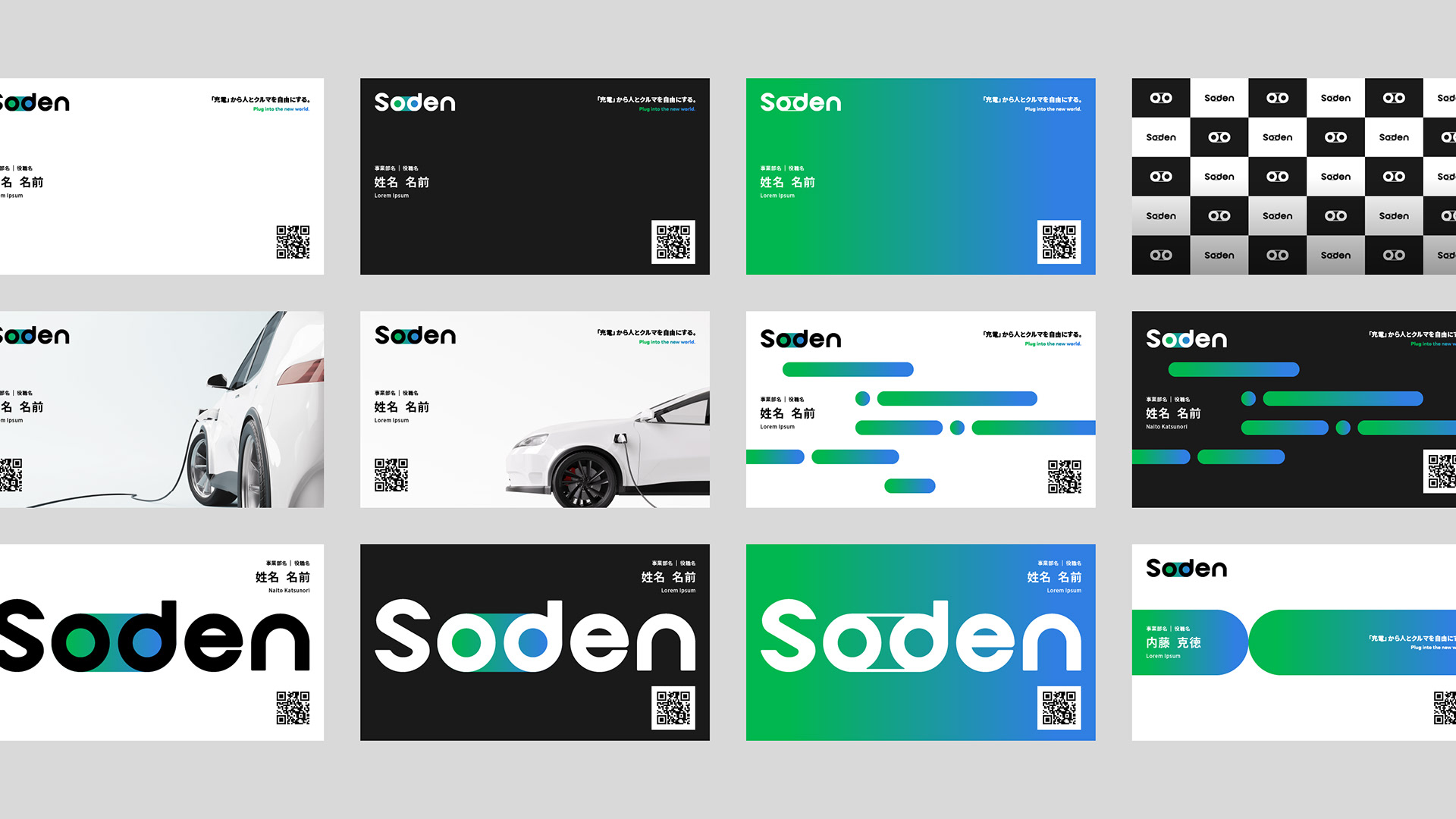
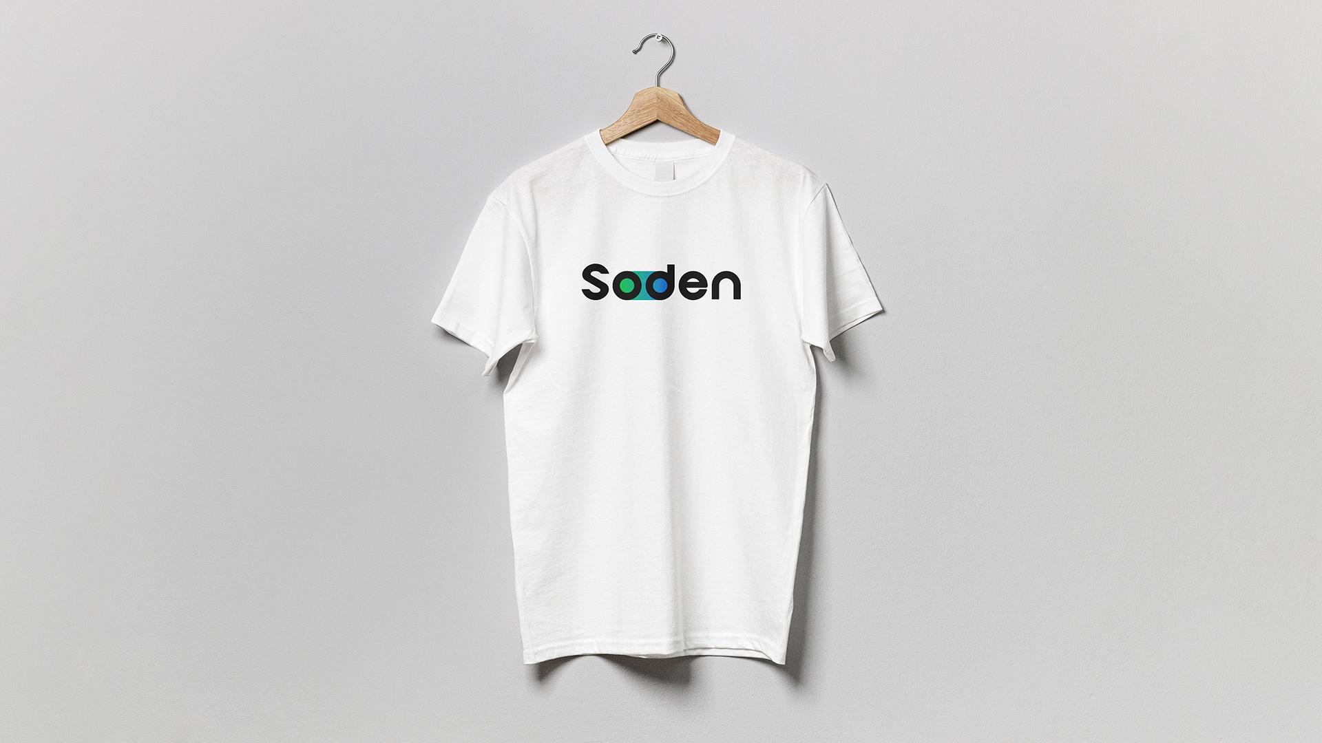
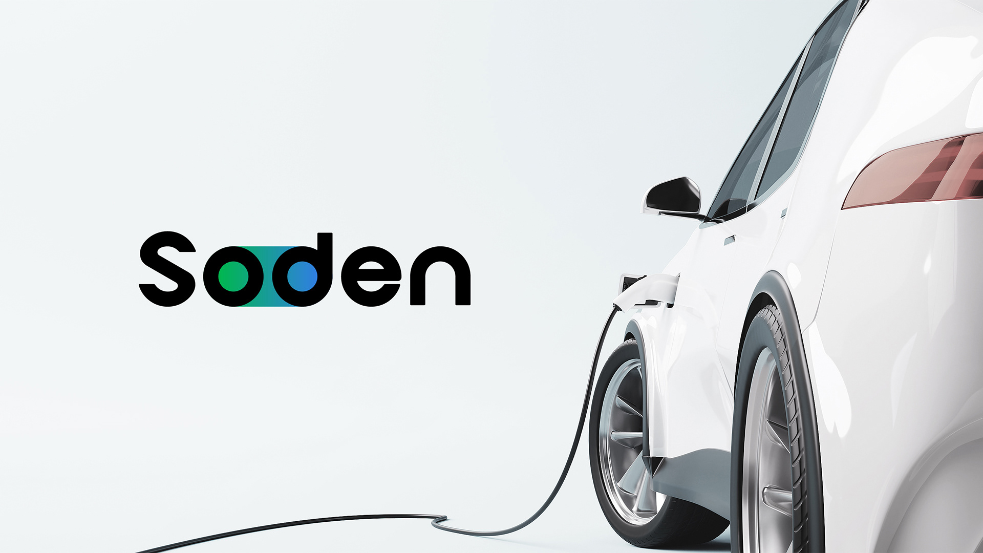
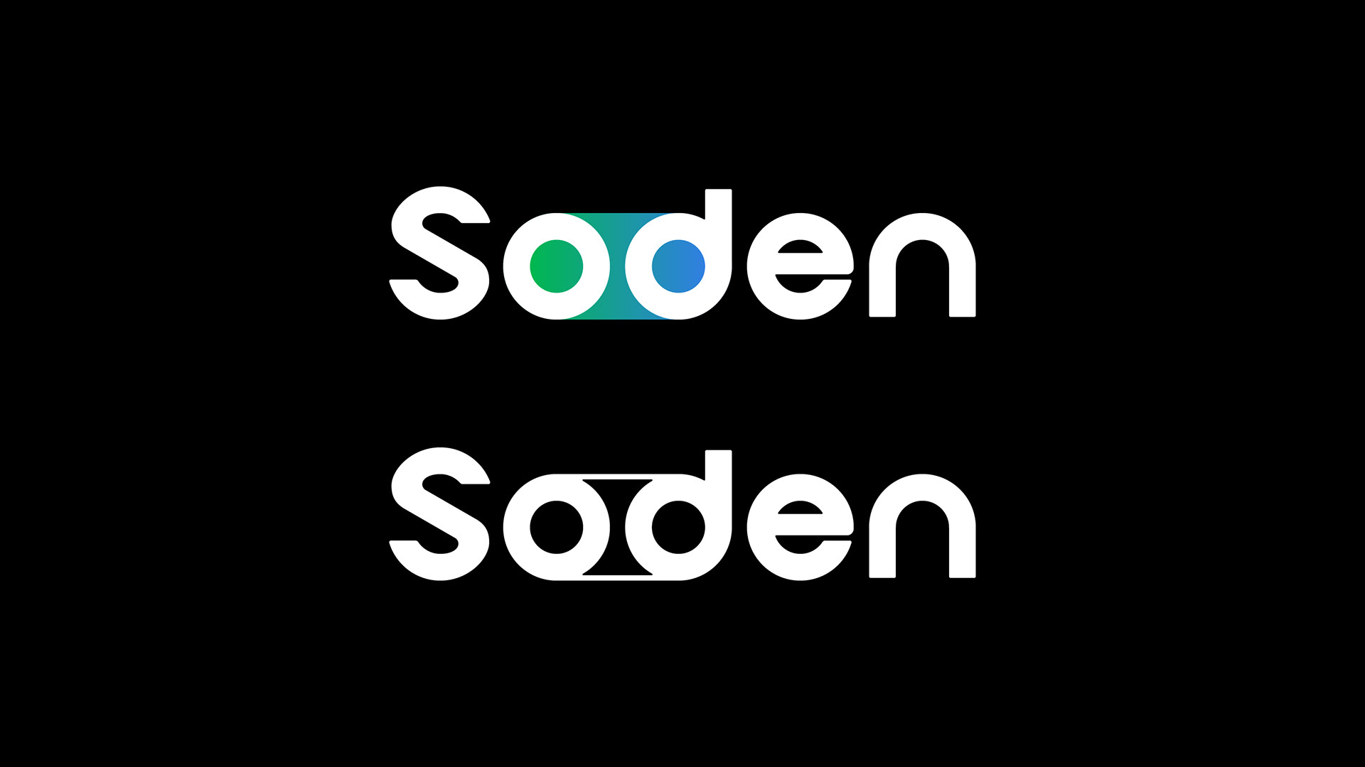
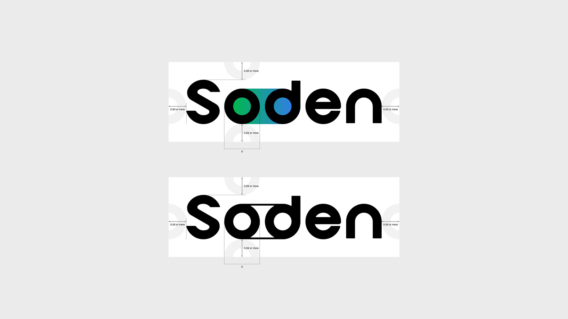
The Soden Inc. brand logo adopts a simple logotype with a continuous structure of circles. This logotype connects the strings of "So" (操: manipulate) and "den" (電: electricity) with a gradient that changes from green to blue, representing the following:
• Transition to a new era:
It symbolizes the transition to the "open world where anyone can freely manipulate electricity" created by Soden. This means breaking away from the conventional wisdom and transitioning to a new era.
• Automobile/power source:
It symbolizes the transition to the "open world where anyone can freely manipulate electricity" created by Soden. This means breaking away from the conventional wisdom and transitioning to a new era.
• Automobile/power source:
The circular parts of "o" and "d" are seen as tires, and the gradient part is seen as the power source (battery) of an EV, respectively, to indicate that Soden is a company related to EV charging.
-
株式会社操電のブランドロゴは、連続する円形状を基調としたシンプルなロゴタイプを採用している。このロゴタイプは、So (操る)とden (電気)の文字列を緑から青へ変化するグラデーションで繋ぐことで、以下を表している:
• 新時代への変革:
操電が掲げる「誰もが自在に電力を活用できる開かれた社会」の実現を象徴する。これは従来の常識から脱却し、新たな時代への移行を意味する。
• 自動車/動力源:
「o」と「d」の円形部分をタイヤ、グラデーション部分をEVの動力源(バッテリー)と見立てて、操電がEV充電分野の企業であることを示している。
• 新時代への変革:
操電が掲げる「誰もが自在に電力を活用できる開かれた社会」の実現を象徴する。これは従来の常識から脱却し、新たな時代への移行を意味する。
• 自動車/動力源:
「o」と「d」の円形部分をタイヤ、グラデーション部分をEVの動力源(バッテリー)と見立てて、操電がEV充電分野の企業であることを示している。
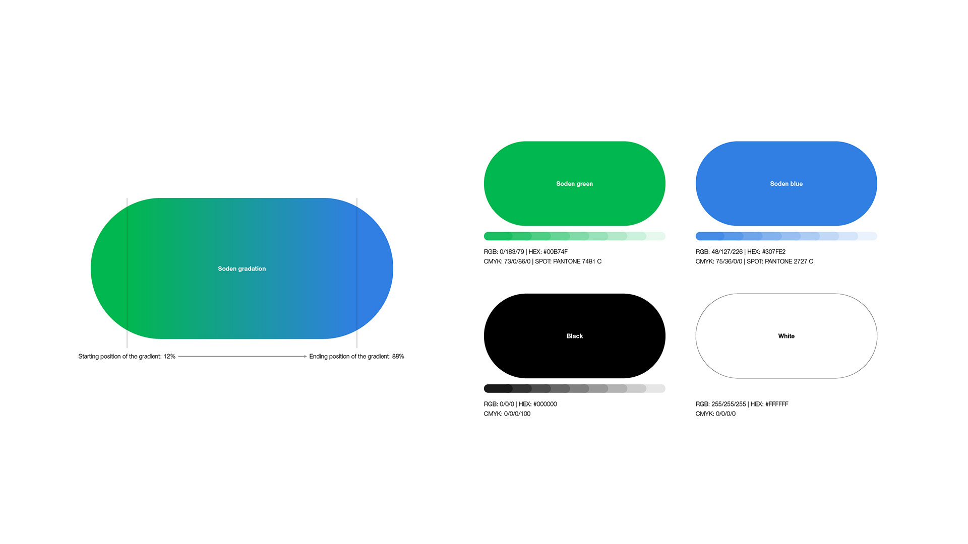
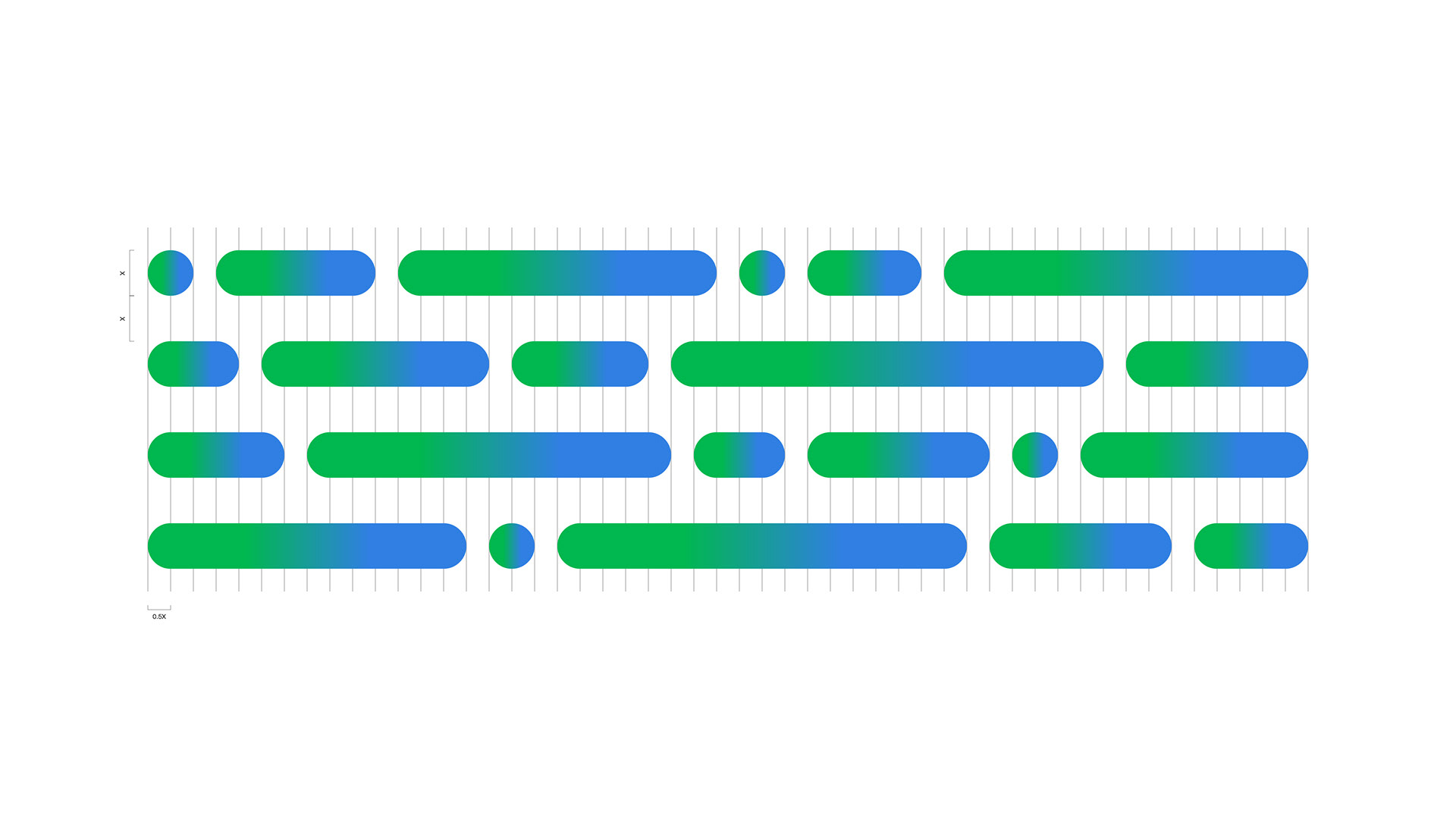
The color green evokes stability and reliability. The bright blue color evokes the vast blue sky that stretches out forever, suggesting a bright and prosperous future and innovation. By combining these two colors in a gradient, Soden's service, which continues to innovate EV charging with ideas and technology, symbolizes not only the normalization of stability and reliability but also the bright and prosperous future that it will achieve.
-
緑色は安定性と信頼性を連想させる。一方、明るい青色は果てしなく広がる青空を想起させ、明るく豊かな未来と革新性を示唆する。これら2色をグラデーションで用いることで、安定性と信頼を当たり前にするだけでなく、アイデアとテクノロジーでEV充電を革新し続ける操電のサービス、そしてそれにより実現する明るく豊かな未来を象徴している。
-
緑色は安定性と信頼性を連想させる。一方、明るい青色は果てしなく広がる青空を想起させ、明るく豊かな未来と革新性を示唆する。これら2色をグラデーションで用いることで、安定性と信頼を当たり前にするだけでなく、アイデアとテクノロジーでEV充電を革新し続ける操電のサービス、そしてそれにより実現する明るく豊かな未来を象徴している。