Kymatic
Kymatic is an innovative hedge fund specializing in the U.S. Market. Combining advanced mathematical skills and phenomenological insights, it strives to gain a deep understanding of ever-changing market environments and achieve outstanding investment results. The main targets are individual and institutional investors with high net assets and a strong educational background. Specifically, it targets an older, competitive, and high-risk-tolerant layer of investors.
The name Kymatic is derived from “Kymatics” (or “Cymatics” in English), which visualizes the impact of sound waves on matter. This symbolizes the importance of visual insights in market data analysis and an investment philosophy based on an experimental spirit and phenomenological approach.
In 2024, we were involved in the brand design of Kymatic.
-
米国市場に特化した革新的ヘッジファンド、Kymaticは先進の数理解析力と現象把握の視点を融合させ、刻々と変化する市場環境の本質を捉え、卓越した運用実績を目指している。彼らの対象は、豊かな資産と高い教育水準を備えた個人投資家や機関投資家である。特に、年齢層が高く、闘争心に富み、リスク許容度の高いお客様に向けたサービスを提供している。
「Kymatic」の名称は「Kymatics」(英語ではCymatics: サイマティクス)に由来する。この言葉は音波が物質に与える影響を可視化したもので、市場データの視覚的分析の重要性と、実証主義・現象論に基づく投資哲学を象徴している。
2024年、私たちはこのKymaticのブランドデザインに携わった。
2024年、私たちはこのKymaticのブランドデザインに携わった。

Project objectives
The requests from Kymatic were as follows:
1. Creation of a new logo design
2. Establishment of logo guidelines
3. Creation of various brand collaterals
The requests from Kymatic were as follows:
1. Creation of a new logo design
2. Establishment of logo guidelines
3. Creation of various brand collaterals
In particular, the following requests were made regarding the logo design:
A. The duality of mathematical structure and artistic beauty represented by the beautiful geometric shapes seen in Cymatics, the origin of the name Kymatic. *This duality is also seen in quantitative finance.
B. A simple design that reminds investors of deep mathematical insights.
C. Recall of technical capabilities. However, geekiness and quirkiness are excluded.
D. Recall of solidity and safety.
E. Recall of being diplomatic and communicative. Projection of an attitude that is competent, professional, and not wasteful, not arrogant.
F. Energetic but no need for playfulness.
G. A design that feels mature but not old-fashioned.
H. Sharp angles, and clearly defined edges. Natural complexity, even if it is complex.
Based on these, we considered several directions for symbol design.
-
Kymaticから寄せられた要望は以下の通りである:
1. 新しいロゴデザインの作成
2. ロゴガイドラインの策定
3. 各種ブランドコラテラルの作成
1. 新しいロゴデザインの作成
2. ロゴガイドラインの策定
3. 各種ブランドコラテラルの作成
特にロゴデザインに関しては、次の点を重視することが求められた:
A. 社名の由来"Cymatics"が表す、美しい幾何学模様にみられる数理的構造と芸術性の二つの調和。*この二重性は定量的金融にも存在する。
B. 深遠な数学的洞察を連想させるシンプルなデザイン。
C. 高い技術力のイメージを喚起すること。ただしギークすぎる印象は避ける。
D. 堅牢性と安心感の演出。
E. 外交的で対話力があることを想起させること。有能でプロフェッショナル、無駄のない堅実なスタンス。
F. エネルギッシュだが遊び過ぎない。
G. 成熟して大人びた雰囲気だが古臭さは感じさせない。
H. 尖った角と明確なエッジ。複雑さがあっても自然な印象。
A. 社名の由来"Cymatics"が表す、美しい幾何学模様にみられる数理的構造と芸術性の二つの調和。*この二重性は定量的金融にも存在する。
B. 深遠な数学的洞察を連想させるシンプルなデザイン。
C. 高い技術力のイメージを喚起すること。ただしギークすぎる印象は避ける。
D. 堅牢性と安心感の演出。
E. 外交的で対話力があることを想起させること。有能でプロフェッショナル、無駄のない堅実なスタンス。
F. エネルギッシュだが遊び過ぎない。
G. 成熟して大人びた雰囲気だが古臭さは感じさせない。
H. 尖った角と明確なエッジ。複雑さがあっても自然な印象。
こうした要望を踏まえ、複数のシンボルデザイン案を検討した。

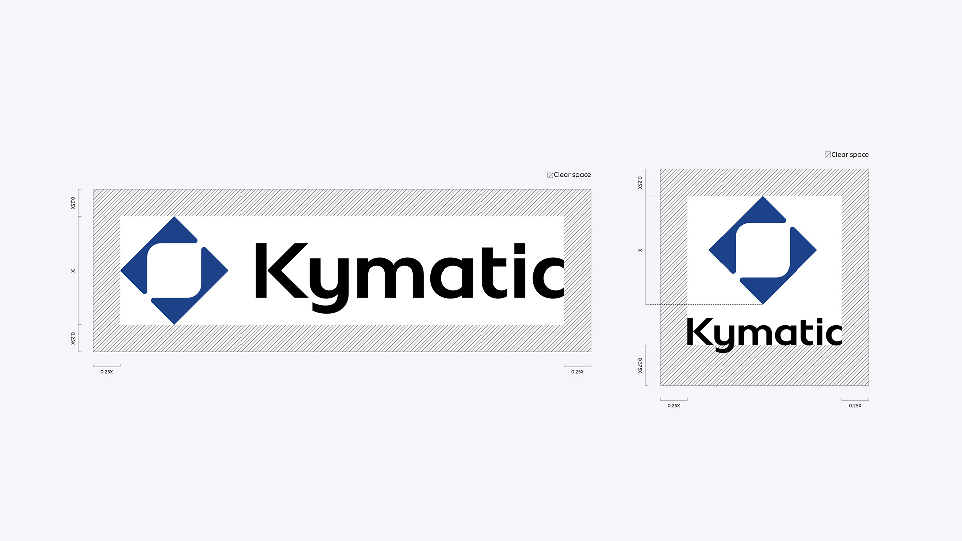
Symbol
The symbol consists of the following elements:
●Focus frame:
This focus frame made up of two ‘K’ characters, symbolizes Kymatic’s hybrid approach. This approach, a combination of advanced mathematical methods and a phenomenological perspective based on expertise, confronts the investment market and focuses on customer profit pursuit.
●Two Ks:
The alphabet ‘K’ that makes up the symbol is the initial of Kymatic, contributing to the visual enhancement and recognition of the brand.
The symbol uses a grid based on the visual patterns generated by Cymatics (Chladni patterns), the etymology of Kymatic, and is composed of a combination of geometric shapes that embody mathematical structure and artistic beauty. The clearly defined symbol shape expresses Kymatic’s mathematical background and professionalism. The diagonal lines placed at 45 degrees give a sense of strength, confidence, competitiveness, and dynamism as a hedge fund.
For the symbol, we created and tested several variations to ensure that the opening does not appear collapsed even when displayed in a small size.
For the symbol, we created and tested several variations to ensure that the opening does not appear collapsed even when displayed in a small size.
-
シンボルは次の要素から成り立っている:
● フォーカスフレーム:
2つの「K」の文字からなるこのフォーカスフレームは、Kymaticのハイブリッドアプローチを象徴している。このアプローチは、先進的な数学的手法と専門知識に基づく現象学的視点の組み合わせで、投資市場に挑み、顧客の利益追求にフォーカスする。
● 2つのK:
● 2つのK:
シンボルを構成するアルファベットの「K」はKymaticの頭文字であり、ブランドの視覚的強化と認知度向上に寄与する。
シンボルは、Kymaticの語源のサイマティクスが生み出す視覚的パターン(クラドニパターン)をベースとしたグリッドを用い、数理と芸術の調和を体現する幾何学的形状の組み合わせで構成されている。明確に定義されたシンボル形状は、Kymaticの数学的背景とプロフェッショナリズムを表現している。45度の傾斜線は、ヘッジファンドとしての力強さ、自信、競争力、ダイナミズムを感じさせる。
シンボルは、小さく表示された場合でも開口部が潰れて見えないように、複数のバリエーションを作成し検証を重ねた。
シンボルは、小さく表示された場合でも開口部が潰れて見えないように、複数のバリエーションを作成し検証を重ねた。
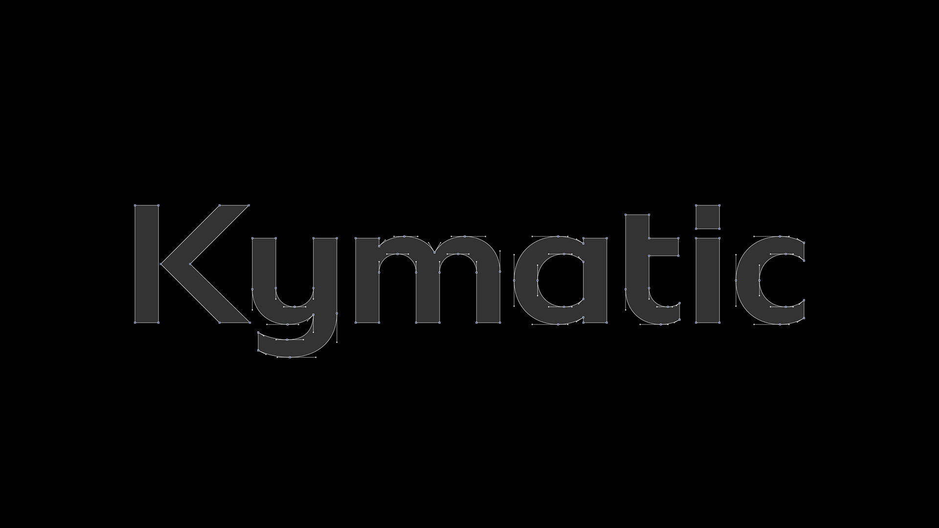
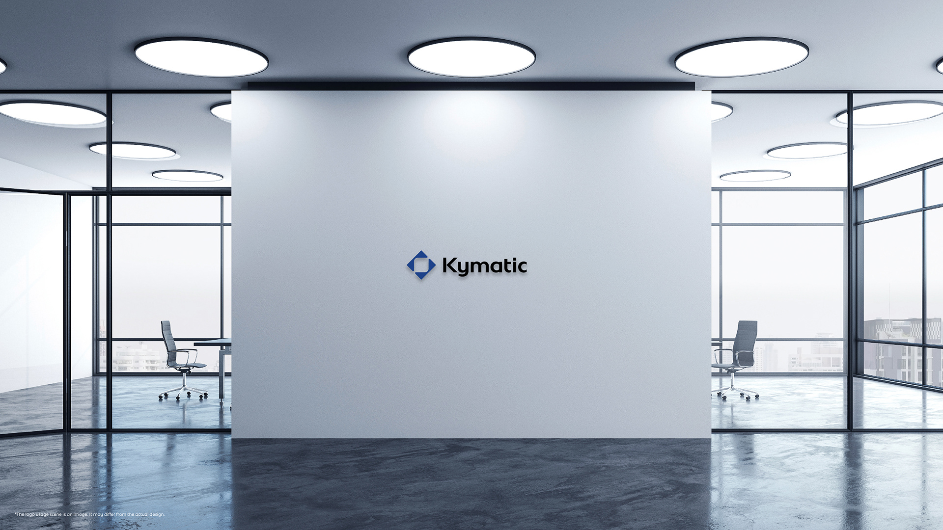
Logotype
The logotype uses the Adobe font Bonnie, which is highly readable, and it has been redesigned to give an overall orderly and sharp impression. The ‘K’ element is tilted at 45 degrees, emphasizing the strength and dynamism of Kymatic. Also, the angle of the symbol and ‘K’ are aligned, emphasizing visual unity. In addition to demonstrating a consistent brand, a stable design enhances credibility. The curves of the characters based on the circle make you feel familiarity and reassurance.
-
ロゴタイプは、高い可読性を持つAdobeフォントの「Bonnie」を採用し、全体的に整然としたシャープな印象に再設計した。 「K」の要素は45度の角度をつけることで、Kymaticの強さとダイナミズムを強調している。また、シンボルと「K」の角度を揃えることで視覚的な統一感を高めている。一貫したブランドイメージを示すだけでなく、安定したデザインは信頼性の向上にも寄与する。円を基調とした文字の曲線は、親しみやすさと安心感を感じさせる。シンプルながらも控えめな印象を与えず、対話を重視する外交的な企業であることを示している。
ロゴタイプは、高い可読性を持つAdobeフォントの「Bonnie」を採用し、全体的に整然としたシャープな印象に再設計した。 「K」の要素は45度の角度をつけることで、Kymaticの強さとダイナミズムを強調している。また、シンボルと「K」の角度を揃えることで視覚的な統一感を高めている。一貫したブランドイメージを示すだけでなく、安定したデザインは信頼性の向上にも寄与する。円を基調とした文字の曲線は、親しみやすさと安心感を感じさせる。シンプルながらも控えめな印象を与えず、対話を重視する外交的な企業であることを示している。


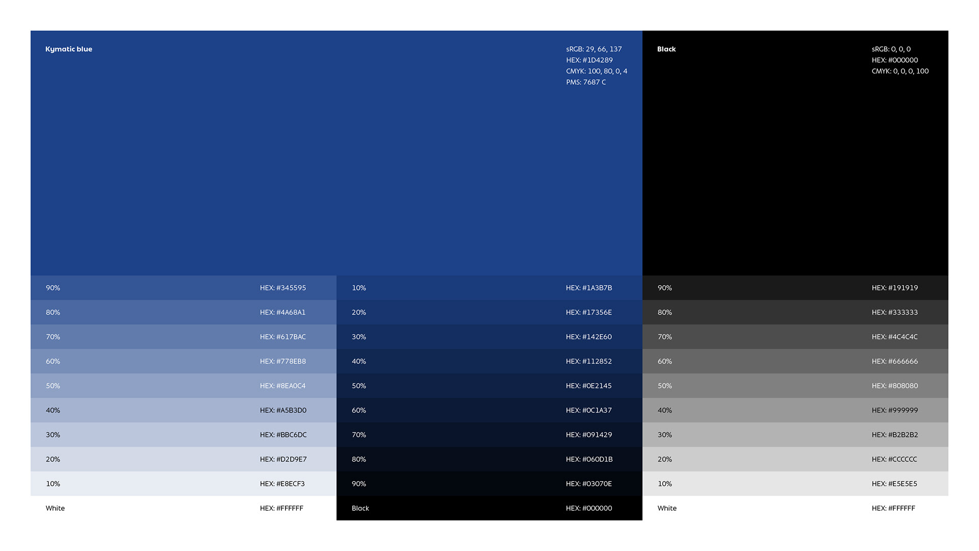
Color palette
The blue color used as the symbol color is a color that symbolizes the expectations of customers towards hedge funds. This color expresses solidity, trustworthiness, and sincerity, strongly implying that Kymatic is a hedge fund worthy of trust. The deep tones give a mature impression, highlighting Kymatic’s solidity, professionalism, intellect, innovation, and advancement. In addition, this color symbolizes the mature technical capabilities that form the foundation of Kymatic’s business.
The secondary color palette of Kymatic is carefully selected to enhance the brand image of Kymatic by maintaining visual harmony with the logo color.
-
シンボルに用いられた青色は、ヘッジファンドに対する顧客の期待を象徴する色である。堅実さ、信頼性、誠実さを表し、Kymaticが信頼に足るヘッジファンドであることを強く印象付ける。深みのある色調は成熟した印象を醸し出し、Kymaticの確かな実力、プロフェッショナリズム、知性、革新性、先進性を際立たせる。また、同時に、Kymaticの事業の礎となる成熟した技術力を象徴でもある。
セカンダリーカラーパレットは、ロゴカラーと視覚的な調和を保ちつつ、Kymaticのブランドイメージを一層高めるよう入念に選定されている。

Font
Kymatic’s brand font is ‘Bonnie’, which offers excellent readability and a simple, sophisticated impression for free. This font, which forms the basis of the logotype, ensures consistency throughout the design. Also, this font, which gives a sense of familiarity and reassurance, reminds us that Kymatic is a diplomatic and communicative company.
-
Kymaticのブランドフォントは、無償で優れた可読性とシンプルな洗練された印象を併せ持つ「Bonnie」を採用した。ロゴタイプの基盤であるこのフォントにより、デザイン全体の一貫性が確保されている。また、親しみやすさと安心感を感じさせるこのフォントは、Kymaticが対話を重視する外交的な企業であることを連想させてくれる。

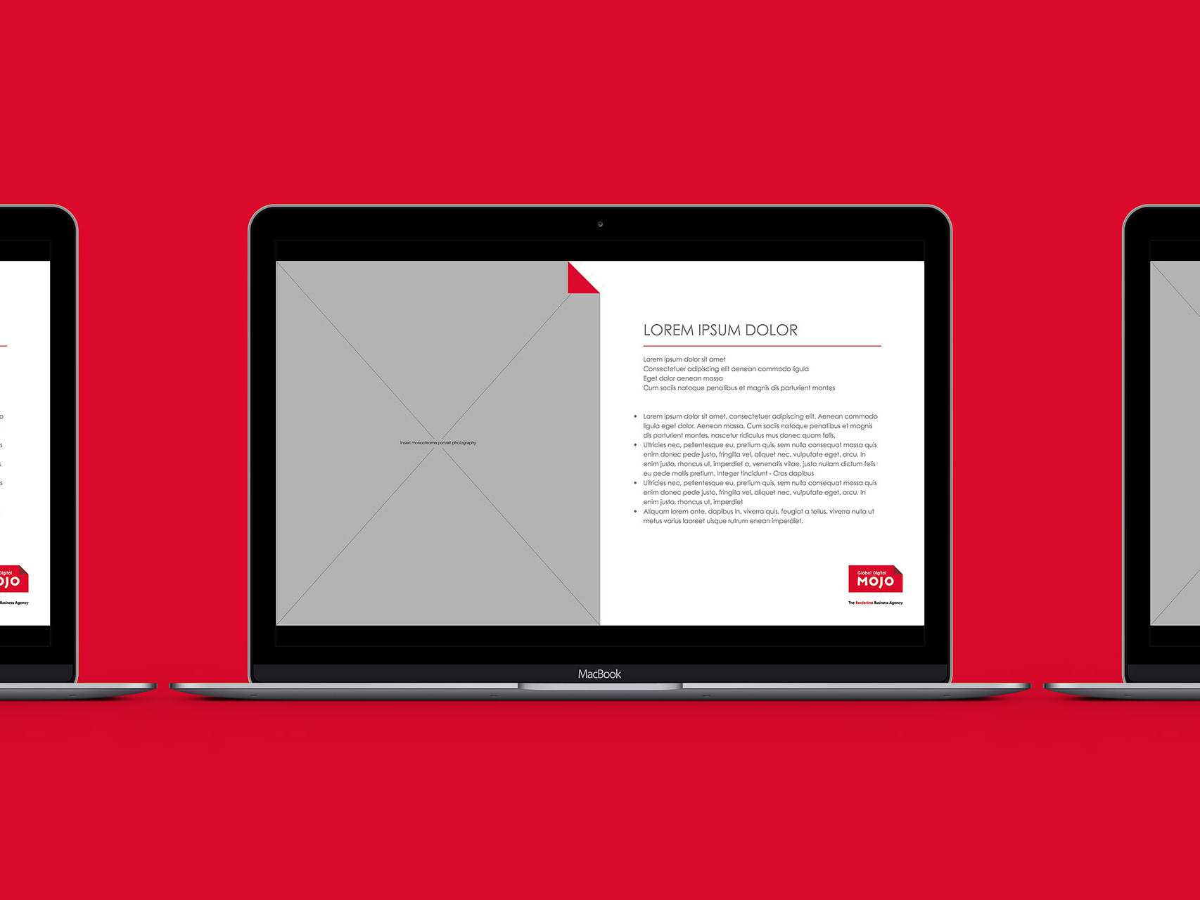
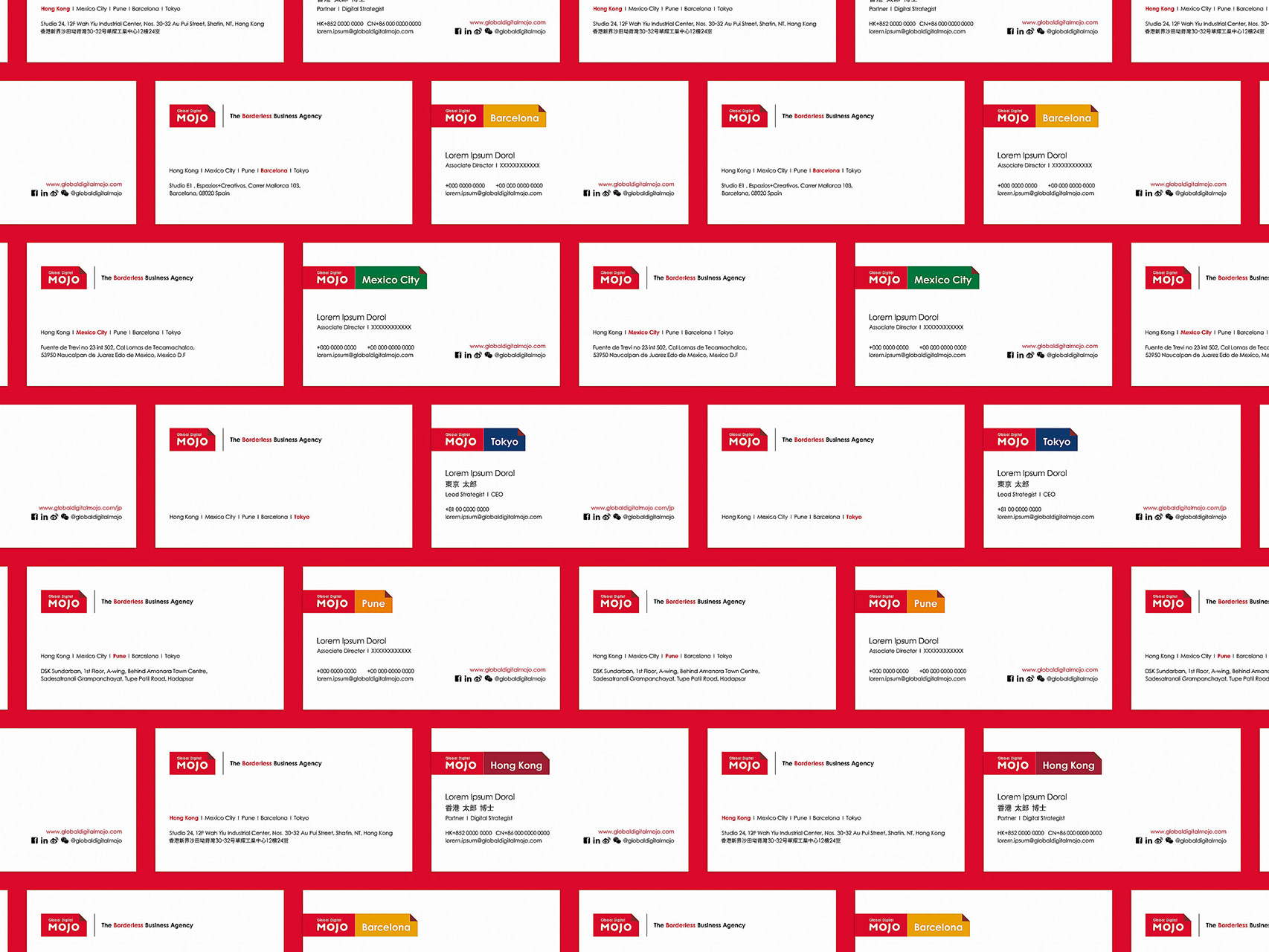
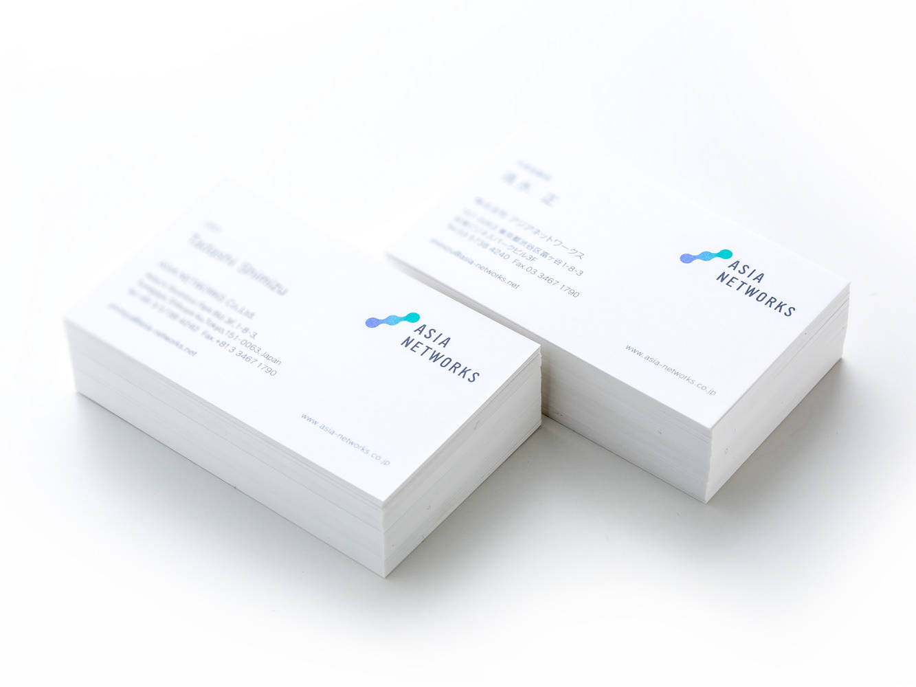
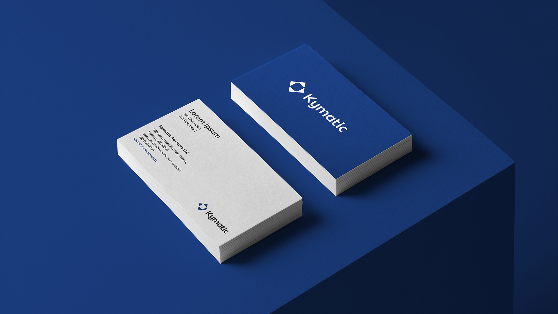
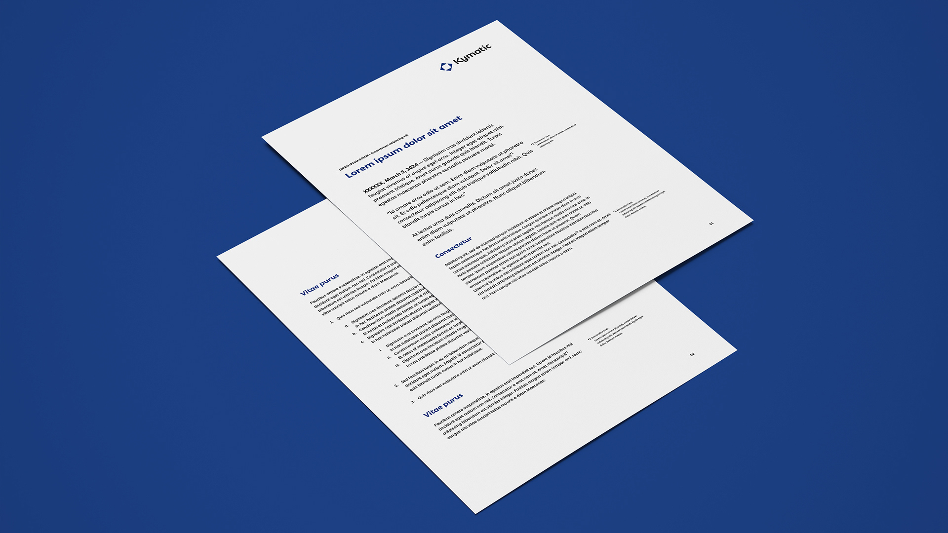
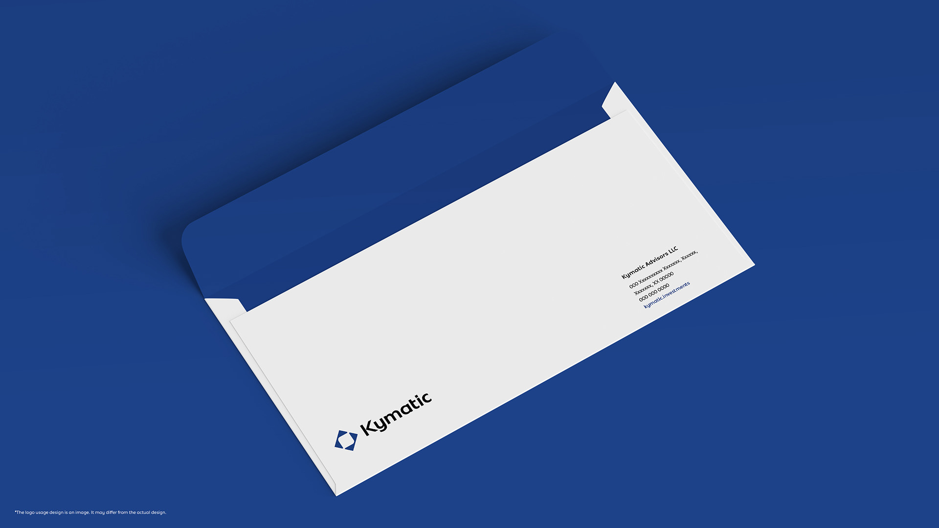
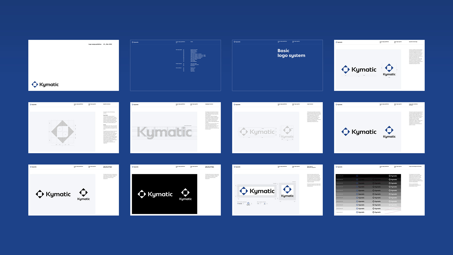
Brand collateral
We designed business cards, letterheads, and document templates as brand collateral. These were compiled into guidelines along with the usage of the logo.
-
ブランドコラテラルとして名刺、レターヘッドやドキュメントテンプレートを作成した。これらはロゴの使用方法と併せてガイドラインに集約されている。


Client: Kymatic Advisors LLC
Logo concept & graphic design: Hiromi Maeo (enhanced Inc.)
Logo concept & graphic design: Hiromi Maeo (enhanced Inc.)
Global project management: Kayoko Tsuchiya
2024 DE, USA