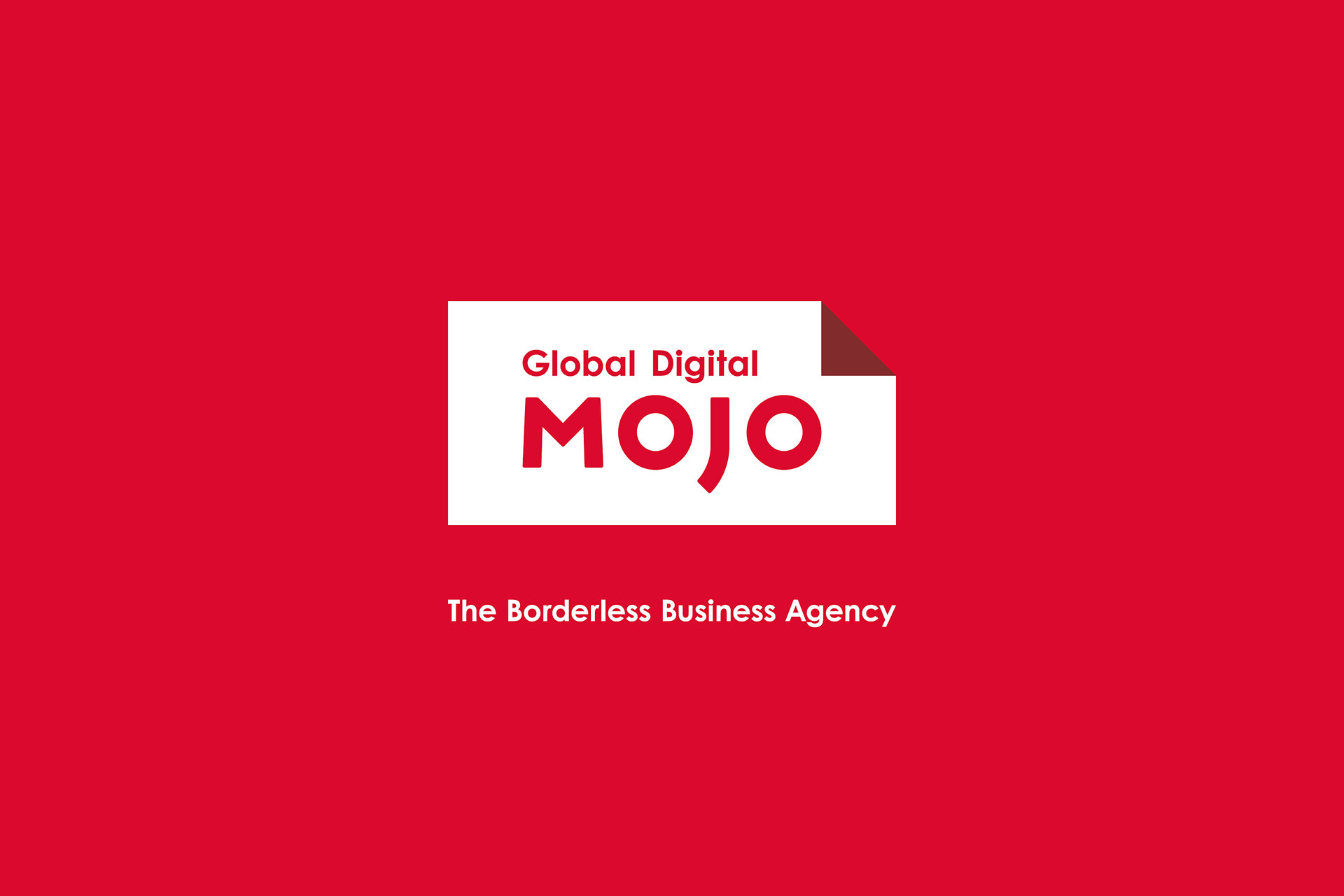
Global Digital MOJO
Asia Digital MOJO is a global & borderless digital agency with base offices in three cities Hong Kong, Barcelona, and Mexico City, It also added two cities Tokyo and Pune in 2017.
We pursued the rebranding just when Tokyo and Pune were added to their network. At the same time, the company name was also changed to Global Digital MOJO (GDM).
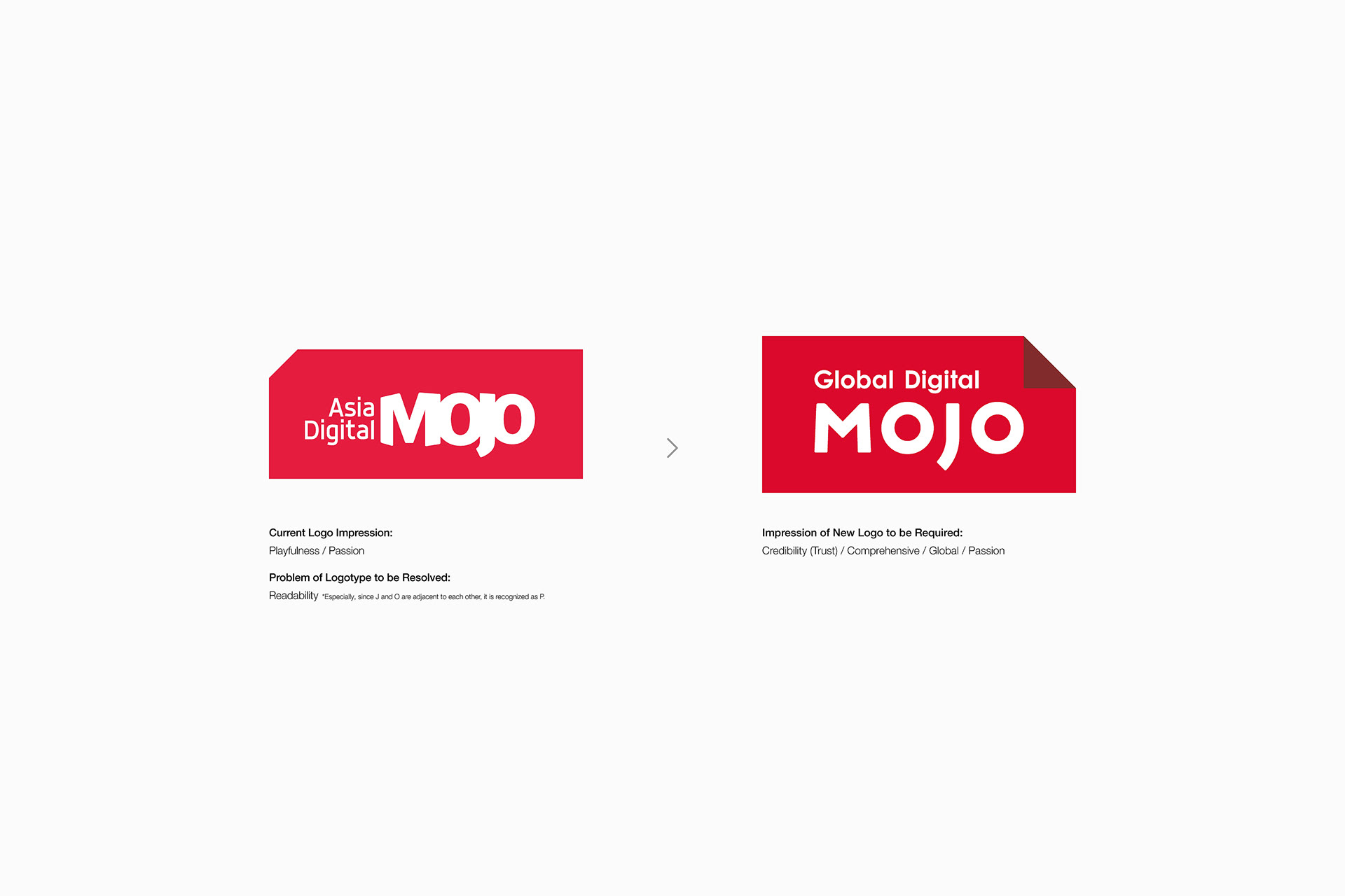
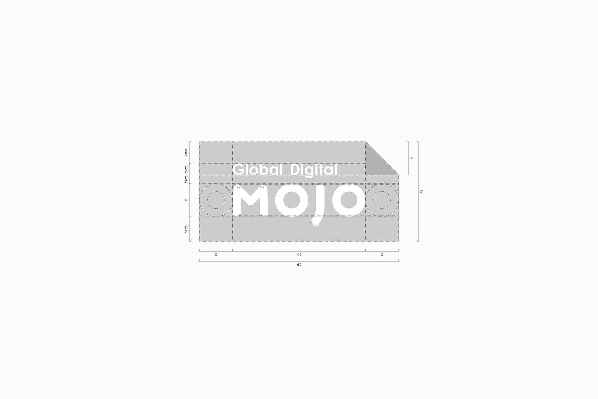
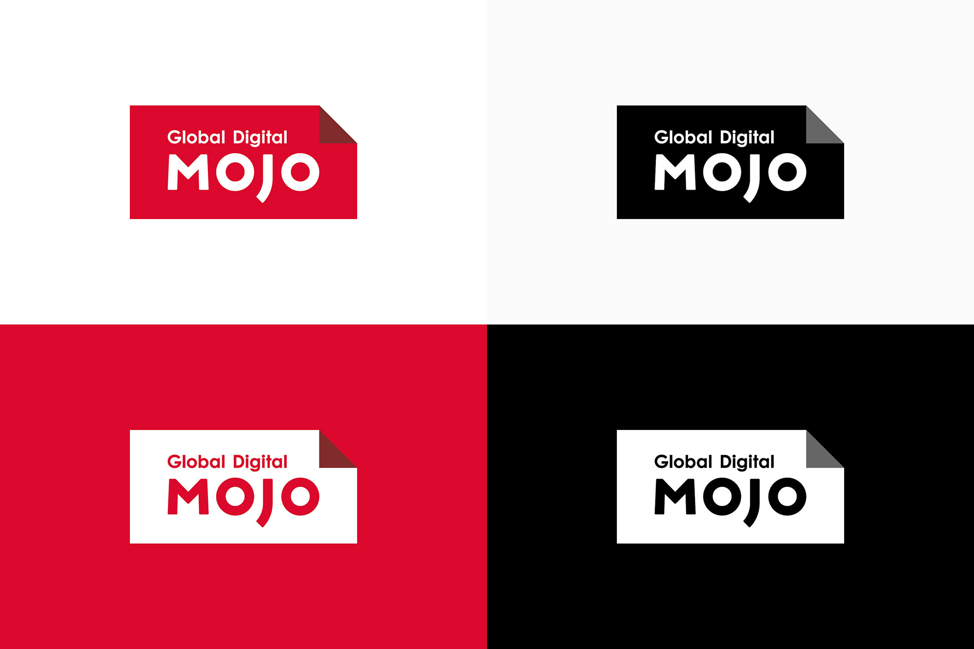
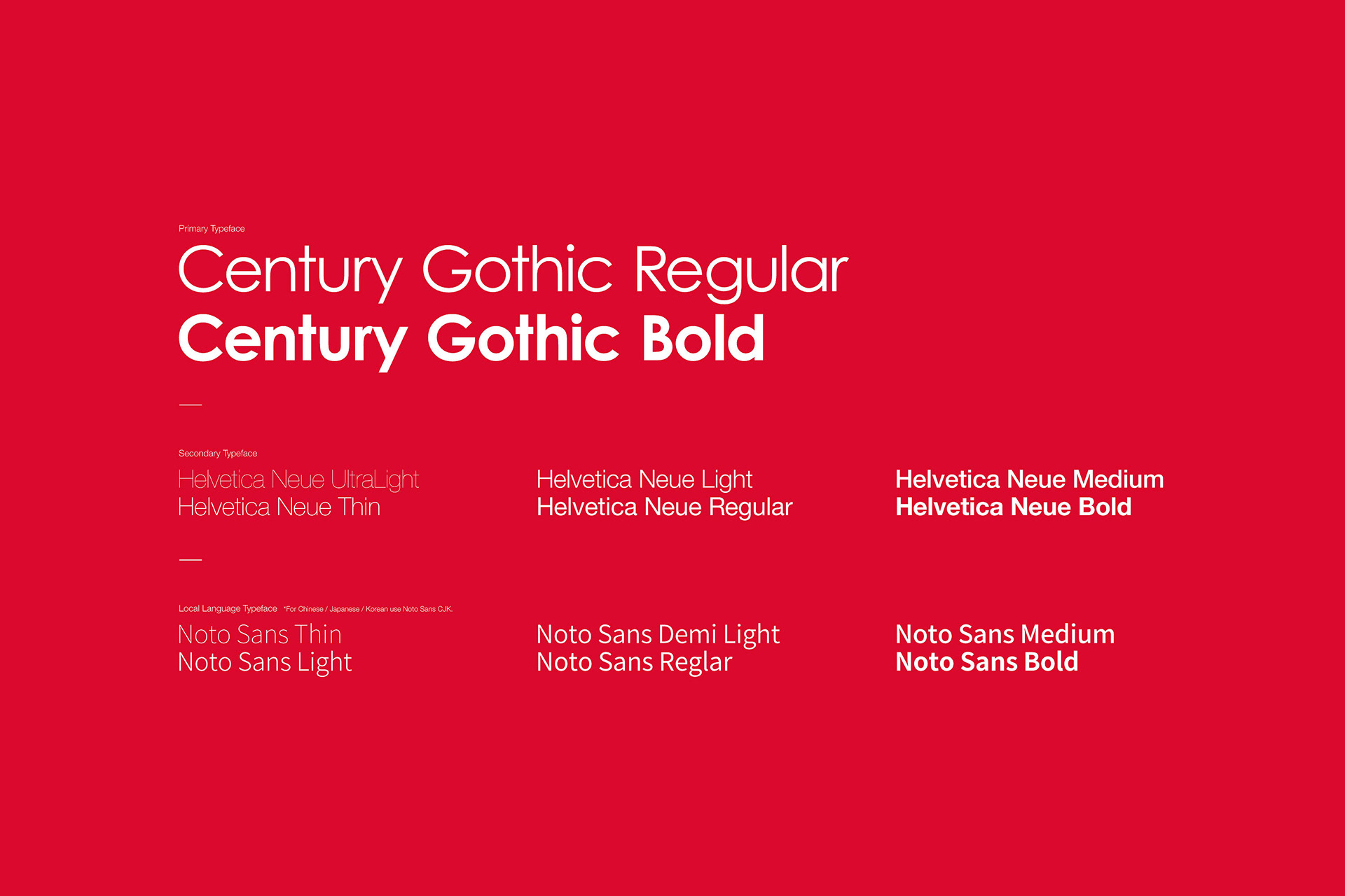
First, to reinforce the sense of trust as a company, we reconsidered the impression of “Playfulness” of the existing logo which was somewhat unbalancing as a global agency. By doing so, while keeping the existing logo's essence, we combined the rebalanced solid logo shape and the simple logotype to express the newly reborn GDM as a borderless agency based on trust with a comprehensive business and design approach.
The red in the existing logo expresses "the color of passion for pursuing clear solutions to the problems the client has". This was also followed in the new GDM logo, but the color value was adjusted to generate more impact.
We pursued the rebranding just when Tokyo and Pune were added to their network. At the same time, the company name was also changed to Global Digital MOJO (GDM).
First, to reinforce the sense of trust as a company, we reconsidered the impression of “Playfulness” of the existing logo which was somewhat unbalancing as a global agency. By doing so, while keeping the existing logo's essence, we combined the rebalanced solid logo shape and the simple logotype to express the newly reborn GDM as a borderless agency based on trust with a comprehensive business and design approach.
The red in the existing logo expresses "the color of passion for pursuing clear solutions to the problems the client has". This was also followed in the new GDM logo, but the color value was adjusted to generate more impact.
-
Asia Digital MOJOは、Hong Kong、Barcelona、Mexico Cityの3都市、そして、2017年にはTokyo、Puneの2都市を新たに拠点に加えたグローバル&ボーダレスデジタルエージェンシーである。
私たちは、彼らのネットワークにTokyoとPuneの2都市が加わったタイミングでリブランディングを行った。その際、名称もGlobal Digital MOJO(以下GDM)へと変更された。
私たちは、彼らのネットワークにTokyoとPuneの2都市が加わったタイミングでリブランディングを行った。その際、名称もGlobal Digital MOJO(以下GDM)へと変更された。
まず私たちは、既存のロゴが持っていたグローバルエージェンシーとしてはやや不釣り合いなPlayfulnessの印象を見直すことからはじめた。企業としての信頼感をより補強するためである。そして、既存のロゴが持っていたエッセンスを踏襲しながらも、リバランスされたソリッドなロゴ形状とシンプルなロゴタイプを組み合わせ、新しく生まれ変わったGDMが信頼に基づいた包括的なビジネス&デザインアプローチを行うことができるボーダレスエージェンシーであることを表した。
既存のロゴで使用されていた赤色には、「クライアントが抱える問題点に対する明確な解決方法を追い求める情熱の色」という意味が込められていたが、新しいGDMのロゴでもこの色の意味を踏襲した。ただし色値に関しては、よりインパクトが生まれるよう微調整を行った。
Shiori
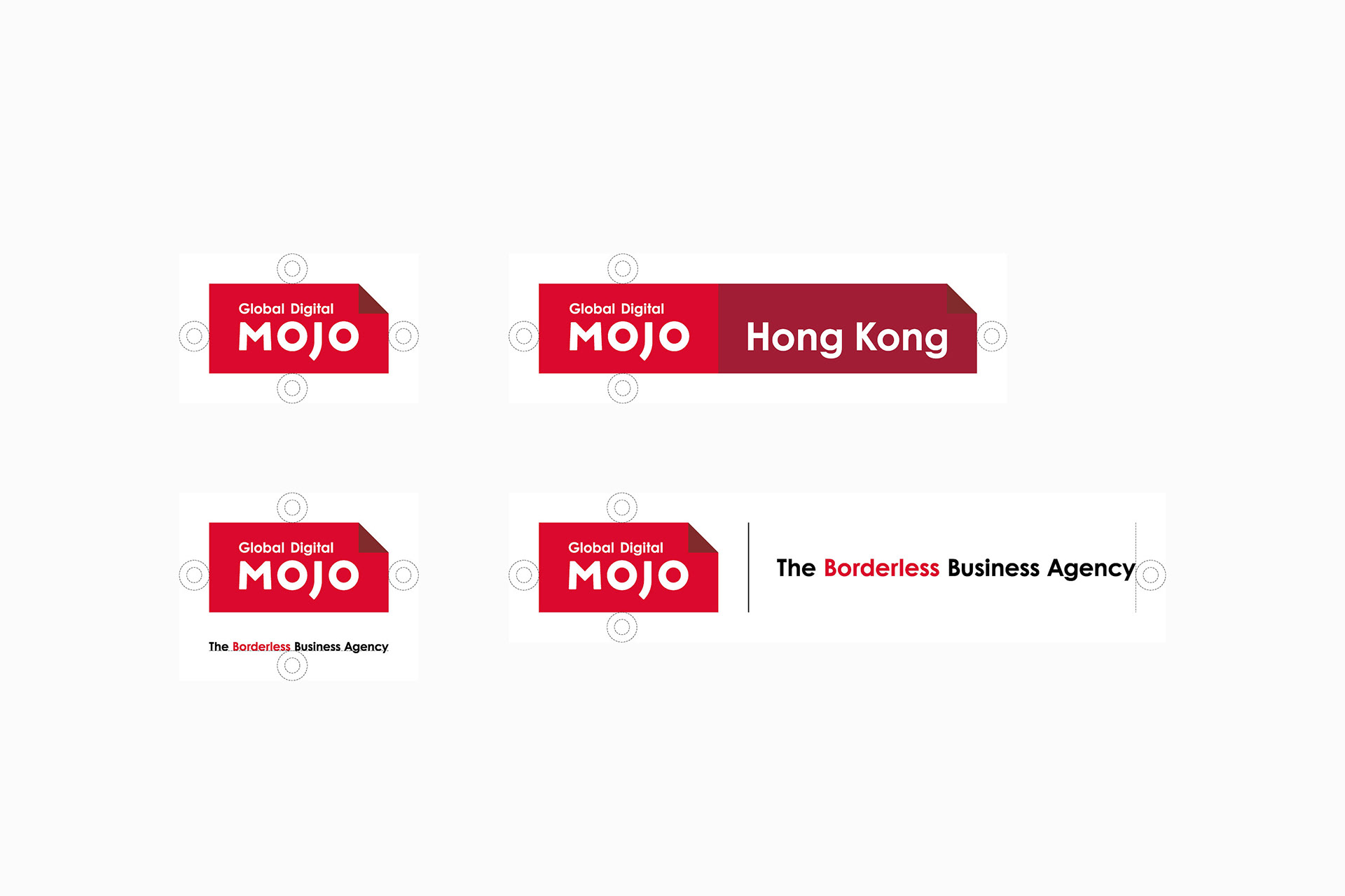
The triangle at the top right corner of the GDM logo is a newly placed eye catch. It is meant to be a “bookmark (shiori)” or “dog ear” for the clients/end-users of GDM.
The Japanese word shiori (栞) has its origin in “shioru (枝折る) - to break branches as markers so a hiker would not stray at a mountain path”, which nowadays means “a marker (dog-ear) to note how far one has read a book” or “a guidebook for beginner”.
Based on this meaning, the eye catch expresses that “GDM provides client/end-user with a variety of thinking methods, such as design thinking, that a client would never have utilized, and solutions based on it, and markers and guidance for reaching a clear goal by GDM”. Not just as part of the logo, this eye-catch can be used in various applications as an accent.
-
GDMロゴの右上には三角形のアイキャッチを新設した。このアイキャッチは、GDMによるクライアント/エンドユーザのための「しおり(栞)」「ドッグイヤー」の意味を持つ。
しおり(栞)という日本語は「登山者が初めて散策する山道等で、迷わないよう目印として木の枝を折りながら進むこと - 枝折る(しおる)」に由来し、「本をどこまで読んだかという目印(ドッグイヤー)」「初心者のための手引書」という意味である。
この意味から、このアイキャッチは「これまでクライアントが導入していなかったデザインシンキング等のさまざまな思考法やそれに基づく解決策、明確なゴールへと辿り着くための目印や手引きがGDMによってクライアント/エンドユーザにもたらされる」ことを表している。このアイキャッチはロゴだけでなくさまざまなアプリケーションにおいてもアクセントとして使用することができる。

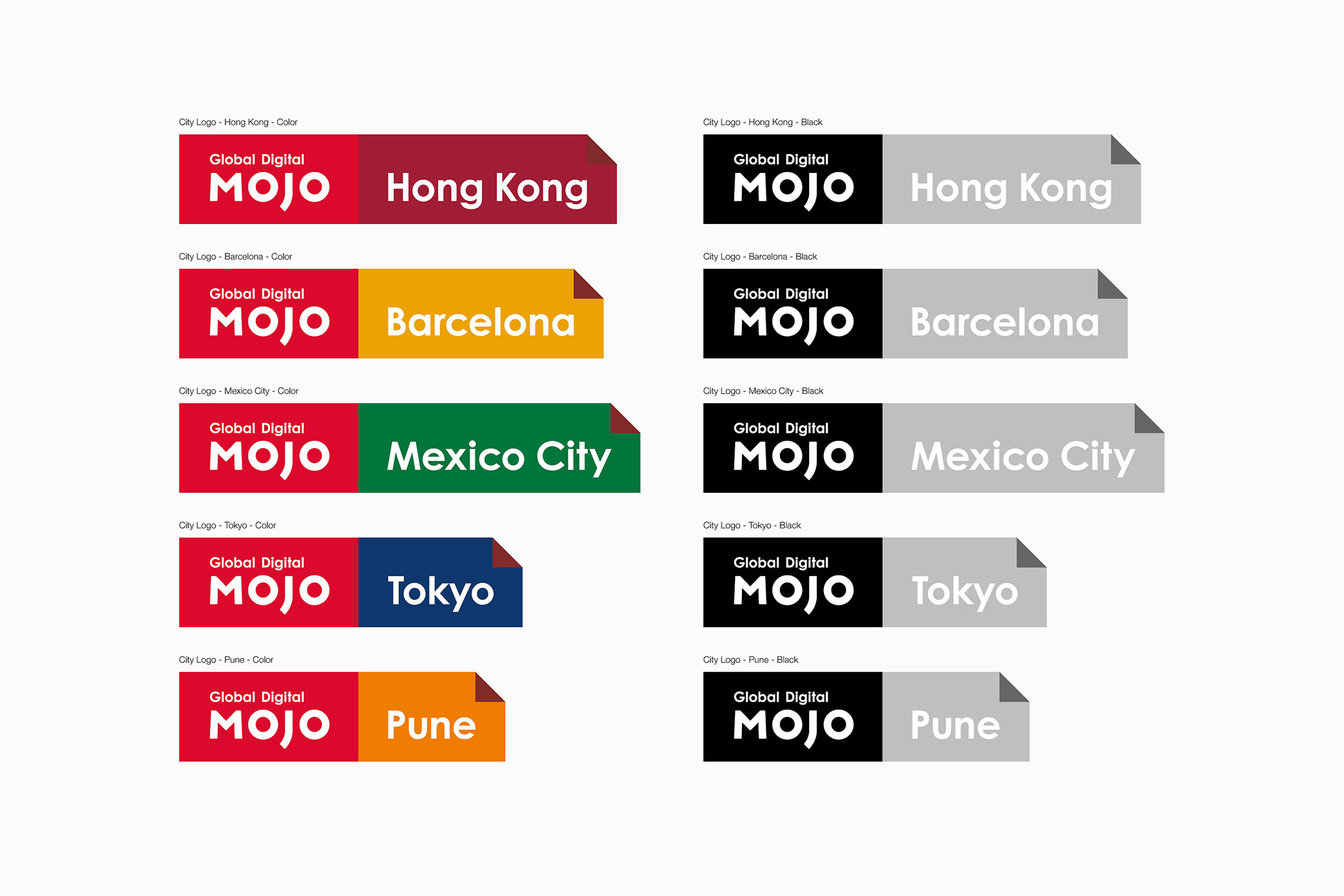
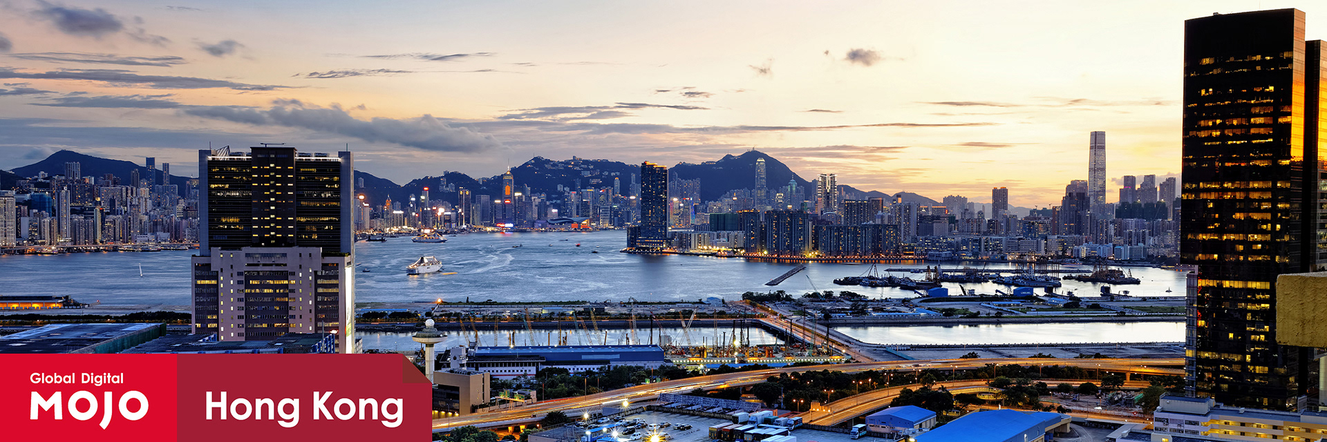
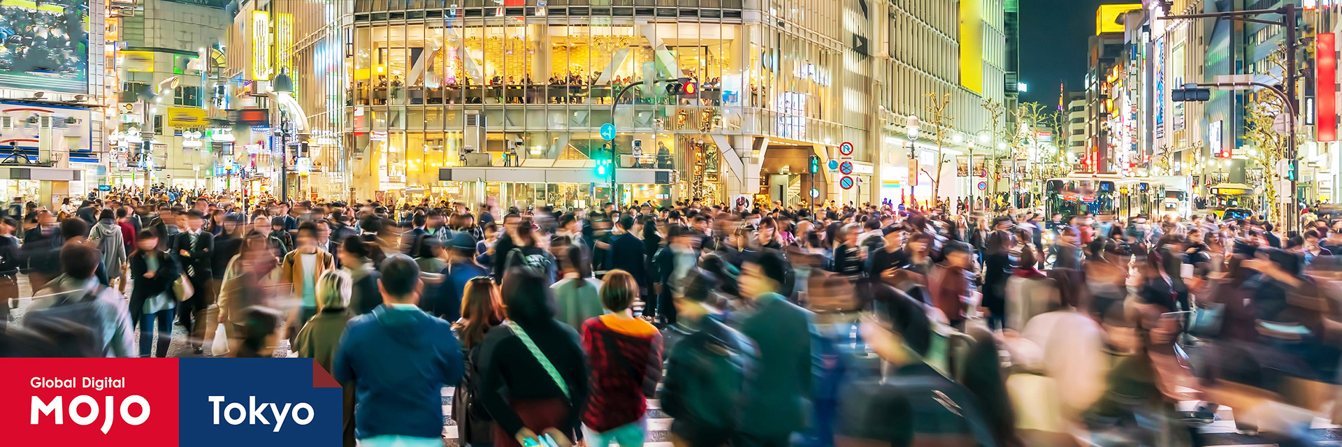
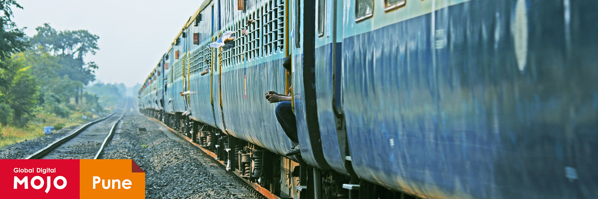
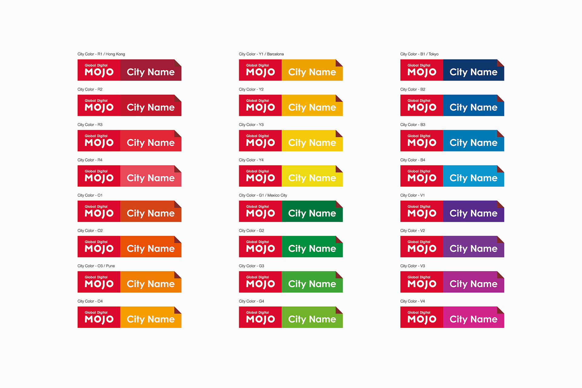
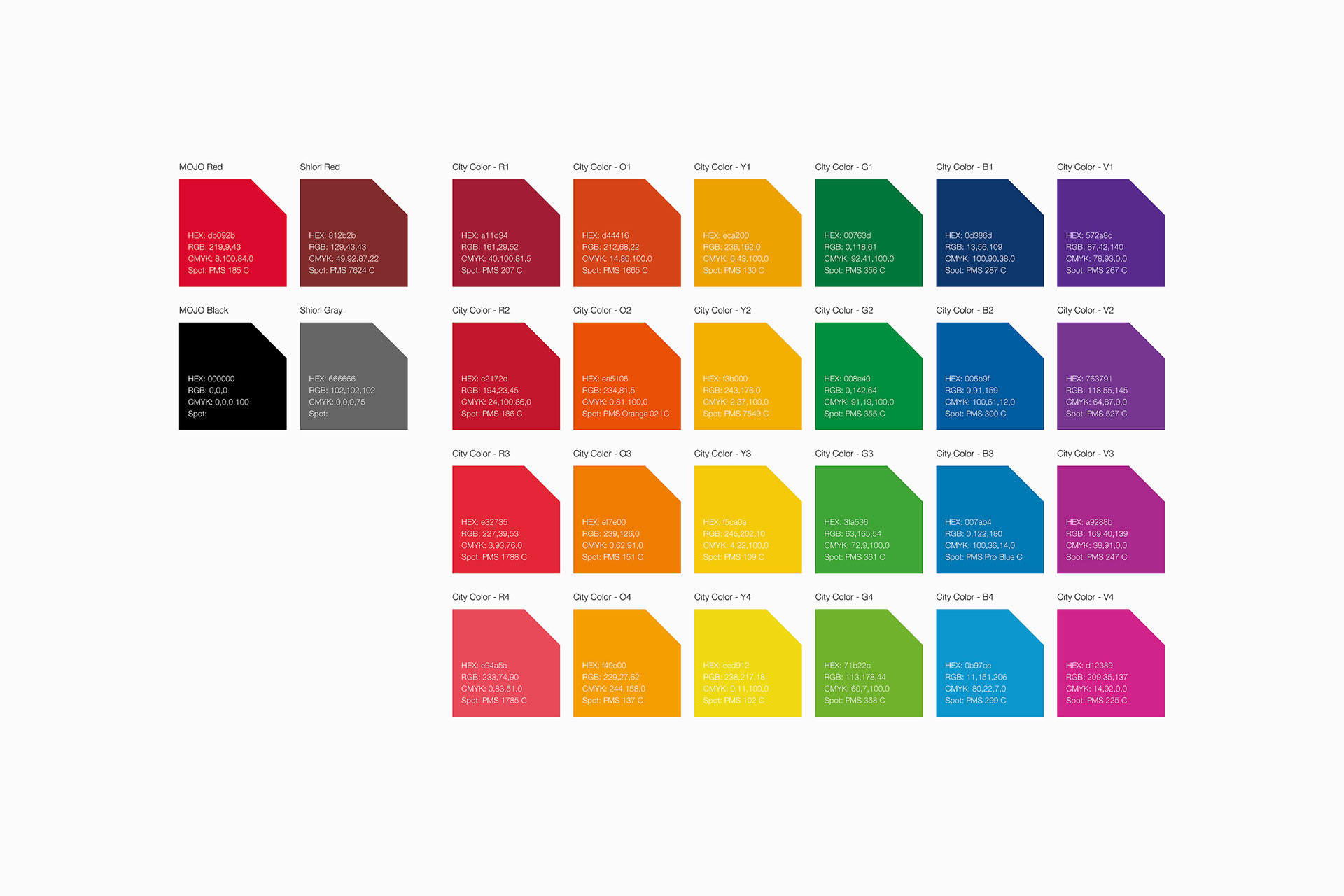
City Logo
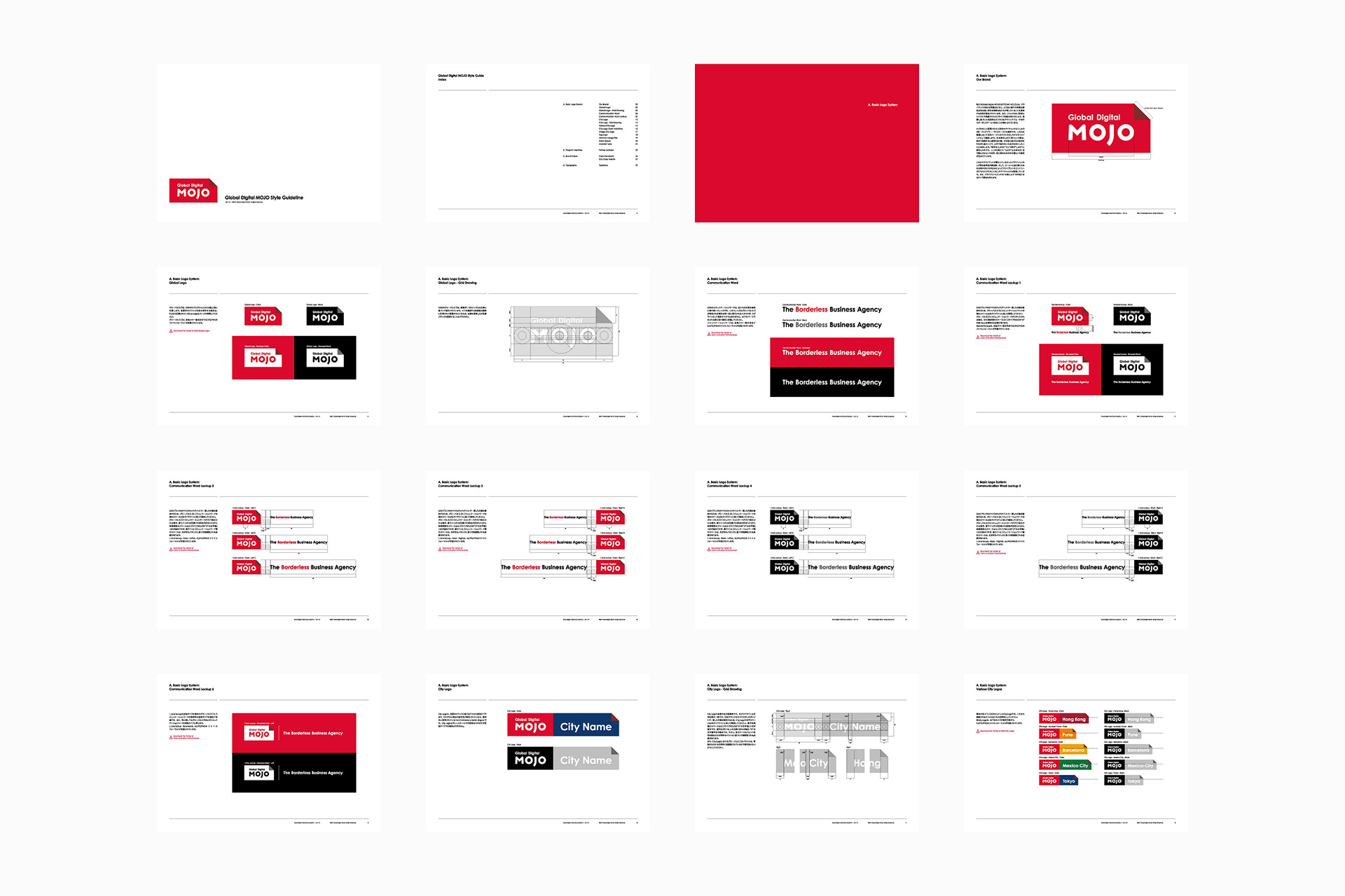
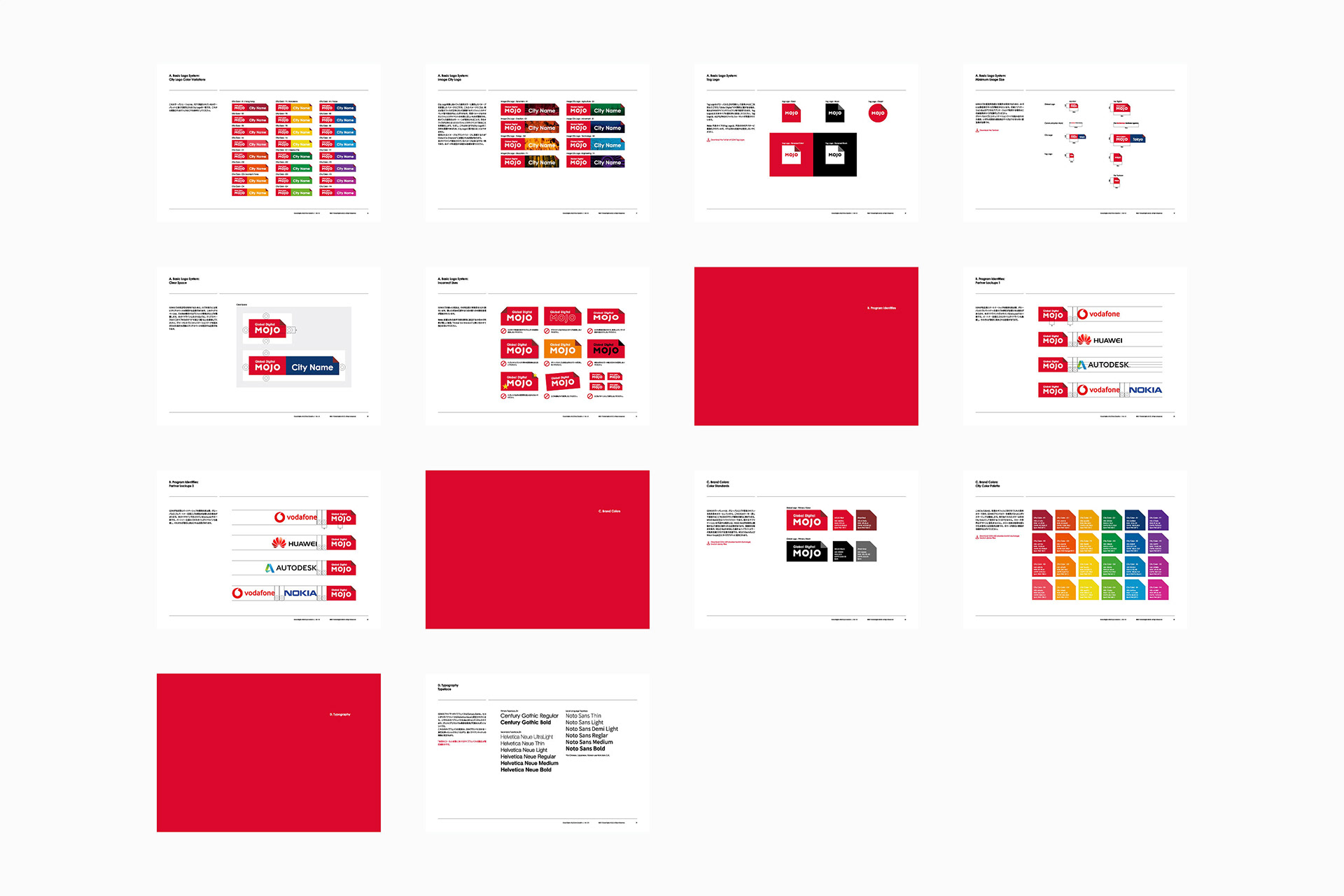
In addition to the basic GDM logo (global logo), we have newly established a country-specific city logo that combines the city names of offices in each country. Each logo is set with its color, complementing the originality of each country's office.
-
基本となるGDMロゴ(グローバルロゴ)以外にも、各国のオフィス所在都市名を組み合わせた各国固有のシティロゴを新設した。このロゴにはそれぞれ固有の色が設定されており、各国オフィスのオリジナリティを補完する。


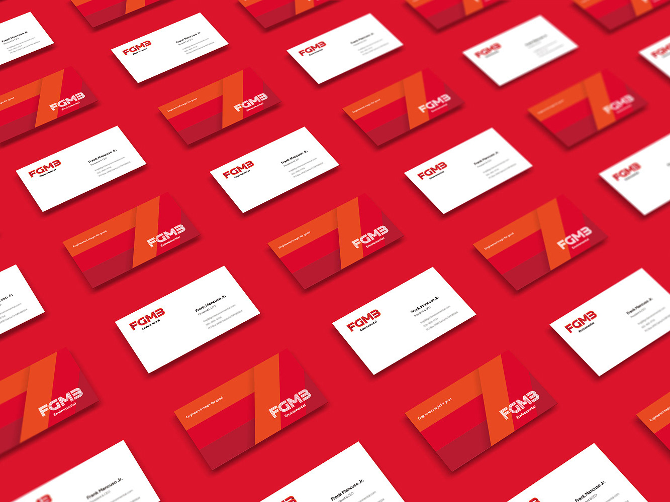
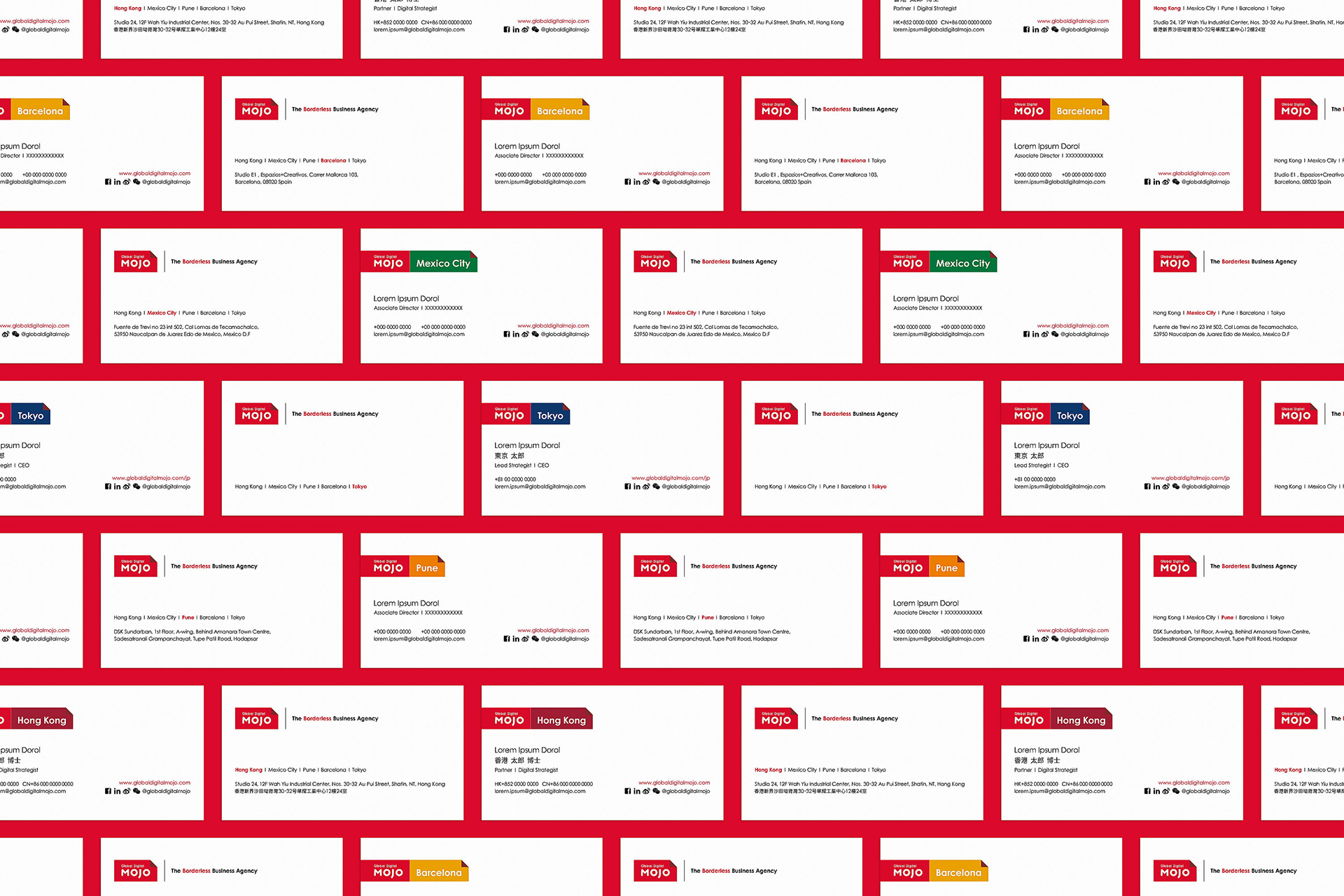
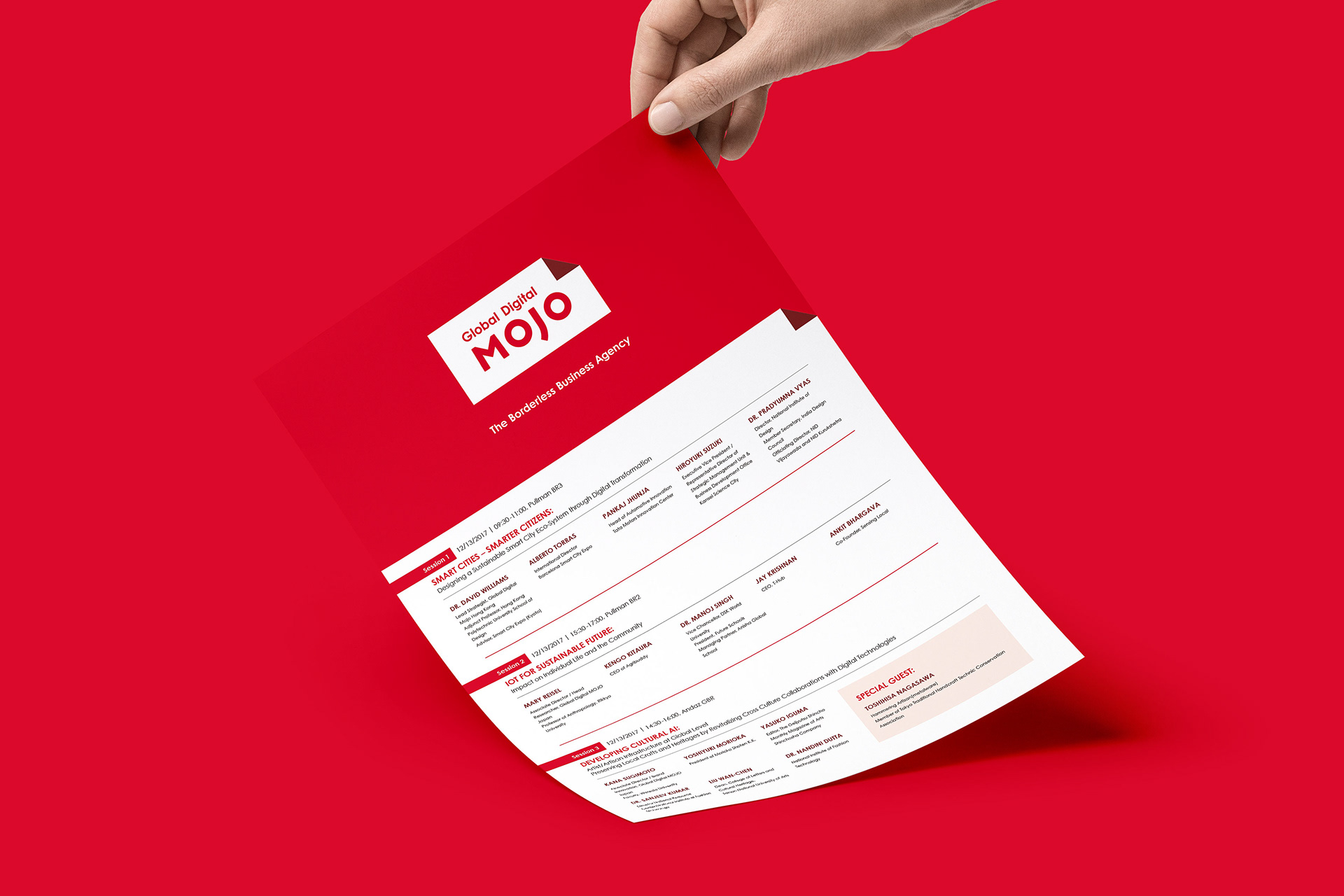
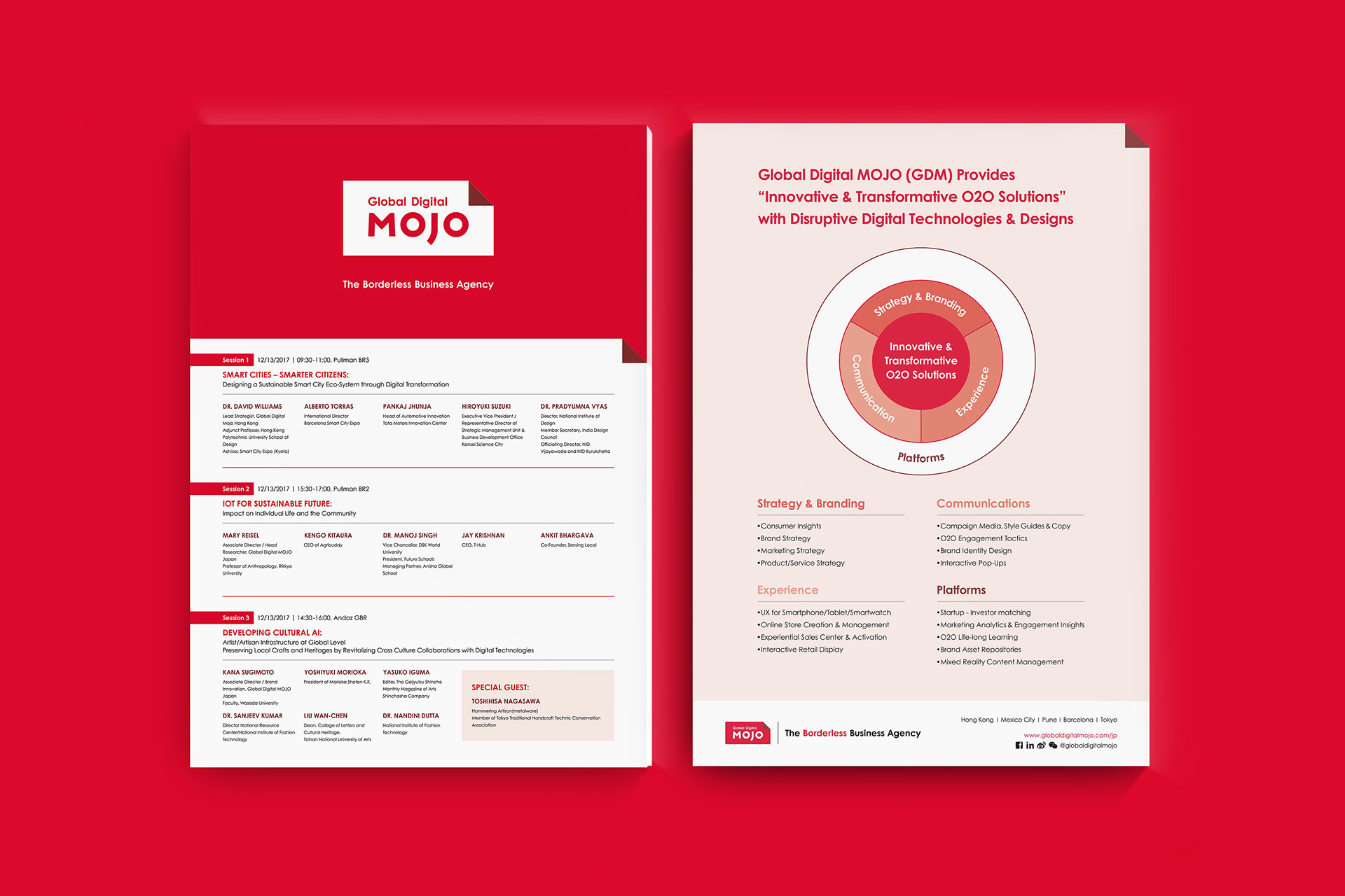
The new logo of GDM was used and published for the first time at Global Partnership Summit 2017 held in New Delhi, India. GDM is also a content partner of this summit and produced leaflets for the sessions sponsored with information such as guest speaker introductions and timetables, and also standing banners, movies, business cards, etc. Business cards using the city logo also received favorable reviews from guests from various countries.
-
GDMの新しいロゴは、インド・ニューデリーで開催されたGlobal Partnership Summit 2017で初めて使用・公開された。GDMは当サミットのコンテンツパートナーでもあり、主催したセッション用のゲストスピーカー紹介スライド、タイムテーブル等を記載したリーフレット、スタンディングバナー、ムービー、名刺等を制作した。シティロゴを用いた名刺は各国のゲストからも好評を博した。
Client: Global Digital MOJO, Digital MOJO Japan
Art direction, Logo concept, Graphic design: Hiromi Maeo (enhanced Inc.)
2017, Hong Kong, Barcelona, Mexico City, Tokyo, Pune