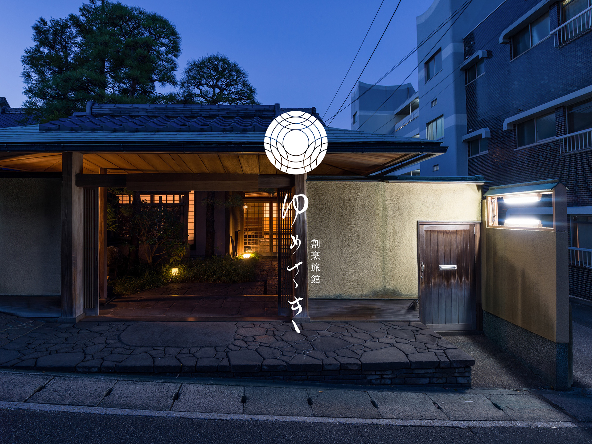
Kappo Ryokan - Yumesaki (割烹旅館ゆめさき)
Beppu city in Oita prefecture is one of Japan's most famous hot spring resorts.
Beppu city in Oita prefecture is one of Japan's most famous hot spring resorts.
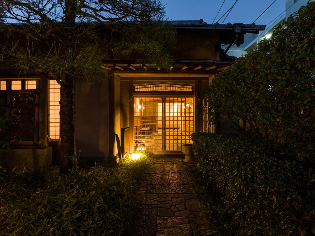
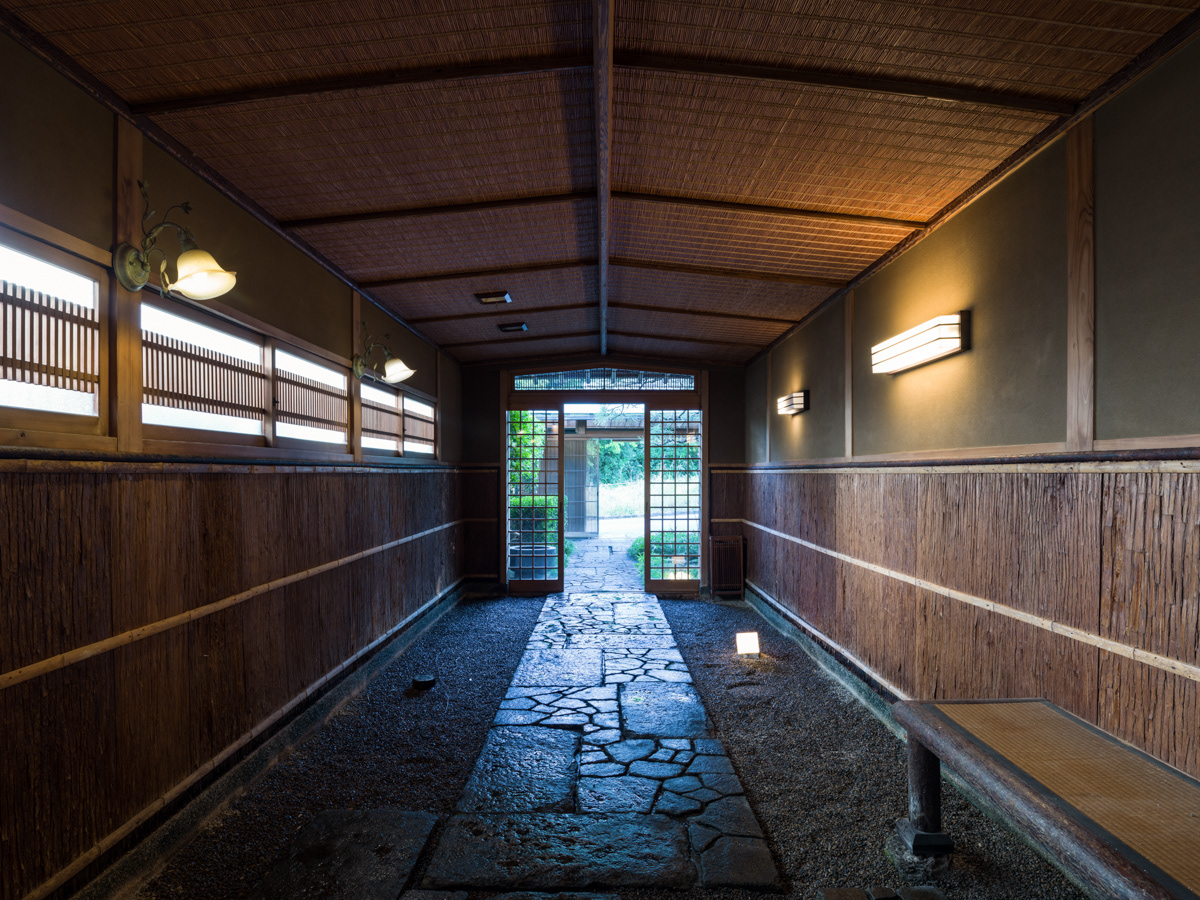
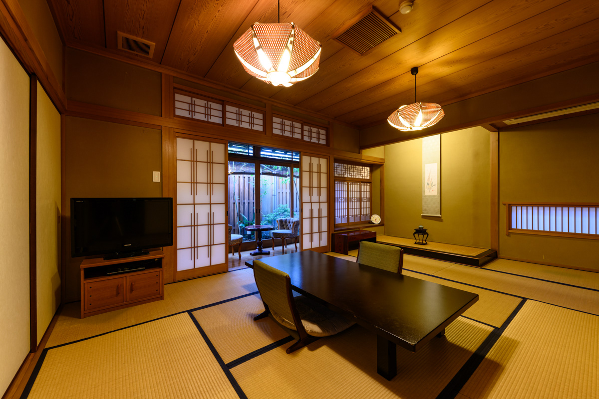
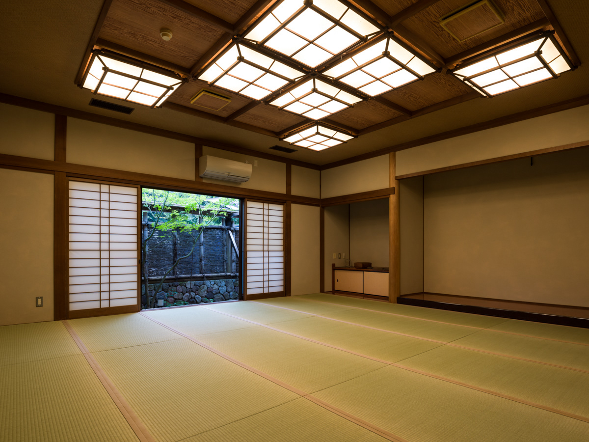
Built-in 1972 in Beppu, "Kappo Ryokan - Yumesaki, a traditional Japanese ryokan (hotel), has been loved by guests for its tranquil Japanese atmosphere and authentic Kappo-style cuisine.
Beautifully renovated in 2020 by architect Fumihiko Sano, Yumesaki is now reborn.
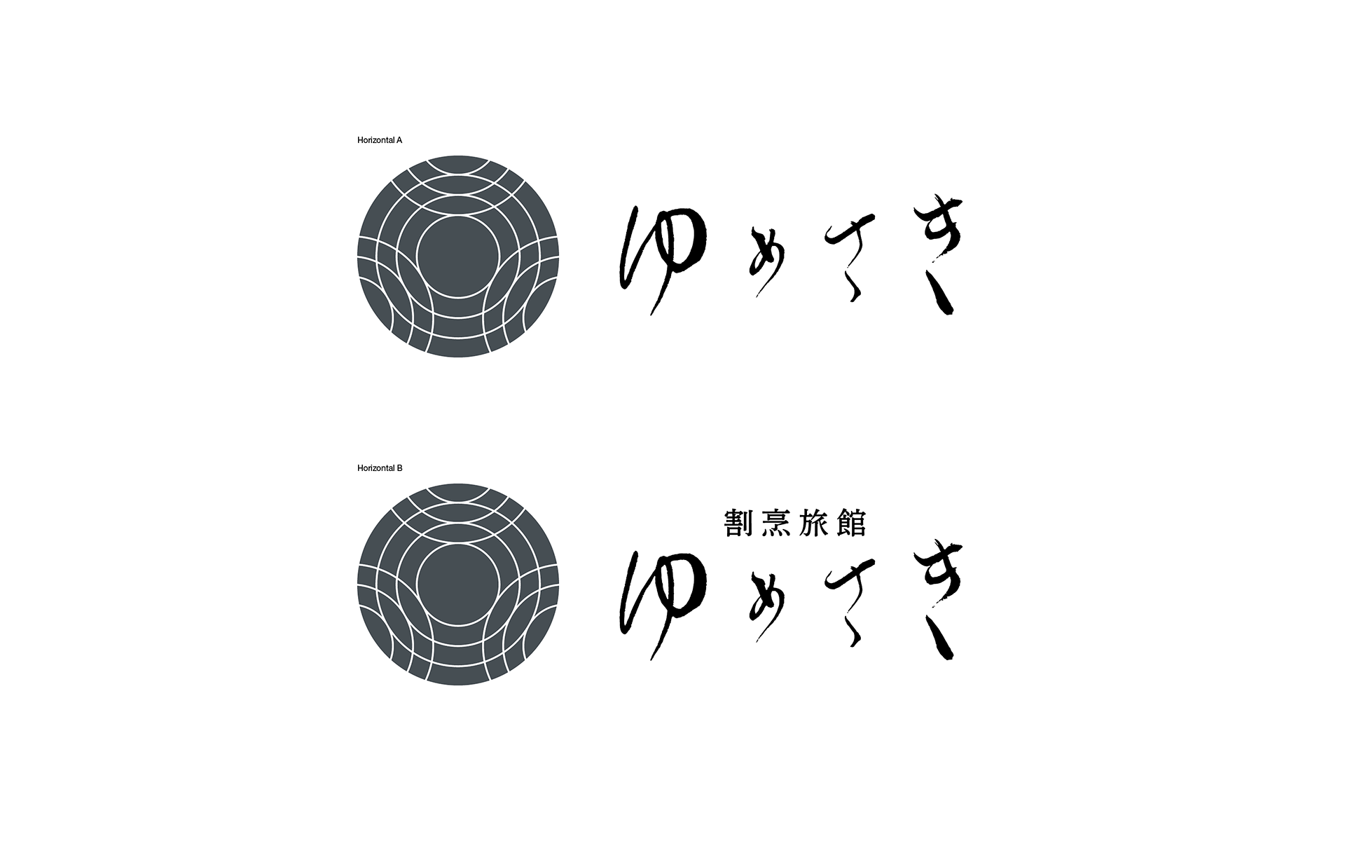
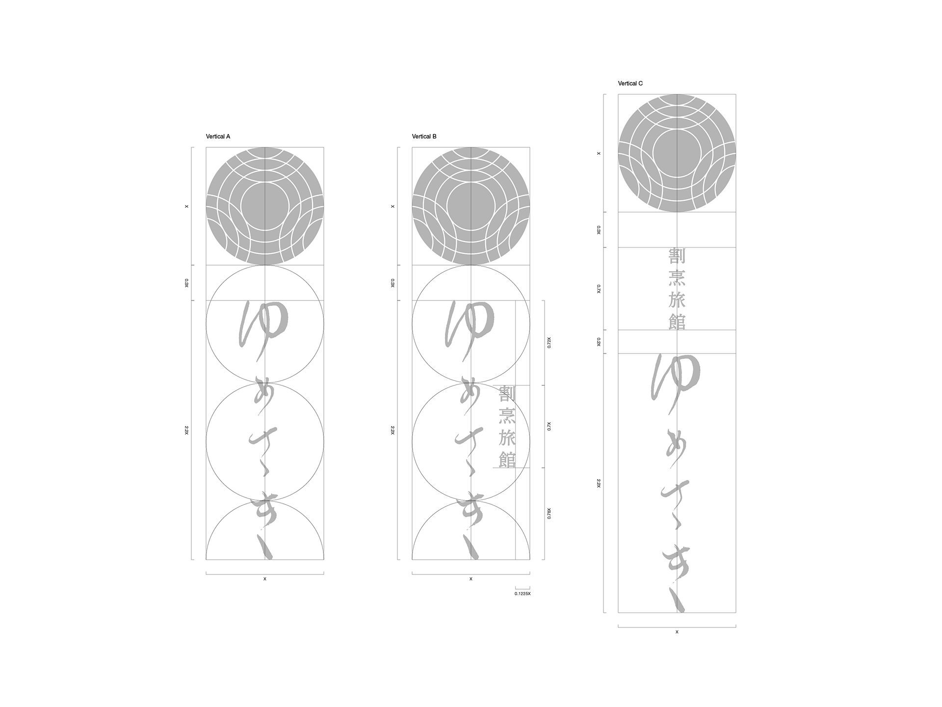
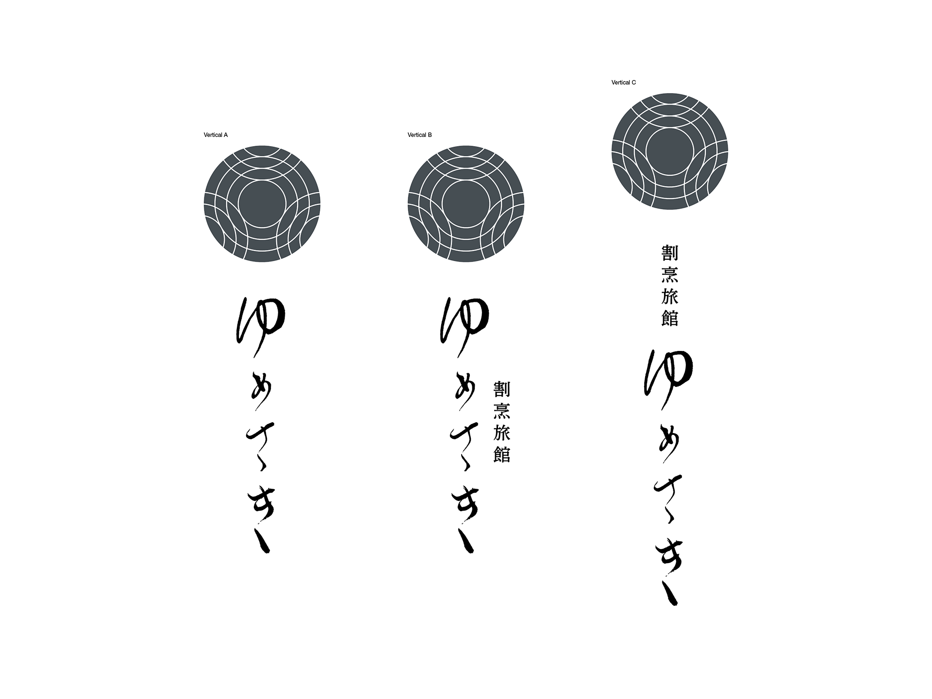
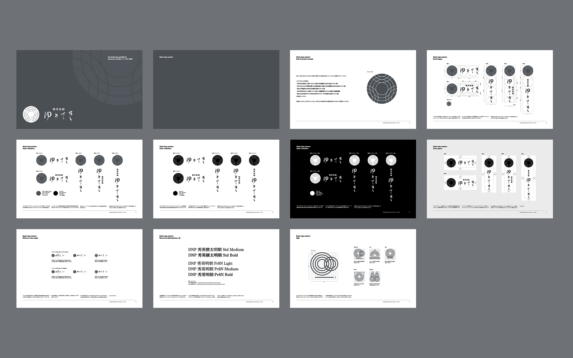
We enhanced Inc. constructed the logo, logo guidelines, and various graphic designs for Yumesaki.
-日本において有名な温泉地のひとつである大分県別府市。
この別府で1972年に建てられた「割烹旅館ゆめさき」は、日本らしい静かな佇まいと本格的な割烹料理の提供により、これまでお客様から愛されてきた宿である。
2020年。このゆめさきは建築家・佐野文彦氏の手により美しくリノベーションされ、新しく生まれ変わった。
enhanced Inc.は、このゆめさきのロゴ・ロゴガイドライン策定、各種グラフィックデザイン等を行なった。
Challenge
Yumesaki’s new branding strategy presented by the client was as follows:
Yumesaki’s new branding strategy presented by the client was as follows:
● Tranquility:
Not luxurious or glamorous, but quiet and secluded. Space away from the busy secular world.
● Those in the know, know the ryokan:
It is the ryokan where guests become repeat customers and want to recommend it to their acquaintances.
● Kappo-cuisine that entertains:
Kappo cuisine, which is rare today, can be enjoyed from various beautiful vessels and arrangements.
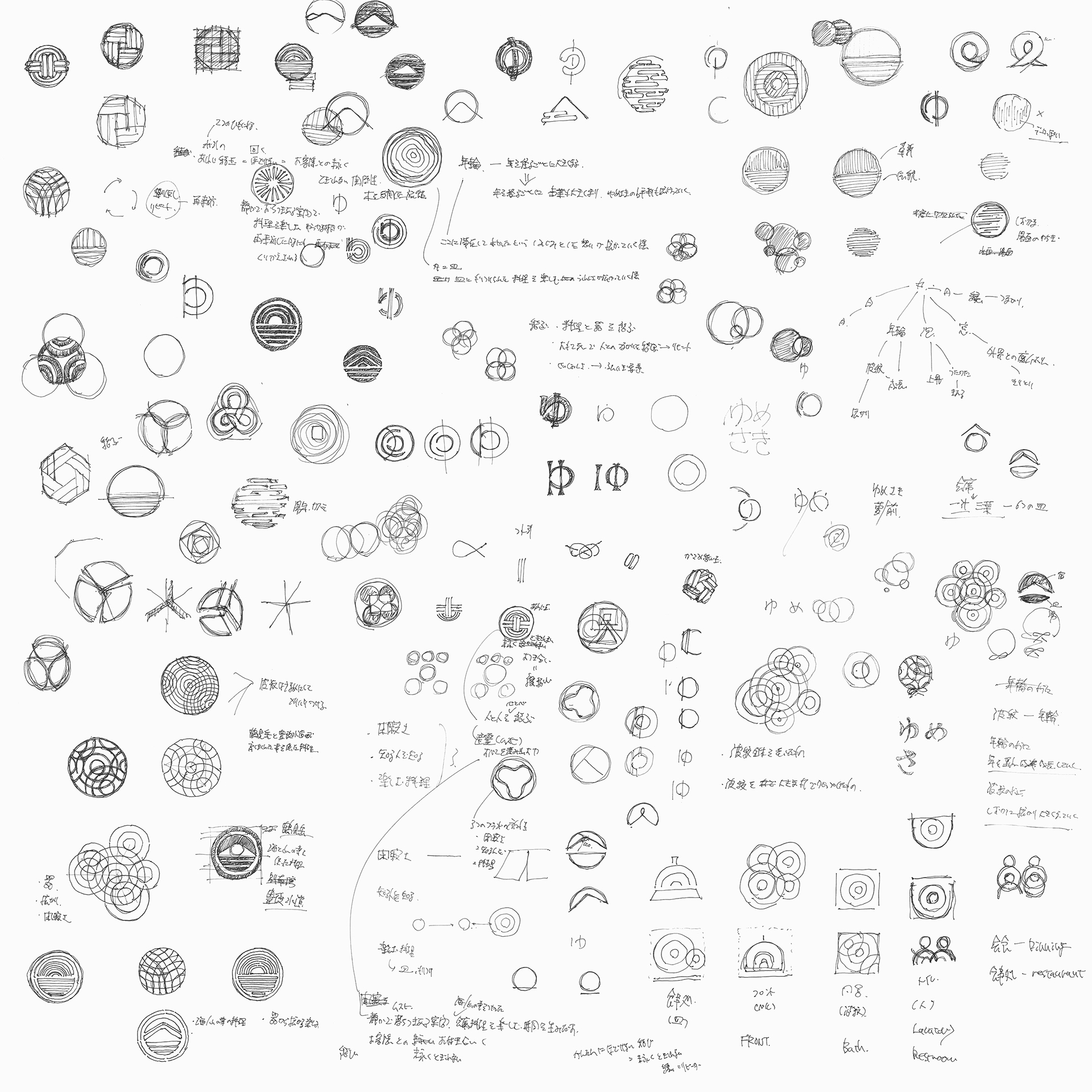
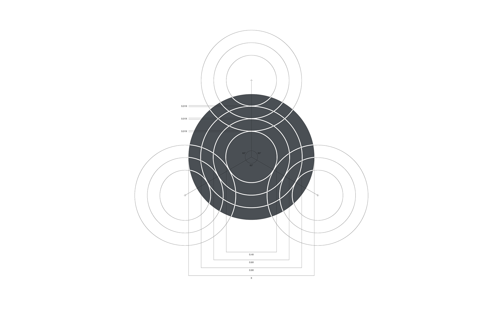
Based on the above, we focused on the keywords Tranquility, Expanse, and Vessel to construct the new brand symbol.
-
クライアントから提示されたゆめさきの新しいブランディング戦略は以下の通りである。
● 閑寂さ:
高級さや華やかさではなく、閑かでひっそりと落ち着いた、騒がしい俗世間から離れた空間。
● 知る人ぞ知る宿:
来ていただいたお客さまがリピーターとなり、つい知人に勧めたくなる宿。
● 楽しませる割烹料理:
現代ではなかなか触れる機会の少ない割烹料理を目にも美しい器や盛り付け方から楽しませる。
これらから「閑寂さ」「拡がり」「料理の器」というキーワードに注目。新しいブランドシンボルの構築を行った。
Solution
The metaphor of the new brand symbol is large and small ripples on the surface of calm and serene water or hot spring.
The metaphor of the new brand symbol is large and small ripples on the surface of calm and serene water or hot spring.
These ripples symbolize the following.
● Feel of happiness staying at Yumesaki spreading in the hearts of its guests.
● Reputation spreading from guests that visited Yumesaki.
● Vessels of various sizes. The way joy spreads in the hearts of the customers who enjoy the food served in those dishes.
● The new management style of the ryokan expands around Yumesaki. Growth of the business scale of Yumesaki.
● How various Oita crafts spread from the new gallery of Yumesaki.
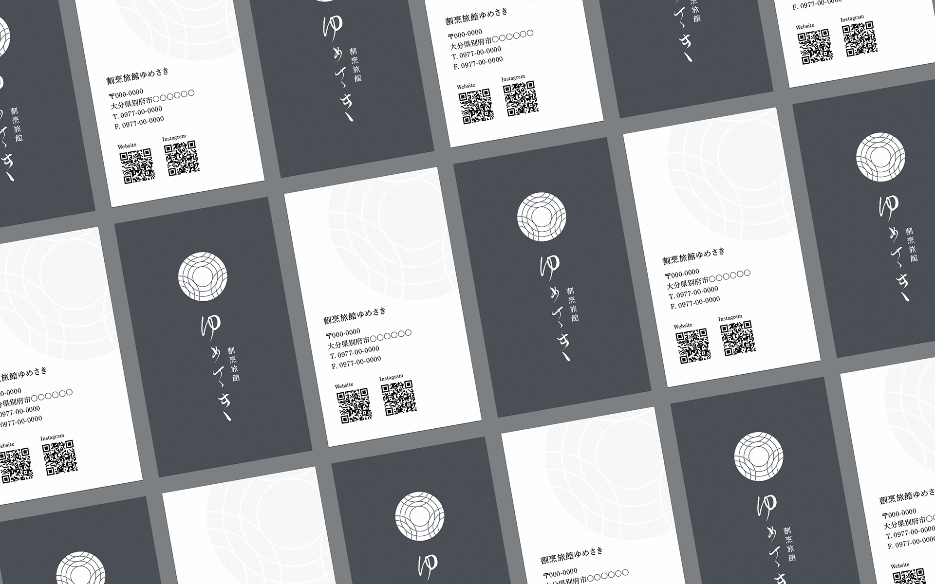
Also, the Japanese family crest was used as the visual motif of the brand symbol, intended to evoke the Yumesaki tradition and Japanese feel.
-
新しく構築したブランドシンボルは、静かで穏やかな水面や温泉の湯に拡がっていく大小の波紋をメタファーとした。
これら大小の波紋は、
● ゆめさきに滞在して良かったという想いがお客様の心の中に拡がっていく様。
● ゆめさきに訪れたお客様からその評判が拡がっていく様。
● さまざまな大きさの料理の器。その器に盛り付けられた料理を愉しむお客さまの心の中に嬉しさが拡がっていく様。
● ゆめさきを中心として拡がっていく新しい旅館経営スタイル。成長するゆめさきの事業規模。
● 新設されるゆめさきのギャラリーから様々な大分県内クラフトが発信され拡がっていく様。
を象徴している。また、ブランドシンボルの外観は日本の家紋をモチーフとし、ゆめさきの伝統と和の風情を感じさせることを意図した。
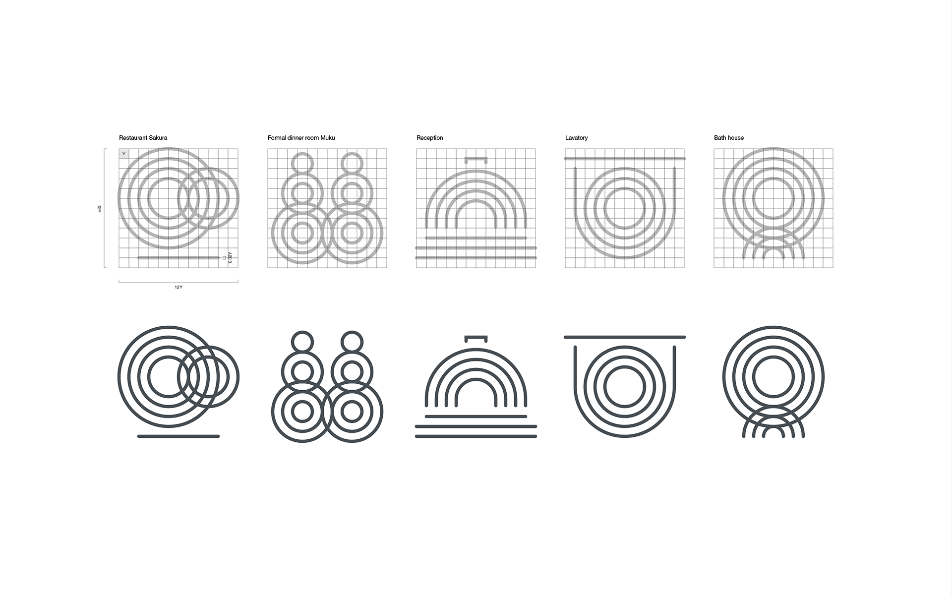
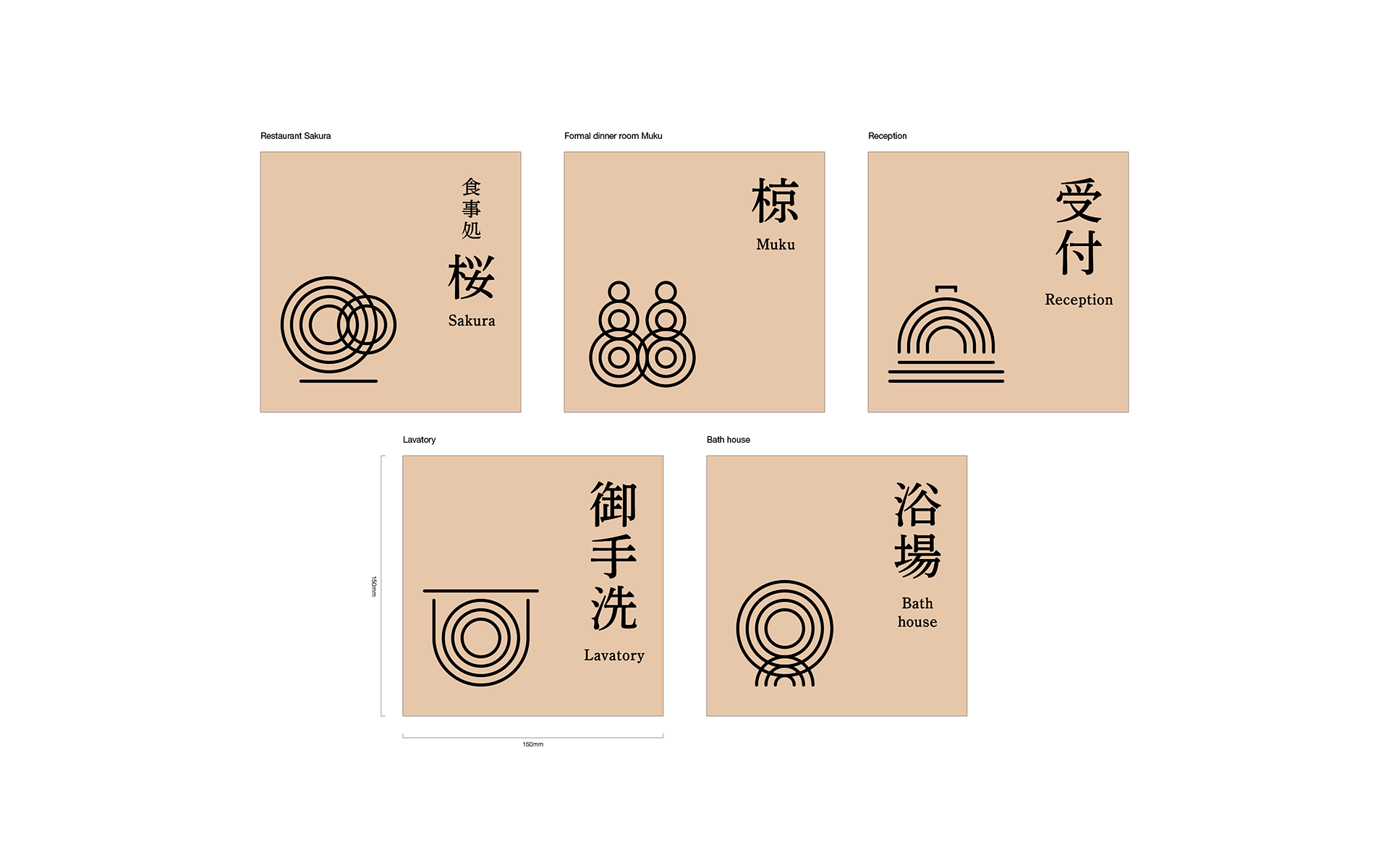
Also, concentric circles that construct the brand symbol, are used for various signs in the ryokan.
The motifs for each are as follows.
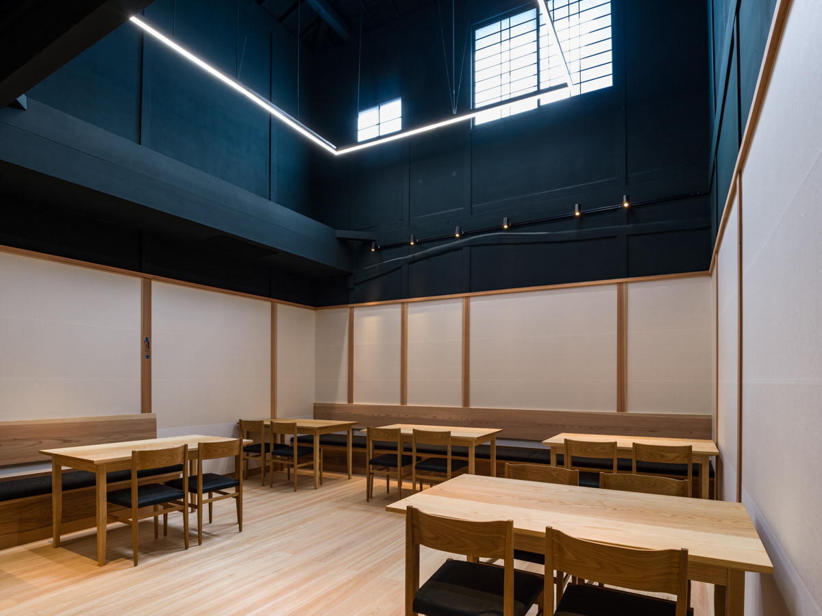
● Restaurant Sakura: Stacked vessels and chopsticks
● Banquet Hall Muku: Silhouettes of people dining / many vessels used at a dinner
● Reception: Doorbell
● Lavatory: Western-style toilet seat viewed from above
● Bathhouse: Ripples spreading on the hot spring water surface
-
ブランドシンボルを構成する同心円の波紋は、旅館内の各種サインでも用いている。
-
ブランドシンボルを構成する同心円の波紋は、旅館内の各種サインでも用いている。
それぞれのモチーフは以下となる。
● 食事処「桜」: 重ねられた器と箸
● 宴会場「椋」: 会食する人々のシルエット/使用される多くの器
● 受付: 呼び鈴
● 御手洗: 上から見た洋式便座
● 浴場: 湯船に拡がる波紋


Result
In October 2020, Yumesaki reopened. The number of guests has steadily grown since then.
-
2020年10月に割烹旅館ゆめさきはリニューアルオープン。現在も順調に客足を伸ばしている。
In October 2020, Yumesaki reopened. The number of guests has steadily grown since then.
-
2020年10月に割烹旅館ゆめさきはリニューアルオープン。現在も順調に客足を伸ばしている。
Client: GENKAI Capital Management Co., Ltd.
Supervision: Yusuke Mawatari (team Lab kids)
Supervision: Yusuke Mawatari (team Lab kids)
Architect: Fumihiko Sano (Fumihiko Sano Studio)
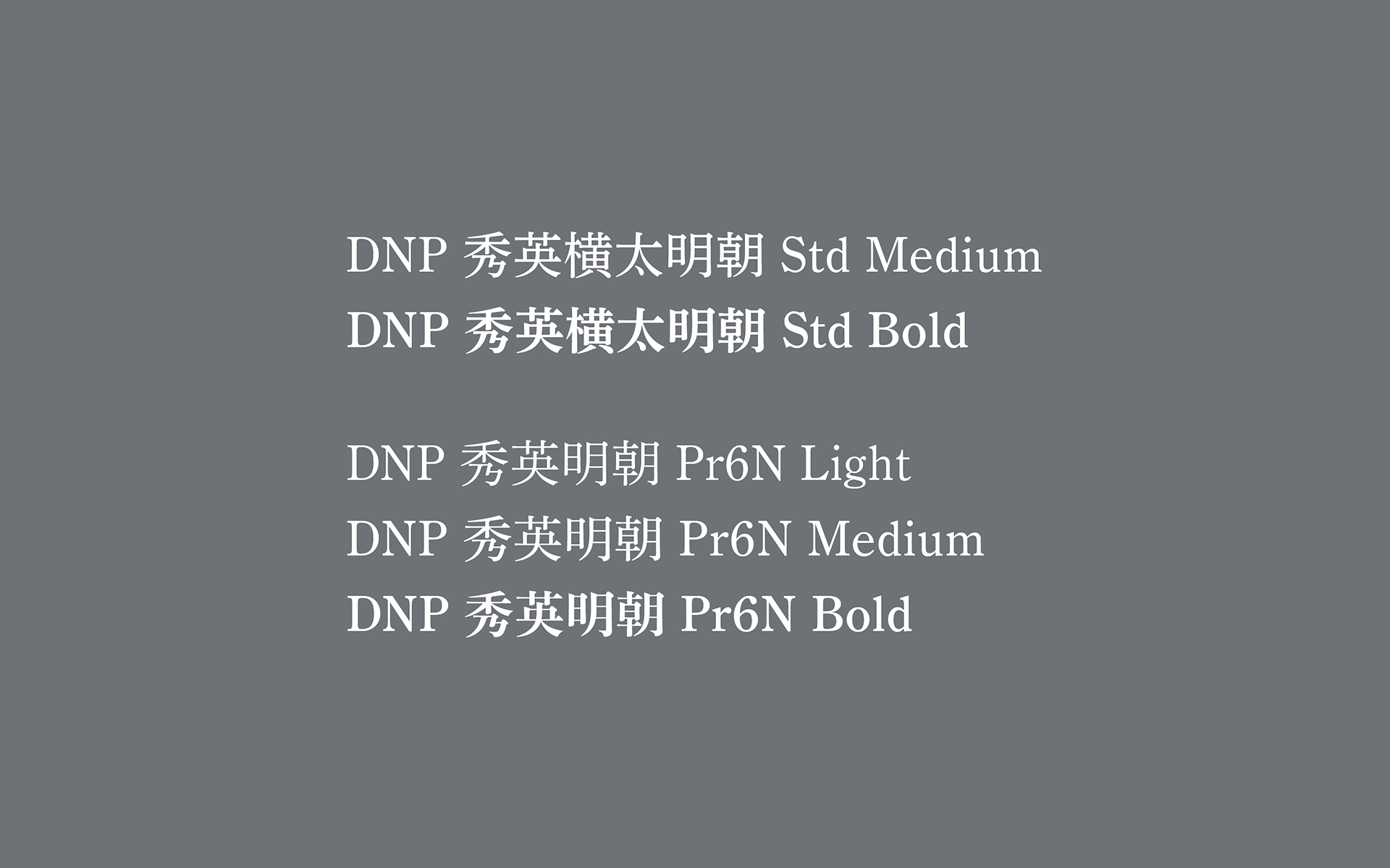
Logo concept & graphic design: Hiromi Maeo (enhanced Inc.)
Logo concept & graphic design: Hiromi Maeo (enhanced Inc.)
2020 Oita, Japan