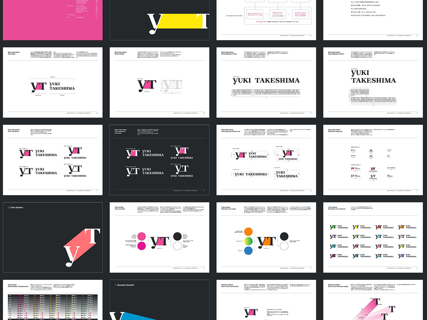
CMED Construction
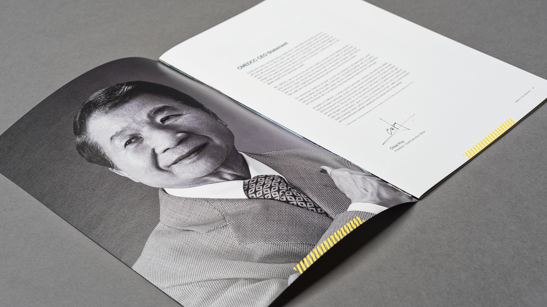
CMED Construction (below CMEDCC) is a new construction company established in 2015 in Phnom Penh, Cambodia, where economic growth is significant. The company is part of CMED Group, a well-known company in Cambodia that has numerous group companies including a joint venture with a company in Japan.
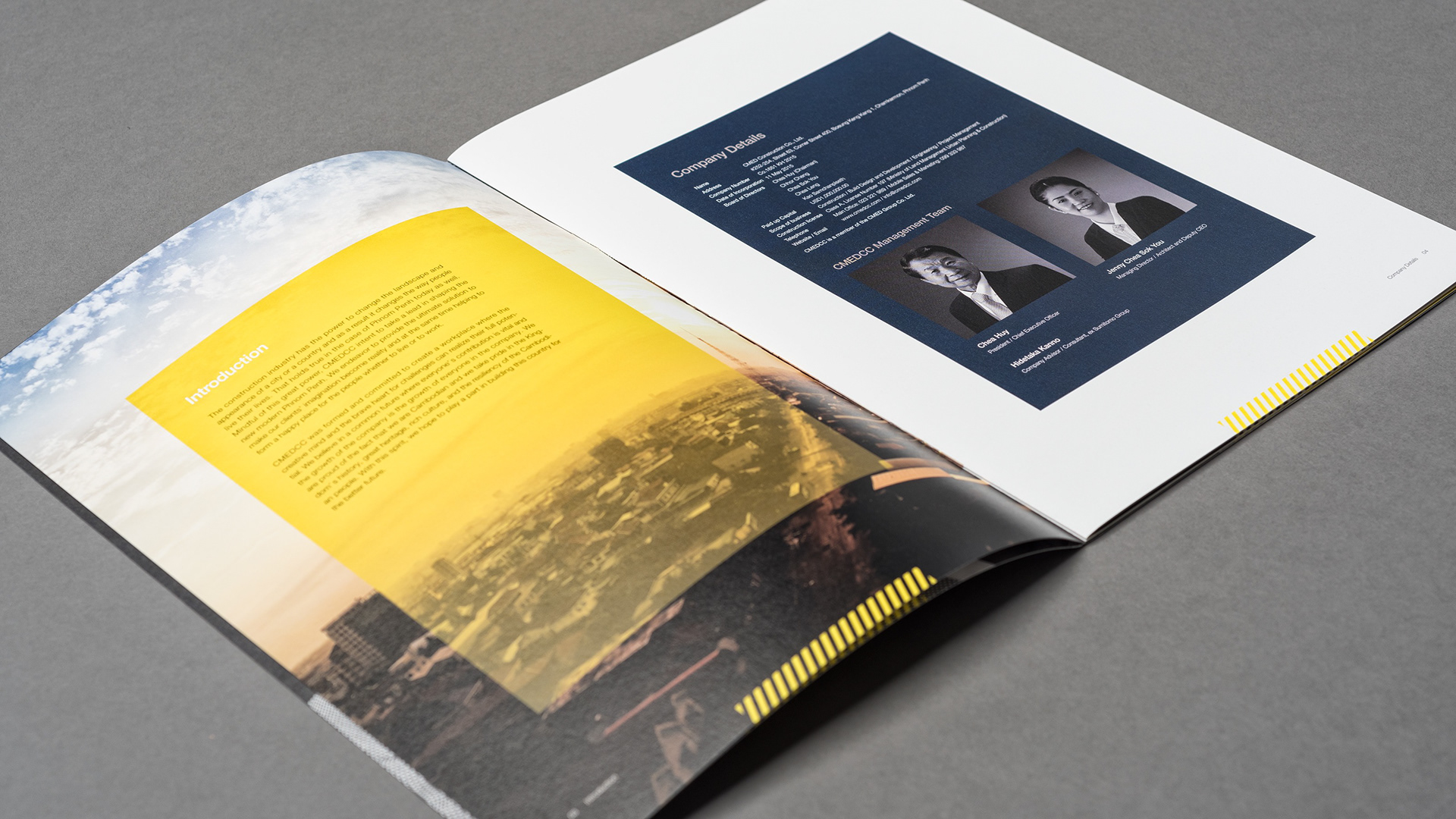
In Phnom Penh, the Cambodian capital, 7% of yearly economic growth is expected until 2020 with an ongoing large-scale construction rush due to the rapid development. While in such a trend, under their delicate design solutions and strict architectural / design policy, CMEDCC is providing high architectural / design quality in a fast, accurate, and safe manner just like Japan. By doing so, CMEDCC is in a continuance of expanding its business scale to become a benchmark of the domestic construction industry.
In Phnom Penh, the Cambodian capital, 7% of yearly economic growth is expected until 2020 with an ongoing large-scale construction rush due to the rapid development. While in such a trend, under their delicate design solutions and strict architectural / design policy, CMEDCC is providing high architectural / design quality in a fast, accurate, and safe manner just like Japan. By doing so, CMEDCC is in a continuance of expanding its business scale to become a benchmark of the domestic construction industry.
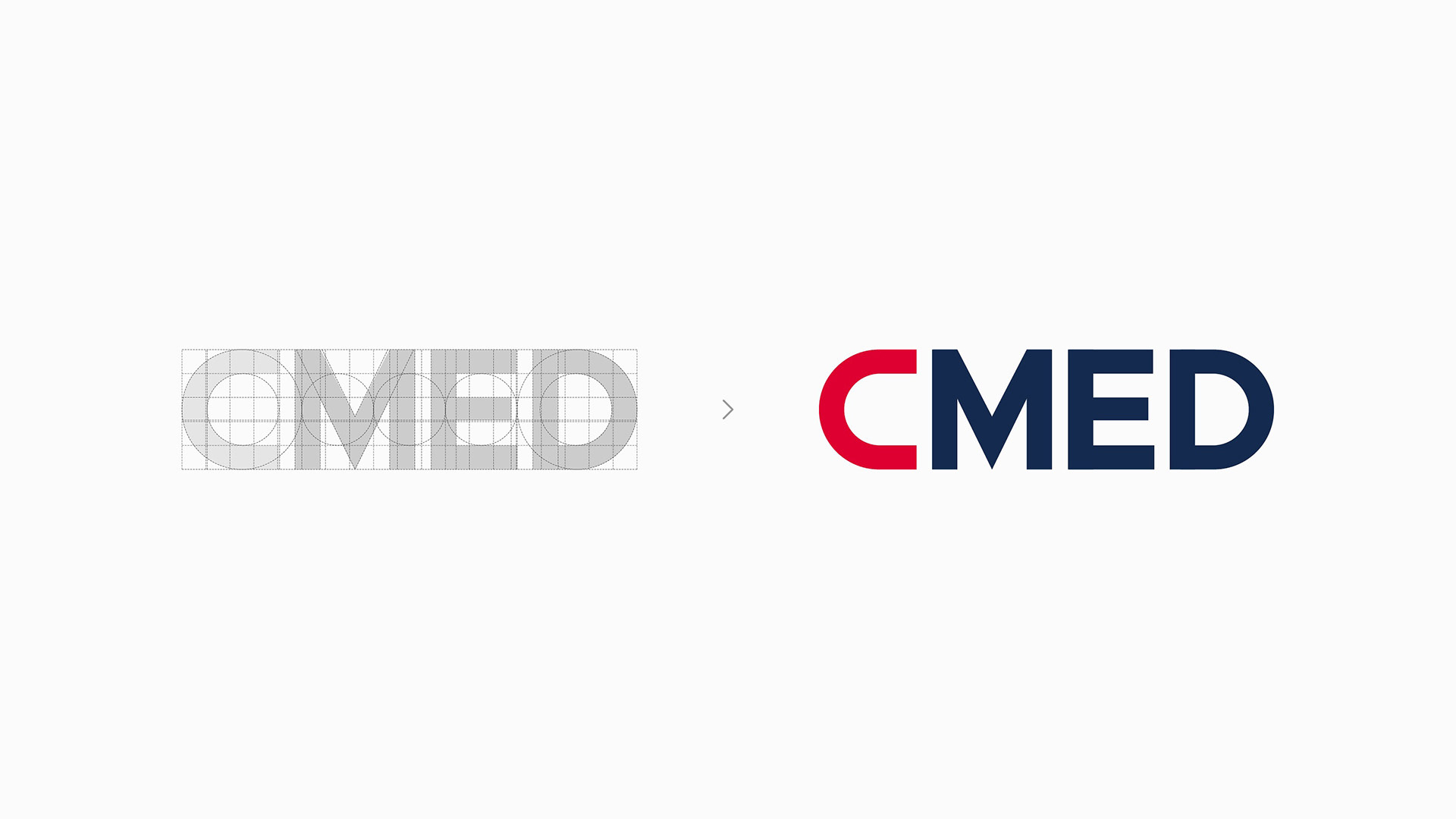
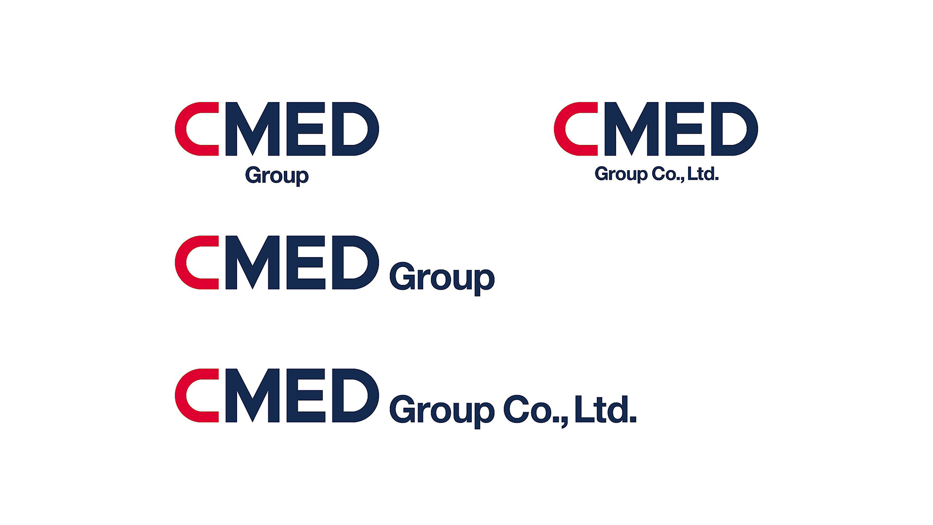
We enhanced Inc. had worked on the full renewal of the visual identity of CMEDCC and CMED Group since mid-April of 2016.
日本企業との合弁会社を含めて多数のグループ企業を有するカンボジアの著名企業CMED Groupを母体とするCMED Construction (以下CMEDCC)は、経済発展が著しいカンボジア・プノンペンにおいて2015年に設立された新しい建設会社である。カンボジアの首都プノンペンでは、2020年まで年7%の経済成長が予想されており、急速な発展に伴う大規模な建築ラッシュが続いている。こうした中でCMEDCCは、細やかな設計ソリューションと厳格な建築/デザインポリシーのもと、高速・正確・安全に日本同様の高い建築/デザイン品質を提供し、国内建設業界のベンチマークとなるべく事業規模を拡大し続けている。
私たちenhanced Inc.は、2016年4月半ばからこのCMEDCCおよびCMED Groupのビジュアル・アイデンティティのフルリニューアルに携わっている。
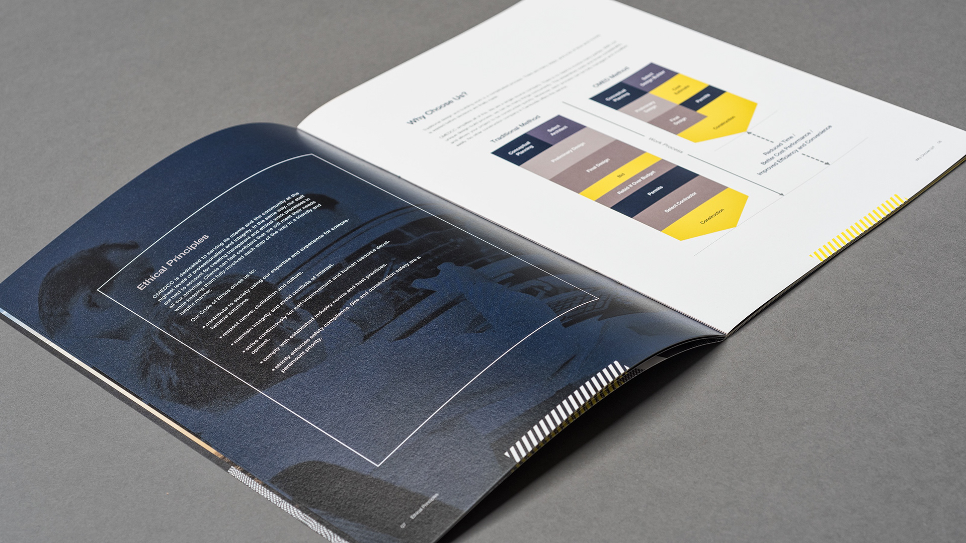
Our Challenge
Our challenge in this project was to execute the production process across a multi number of countries.
Design, direction, project management, printing, and printing quality management were done in Japan (part of product printing in China) while cooperating with a copywriter in England and a photographer in Cambodia.
Design, direction, project management, printing, and printing quality management were done in Japan (part of product printing in China) while cooperating with a copywriter in England and a photographer in Cambodia.
今回、私たちは自身のチャレンジとして多国間にまたがる生産プロセスを行った。デザインおよびディレクション、プロジェクトマネージメント、印刷と印刷品質管理は日本で行い(一部プロダクトの印刷は中国)、イギリス在住のコピーライターおよびカンボジア在住のカメラマンとも連携した。
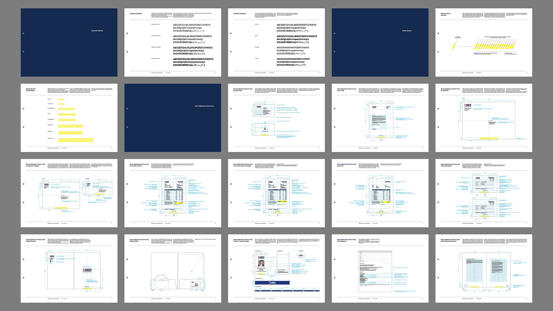
Design Element
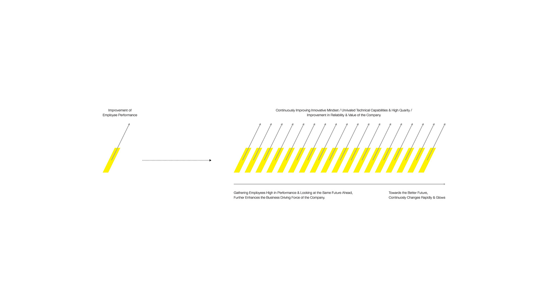
CMED Design Element configured by continuous diagonal lines is the element commonly applied to each business unit of CMED Group service sectors.
Design Element inclined to the right symbolizes the continuously improving innovative mindset / unrivaled technical capabilities and high quality/improvements in the reliability and value of the company.
Each diagonal represents improving performance and the demonstrated potential of individual CMED employees. Moreover, because they gather, the performance and potential of CMED Construction as a whole improve.
Having employees gather looking at the same future ahead enhances the business driving force of the company, enables to rapidly change continuously and grow towards a better future.
In this way, companies surviving for long is lead to contribute to future Cambodia’s economic development and environmental protection.
連続する斜線で構成されたCMEDデザインエレメントは、CMEDグループにおけるサービス部門の各ビジネスユニットに共通して適用される要素である。
右に傾斜したデザインエレメントは、向上し続けるイノベーティブなマインド / 他の追随を許さない技術力と品質の高さ / 企業の信頼性と価値の向上を象徴している。
ひとつひとつの斜線は、個々のCMEDCC社員のパフォーマンスが向上し、ポテンシャルが引き出されている様を表す。
そして、彼らが集まるからこそCMEDCC全体としてのパフォーマンスとポテンシャルも向上する。
同じ未来を見据える社員が集うことで、企業の事業推進力もさらに高まり、より良い未来に向けて素早く変化し続けながら発展することが叶う。
こうして企業が長期にわたり存続していくことが、これからのカンボジアの経済発展や環境保全に寄与することに繋がっていく。
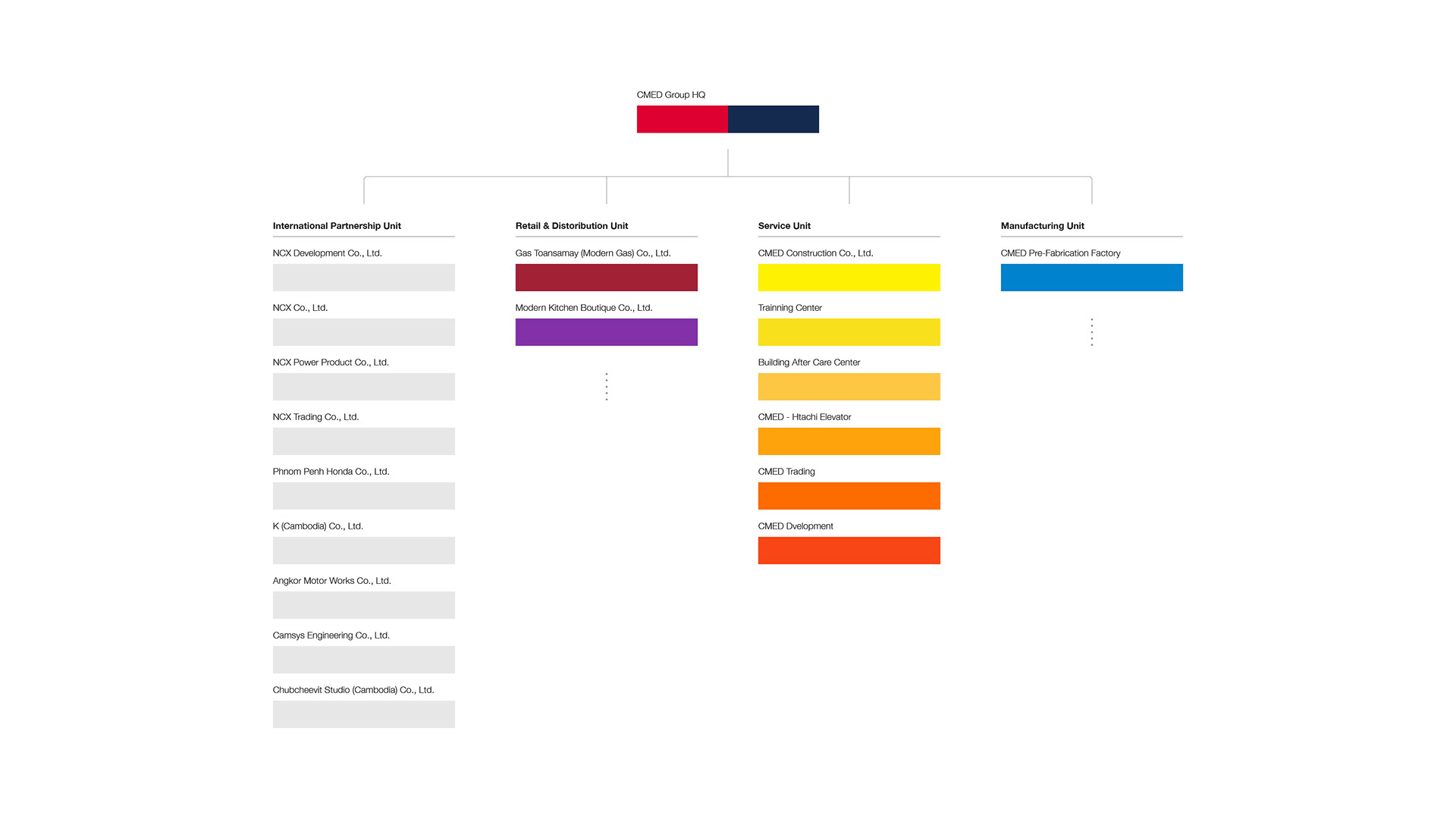
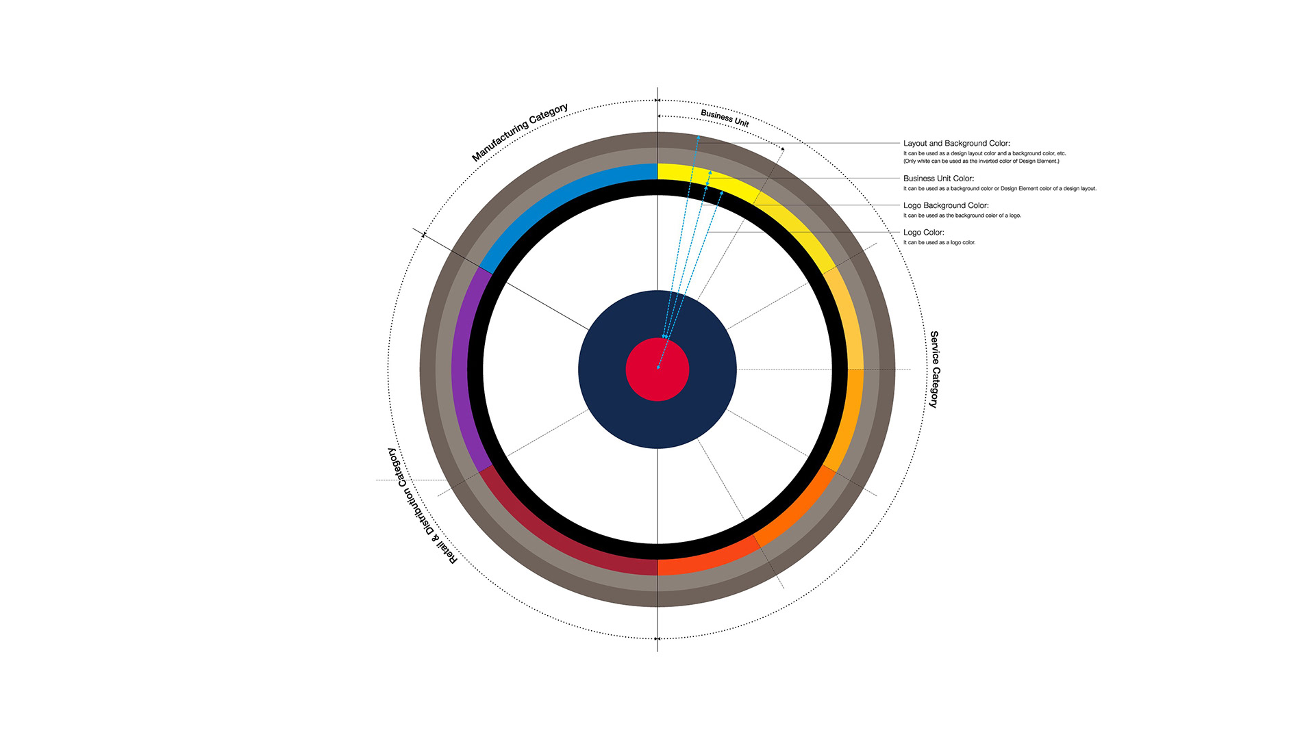
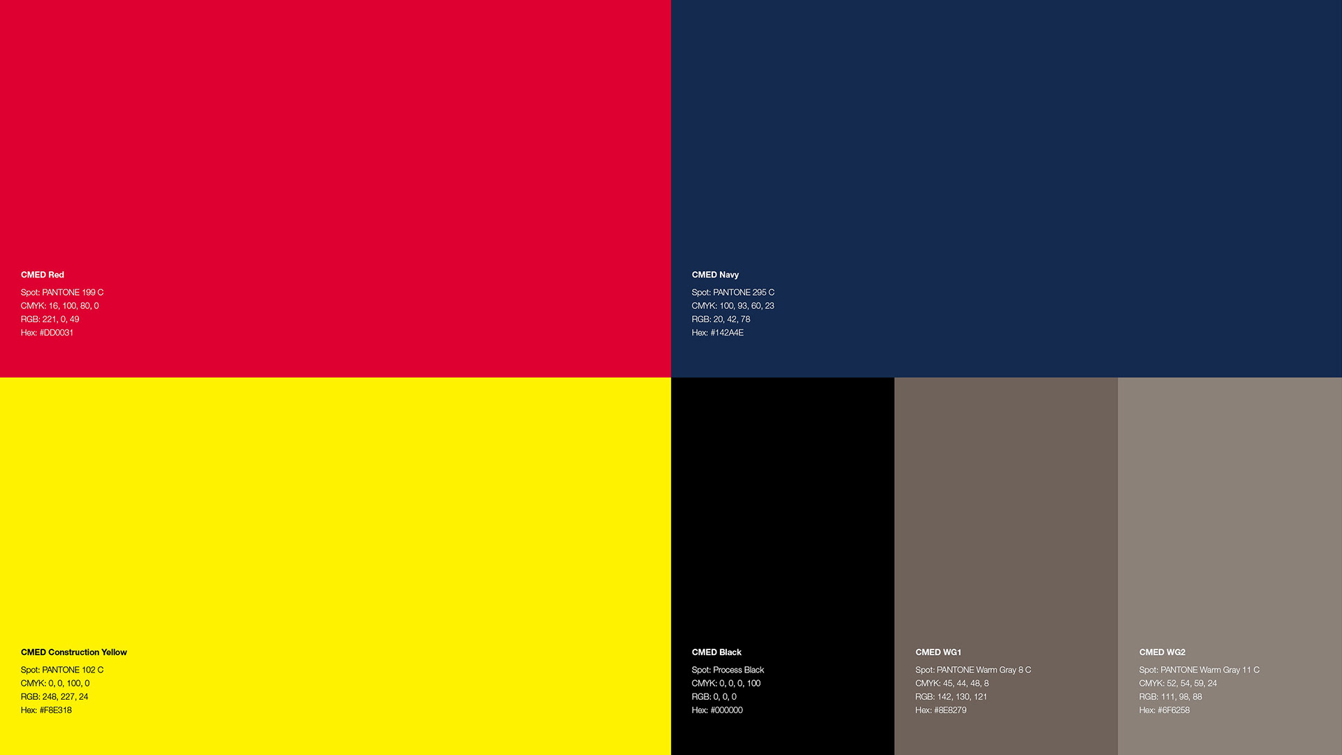
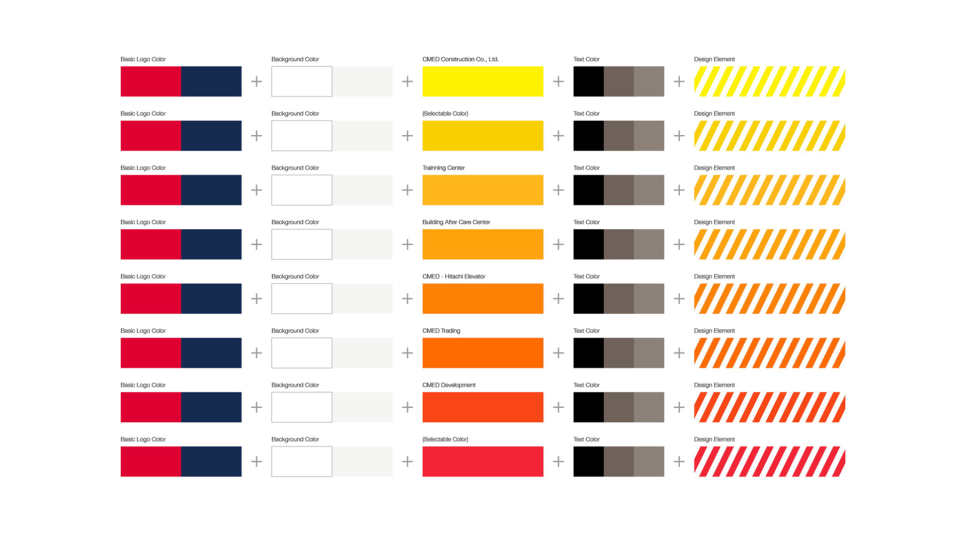
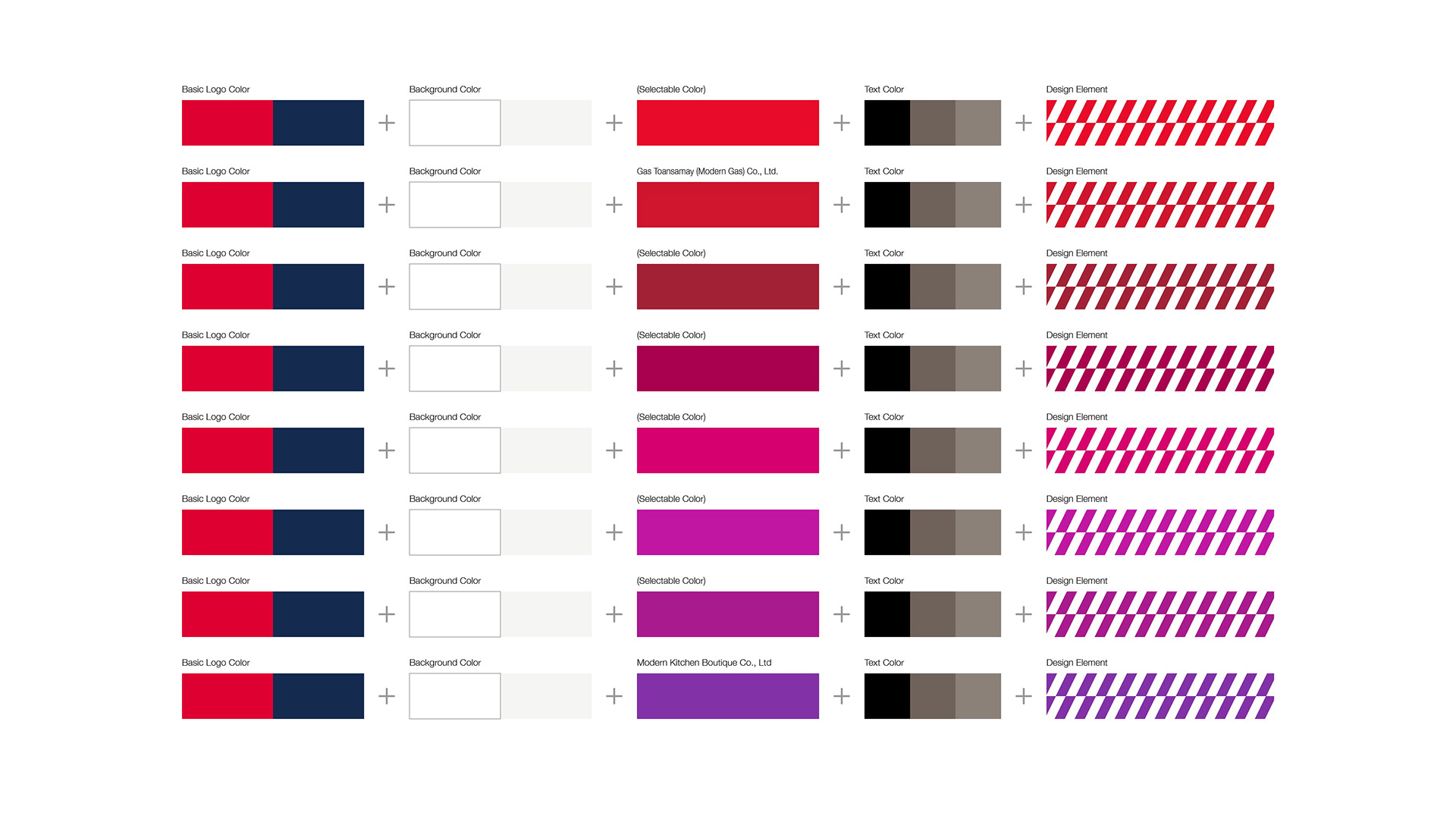
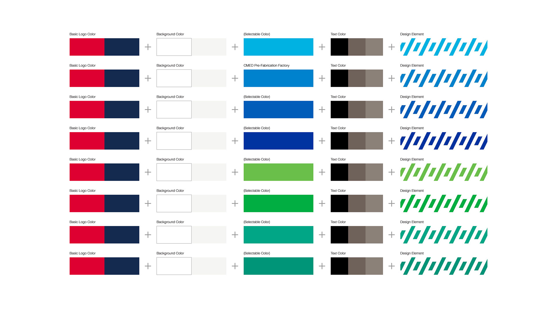
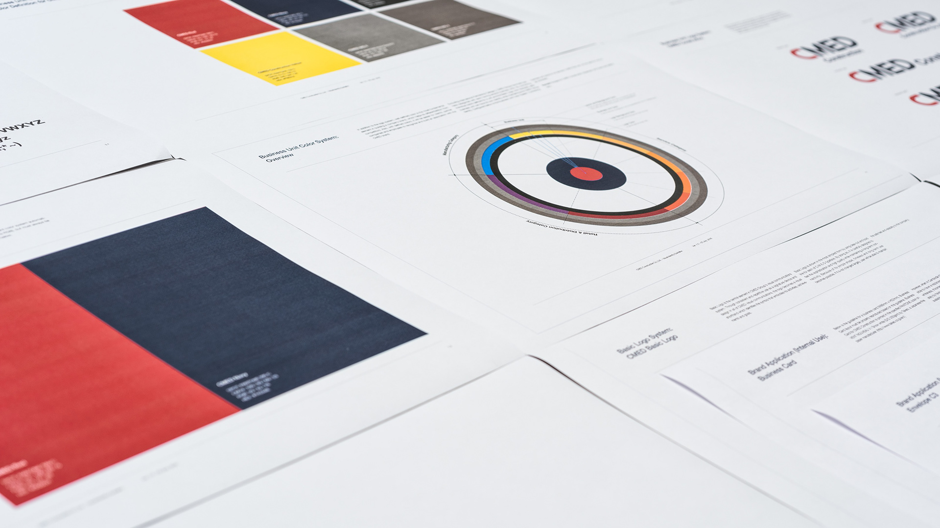
Business Unit Color System
CMED Group which CMEDCC belongs to, excluding the International Partnership Unit, has three business units with each having several companies.
For each company, we assigned a certain color combined with the color standard of the Basic Logo. By doing so, we were able to create a Business Unit Color System that provides a unique identity to each company while keeping the CMED Group identity as a whole.
For each company, we assigned a certain color combined with the color standard of the Basic Logo. By doing so, we were able to create a Business Unit Color System that provides a unique identity to each company while keeping the CMED Group identity as a whole.
CMEDCCが属するCMED Groupは, International Partnership Unitを除いて3つのビジネスユニットを保有しており, その下層にはそれぞれいくつかの企業が存在する.
今回私たちはその企業ごとに色を割り当てBasic Logoのカラースタンダードと組み合わせることで, CMED Group全体のアイデンティティを保持したまま各企業ごとに独自のアイデンティティを付与するBusiness Unit Color Systemを作成した. 割り当てられた色は、各企業のキーカラーとしてデザインエレメント等に使用される.
今回私たちはその企業ごとに色を割り当てBasic Logoのカラースタンダードと組み合わせることで, CMED Group全体のアイデンティティを保持したまま各企業ごとに独自のアイデンティティを付与するBusiness Unit Color Systemを作成した. 割り当てられた色は、各企業のキーカラーとしてデザインエレメント等に使用される.
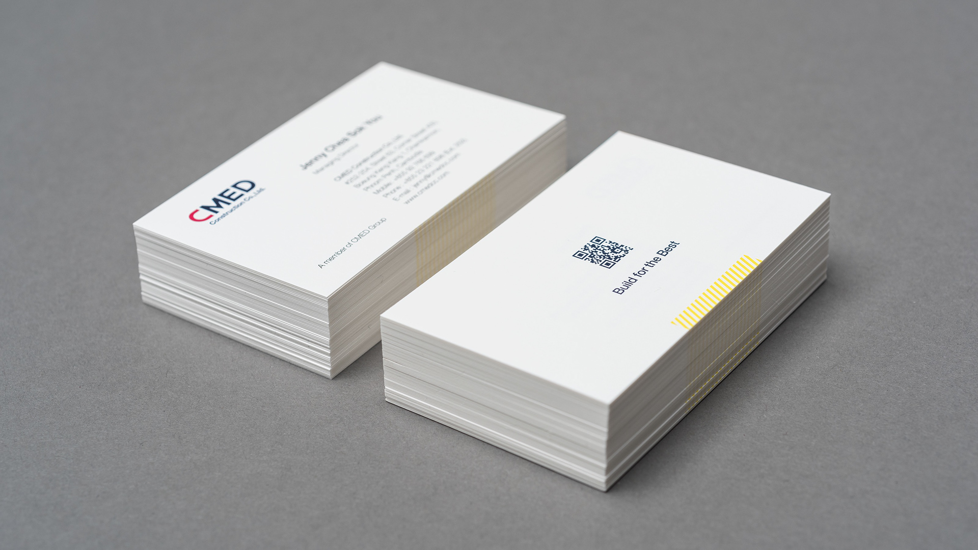
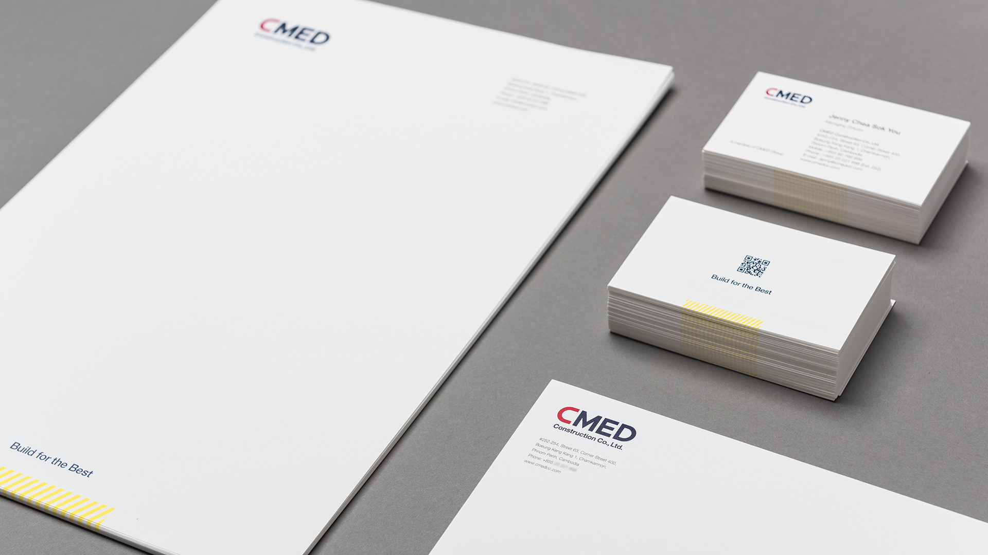
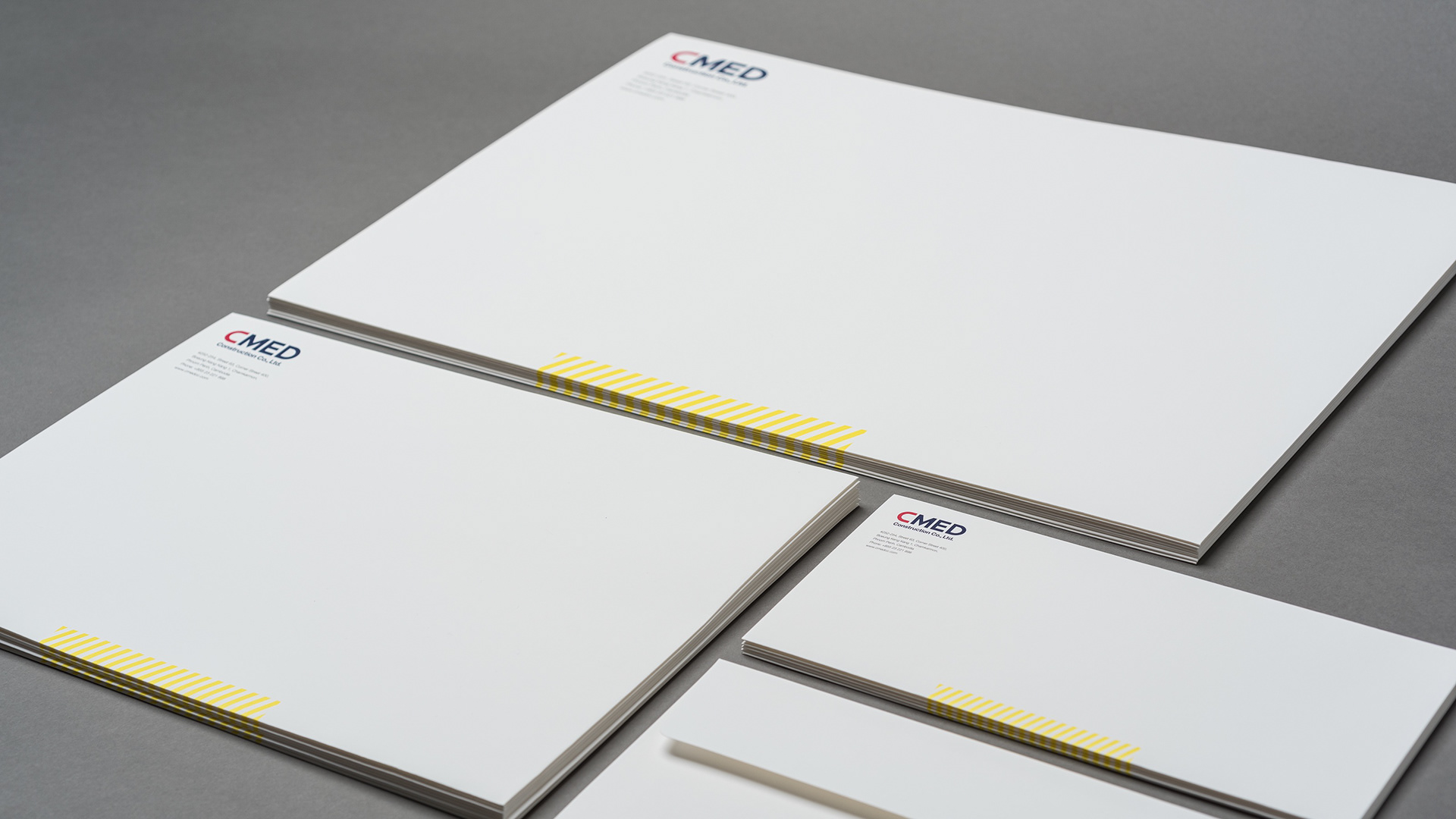
Printing
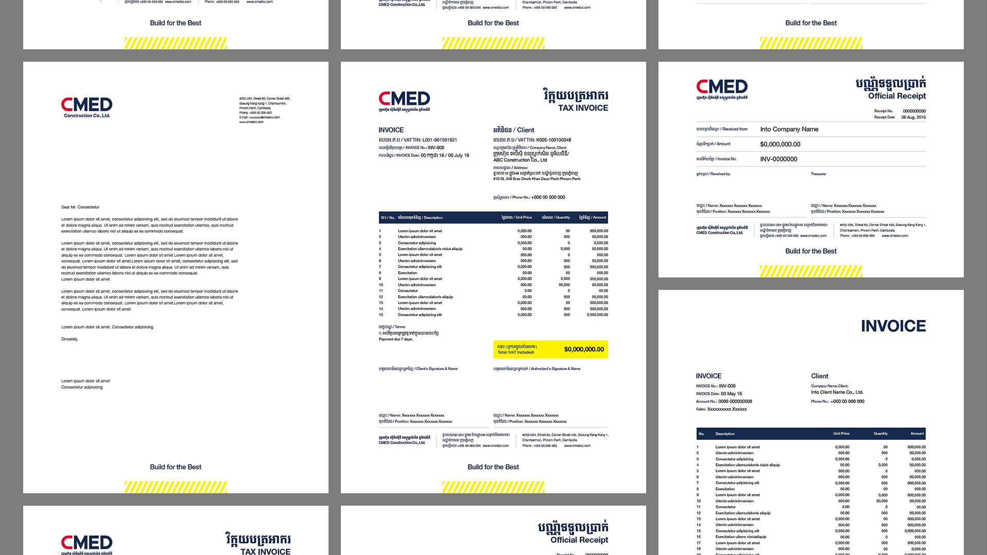
All the paper materials in printing were from Takeo, the fine paper manufacture of Japan. We selected the VENT NOUVEAU V / Snow white from their superior line-up. By using the FSC certified paper, we took into account of environmental protection, one of CMEDCC philosophies. Also, the use of high-quality paper and high printing techniques from Japan is intended to express the high quality of architecture done by CMEDCC.
印刷物に使用したすべての用紙は、日本のファインペーパーメーカー・竹尾の最高級紙VENT NOUVEAU V / Snow whiteを使用した。このFSC認証紙を用いることでCMEDCCのフィロソフィーのひとつである環境保全にも配慮した。また、日本の高品質な用紙と高い印刷技術を用いることで、CMEDCCの手掛ける建築物が高品質であることを意図させている。
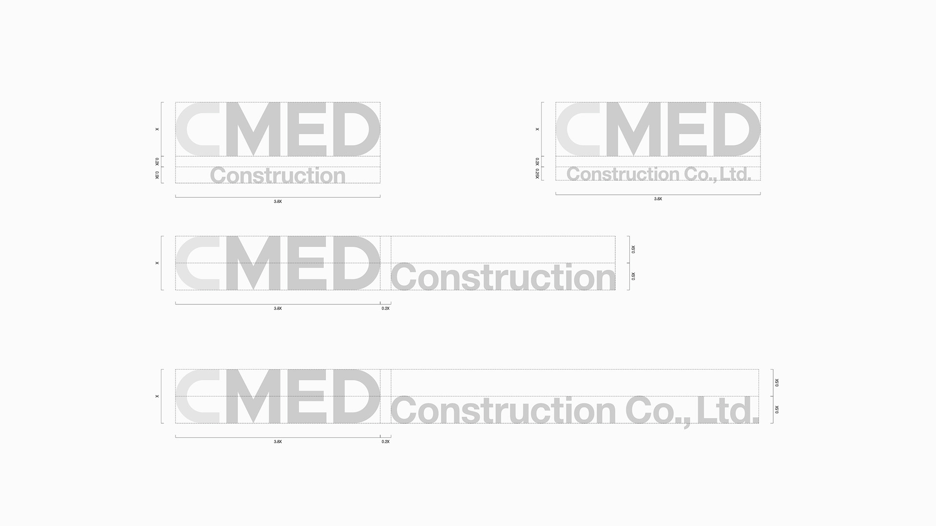
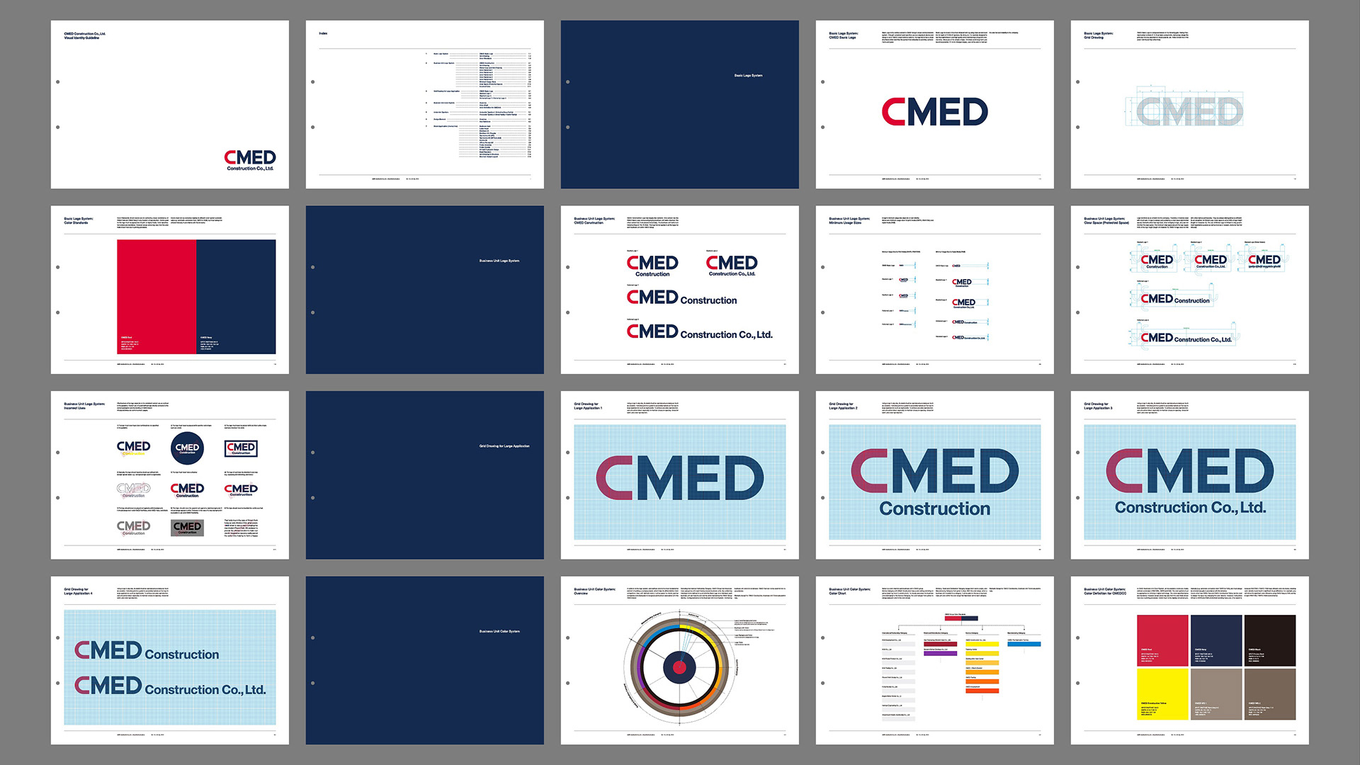
Guidelines
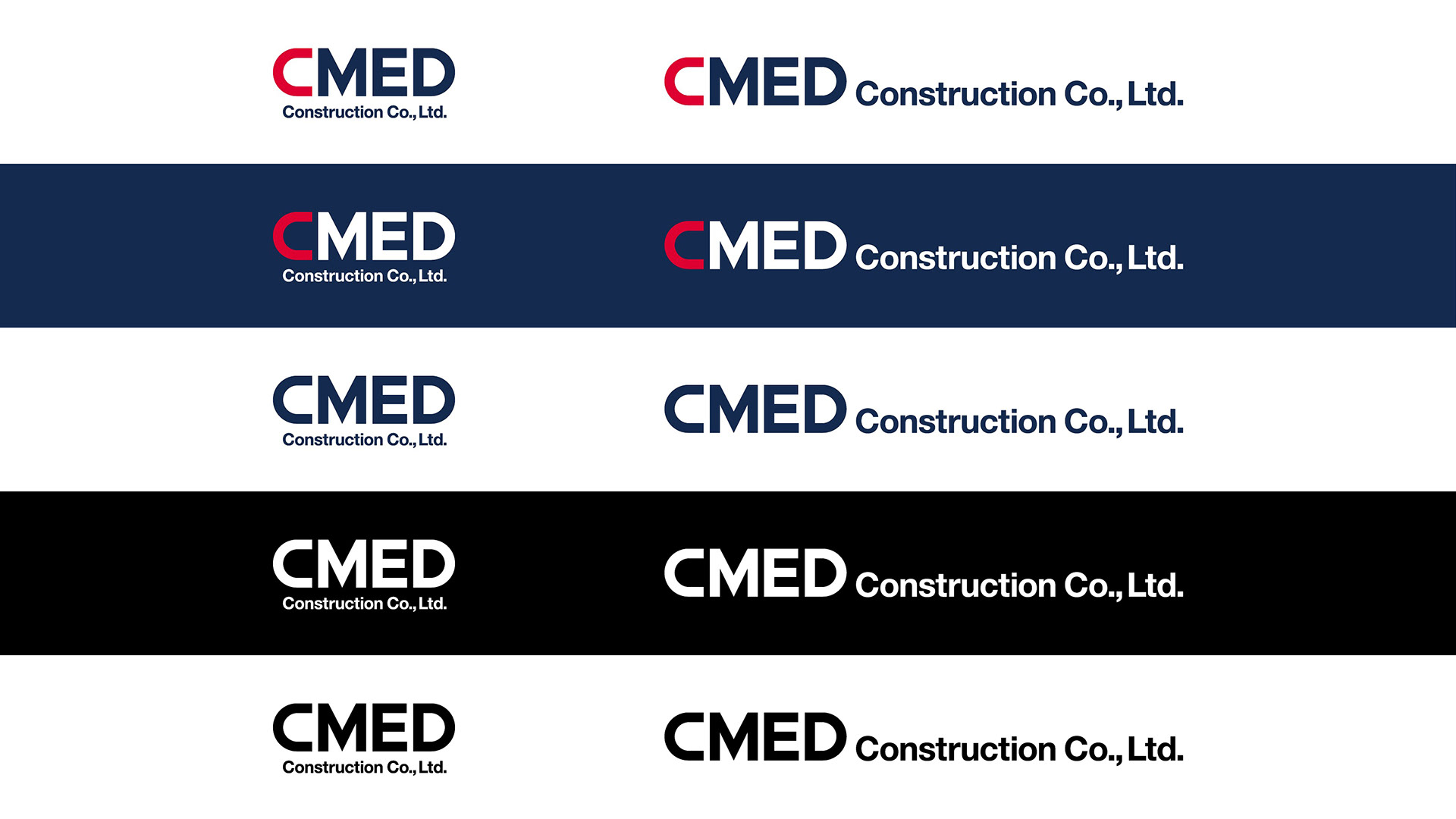
To ensure the proper and long use of the identity and various applications created for CMEDCC, we created the guideline with details.
今回CMEDCCのために作成したアイデンティティおよび様々なアプリケーションは、今後も正しく使用され続ける必要がある。そのため詳細なガイドラインも策定した。
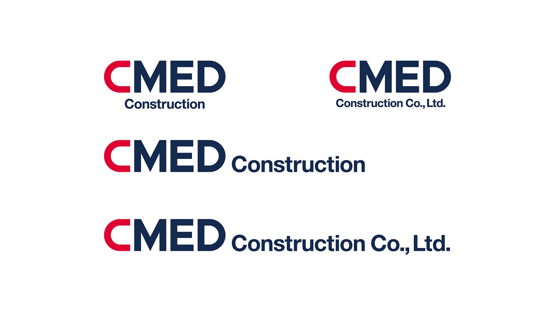
Client: CMED Construction Co., Ltd.
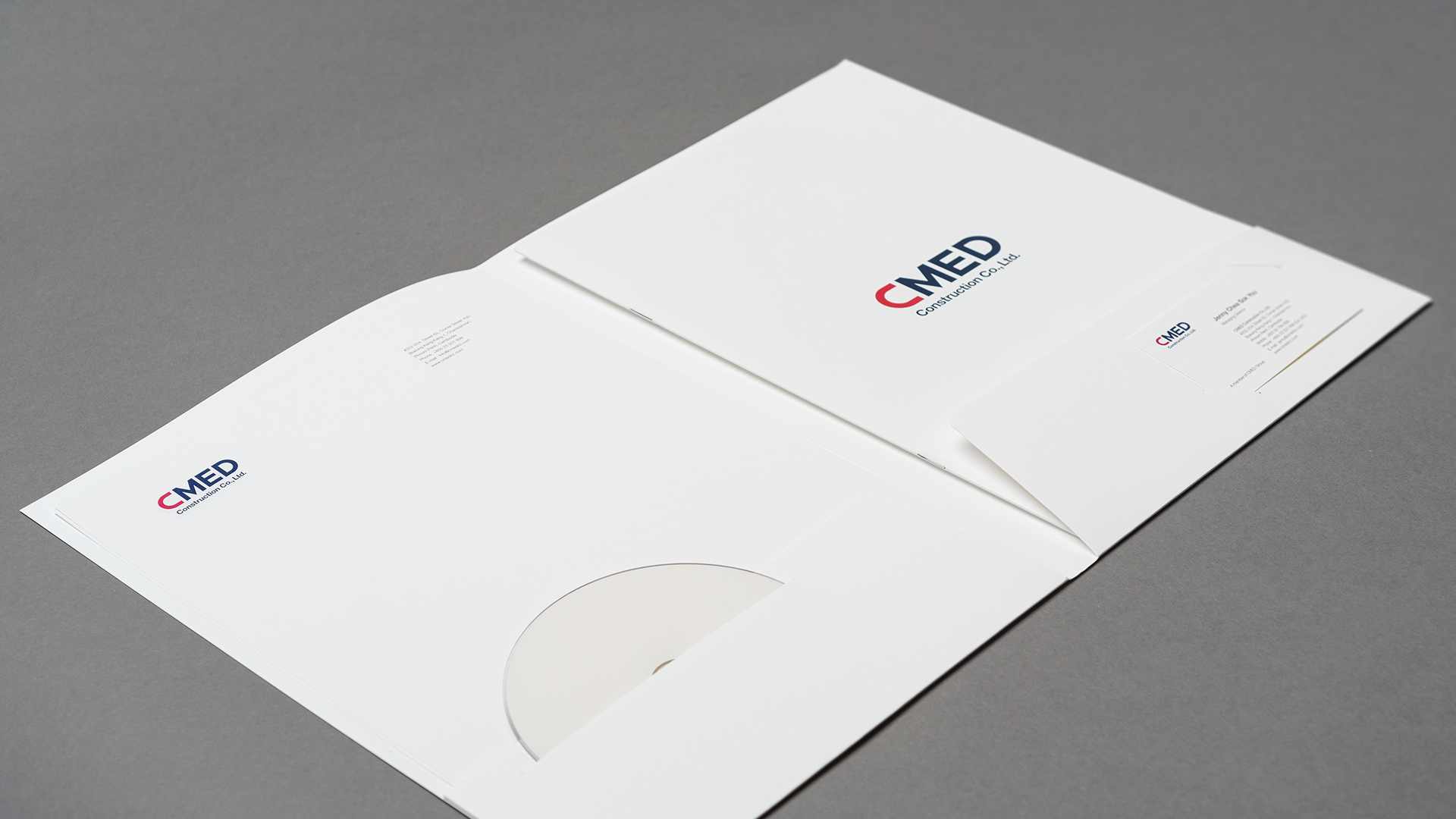
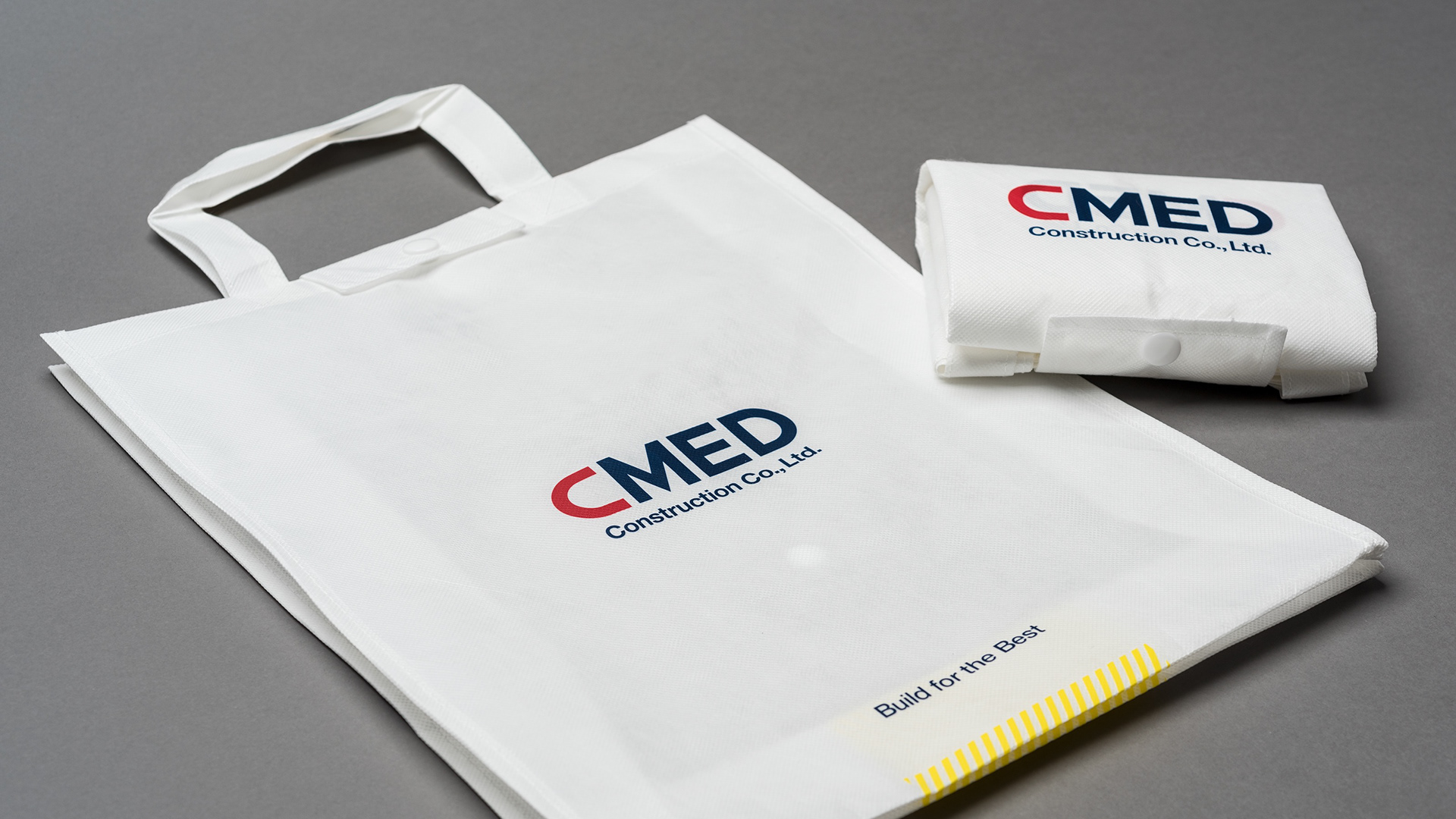
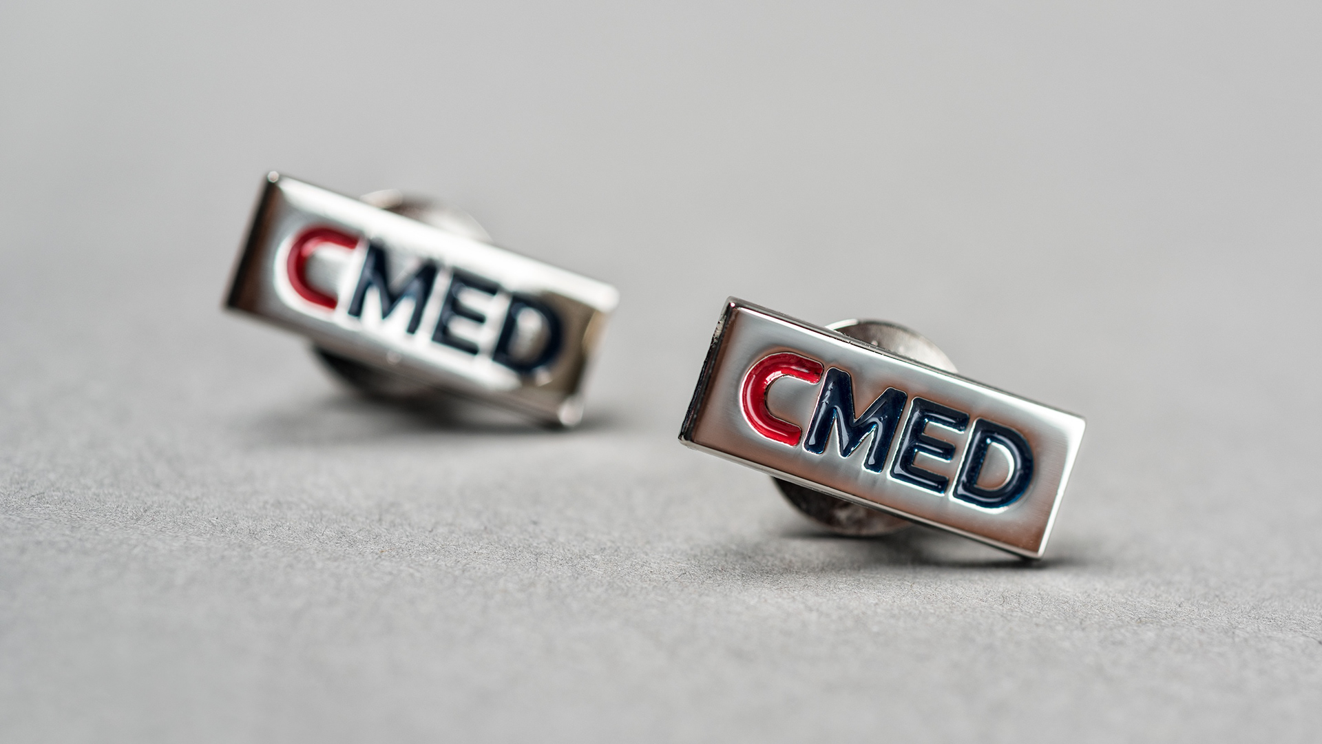
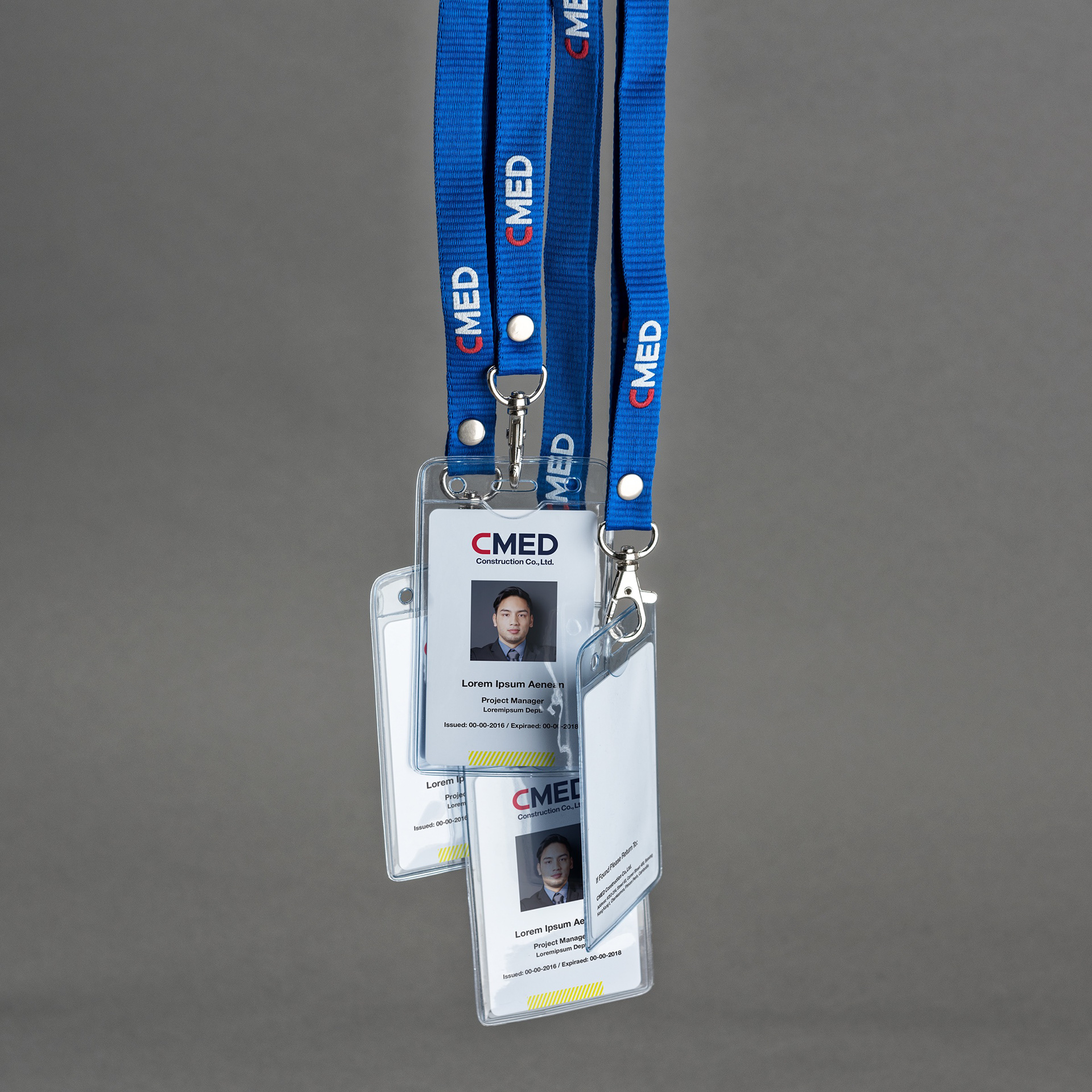
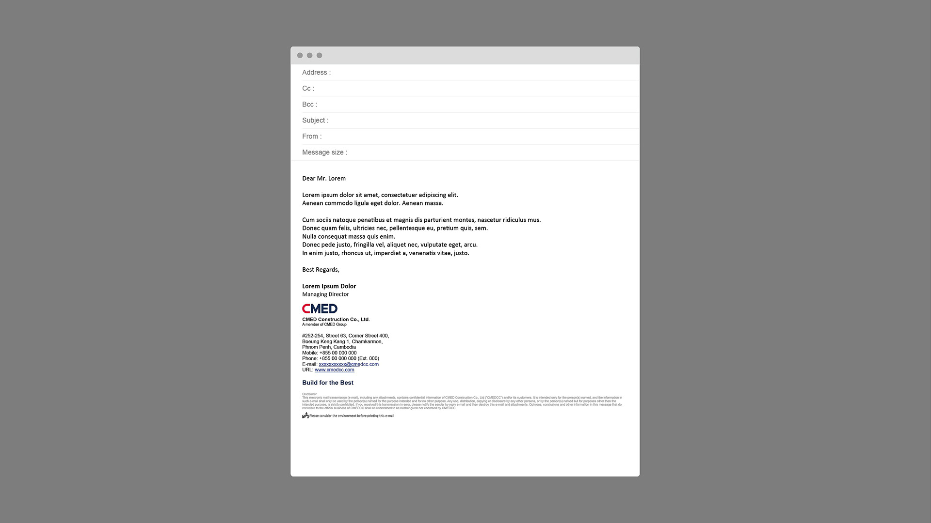
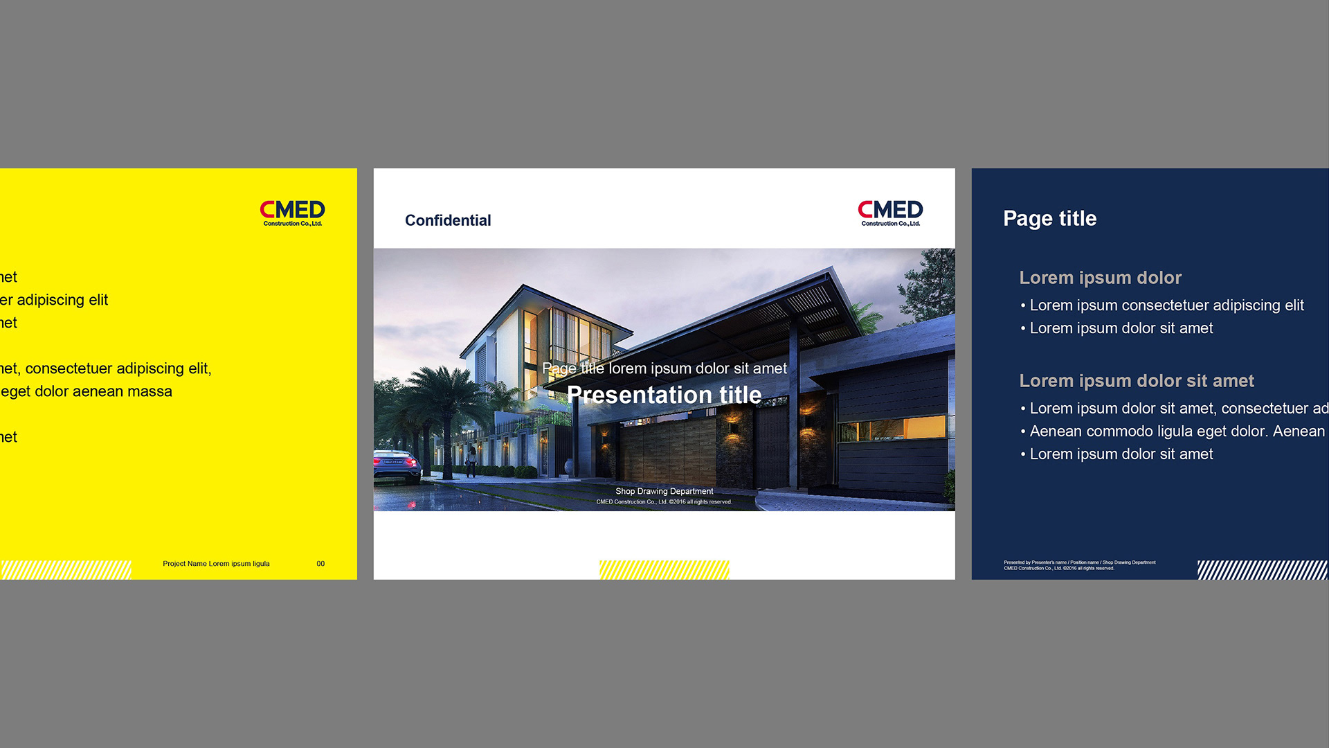
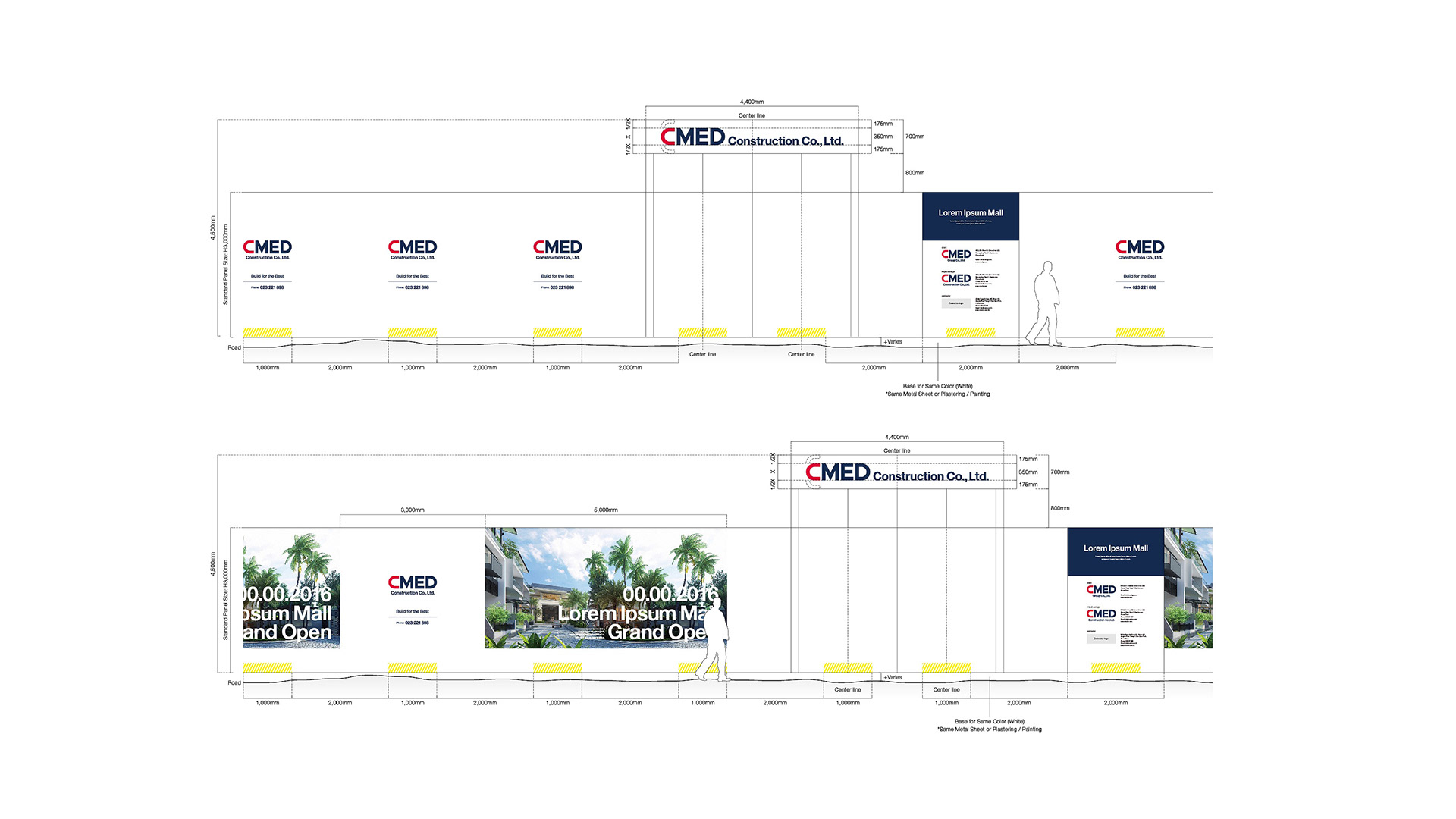
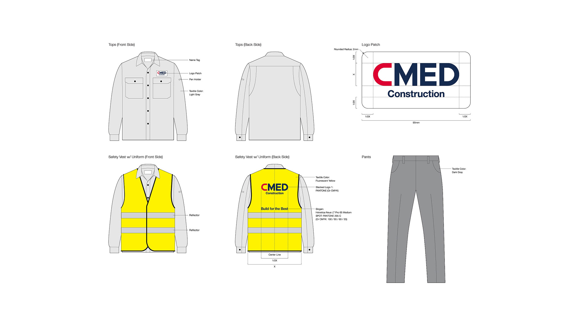
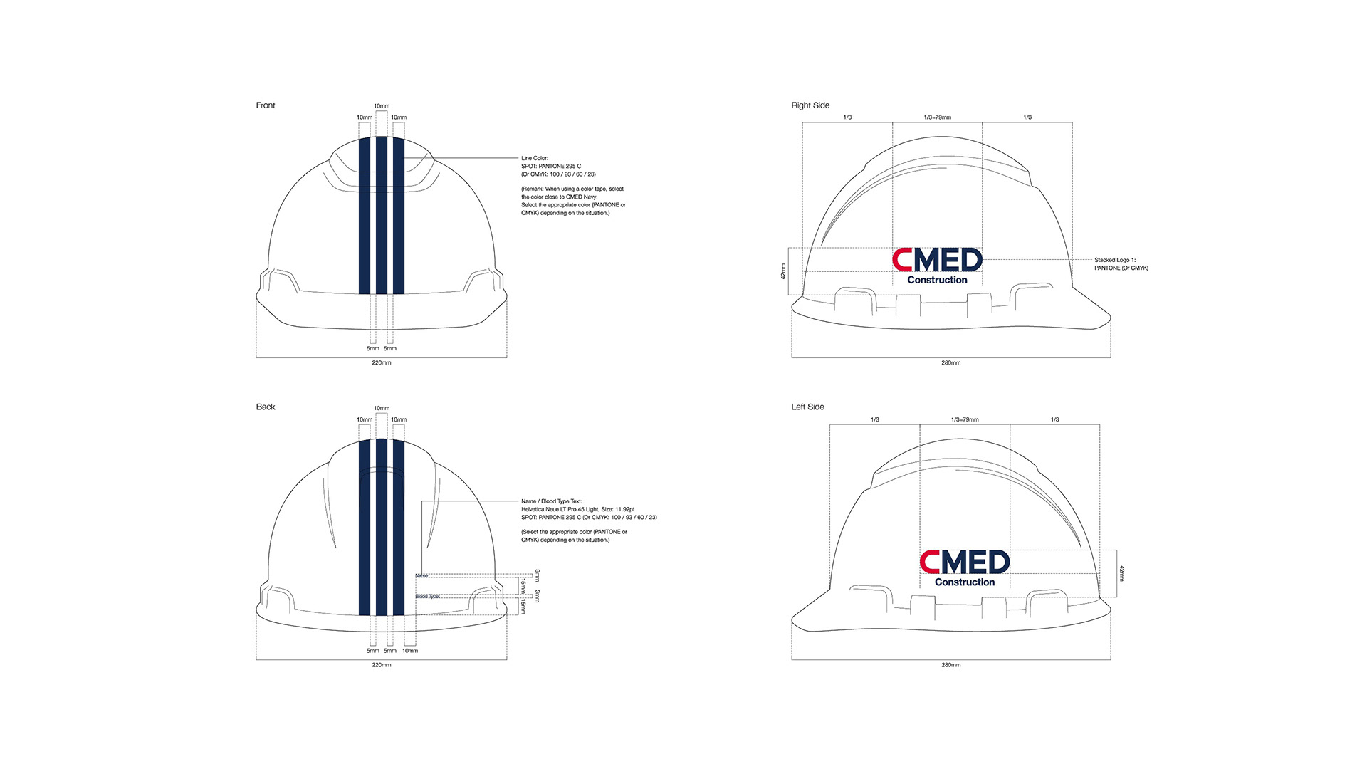
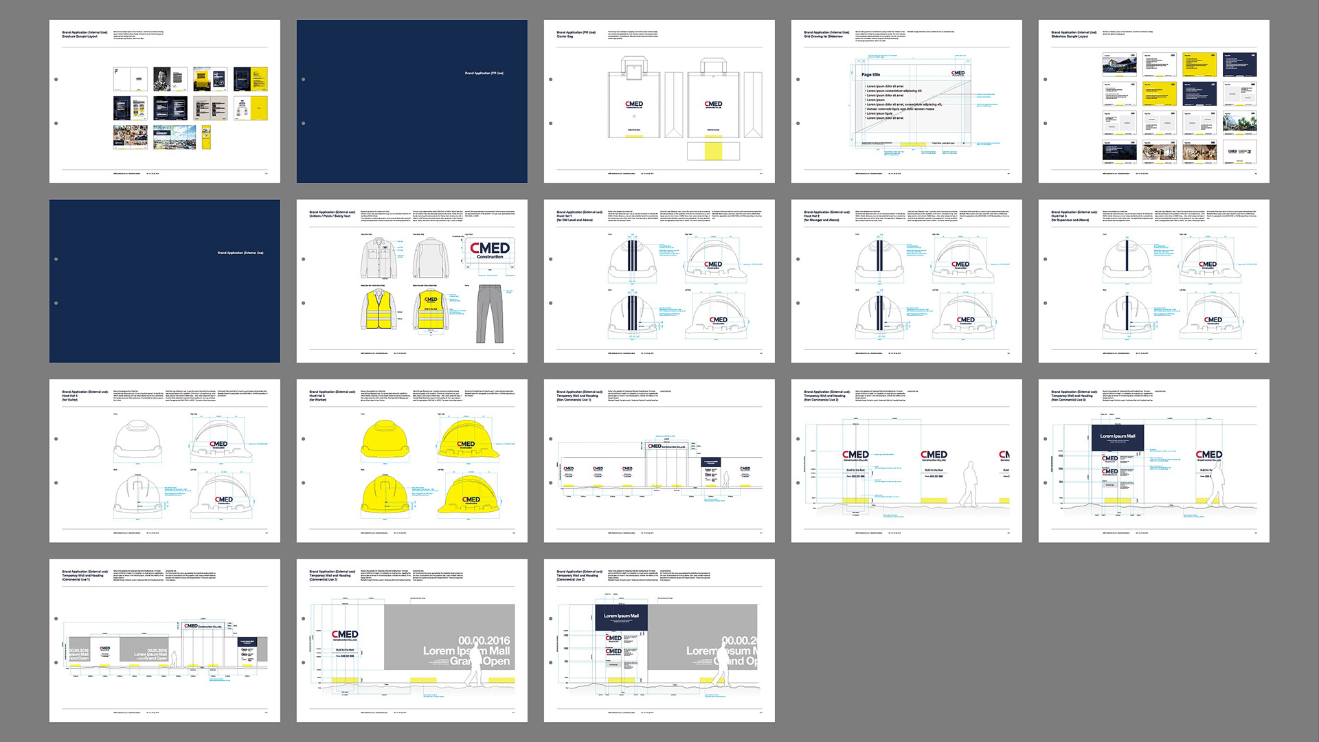
Range of work: Identity Development, VI Guideline, Art Direction, Brand Identity Collateral (Brochure, Business Card, Envelopes C3 / C4 / Regular Size, Letter Head, Tax Invoices, Official Receipt, Email Signature, Folder, ID Card, Lanyard, Company Badge, Carrier Bag, Slide Template, Uniform, Patch, Safety Vest, Hard Hat, Temporary Wall and Hoading Board Template)
Range of work: Identity Development, VI Guideline, Art Direction, Brand Identity Collateral (Brochure, Business Card, Envelopes C3 / C4 / Regular Size, Letter Head, Tax Invoices, Official Receipt, Email Signature, Folder, ID Card, Lanyard, Company Badge, Carrier Bag, Slide Template, Uniform, Patch, Safety Vest, Hard Hat, Temporary Wall and Hoading Board Template)
Art Direction / Graphic Design: Hiromi Maeo
Project Management: Kayoko Tuchiya
Assistant Project Management: Midori Yamanaka
Copywriting: Dr Julian Ng (Vice-President of Warnborough College)
Photo: Tee Peou (Chubcheevit Studio Cambodia Co., Ltd.)
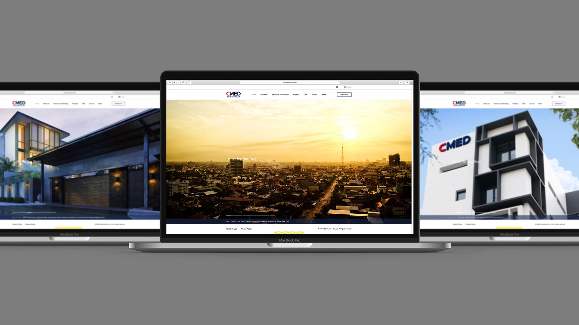
Web Design: Hirofumi Okayama
2016~ Phnom Penh, Cambodia