KAI Presents EARTH RADIO
Knives as its main product, Kai Corporation (KAIJIRUSHI) offers a wide range of products in Japan and globally, from kitchen, confectionery, and beauty care products to medical and commercial knives.
Since 2010, the company has provided the radio program EARTH RADIO themed as "Listen to the voices of the earth to create the future 100 years ahead” led by actor and navigator Yusuke Iseya, broadcasting talks and music with cutting-edge guests.
The year 2020 marks the 10th anniversary of the program. To raise awareness of KAIJIRUSHI among young people, and to promote SDGs and social good living as its new strategy, redesigning the EARTH RADIO logo was decided.
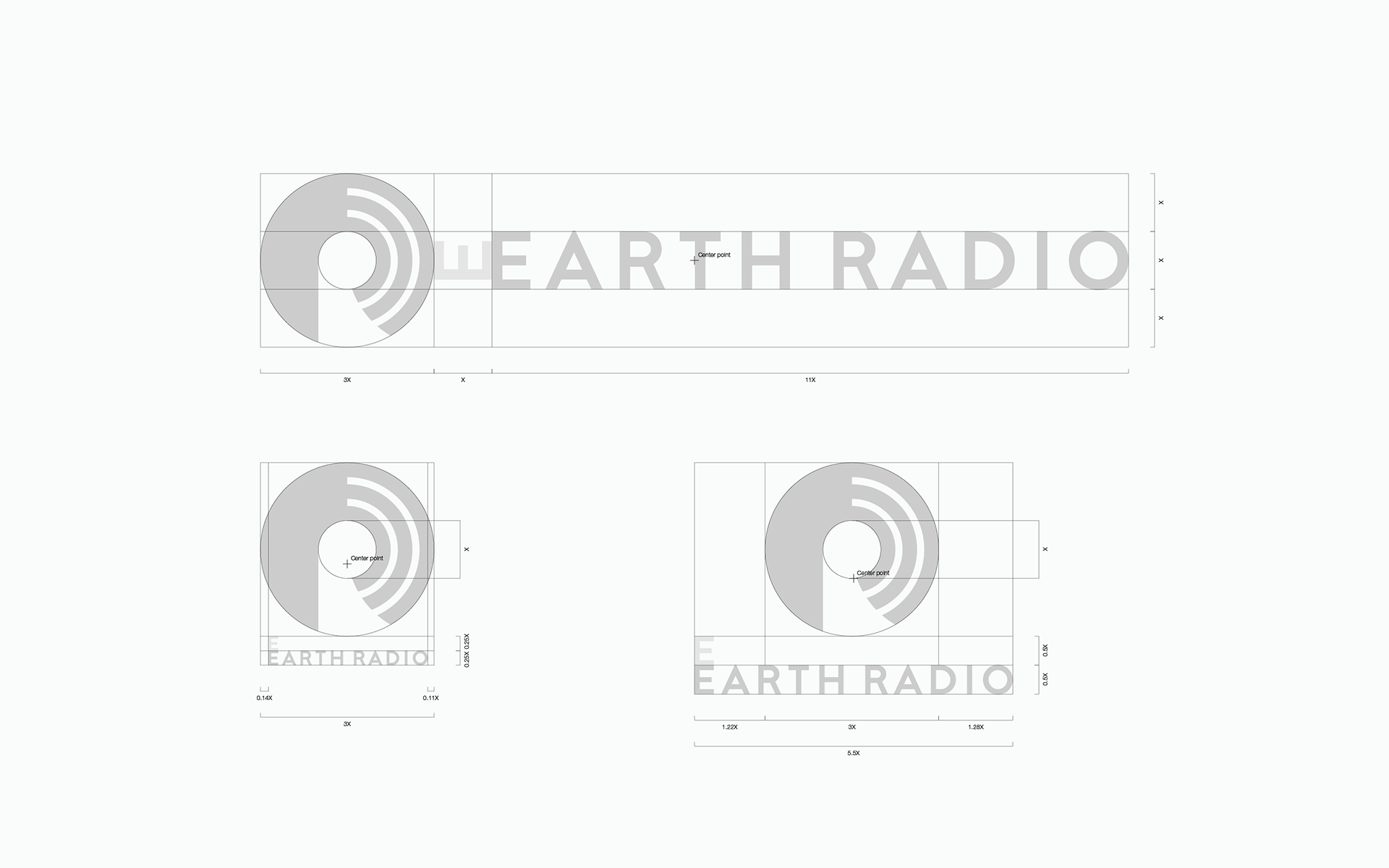
We enhanced Inc. have developed the EARTH RADIO logo and the logo guidelines.
-
刃物を中心とし、キッチン・製菓・ビューティケア等の生活用品から、医療用品・業務用刃物まで国内外で幅広く展開する貝印株式会社。
刃物を中心とし、キッチン・製菓・ビューティケア等の生活用品から、医療用品・業務用刃物まで国内外で幅広く展開する貝印株式会社。
同社が2010年から運営してきたEARTH RADIOは、「100年後の未来を創るため、地球の声を聴く」ことをテーマとし、俳優でナビゲーターの伊勢谷友介氏を中心にカッティング・エッジなゲストとのトークや音楽をオンエアしてきた。
10周年という節目を迎える2020年。若年層へのさらなる貝印の認知度向上、および、SDGsの啓蒙とソーシャルグッドな生活の普及を目指す新戦略のもと、EARTH RADIOはロゴを作り変えることとなった。
enhanced Inc.は、このEARTH RADIOのロゴ構築およびロゴガイドライン策定等を行なった。
Challenge
From the project brief and client interviews, we extracted the key elements that shape the new EARTH RADIO logo.
● Through the reborn EARTH RADIO, KAIJIRUSHI aims to educate young people about the SDGs in an easy-to-understand manner.
● KAIJIRUSHI, the mass consumer goods company, would be the pioneer in this field and form a new awareness among consumers.
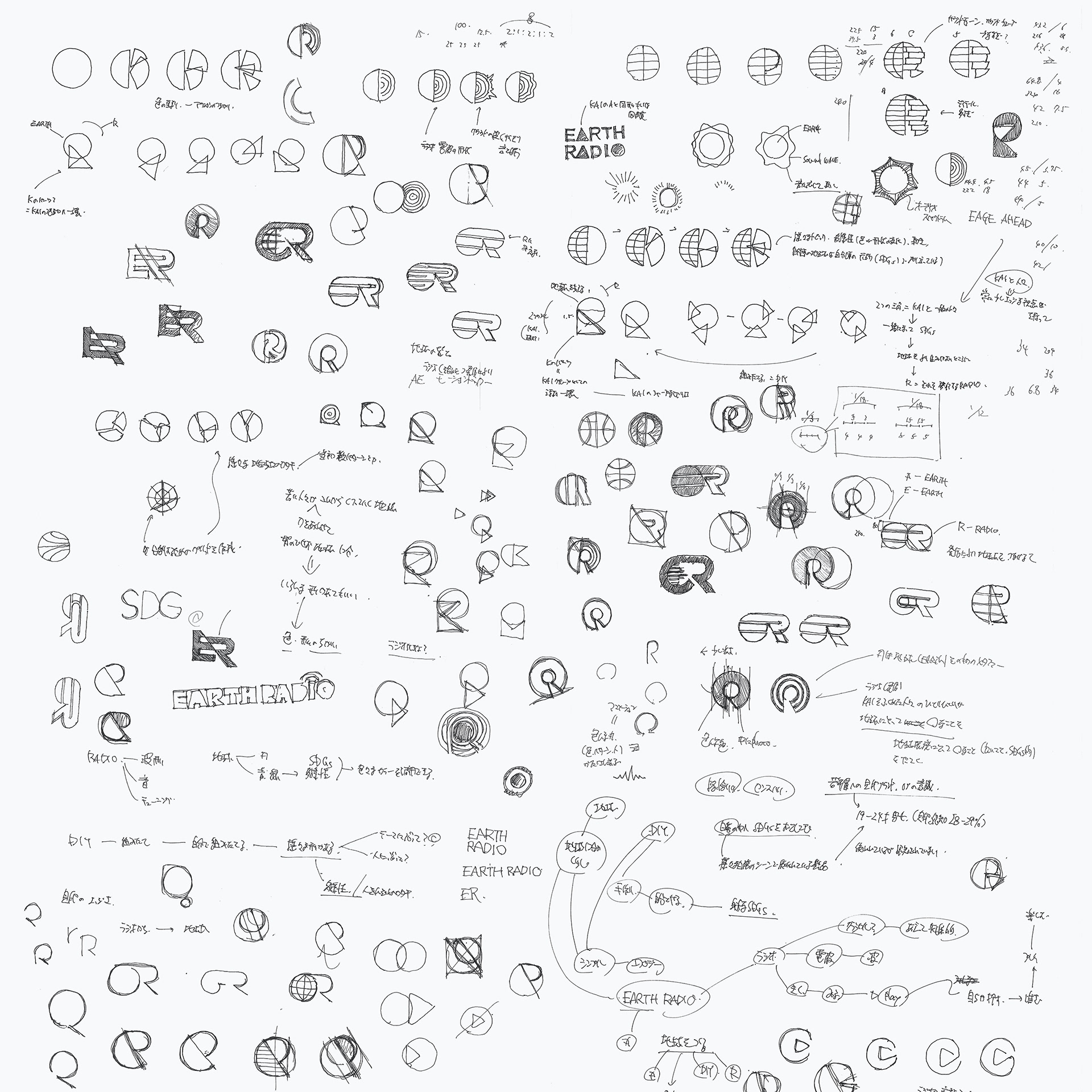
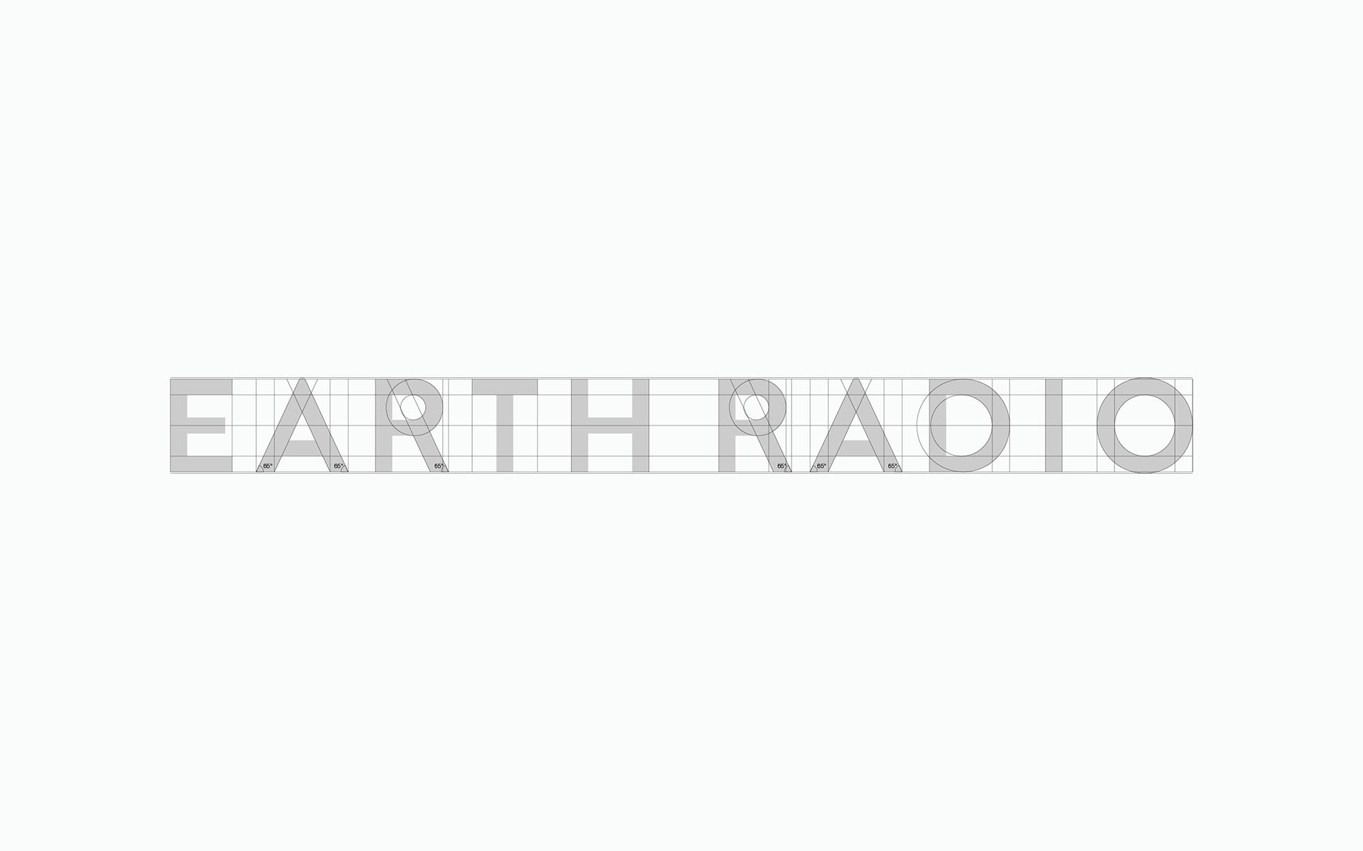
Besides, we created several symbol plans based on the request to add motion to the logo when placed on motion graphics.
-
プロジェクトブリーフおよびクライアントへのヒアリングから、新しいEARTH RADIOのロゴを形作る上で重要な骨子を抽出した。
● 貝印は、生まれ変わったEARTH RADIOを通して、若年層へのわかりやすいSDGsの啓蒙を目指す。
● 大量消費材を扱う貝印がその先駆者となり、消費者の新しい意識を形成していく。
これに加え、モーショングラフィック上でロゴに動きをつけたいという要望を踏まえながらいくつかのシンボルプランを作成した。
Solution
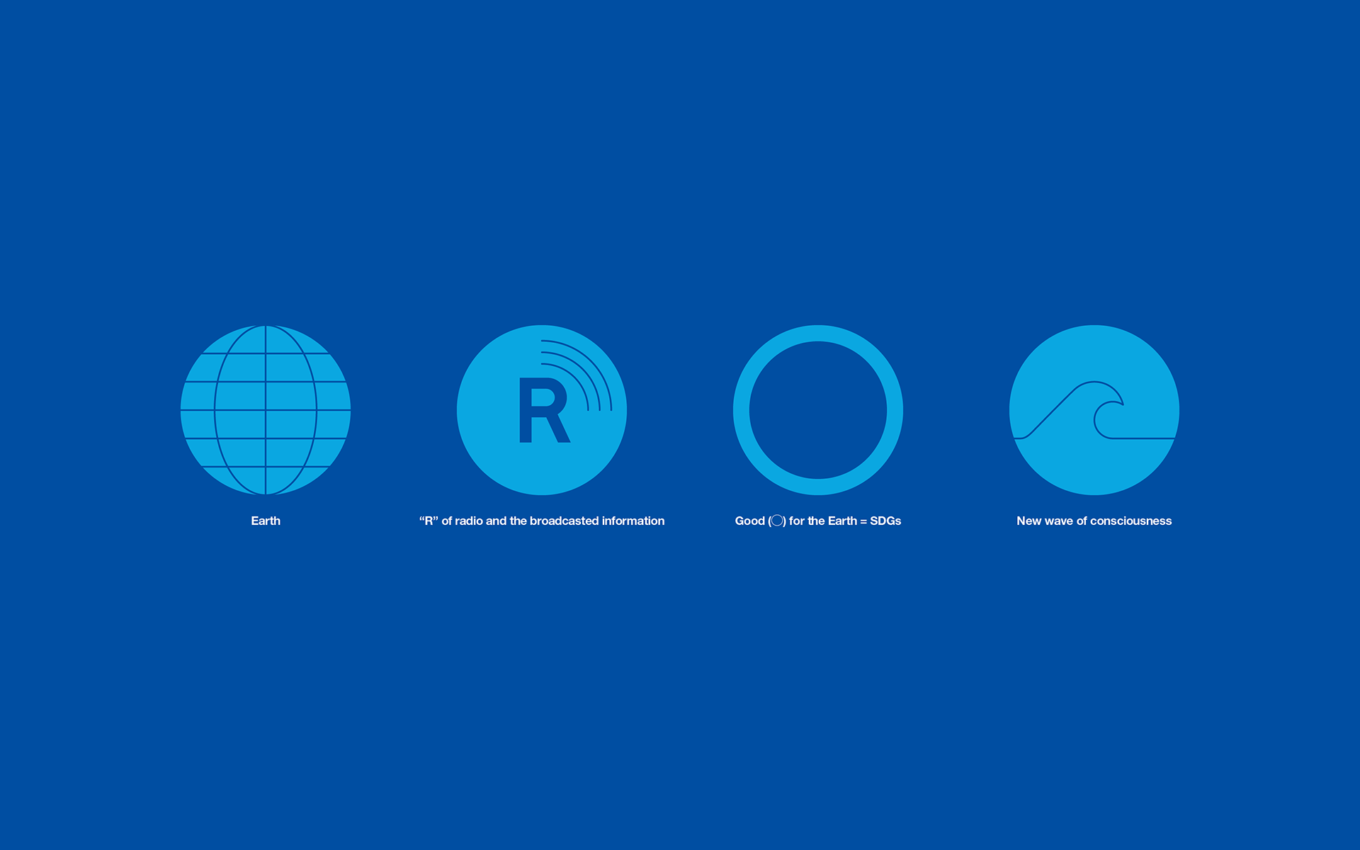
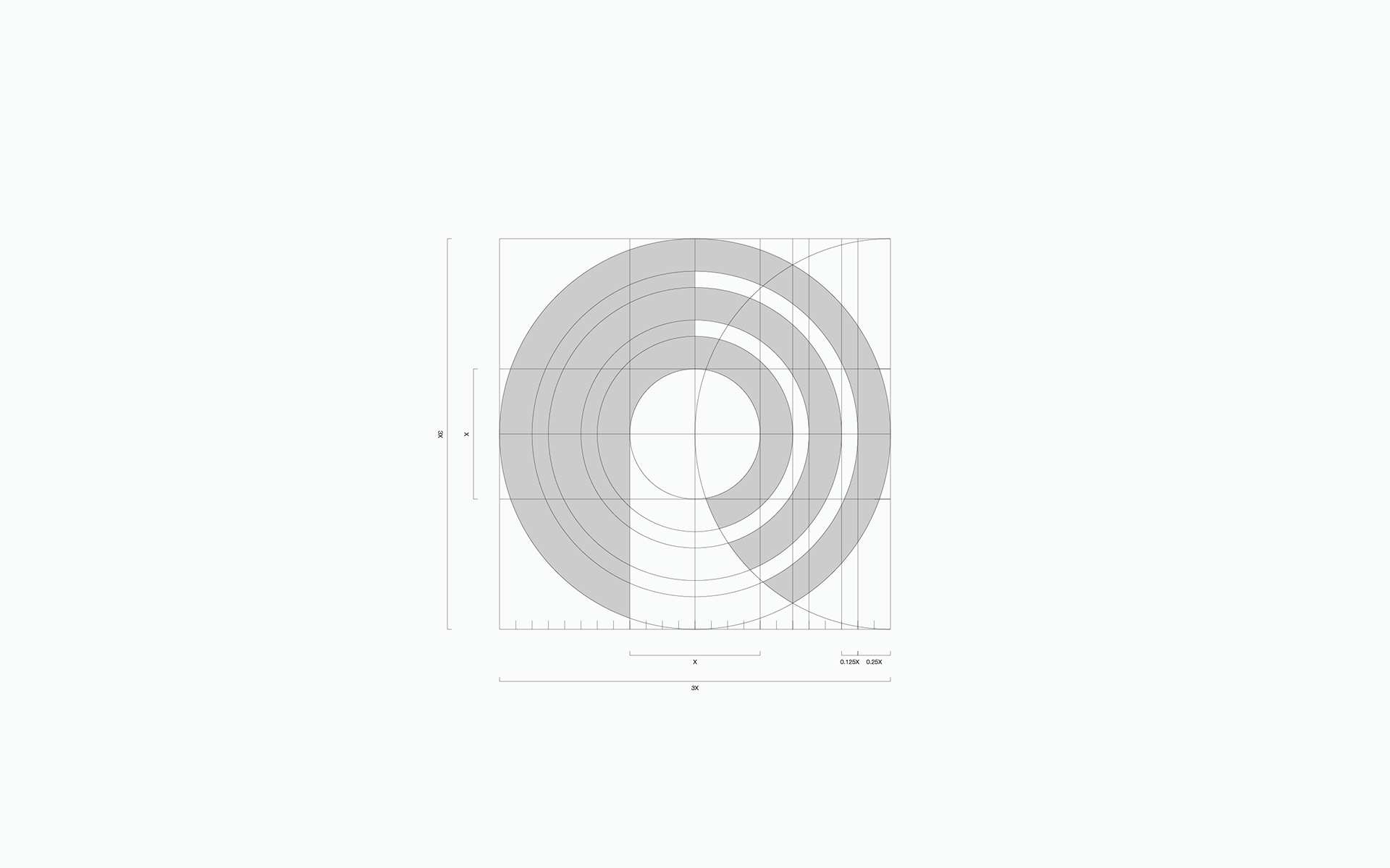
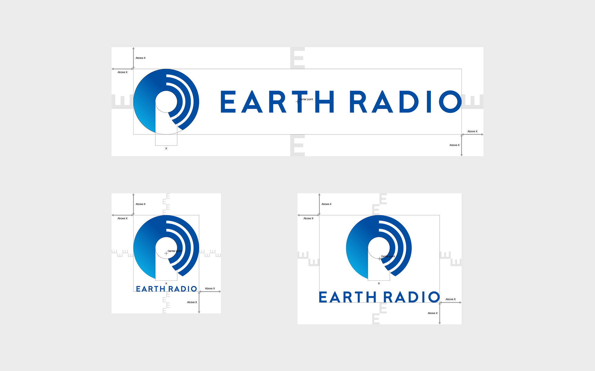
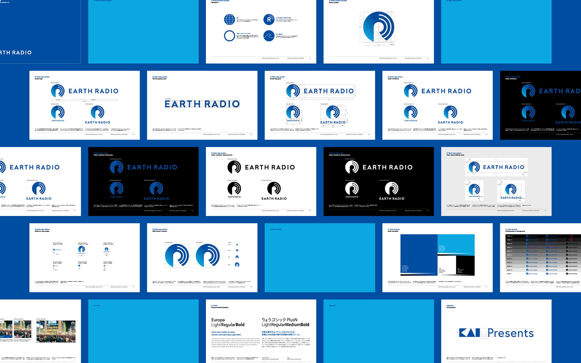
Within the several symbol plans suggested, the plan chosen finally forms the letter R with circles.
The symbol has four metaphors.
#1. Earth:
The young generation is the core target of the new EARTH RADIO, and the global environment and society of the future, which they will work together to create.
#2. “R” of radio and the broadcasted information:
The new EARTH RADIO YouTube channel will provide creative, ethical, and cool information on how to live your life.
#3. Good (◯) for the Earth = SDGs:
#3. Good (◯) for the Earth = SDGs:
Information provided by the new EARTH RADIO will promote SDGs to be enjoyed easily and casually, which will be useful for creating a sustainable global environment and society, and good (◯) for the daily lives of the people who live there.
*Circle, in Japan, generally represents a positive element.
#4. The new wave of consciousness:
#4. The new wave of consciousness:
Edge ahead and pioneering information available because of KAIJIRUSHI, the mass consumer goods company, running the program. And the big wave of new consciousness nurtured from it.
-
いくつかのシンボルプランを提案した後、最終的に選ばれたシンボルは、円がRの文字を形作るプランである。
このシンボルは4つのメタファーを持つ。
#1. 地球:
#1. 地球:
新しいEARTH RADIOのコアターゲットとなる若い人々。彼らが力を合わせて創り上げていくこれからの地球環境と社会。
#2. RADIOの頭文字Rと発信される情報:
新しいEARTH RADIOのYouTubeチャンネルから発信される、クリエイティブかつエシカルでクールな暮らしづくり情報。
#3. 地球にとって良い(◯)こと=SDGs:
新しいEARTH RADIOから発信される情報は、SDGsを簡単・手軽に楽しく啓蒙する。それは、持続可能な地球環境や社会づくりに役立ち、そこに住む人々の日常にとって良い(◯)情報。
※◯は、日本において一般的に肯定的要素として用いられる。#4. 新しい意識の波:
大量消費材を扱う貝印が運営するからこそのエッジアヘッドな先駆的情報の発信。そして、そこから育まれる新しい意識のビッグウェーブ。
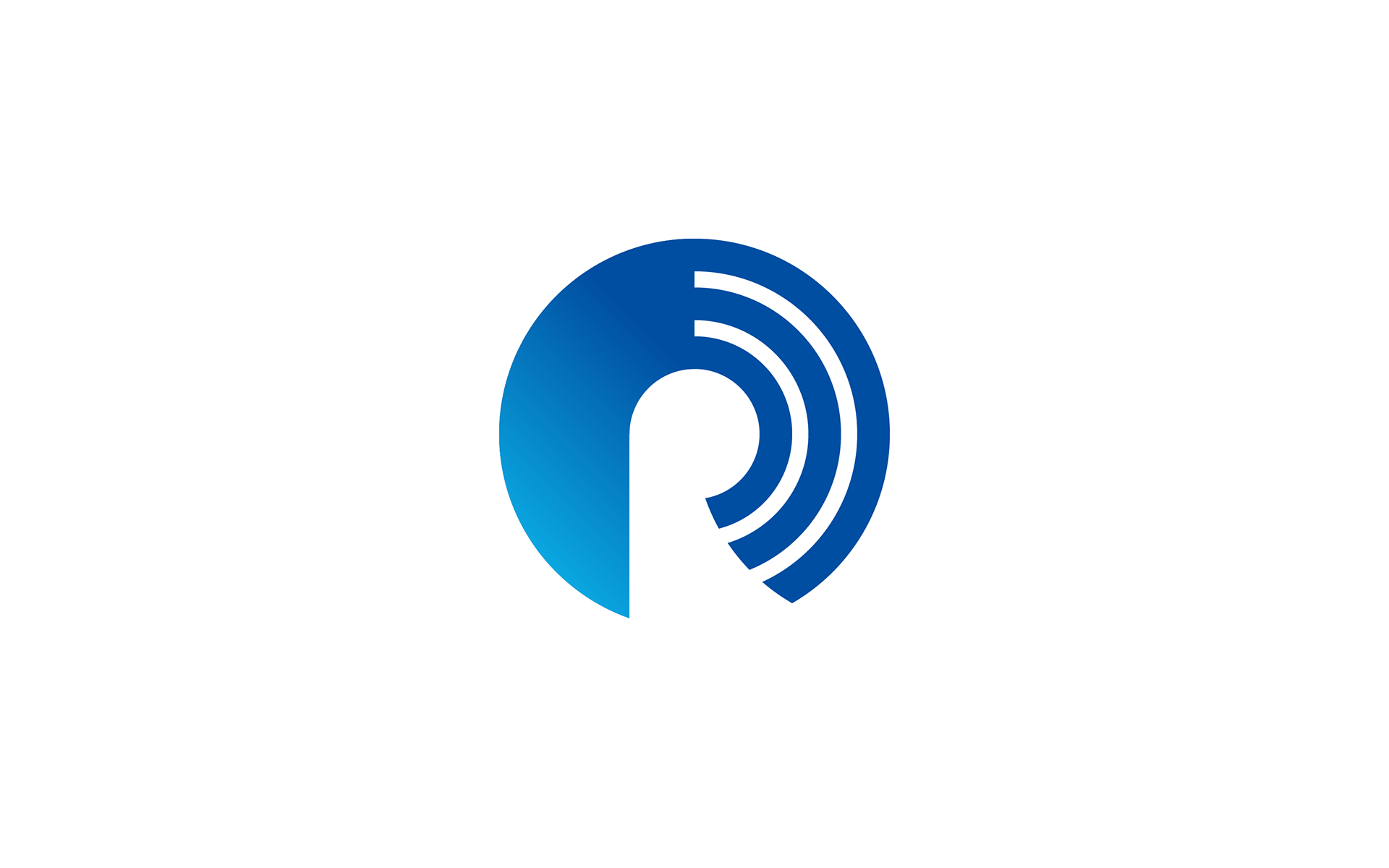
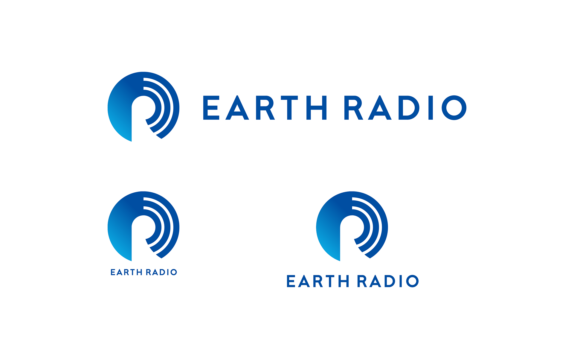
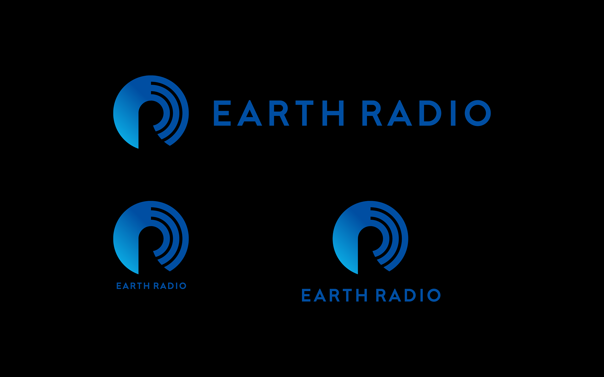
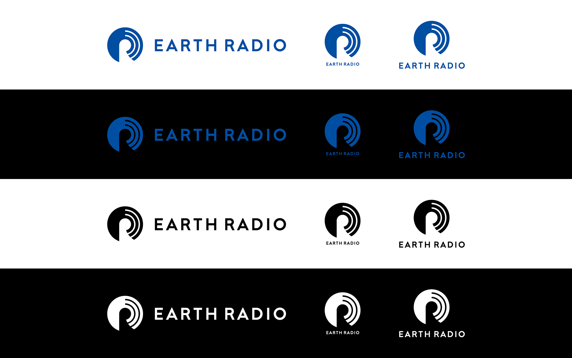
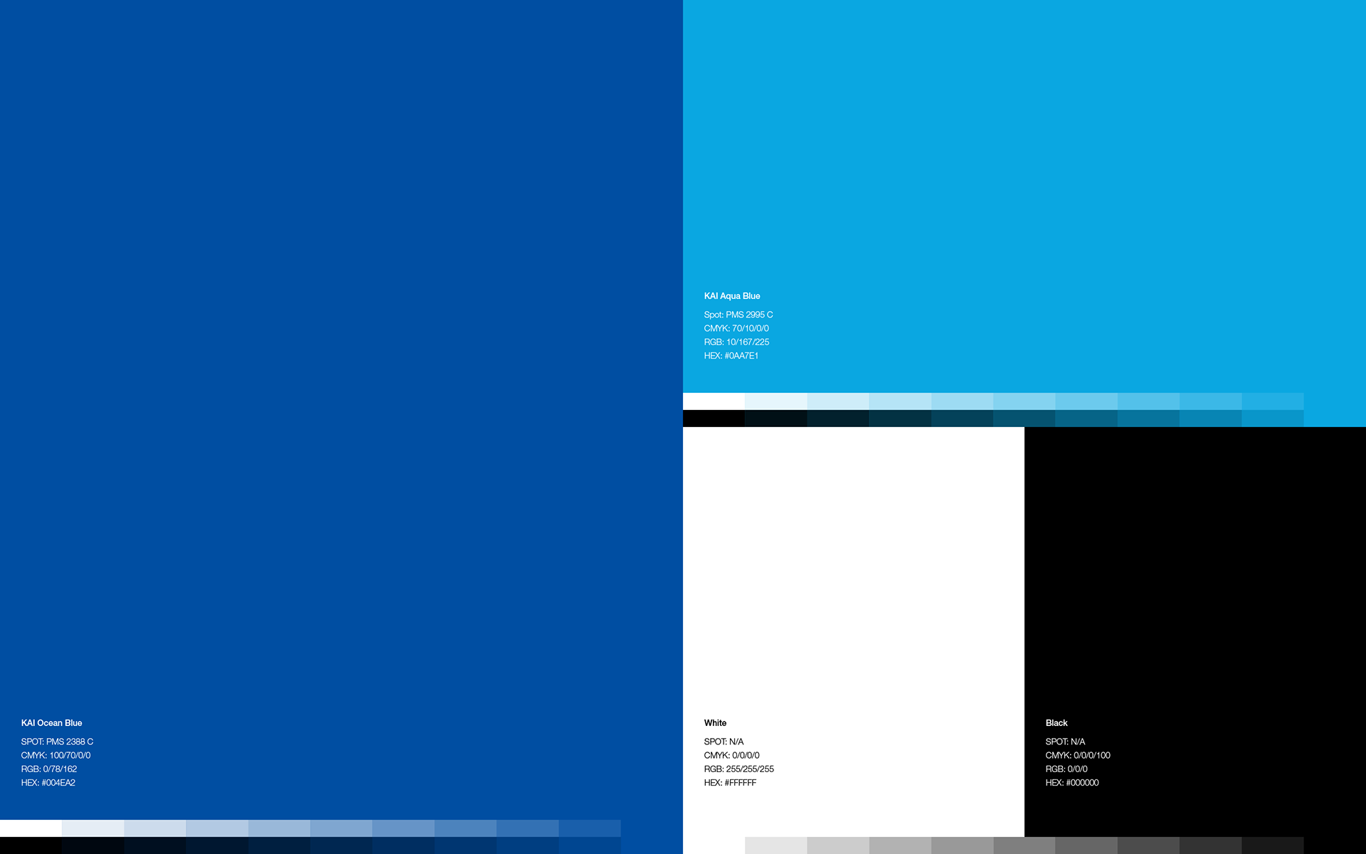
Color
The new logo is based on KAI Ocean Blue, KAIJIRUSHI’s corporate color, combined with a gradation of KAI Aqua Blue to evoke the clear earth. These colors could be changed or patterns added, depending on the topic of the program.
-
新しいロゴは、貝印のコーポレートカラーであるKAI Ocean Blueを基調とし、澄んだ地球を想起させるKAI Aqua Blueのグラデーションを組み合わせた。これらのカラーは、放送のトピックによっては色を変えたりパターンを加えたりすることも可能とした。
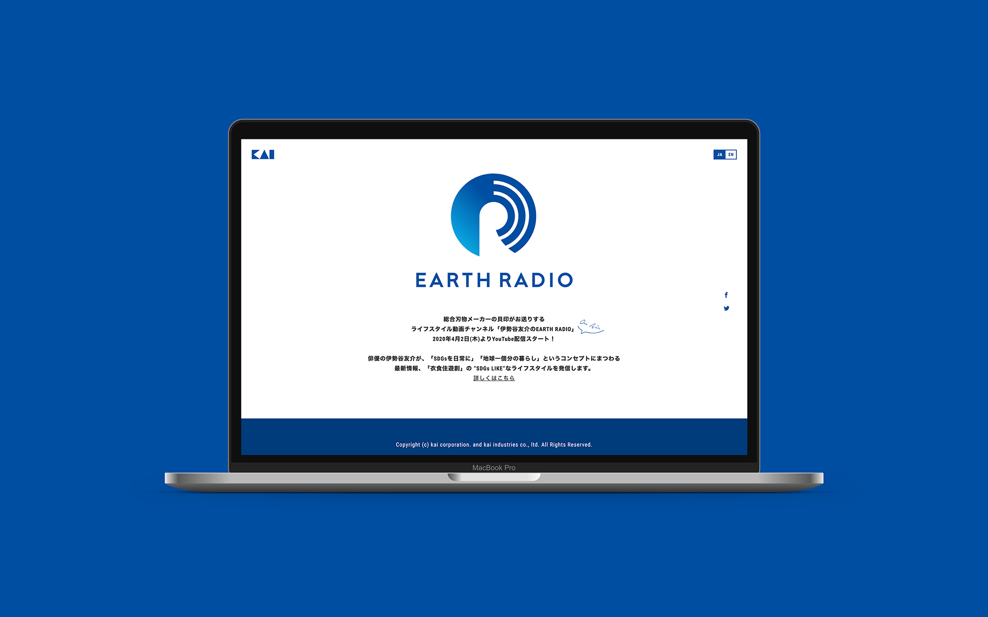
Result
In April 2020, the renewed website and the new YouTube channel was released.
-
2020年4月。リニューアルされたウェブサイトと新設されたYouTubeチャンネルが公開された。
Client: kai corporation. and kai industries co., ltd.
Agency: Great Works KK
Logo concept & design, Logo guidelines: Hiromi Maeo (enhanced Inc.)
Logo concept & design, Logo guidelines: Hiromi Maeo (enhanced Inc.)
2020 Tokyo, Japan