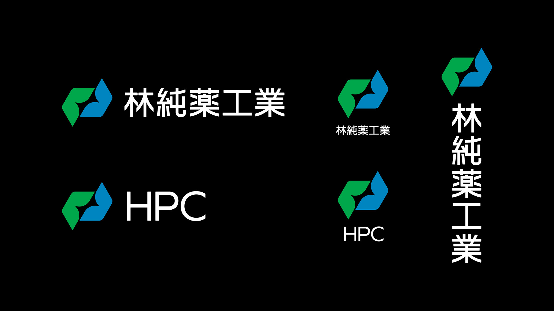
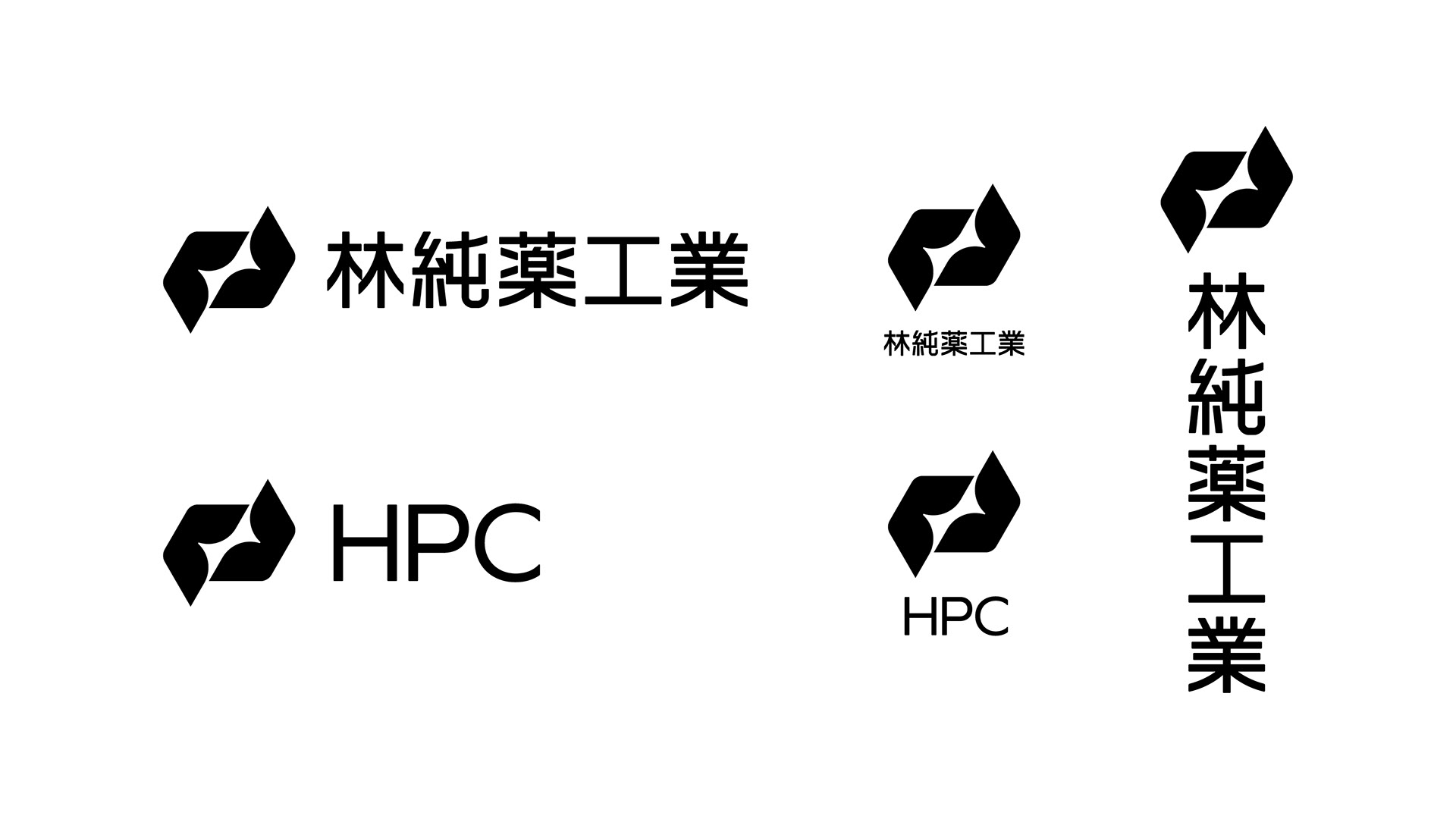
Hayashi Pure Chemical Ind., Ltd. - 林純薬工業
Hayashi Pure Chemical Ind., Ltd. (HPC) is a chemical manufacturer that was founded in 1904 to sell chemical products. Through the research development and manufacturing of reagents, it has contributed to the advancement of science and technology. In recent years, it has provided high-performance chemical solutions used in the manufacturing process of devices in the electrical and electronics fields and has expanded its services, including contract synthesis, to cutting-edge industries such as integrated chemistry, pharmaceuticals, and pesticides, government agencies, and private research institutions. It has expanded its lineup of various compounds, including minor compounds for specific markets, and prepared reagents.
On the occasion of the 120th anniversary of its founding, we were involved in the rebranding of HPC.
-
林純薬工業株式会社は、1904年に化学薬品の販売を目的として創業した化学メーカーであり、試薬の研究開発と製造を通じて科学技術の発展に寄与してきた。 近年では、電気・電子分野のデバイス製造プロセスに使用される高機能性薬液を提供し、総合化学、医薬品・農薬、官公庁や民間の研究機関などの先端業界に対して、受託合成をはじめとするサービスを展開。特定市場向けのマイナー化合物を含む各種化合物、調液・調製試薬のラインアップを拡大している。
創業120年の節目に際して、私たちは林純薬工業のリブランディングに携わった。
創業120年の節目に際して、私たちは林純薬工業のリブランディングに携わった。
Challenge
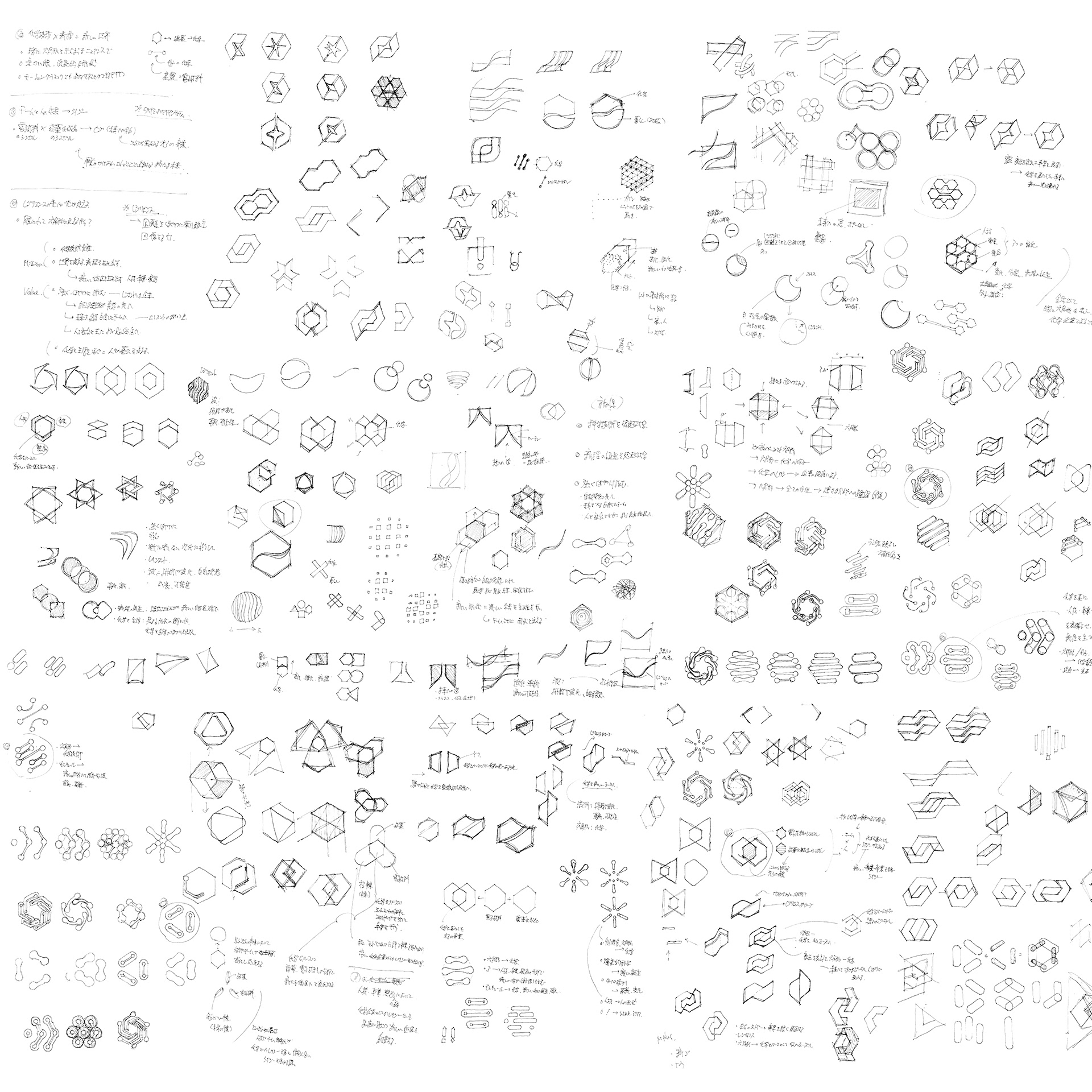
Based on the HPC's business activities and corporate philosophy, we proposed various design ideas from the following three concept stories:
1. One that evokes science and technology
2. One that evokes the birth of a new species
3. One that evokes resilience
From these design ideas, we created several simple and sophisticated symbol proposals.
-
同社の事業内容や企業理念に基づく以下の3つのコンセプトストーリーから様々なデザインアイデアを提案。
1. 科学技術を想起させるもの
2. 新種の誕生を想起させるもの
3. レジリエンスを想起させるもの
これらのデザインアイデアからシンプルで洗練されたいくつかののシンボル案を作成した。
1. 科学技術を想起させるもの
2. 新種の誕生を想起させるもの
3. レジリエンスを想起させるもの
これらのデザインアイデアからシンプルで洗練されたいくつかののシンボル案を作成した。
Solution
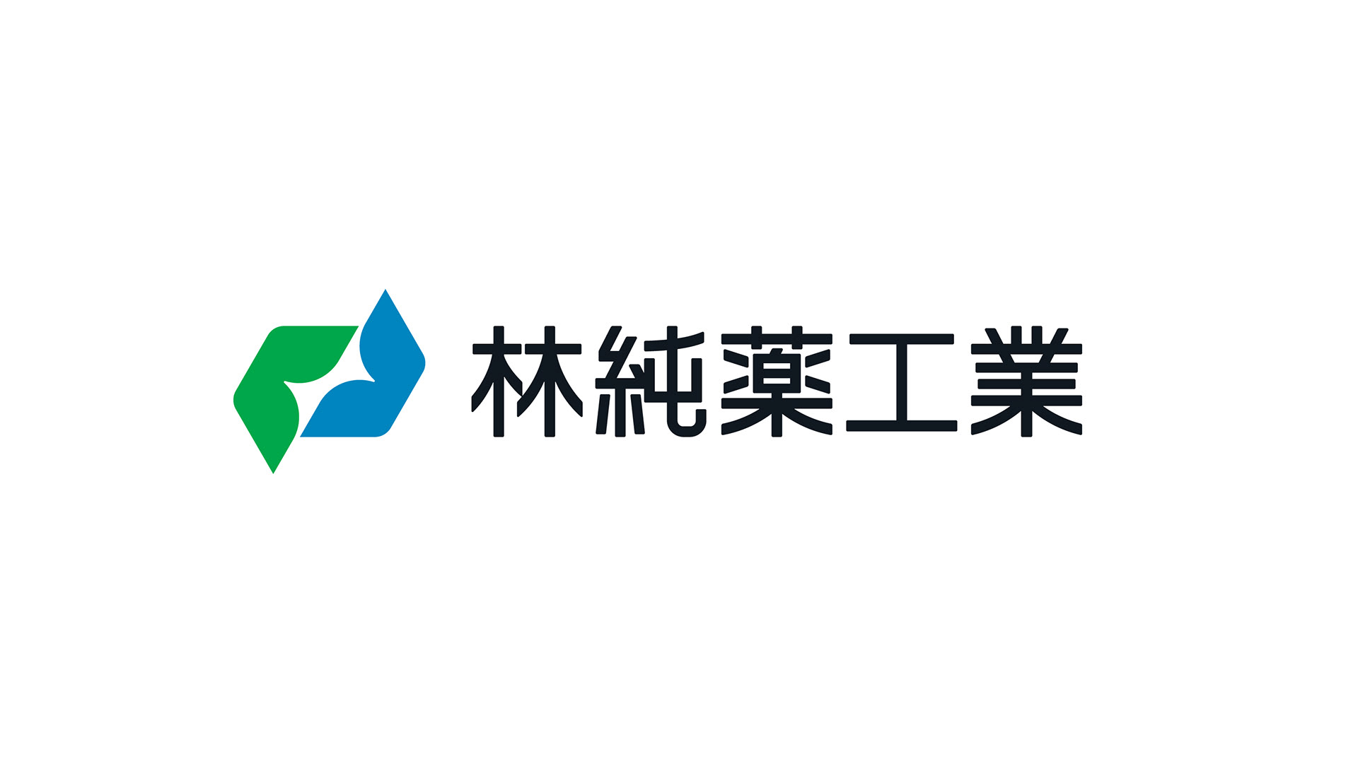
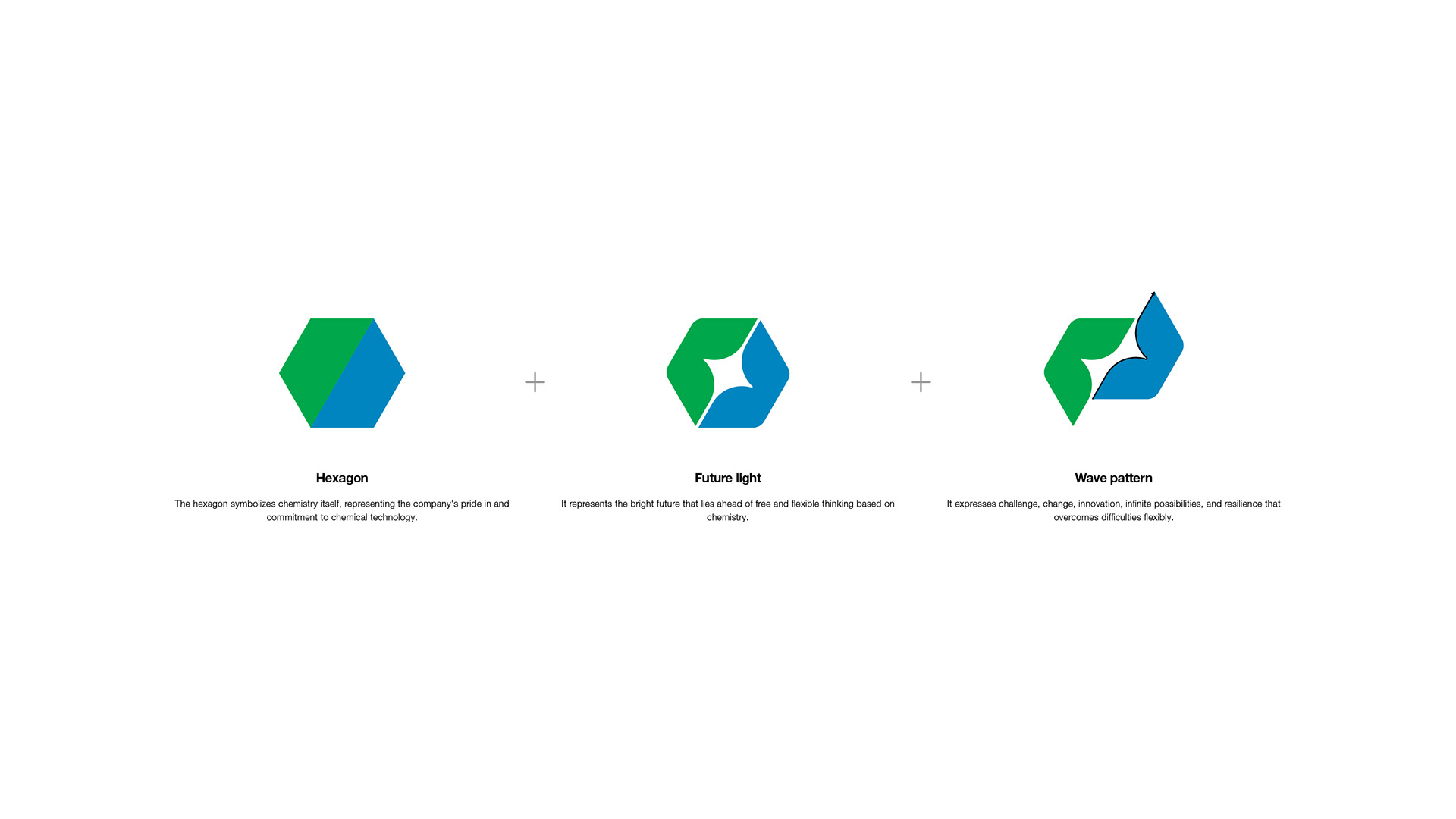
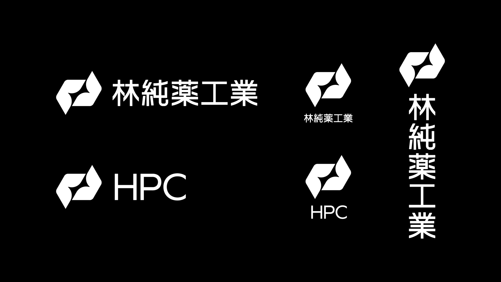
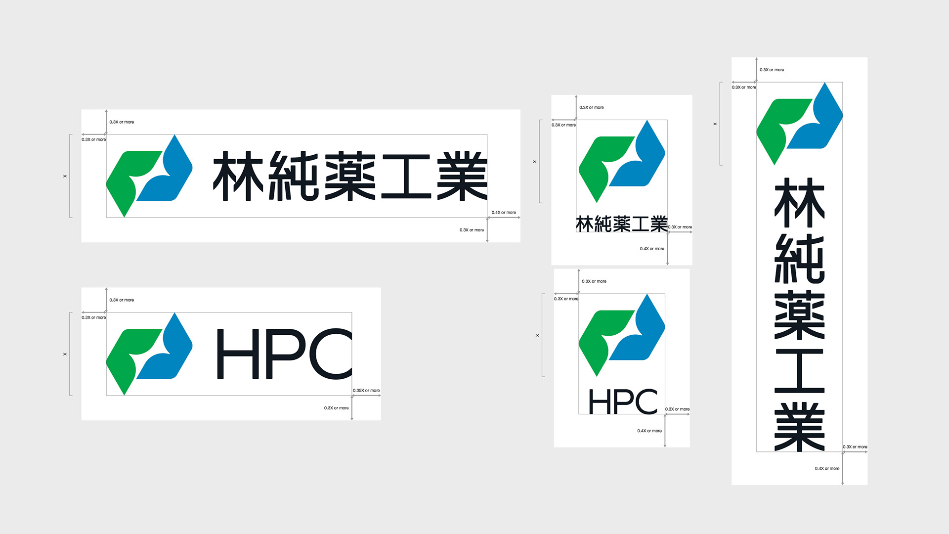
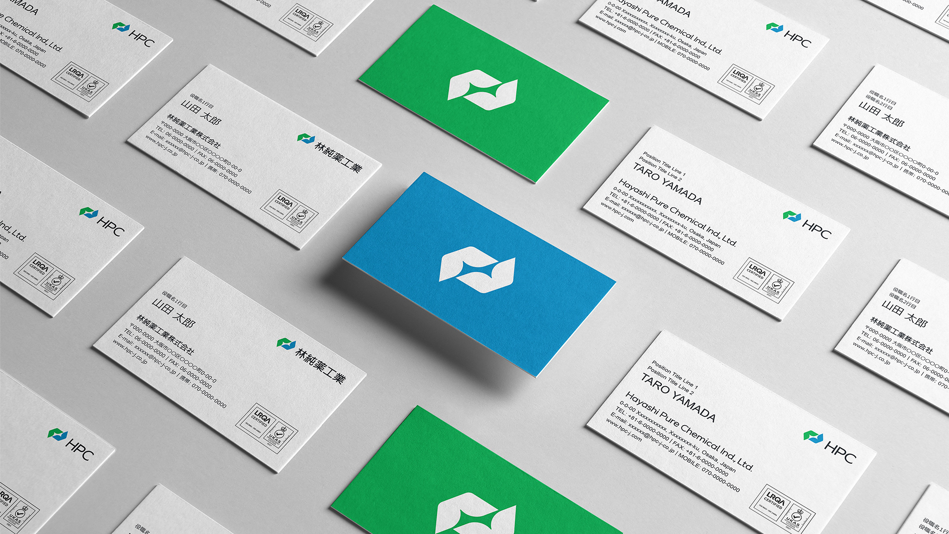
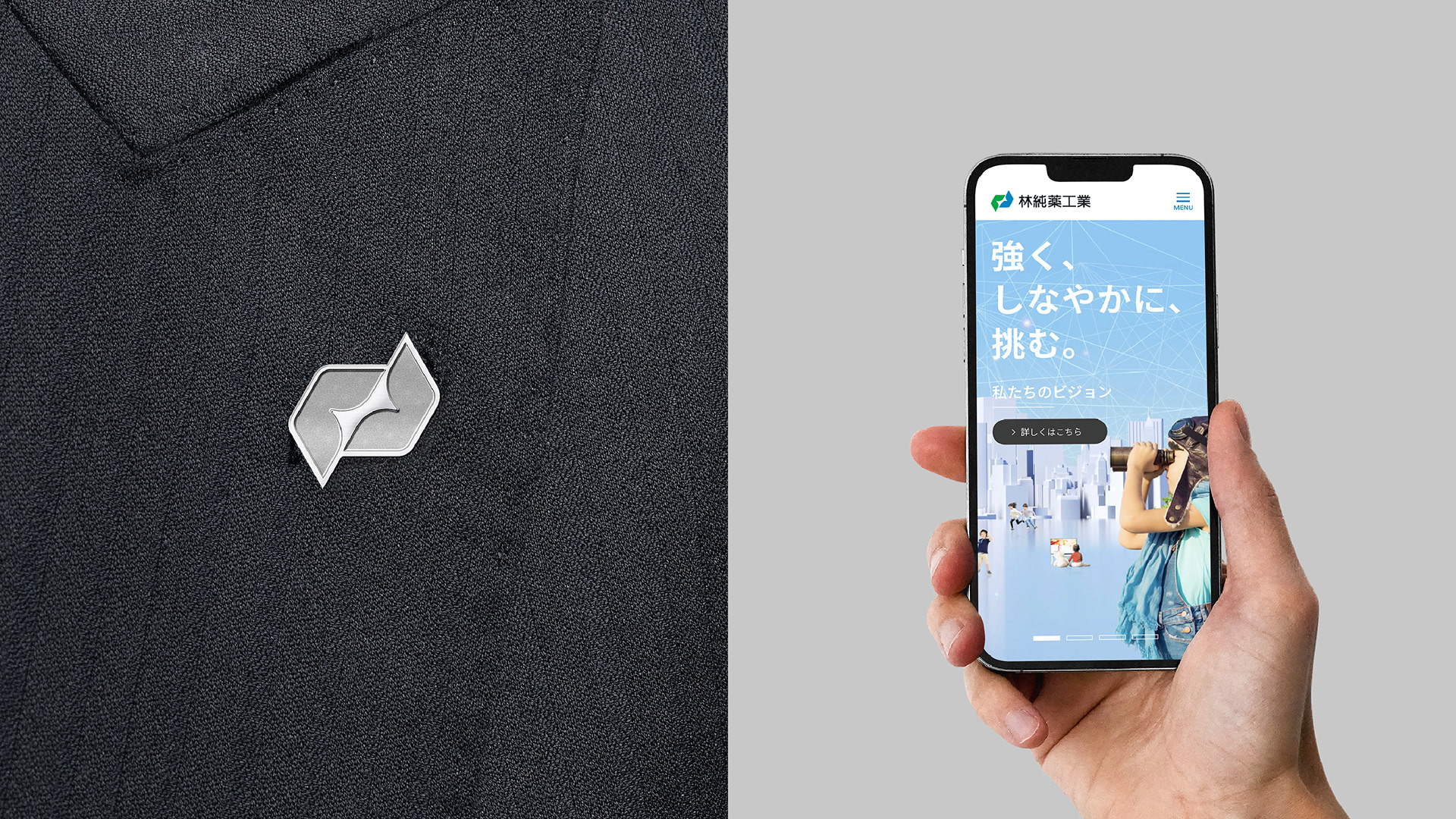
The new brand symbol of HPC is based on the corporate philosophy keyword "Resilience leads to light." It consists of the following elements:
The new brand symbol of HPC is based on the corporate philosophy keyword "Resilience leads to light." It consists of the following elements:
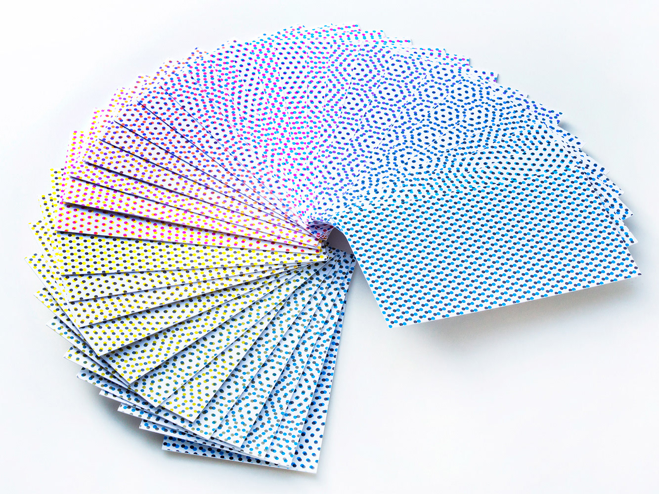
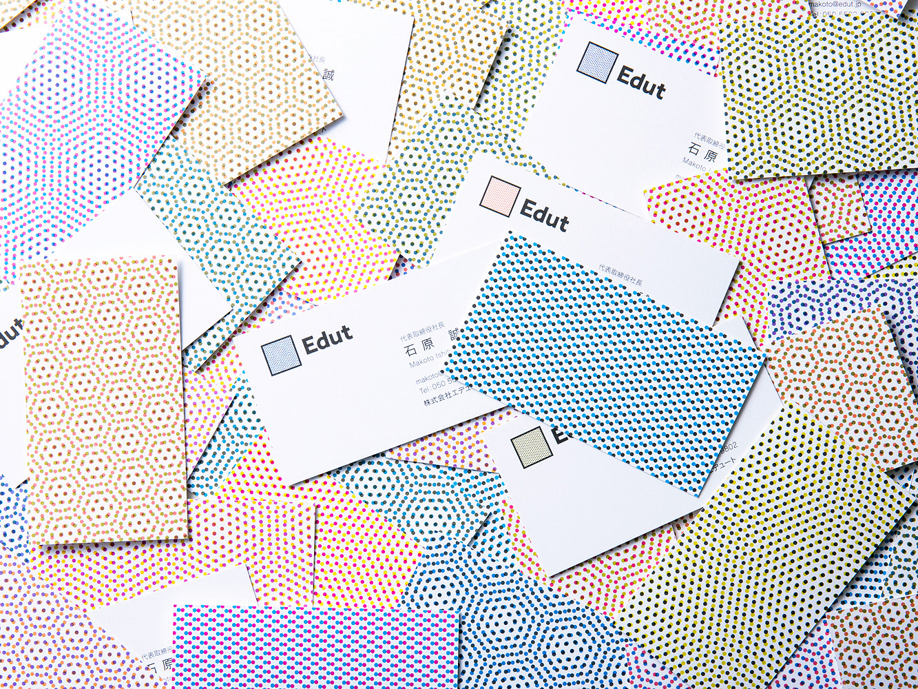
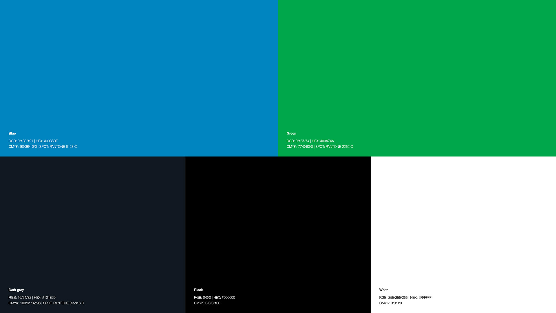
● Hexagon:
The hexagon symbolizes chemistry itself, representing the company's pride in and commitment to chemical technology.
● Future light:
It represents the bright future that lies ahead of free and flexible thinking based on chemistry.
● Wave pattern:
It expresses challenge, change, innovation, infinite possibilities, and resilience that overcomes difficulties flexibly.
The blue color, reminiscent of the vast sky and the deep sea, symbolizes the rich future that the HPC aims for. The green color also symbolizes the company's stability and reliability.
-
林純薬工業の新しいブランドシンボルは、企業理念に基づくキーワード「レジリエンスの先に光が見える」を基に、次の要素から構成されている。
● 六角形:
林純薬工業が化学技術に誇りを持ち、携わる企業であることを表す。
● 未来の光:
● 未来の光:
化学を基にした自由で柔軟な発想の先に、光り輝く未来が現れることを表す。
● 波型:
● 波型:
挑戦、変化、革新、無限の可能性、困難をしなやかに乗り越えるレジリエンスを象徴する。
広大な空や深い海を連想させる青色は、林純薬工業が目指す豊かな未来を象徴する。また、緑色は、企業の安定性と信頼性を象徴する。
Client: Hayashi Pure Chemical Ind., Ltd.
Branding agency: haru Inc.
Logo concept & graphic design: Hiromi Maeo (enhanced Inc.)
Branding agency: haru Inc.
Logo concept & graphic design: Hiromi Maeo (enhanced Inc.)
2023 Osaka, Japan