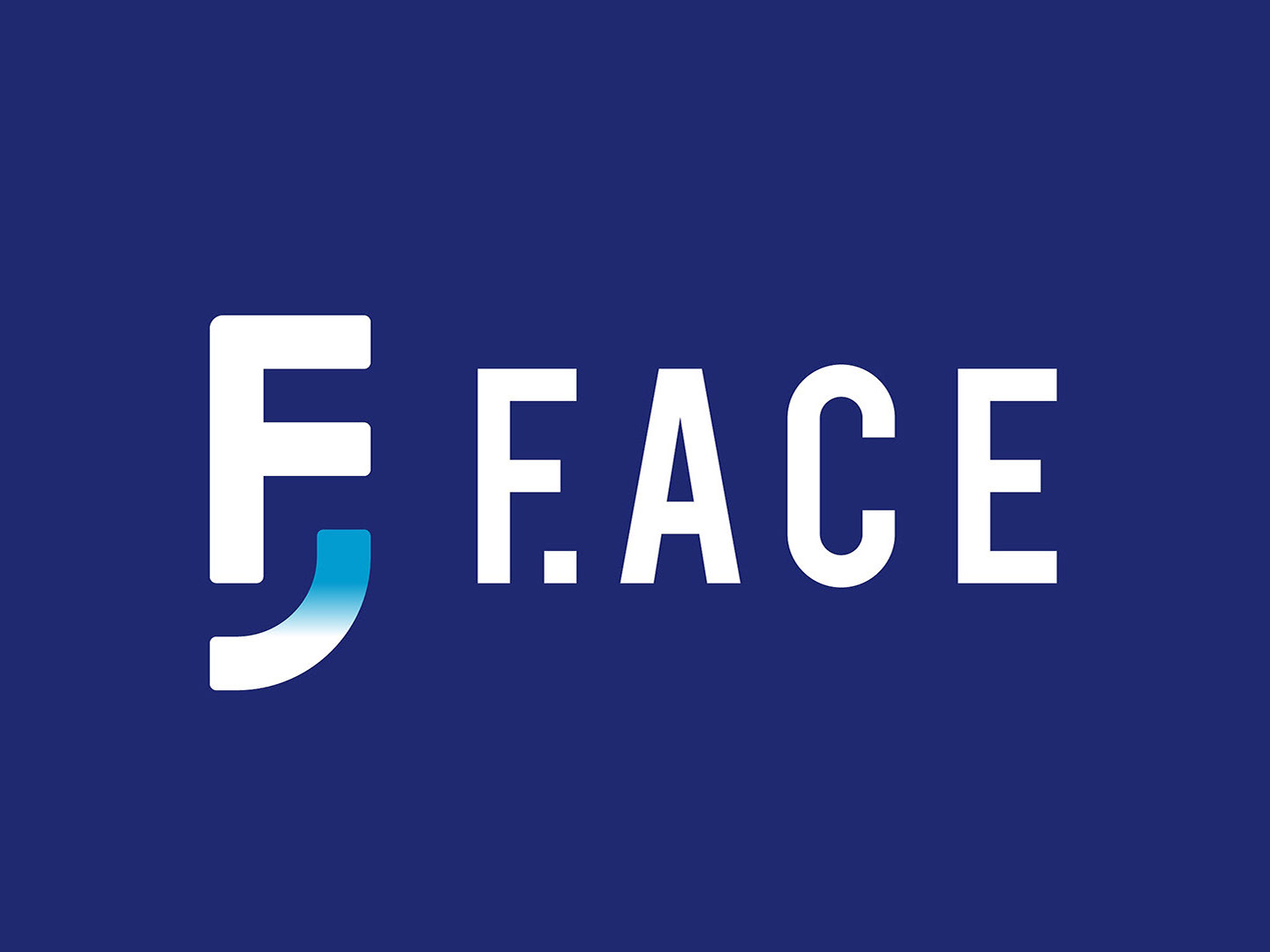
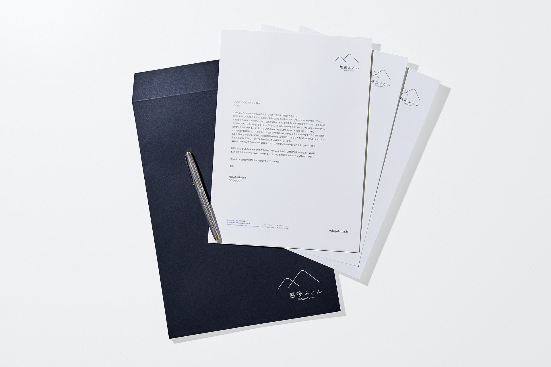
Echigo Futon
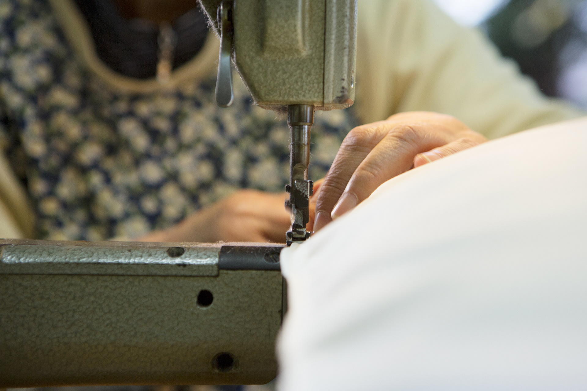
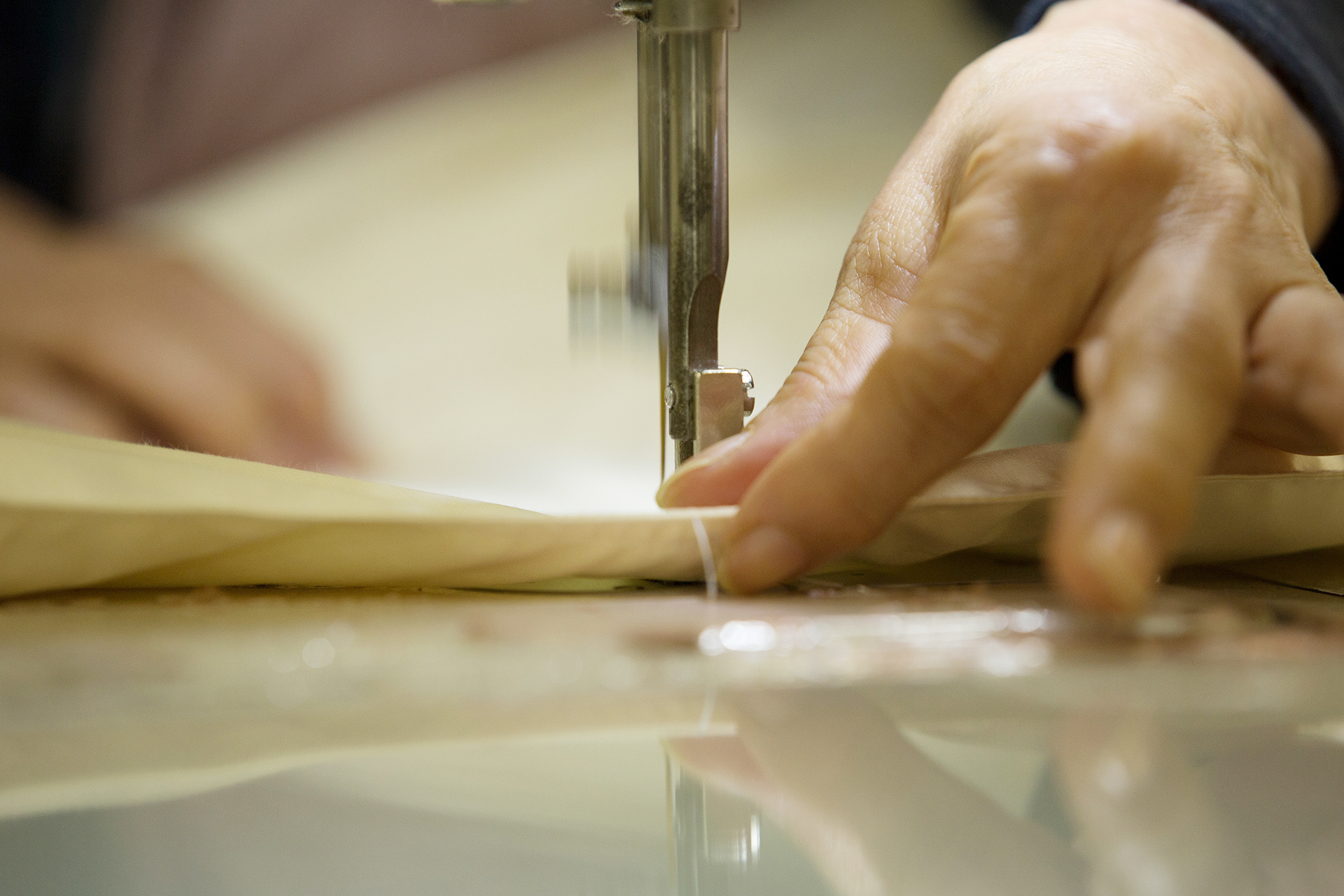
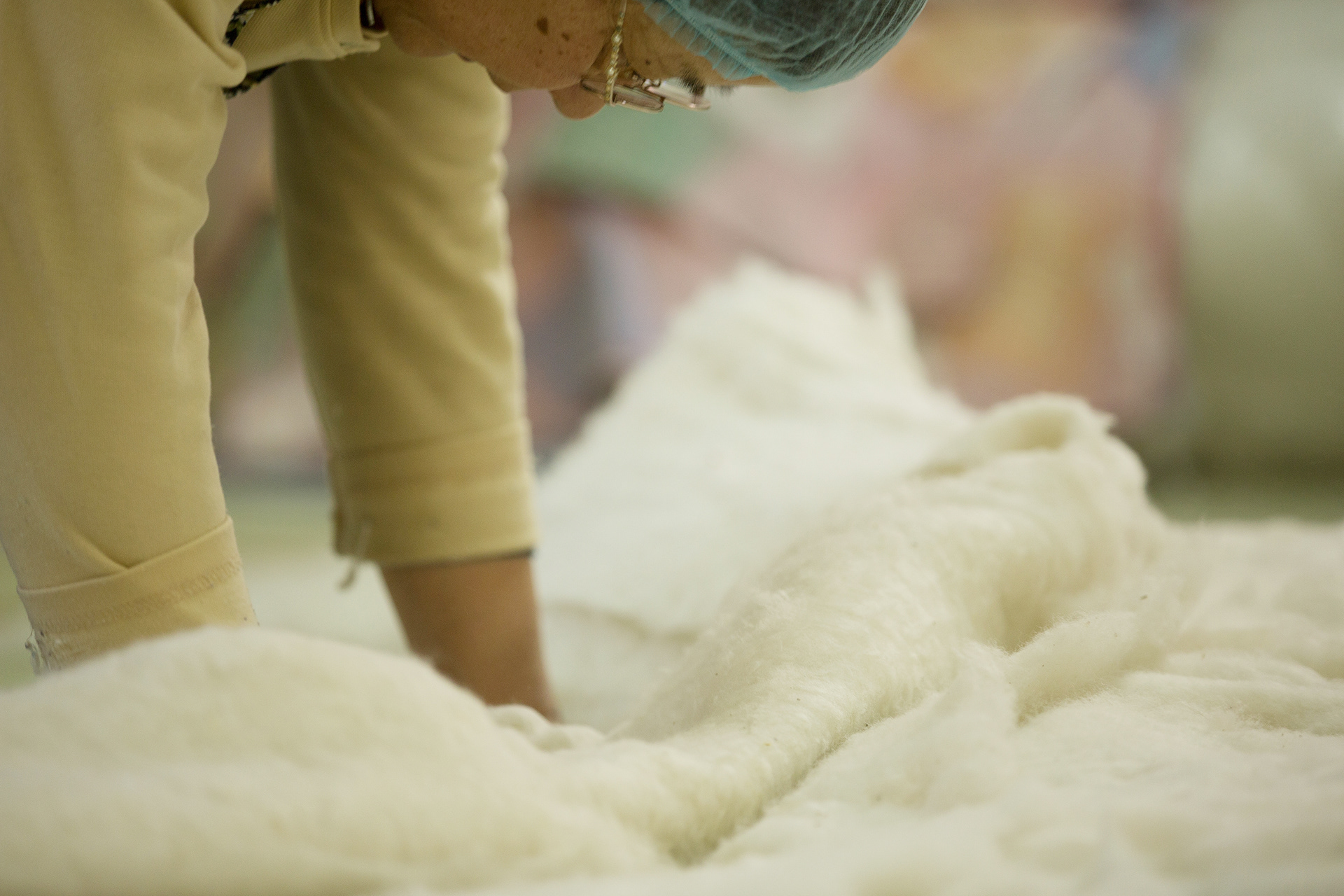
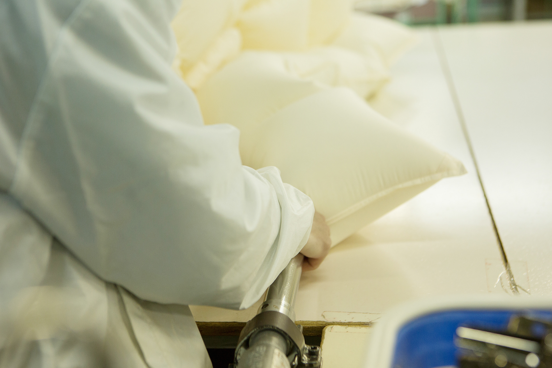
Echigo Futon Co., Ltd. (former company name Ito Co., Ltd.), founded in Tainai, Niigata Prefecture in 1868 (the first year of the Meiji period), is a company that develops business mainly on manufacturing and wholesale of bedding. Based on know-how and technical capabilities cultivated from the foundation to the present day, the company continues sincerely making high-quality products that enable customers' good sleep.
Enhanced Inc., with Brilliant Color International, has been engaged in rebranding Echigo Futon since 2016.
Enhanced Inc., with Brilliant Color International, has been engaged in rebranding Echigo Futon since 2016.
-
1868年(明治元年)に新潟県胎内市の里山で創業された越後ふとん株式会社 (旧社名 株式会社イトウ)は、寝具の製造・卸を中心に事業を展開する企業である。創業から現在に至るまで培われたノウハウと技術力をもとに、顧客の良質な睡眠を実現する高品質な製品づくりを真面目一筋に続けている。
enhanced Inc.はBrilliant Color Internationalとともに、2016年から越後ふとんのリブランディングに携わっている。
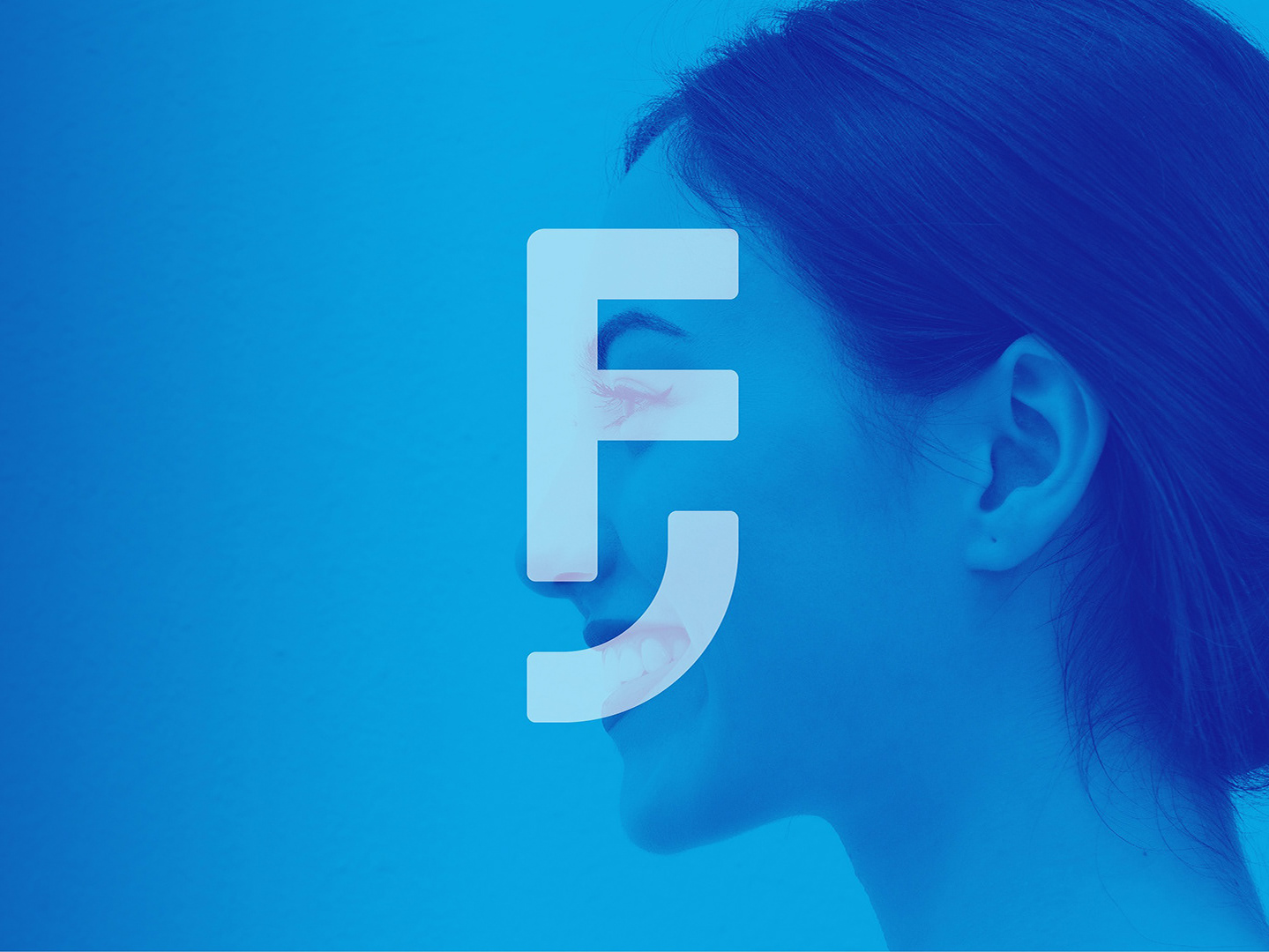
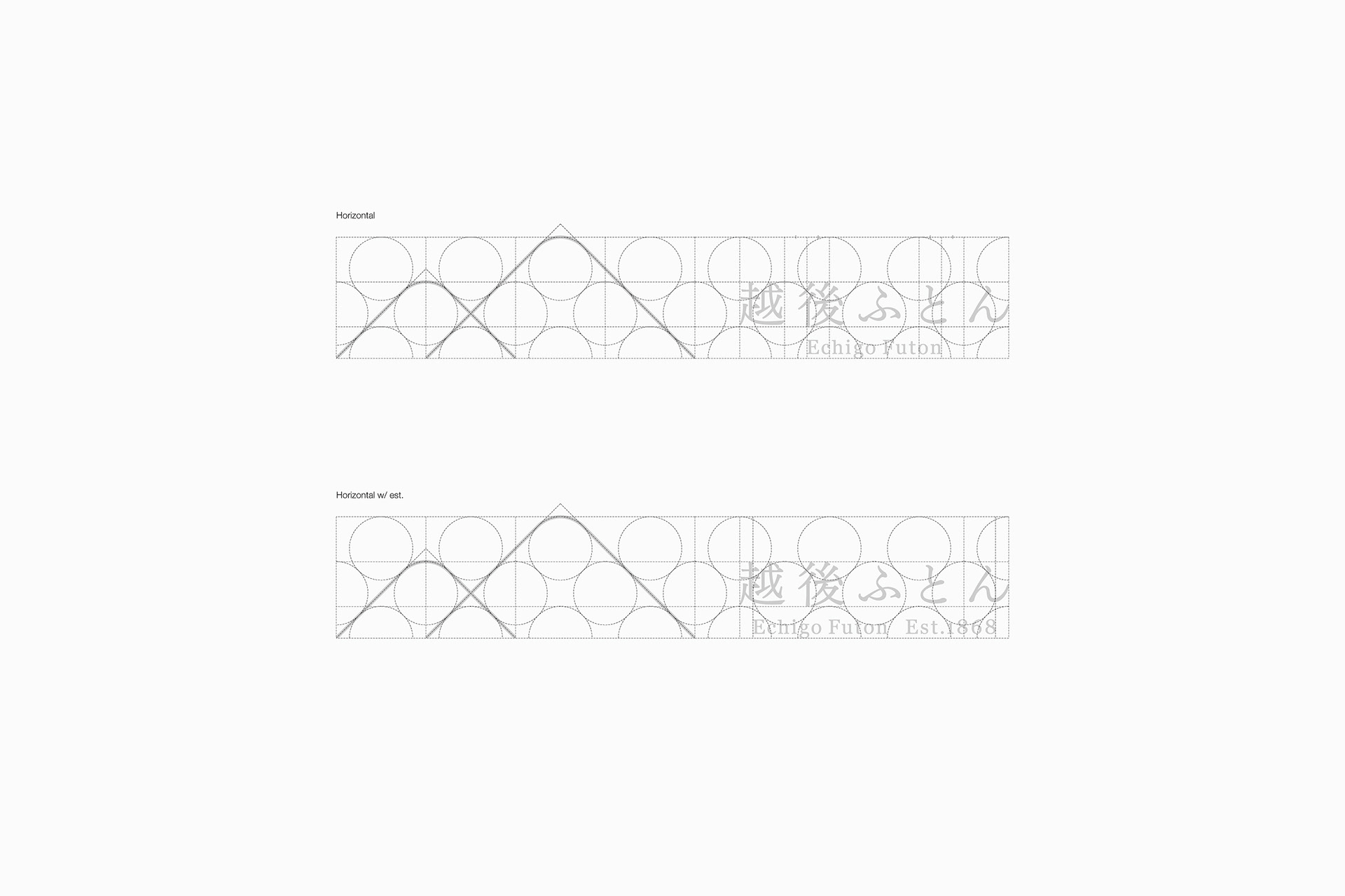
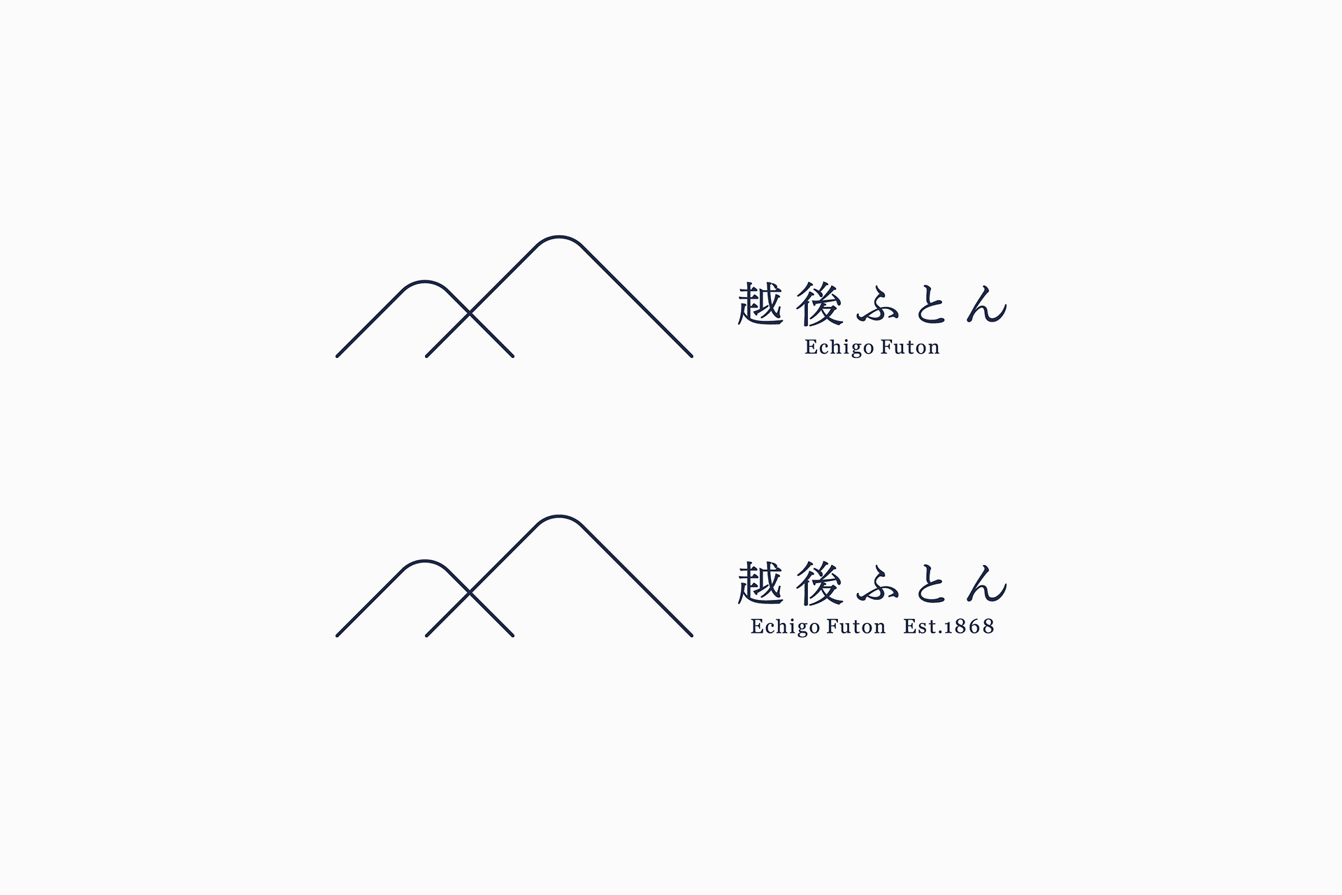
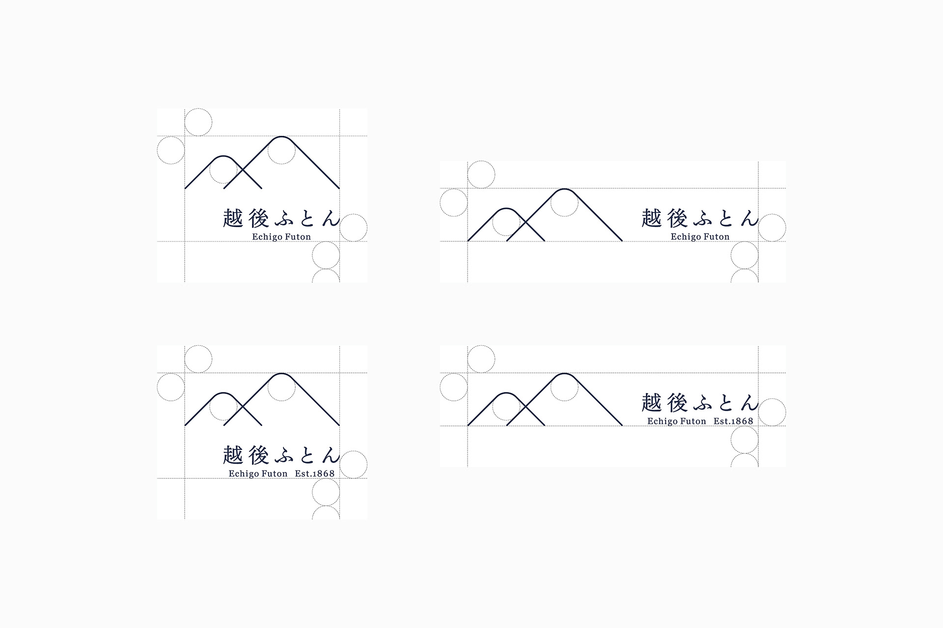
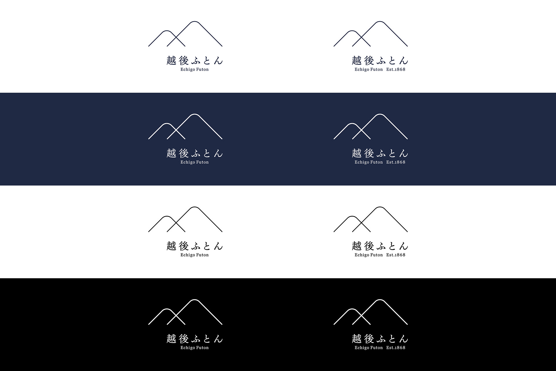
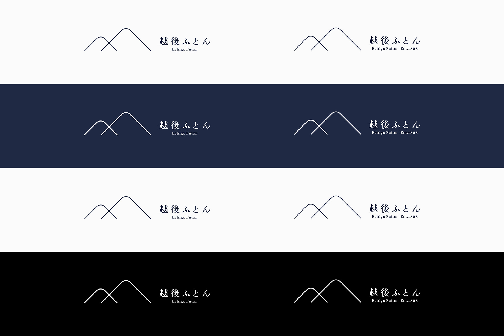
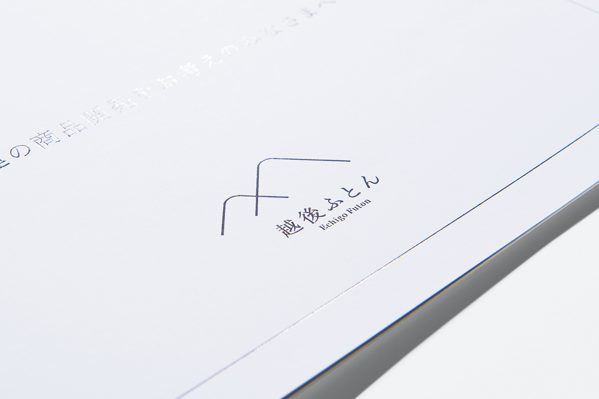
New symbol
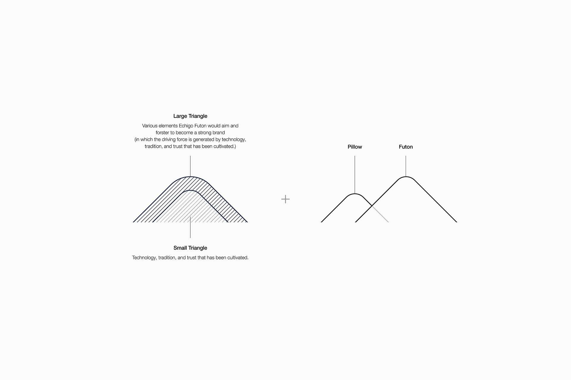
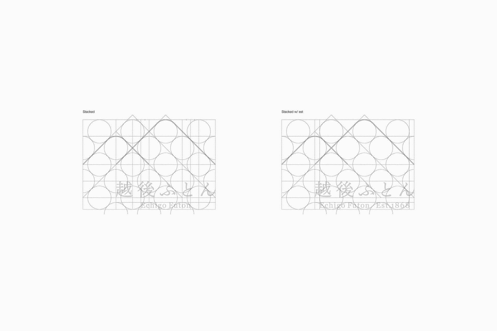
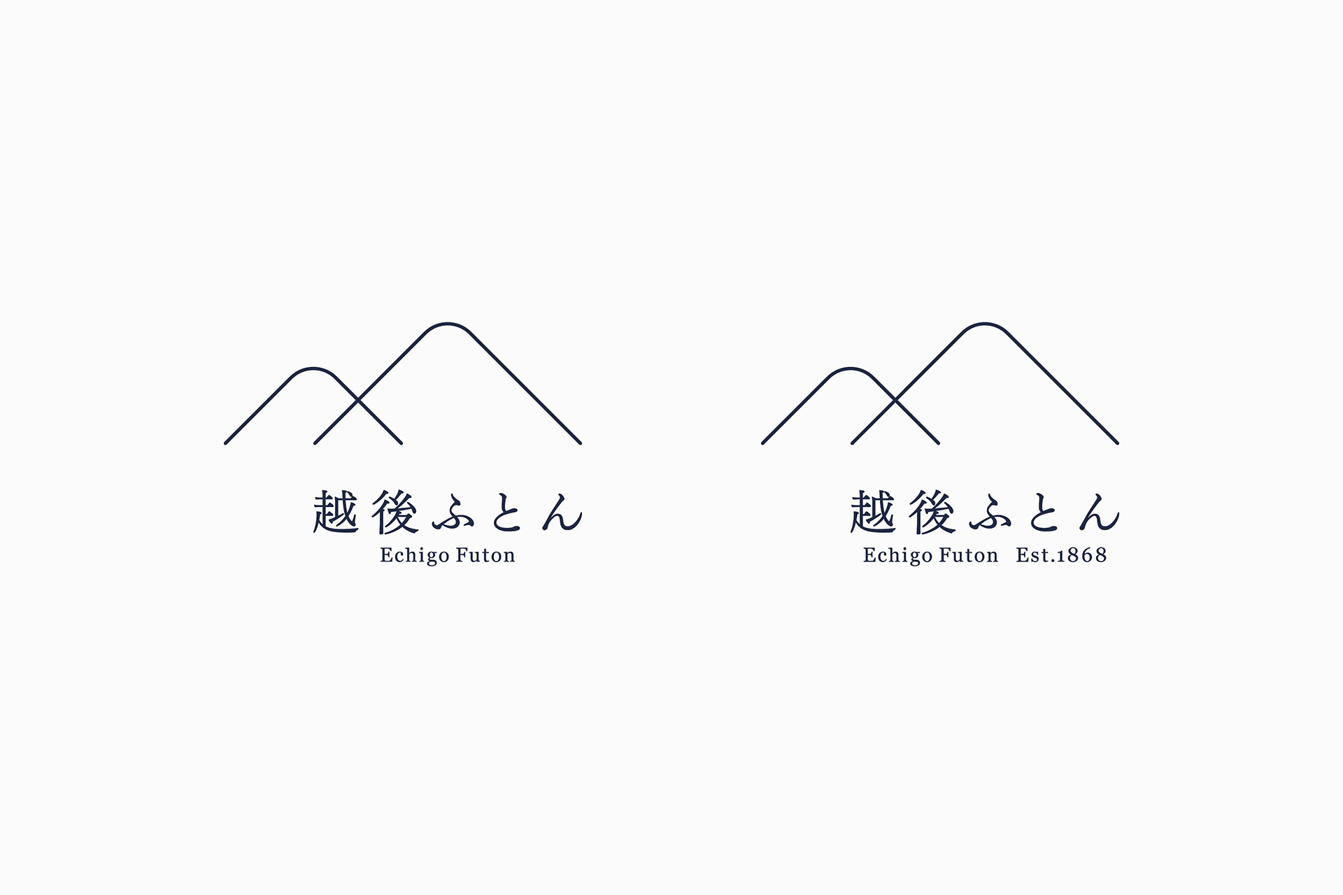
The new symbol of Echigo Futon is composed of two triangles, which include the following meanings.
A: Having pride in technology, traditions, and trust from their customers that all employees have cultivated within themselves, the company was reborn. Therefore we visualized the elements that should be aimed and fostered by the company to become a strong brand.
B: Overlapping triangles represent the pillow and futon, which are the business of the company as a bedding manufacturer.
B: Overlapping triangles represent the pillow and futon, which are the business of the company as a bedding manufacturer.
-
越後ふとんの新しいシンボルはふたつの三角形から構成されており、以下の意味が含まれている。
A: すべての社員がこれまで培ってきた技術力、伝統、顧客からの信頼に対する誇り。 それらをひとりひとりの社員が心のなかに置きながら、生まれ変わった同社がこれから強いブランドとなるために目指し育んでいくべき要素を視覚化したものである。
B: 2つの三角形の重なりは、枕と掛け布団が重なった様を表す。それは、寝具メーカーである同社の業態を表す。
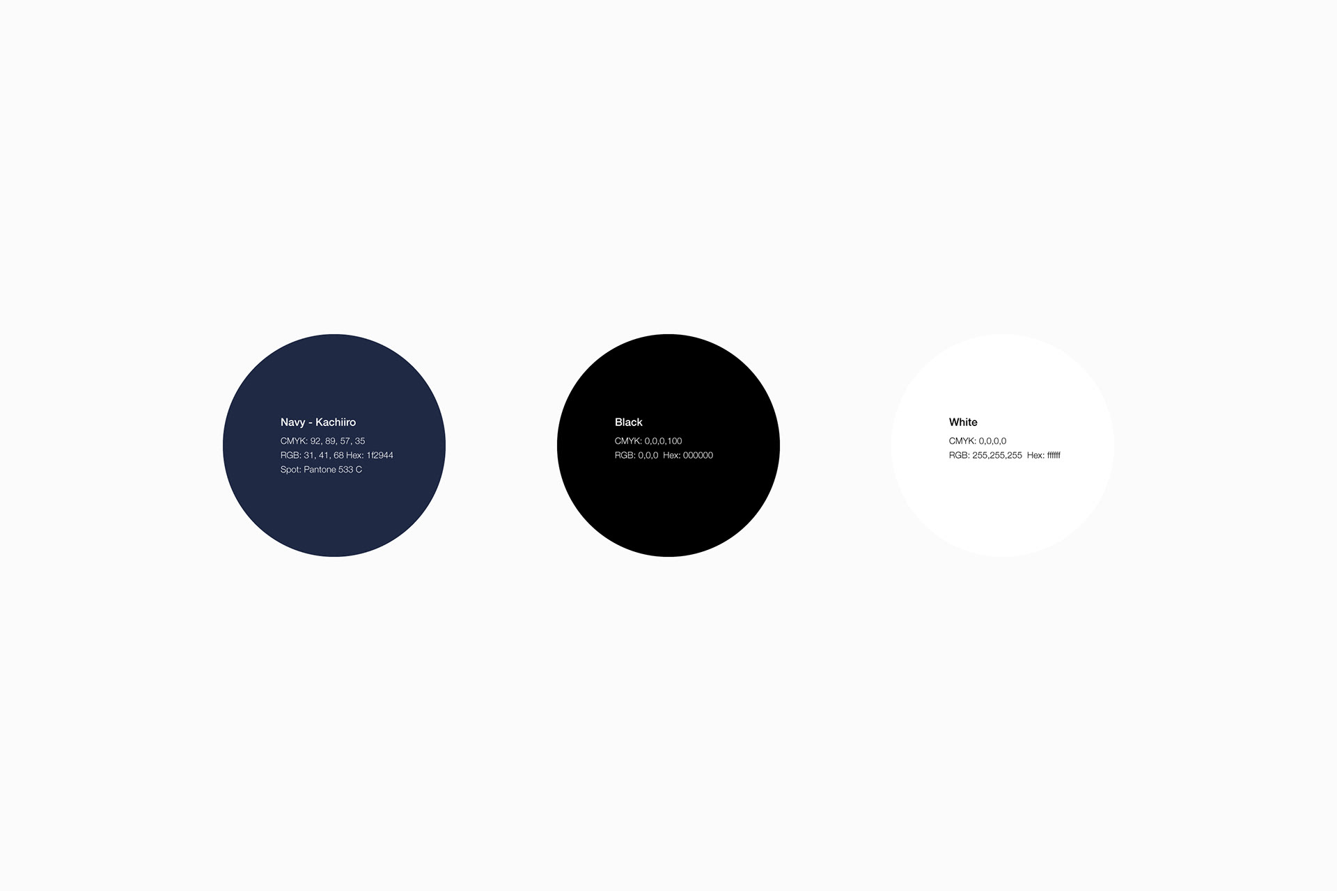
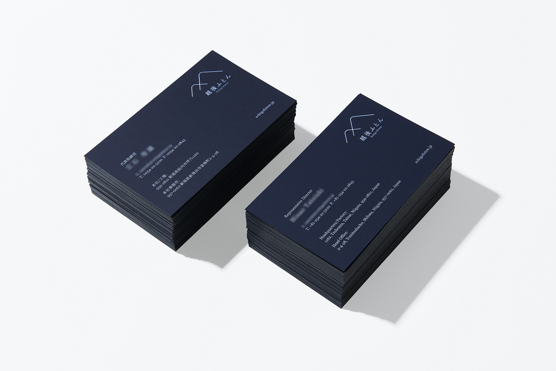
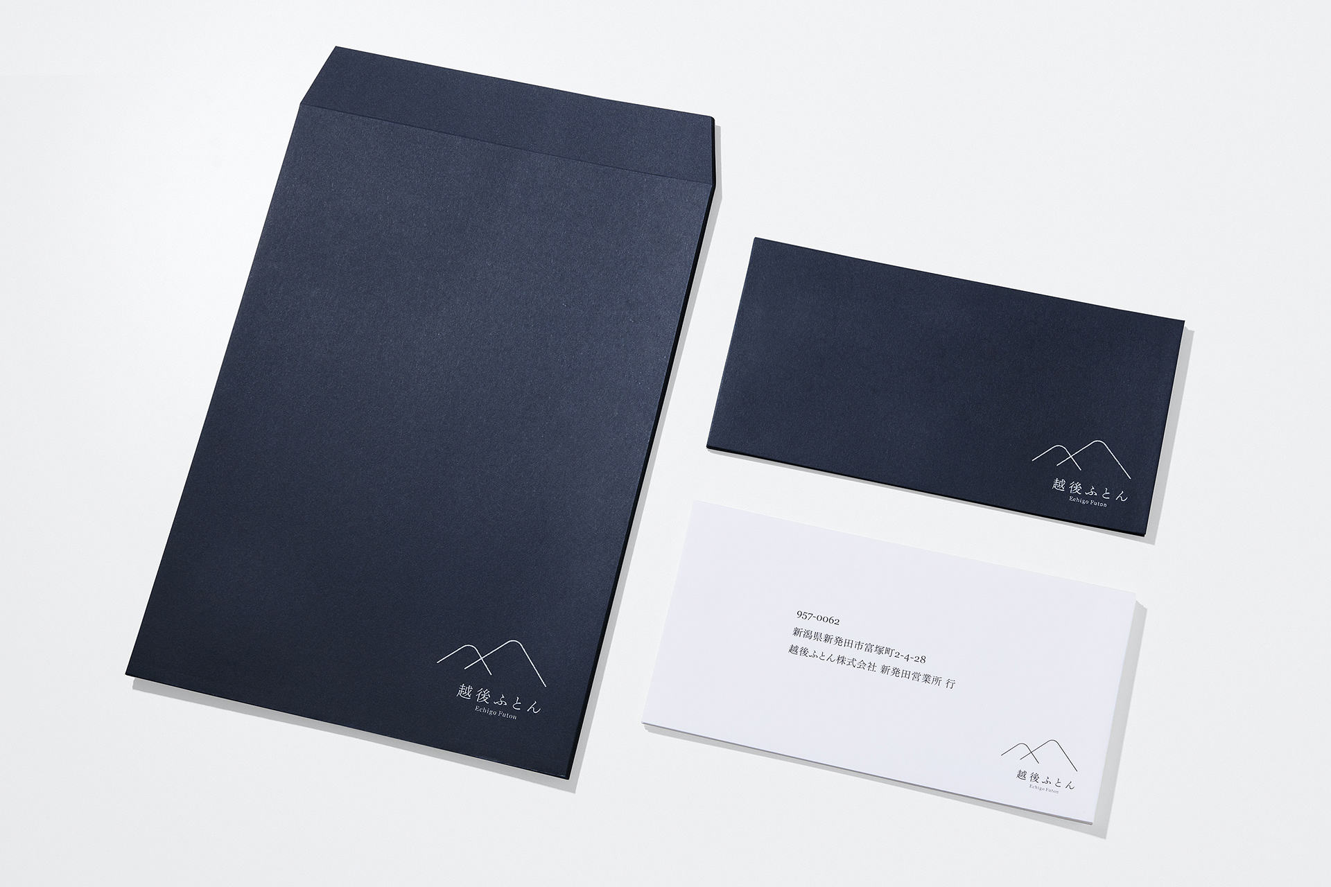
New color
As the new corporate color, we chose the Japanese traditional color katsu-iro (勝色), meaning “victory color”.
Katsu-iro is even deeper indigo than navy blue that originates its history back to the Heian period which was around the ninth century. During the Heian period, there were clothes dyed with indigo and navy called kachie (褐衣) often worn by people called toneri (舎人).
To give a glossy finish by having the indigo-dyed deeply into the linens, kachie was made by expanding and beating the cloth on top of the board. This process and the way of dyeing are called katsu (搗つ) or kachi-zome (搗染め), which made the color eventually called kachi-iro (褐色).
Then in the Kamakura period, the kanji character for katsu (搗つ) was replaced with katsu (勝つ) meaning "victory", and the color representing victory as an auspicious color became loved by a wide range of people including the samurai.
We chose this katsu-iro as the auspicious color for the newly reborn Echigo Futon to represent its corporate victory. Indigo is a color that brings forth honesty and trust, and it is also a color that gives an image of calmness, rest, and sleep. It also has a psychological effect of promoting sleep. Having that said, it is the best color for the company dealing with bedding.
-
新しいコーポレートカラーには、日本古来の伝統色である勝色(かついろ)を設定した。
この勝色とは、紺よりもさらに濃く深い藍色のことであり、その歴史は平安時代まで遡る。平安時代、舎人(とねり)と呼ばれる人々が着ていた服に”褐衣(かちえ)”と呼ばれる藍や紺で染めたものがあった。この褐衣は、染料である藍を麻布に深く濃く染み込ませて光沢を与えるために染めた布を板の上に拡げ叩いて作られた。この作業と染め方のことを”搗つ(かつ)”や”搗染め(かちぞめ)”と呼び、ここからこの色が”褐色(かちいろ)”と呼ばれるようになった。その後、鎌倉時代になると”搗つ”は”勝つ”に置き換えられ、勝利を表す縁起の良い色として武士を始めとする幅広い人々に愛好されるようになった。
この勝色を新しく生まれ変わった越後ふとんの企業的勝利を意味する縁起の良い色として設定した。藍色は誠実さや信頼感を醸し出す色であり、落ち着きや安息、眠りをイメージをさせる色でもある。睡眠を促進するという心理効果も併せ持つことから、寝具を扱う同社にとって最適な色であると言えるだろう。
New efforts
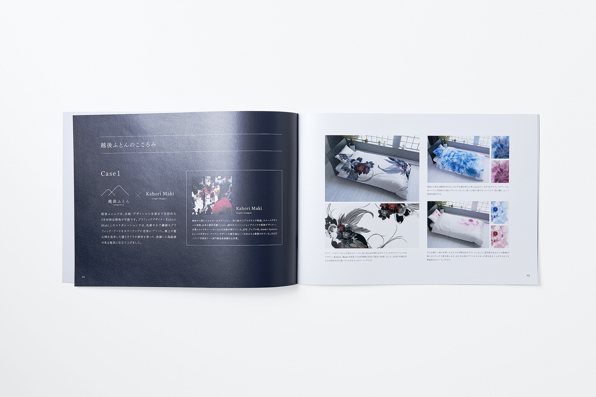
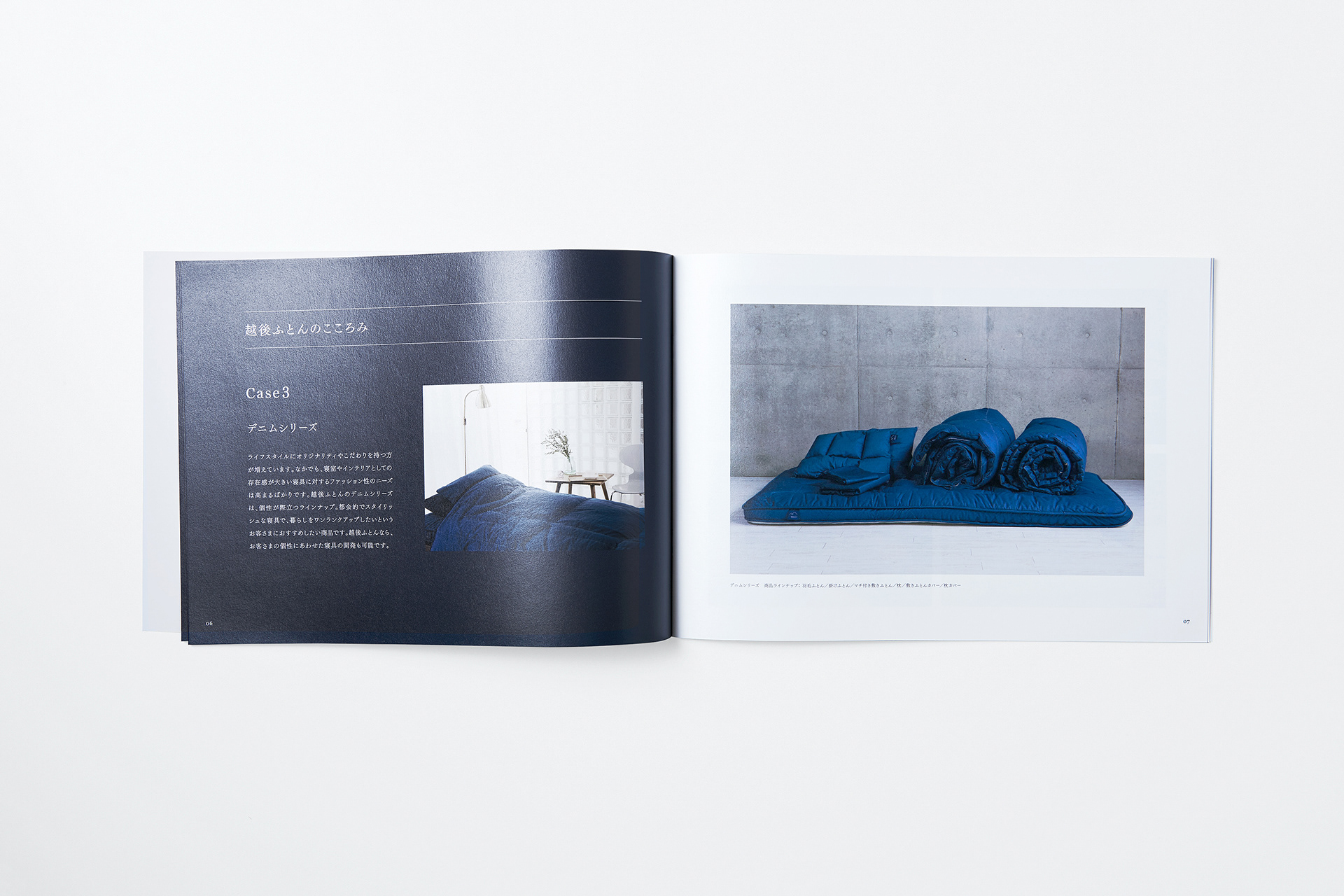
To acquire a new sales channel for potential customers, we also supported Echigo Futon in developing products that had not been worked on until then. Acquiring new sales channels and developing new products aligned with their customer needs are the most important elements for the company to become a strong brand. They occupy a high ratio of what the new Echigo Futon brand must work on, as implied in the new symbol’s large triangle.
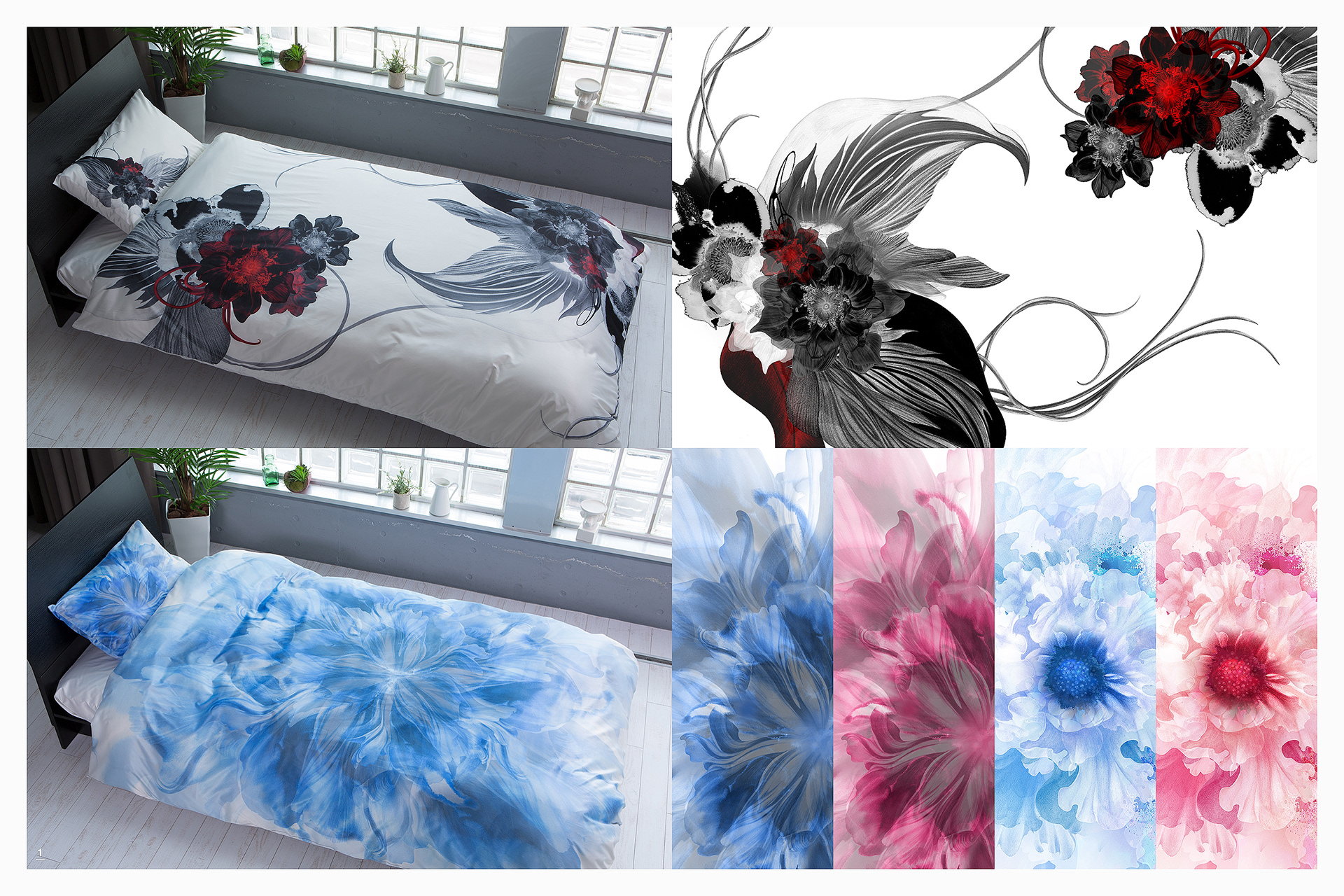
1: Collaboration with graphic artist "Kahori Maki" who handles many collaborations with domestic and foreign fashion brands and clothing designers and companies. Developed a colorful, delicate, and sophisticated series of graphic covers which the company had not done previously.
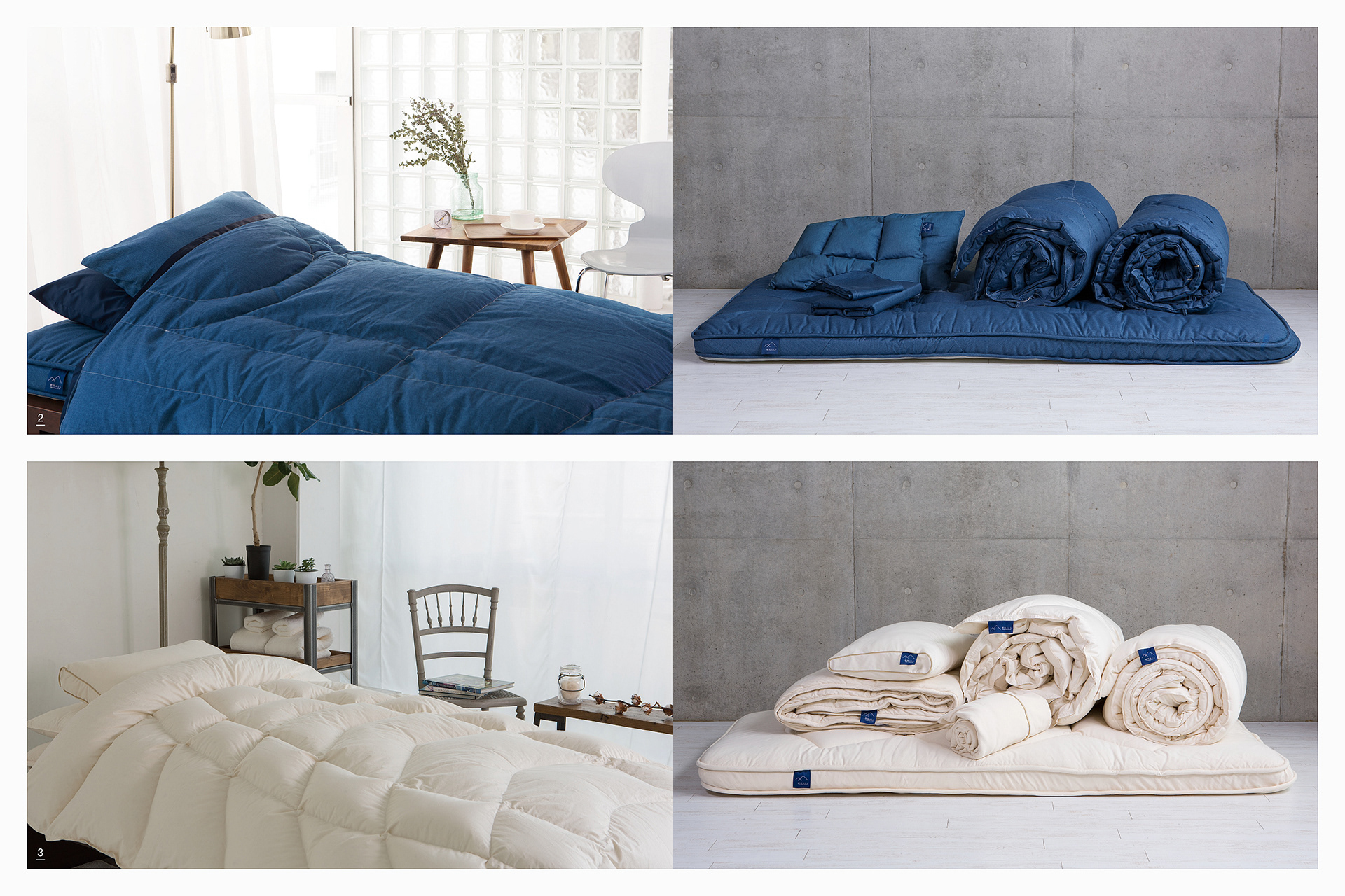
2: Developed product series using casual and fashionable denim fabric.
3: Developed a product series using organic cotton that is friendly not only to users but also to makers and the environment.
-
潜在的顧客に向けた新しい販売チャネル獲得に向けて、これまで越後ふとんが手がけてこなかった商品群の開発サポートもおこなった。新しい販売チャネルの獲得とその顧客ニーズに即した新商品の開発は、同社が強いブランドとなるための最も重要な要素であり、シンボルの大きい三角形が意味する新しい越後ふとんブランドが育んでいかなければならない部分において高い比重を占める。
1: 国内外のファッションブランドや服飾デザイナー、企業とのコラボレーションも多数手がけるグラフィックアーティスト”Kahori Maki”とコラボレーション。これまで同社が手がけてこなかった色鮮やかで繊細、洗練されたグラフィックカバーリングシリーズを開発。
2: カジュアルでファッショナブルなデニム生地を使用した製品シリーズを開発。
3: 使用者だけでなく、作る人や環境にも優しいオーガニックコットンを使用した製品シリーズを開発。
Client: Echigo Futon
Produce & Management: Kayoko Tsuchiya (Brilliant Color International)
Creative art direction, Logo concept: Hiromi Maeo (enhanced Inc.)
Graphic design: Hiromi Maeo (enhanced Inc.), Koji Terao
Web design: Hirofumi Okayama
Movie direction: Seiji Kitahara
Movie & photos: Yousuke Omori
Portfolio photos: Yoshitsugu Enomoto
Portfolio photos: Yoshitsugu Enomoto
Graphic artist: Kahori Maki
2016~ Niigata, Japan